Marketing Campaign
Harlig
From the lush pastures of Sweden, a country renowned for its dairy products and rich agricultural heritage, a second-generation family of leading agriculturalists and farmers envisioned a brand evolution. Instead of supplying milk and yogurt to the food industry, they aspired to carve out their niche in the premium ice cream and yogurt market.
With a legacy of supplying high-quality dairy products and a passion for innovation, they approached Owl Studio. Our mandate was to sculpt their vision into reality, crafting a holistic brand narrative encompassing everything to redefine the luxury of ice creams and yogurt, blending Swedish tradition with global flavor.
Project Scope
Brand Strategy & Positioning
Brand Portfolio & Architecture
Brand Identity & Imagery
Brand Style Guidelines
Packaging & Label
Messaging & Tone-of-Voice
Brand Concepts & Communications
Brand Tagline
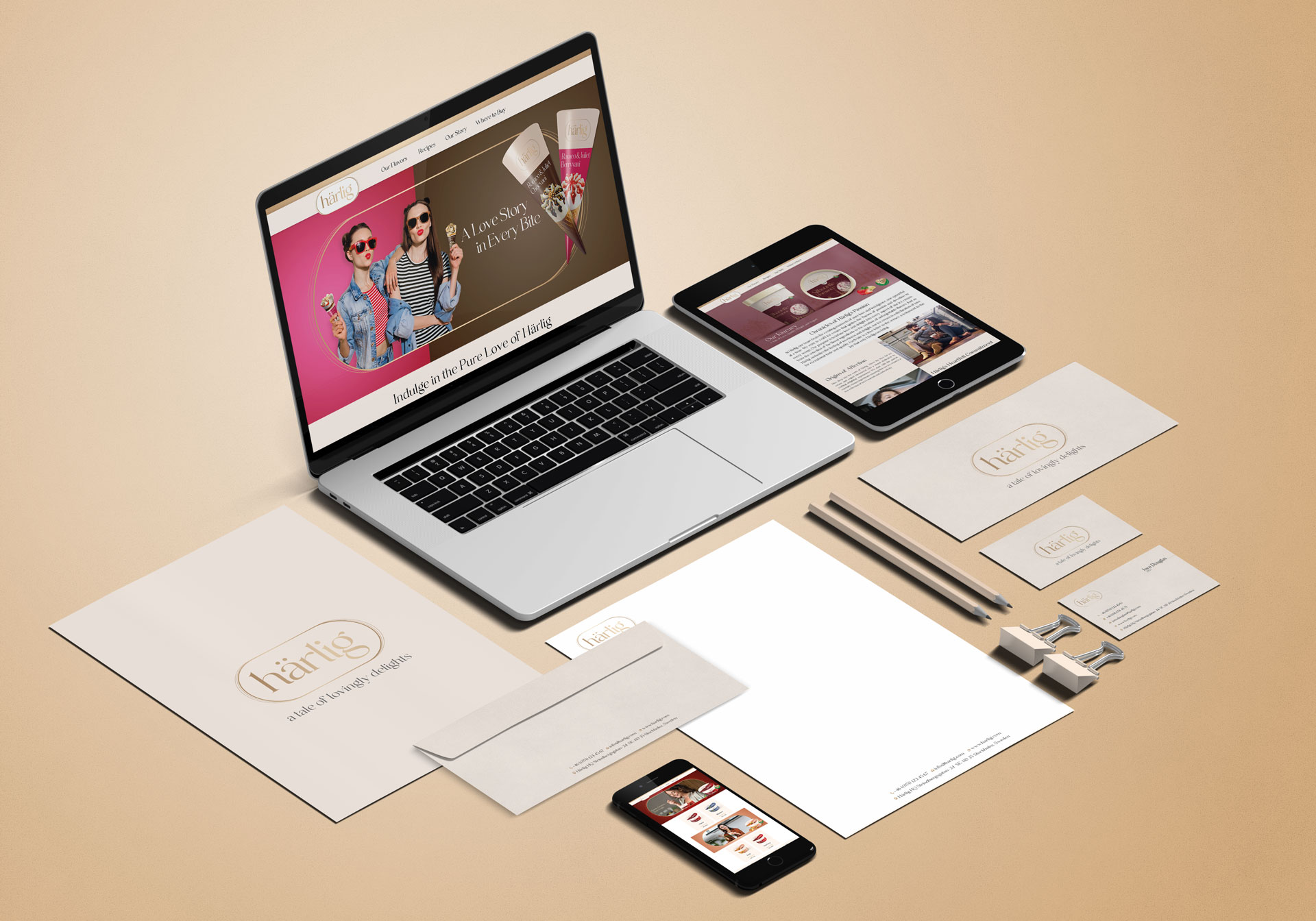
Website & E-commerce
Retail Branding & Merchandise
OOH – Signage & Billboard
Marketing Collateral
LOGO / STATIONARY
Brand Philosophy
Brand Naming
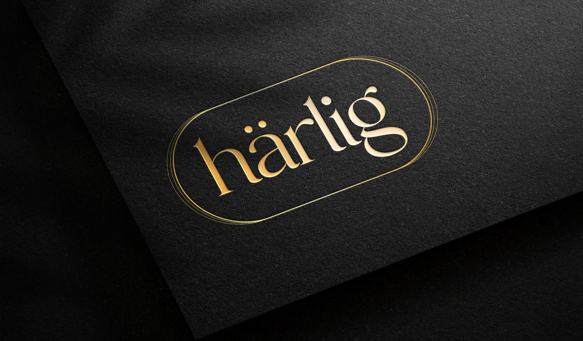
Brand Logo & Identity
- Matte Gold Logo: The matte gold logo, positioned prominently, exudes luxury and sophistication.Positioned dominantly, this logo radiates luxury and sophistication, capturing the essence of Härlig.
- Unique Casing & Font Styling: The unique casing around “härlig” showcases the brand’s commitment to quality and elegance with lowercase “härlig,”. This design element adds a touch of distinction, promising an experience that’s as delightful as the brand’s visual identity.
Brand Essence
Brand Usage Guide
Brand Imagery
Design Philosophy
Visual Storytelling Design Elements
- Top White Panel Strip: This strip, running across the top of the packaging, serves as a backdrop for the “Härlig” logo in a consistent dull matte gold finish, adding a touch of sophistication and emphasizing the brand’s minimalist design approach.
- Flavor Color Representation: The lower, more significant portion of the packaging showcases a solid color indicative of the flavor, complemented by a visual of the main ingredient (e.g., a cocoa bean for Chocolate Holandes, a mint leaf for Alpine Mint, etc.). This color-coding system allows consumers to easily identify their preferred flavors.
- Stylized Font: The flavor name is presented in a stylized lowercase font, positioned at the center of the packaging. This modern typography, in white color with a thick outline of the flavor color, complements the brand’s contemporary image and ensures prominence.
- Ice Cream Visualization: On the right bottom of the packaging, there’s a visual representation of a single scoop of ice cream, bar, or cone, giving consumers a tantalizing preview of the indulgence inside.
- Special Edition Imagery: For the special edition range, a golden line sketch of Stockholm’s city skyline is subtly incorporated into the background. This touch not only adds a layer of sophistication but also pays homage to the brand’s Swedish roots.
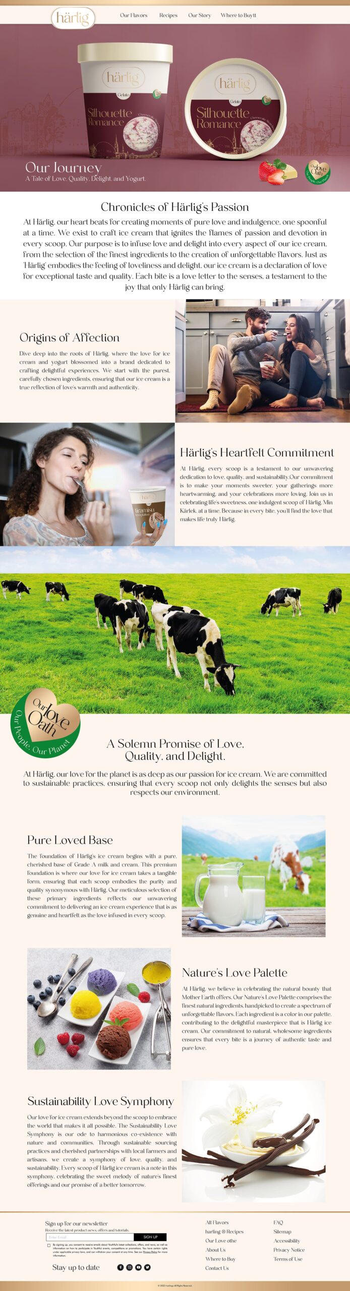
Brand Sustainability Approach : Harlig’s Love Oath
- Pure Loved Base: Discover the pristine foundation of Grade A milk and cream that makes Härlig ice cream a masterpiece of love and quality.
- Nature’s Love Palette: Explore our commitment to handpicking the finest natural ingredients, creating a spectrum of unforgettable flavors.
- Sustainability Love Symphony: Learn about our dedication to sustainable sourcing and local partnerships, celebrating a harmonious blend of love for ice cream, Mother Earth and our community.
Retail Presence Branding
Brand Communications
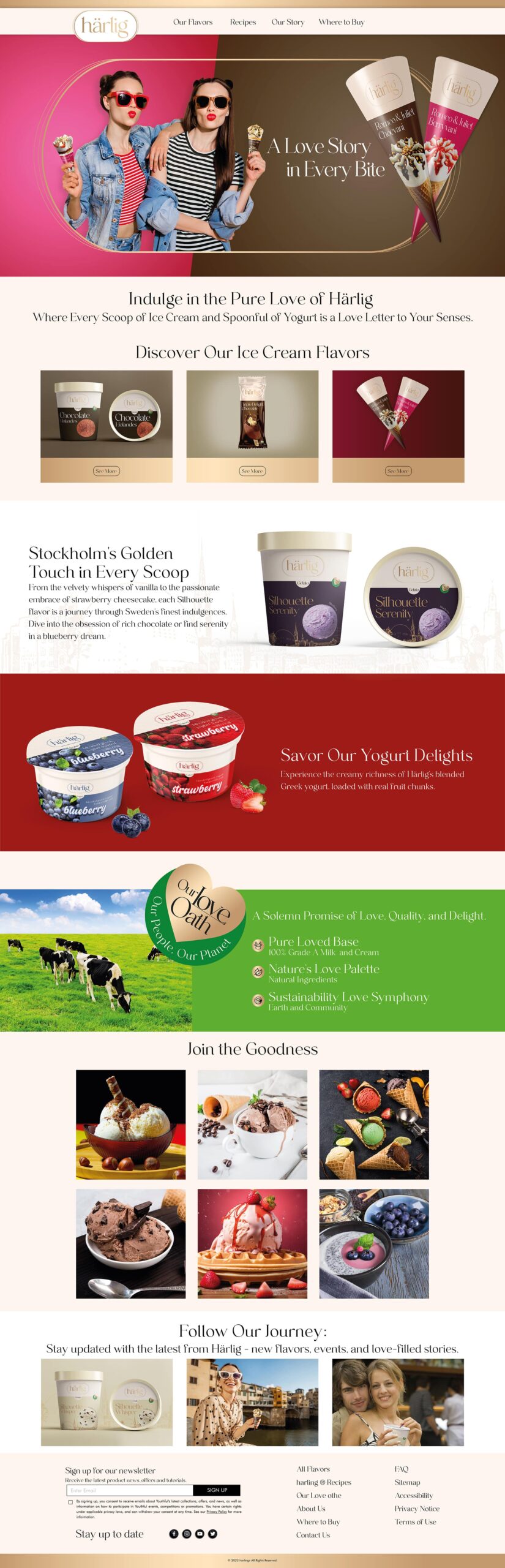
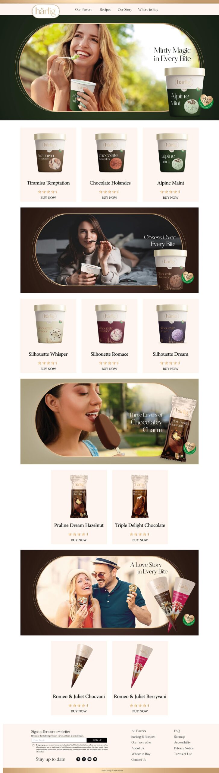
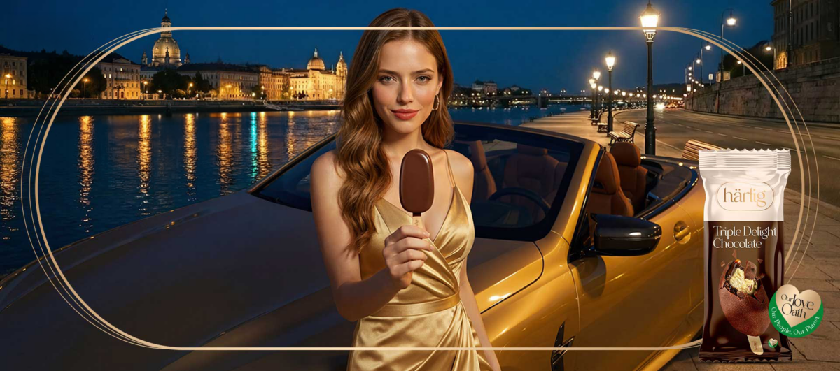
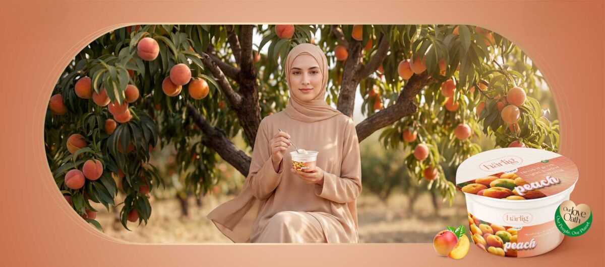
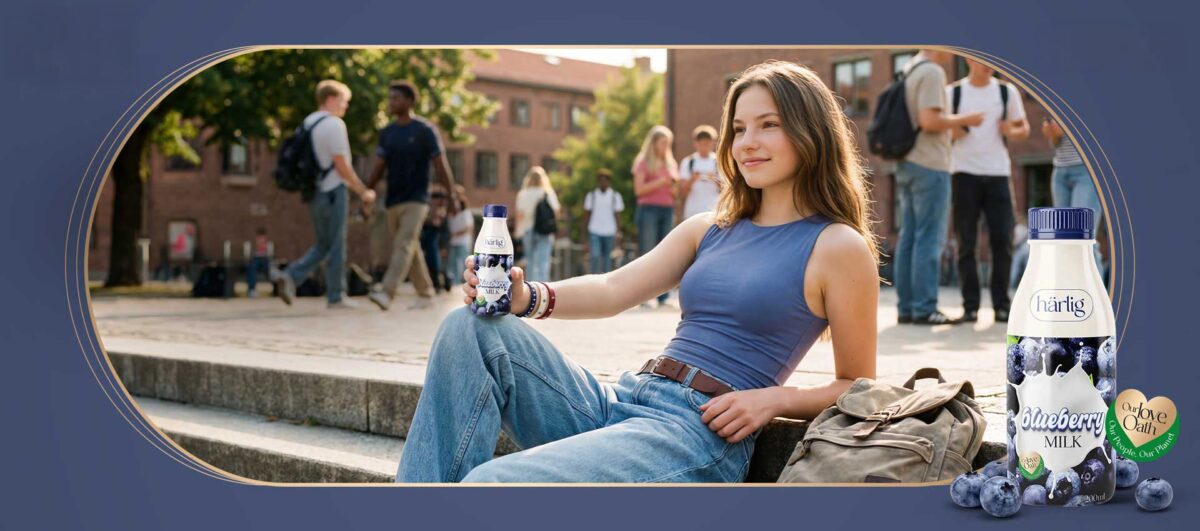
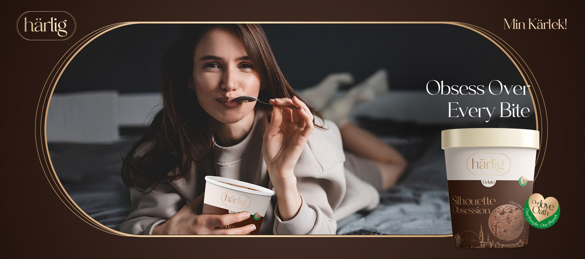
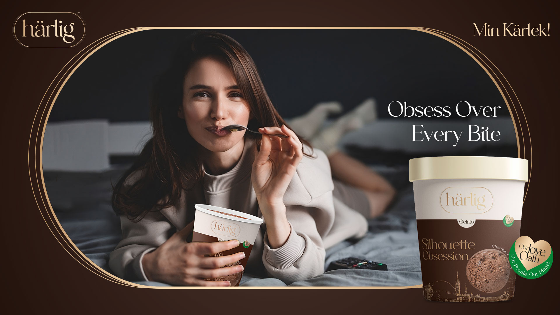
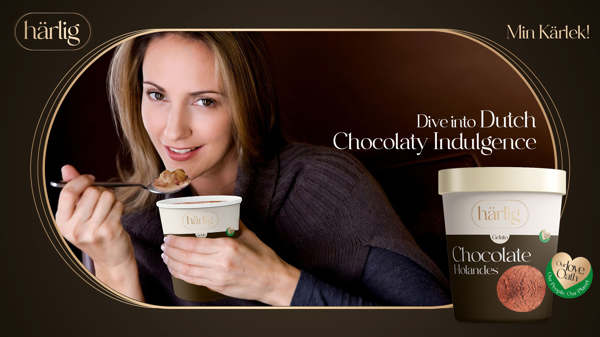
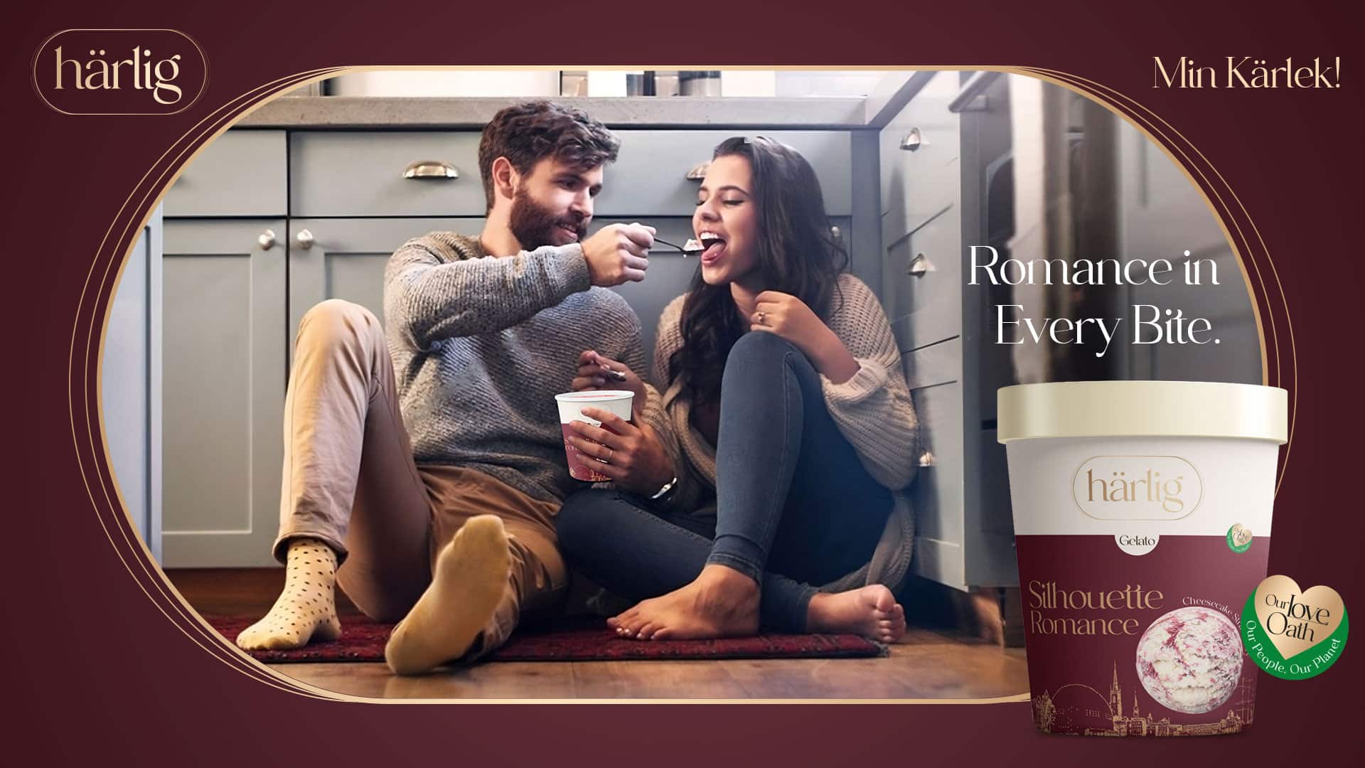
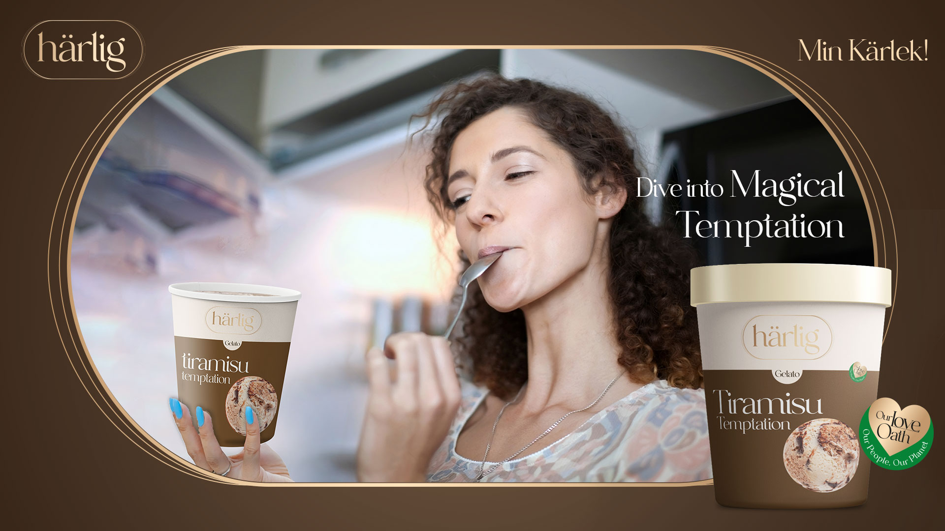
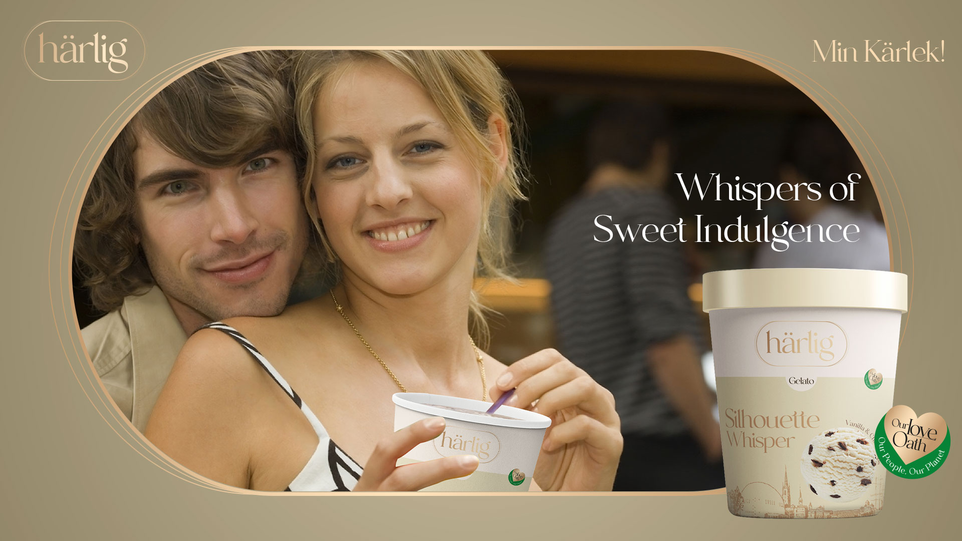
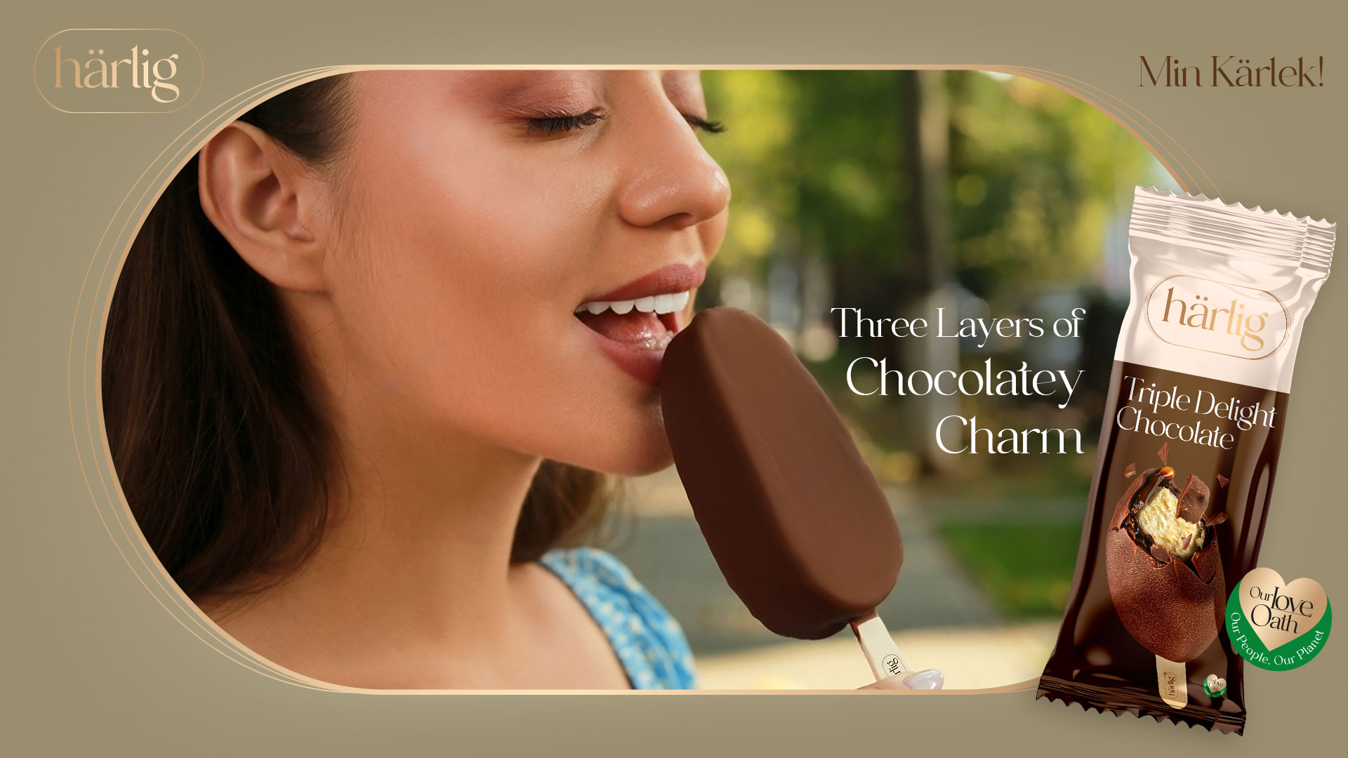
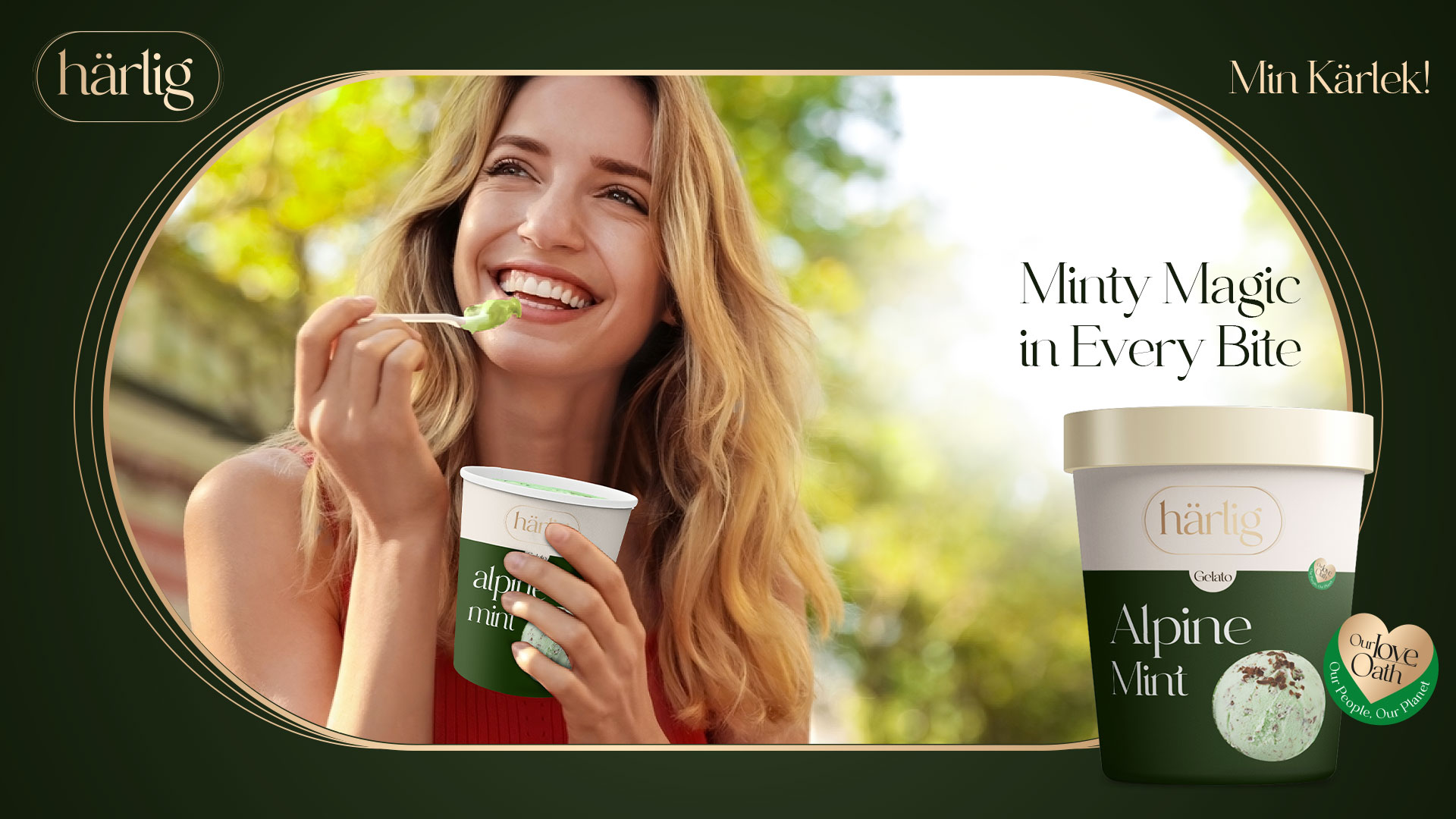
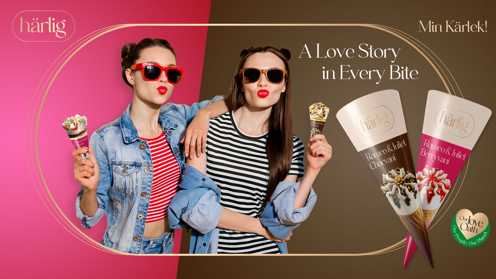
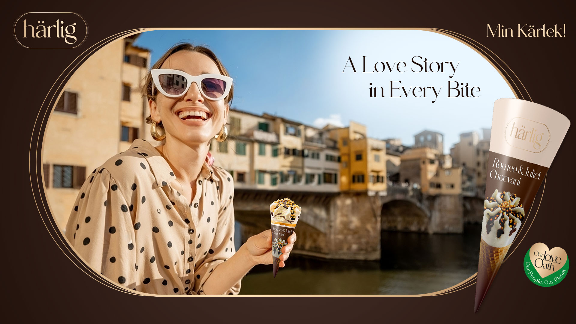
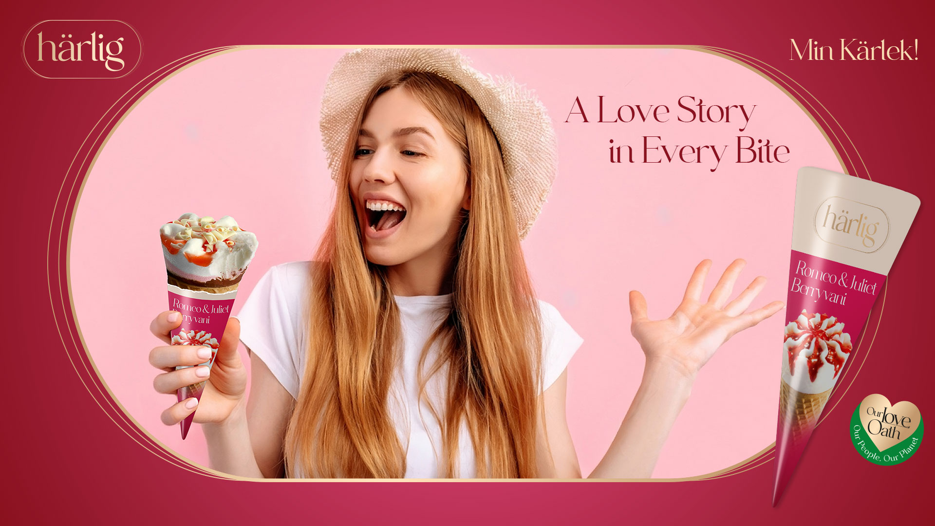
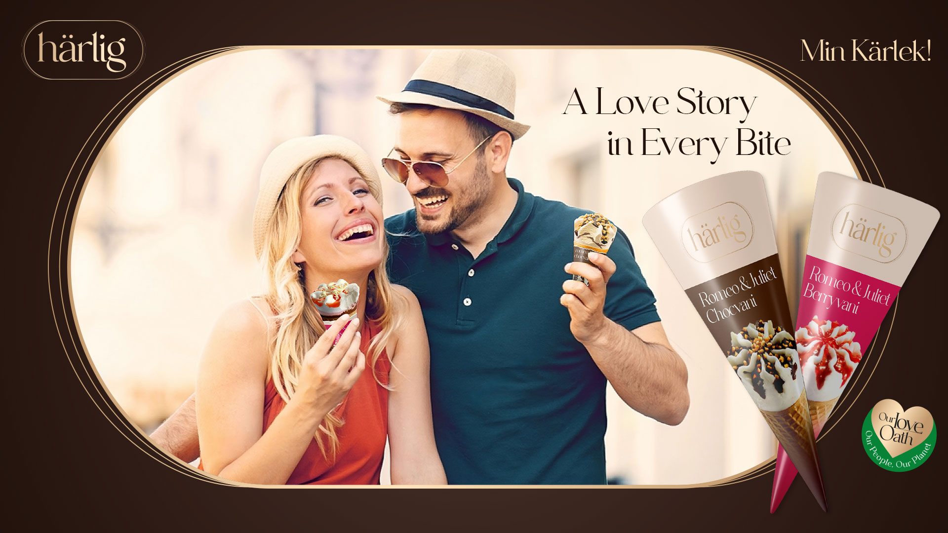
Together, we meticulously crafted a series of evocative brand communications that deeply resonate with Härlig’s target demographic. The journey from the ice cream’s creation to the moment it’s enjoyed by discerning consumers is beautifully portrayed, emphasizing the brand’s commitment to quality, luxury and the celebration of life’s delightful moments.Campaigns such as “Harlig- A Tale of Lovingly Delights” for the range, “Minty Magic In Every Bite” for Alpine Mint, “Obsess Over Every Bite” for Silhouette Range, “A Love Story in Every Bite” for Romeo & Juliet Cone and “Three Layers of Chocolaty Charm” for the Bar have been tailored to captivate our target audience.
These narratives evoke sensations of indulgence, luxury and sheer delight and weave the compelling tale of cherishing life’s delightful moments with Härlig Premium Ice Cream.
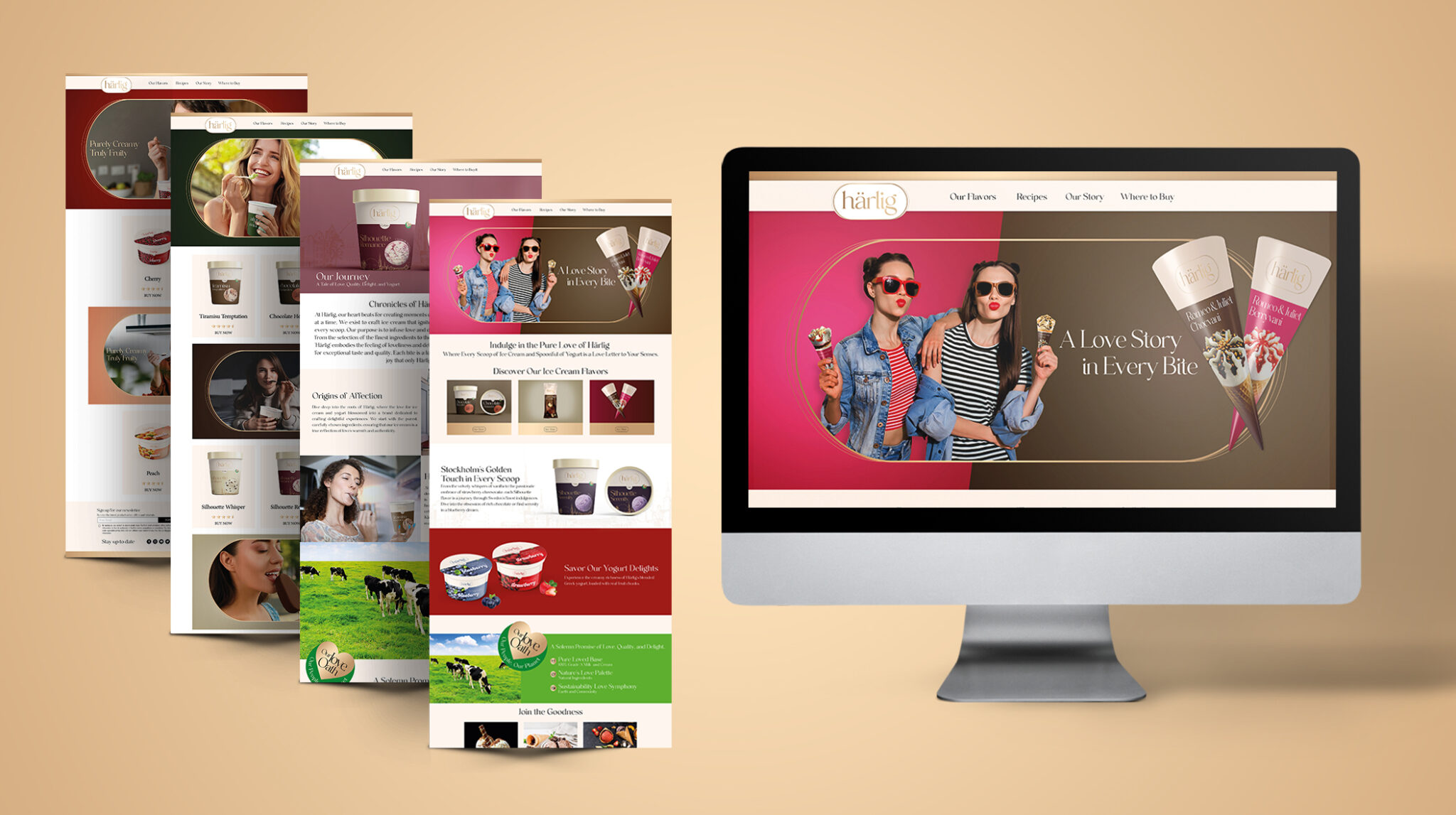
Online Presence
Härlig’s digital platform offers an immersive experience, taking visitors on a journey through the world of Härlig, from the rich traditions of Sweden to the innovative flavors inspired by global tastes. With its user-friendly interface, the website showcases a diverse range of products, from the creamy richness of ice creams to the refreshing tang of yogurts, allowing visitors to savor the flavors even before they place an order.
PRODUCTS
KEY VISUALS

OUTDOOR
STORE
WEBSITE