Marketing Campaign
New Product Launch
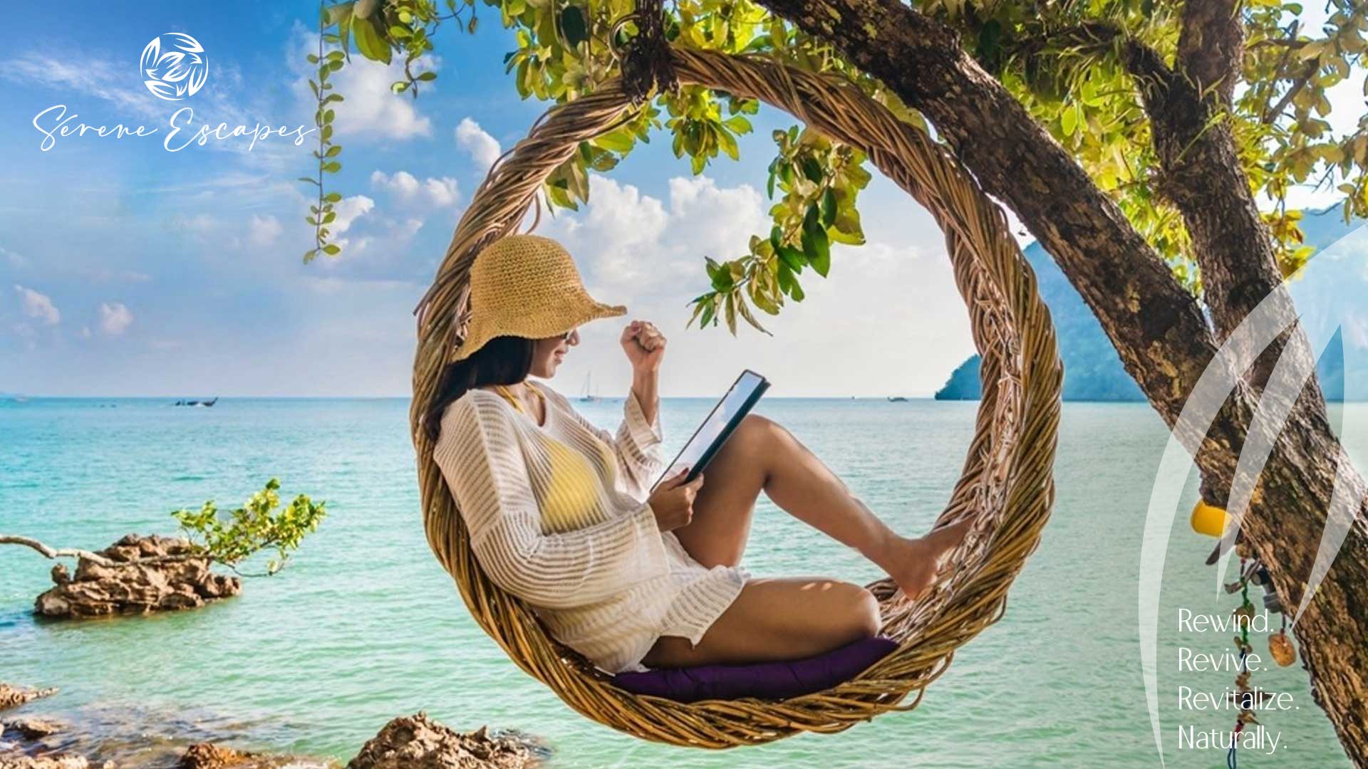
Serene Spa
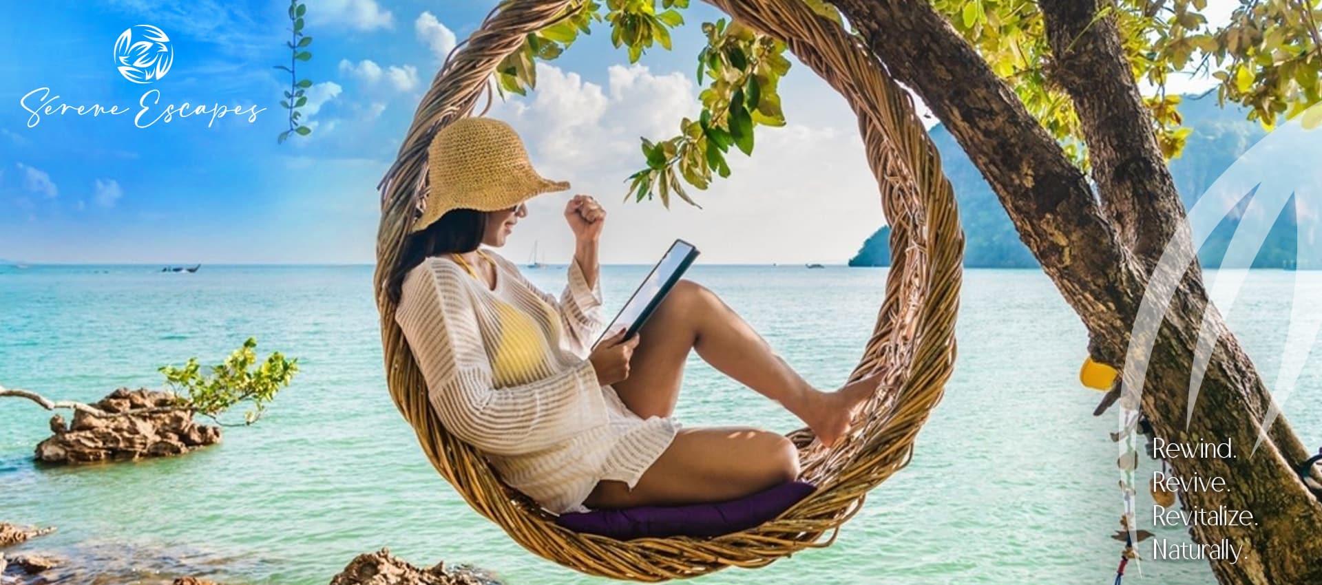
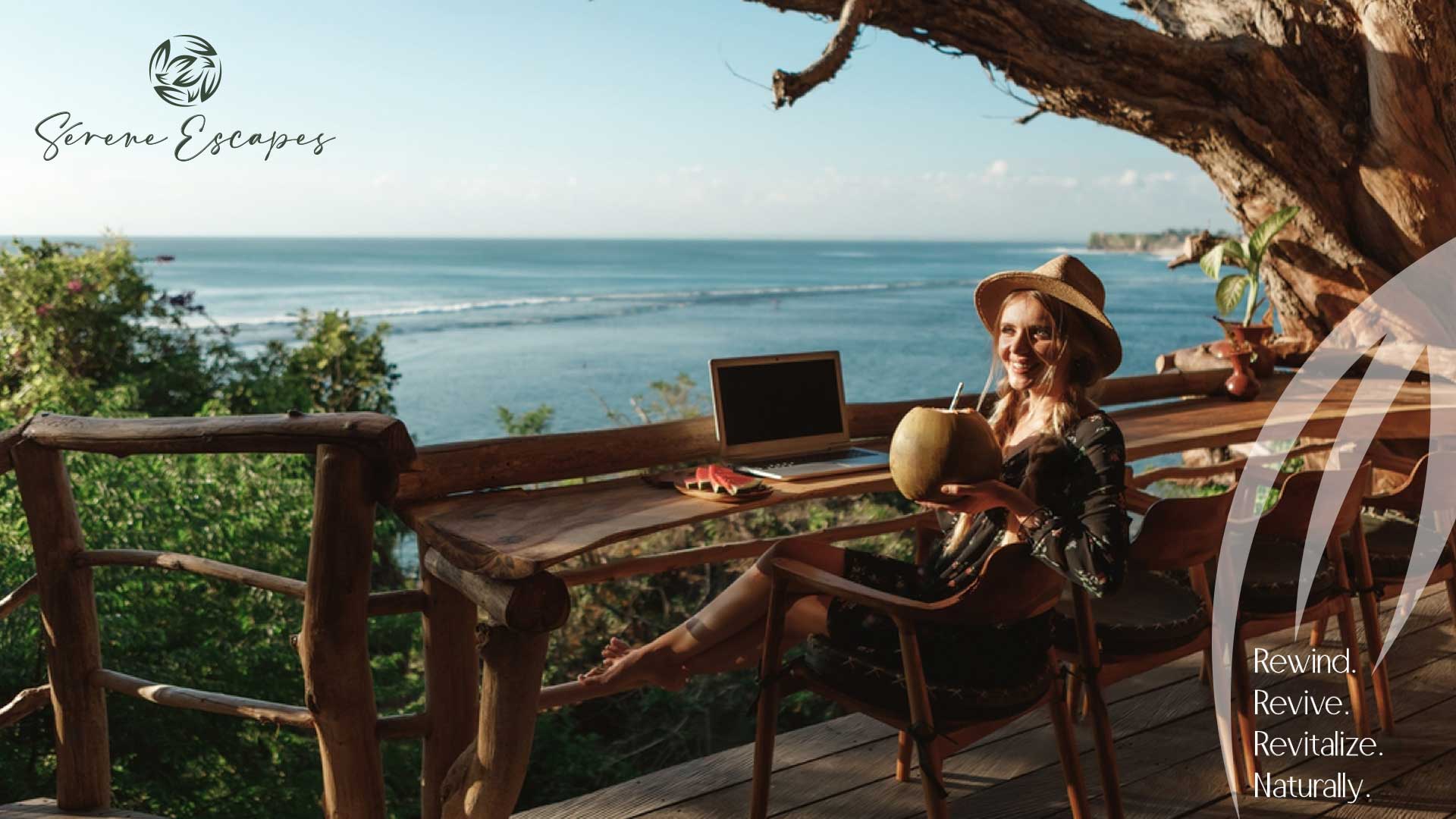
Rewind, Revive and Revitalize
Nestled in the picturesque setting of Porquerolles, Italy, Serene Escape emerges as a beacon of tranquility and rejuvenation. As a sanctuary designed to offer a serene retreat from the daily hustle, this Spa and resort embodies the very essence of relaxation. Entrusted with the task of encapsulating this essence, Owl Branding Studio embarked on a branding journey to craft a narrative that truly resonates with the ethos of Serene Escape. Through meticulous design and strategic branding, Owl Studio has woven a tale of “Rewind. Revive. Revitalize. Naturally,” ensuring that every touchpoint of Serene Escape invites visitors to embark on their personal journey of relaxation and revitalization.
Project Scope
Brand Purpose
Brand Strategy & Positioning
Brand Portfolio & Architecture
Brand Identity & Imagery
Brand Style Guidelines
Brand Strategy & Positioning
Brand Portfolio & Architecture
Brand Identity & Imagery
Brand Style Guidelines
Logo Creation
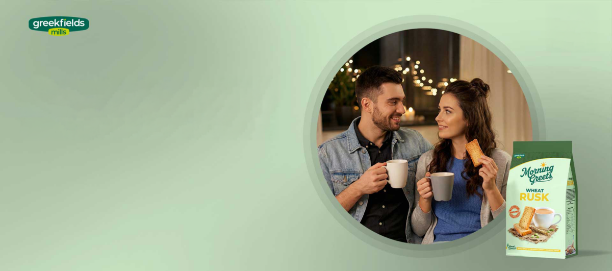
Packaging & Label
Messaging & Tone-of-Voice
Brand Concepts & Communications
Brand Tagline
Packaging & Label
Messaging & Tone-of-Voice
Brand Concepts & Communications
Brand Tagline
Experiential Designs
Website & E-commerce
Retail Branding & Merchandise
OOH – Signage & Billboard
Marketing Collateral
Website & E-commerce
Retail Branding & Merchandise
OOH – Signage & Billboard
Marketing Collateral
LOGO / STATIONARY
Brand Philosophy
Serene Escape is more than just a name; it’s a promise. A commitment to offering moments where one can “Rewind. Revive. Revitalize. Naturally.” It’s about embracing tranquility, rejuvenating the spirit and revitalizing the body amidst nature’s embrace.
Brand Naming
“Serene Escape” encapsulates the brand’s core offering – a tranquil retreat where guests can escape the chaos of daily life and find solace in nature’s lap.
Brand Identity Development
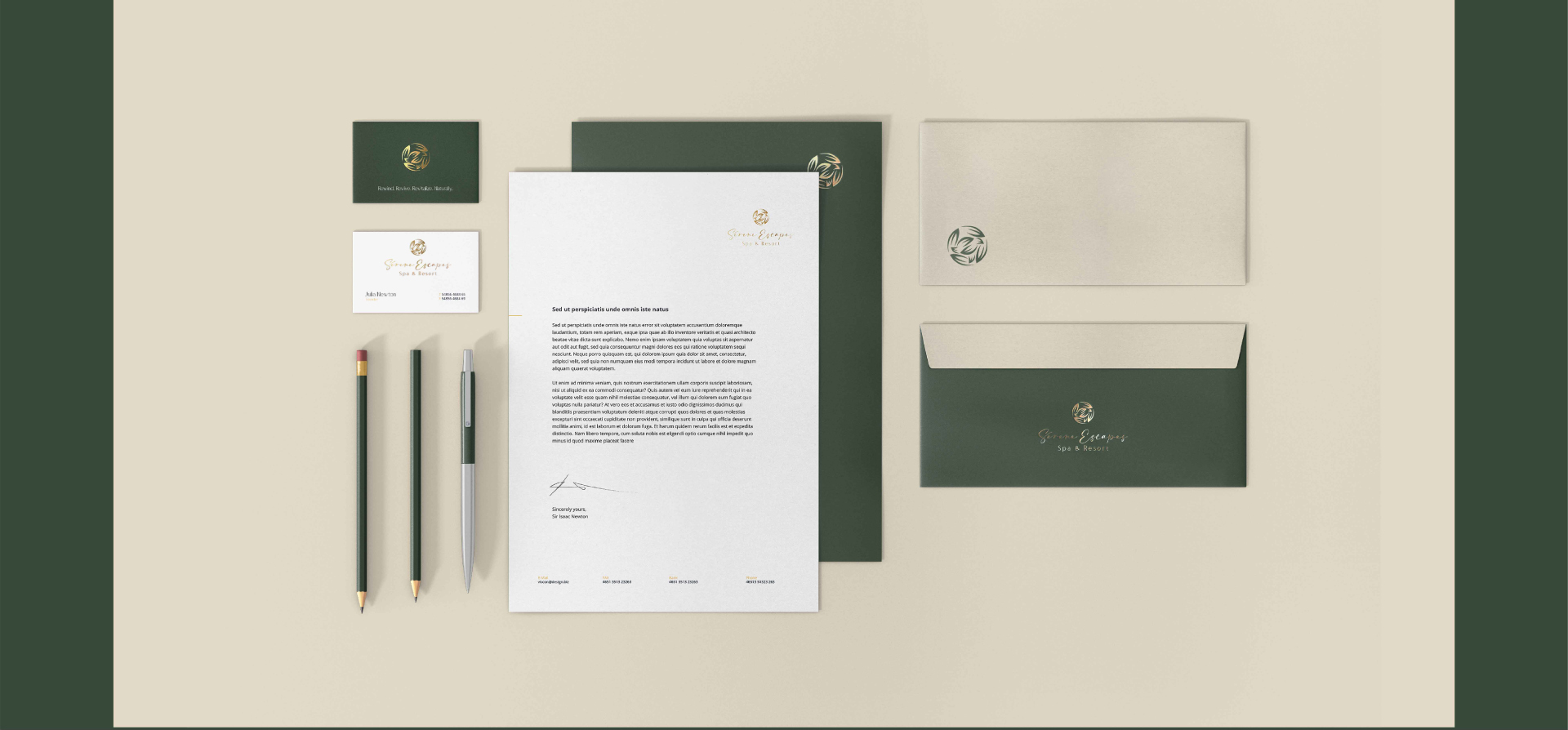
Our collaboration with Serene Escape led to the creation of a brand identity that resonates with tranquility and rejuvenation. Every element, from color choices to typography, mirrors the brand’s commitment to offering a serene retreat.
Logo Concept
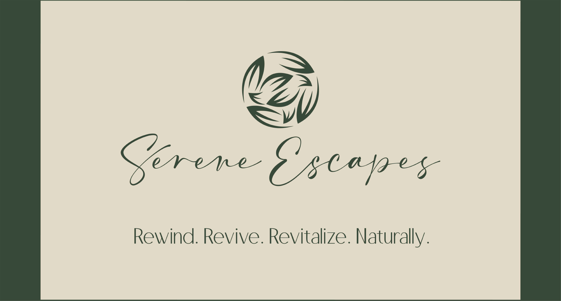
The Serene Escape logo is a harmonious blend of nature and rejuvenation, encapsulated within a circular design reminiscent of a world globe crafted through leaves. The logo symbolizes the spa’s natural essence and communicates the brand’s core philosophy of “Rewind, Revive, Revitalize.” The elegant design, combined with calming hues, represents tranquility, rejuvenation and luxury, inviting guests to immerse themselves in a serene oasis.
Brand Usage Guide
Guidelines were meticulously crafted to ensure a consistent brand representation across all platforms. From color codes to typography, every detail was defined to maintain the brand’s integrity and essence.
Brand Essence
At its core, Serene Escape offers moments of tranquility and rejuvenation. It’s an invitation to rewind, revive and revitalize promising experiences that resonate with peace and luxury.
Brand Imagery
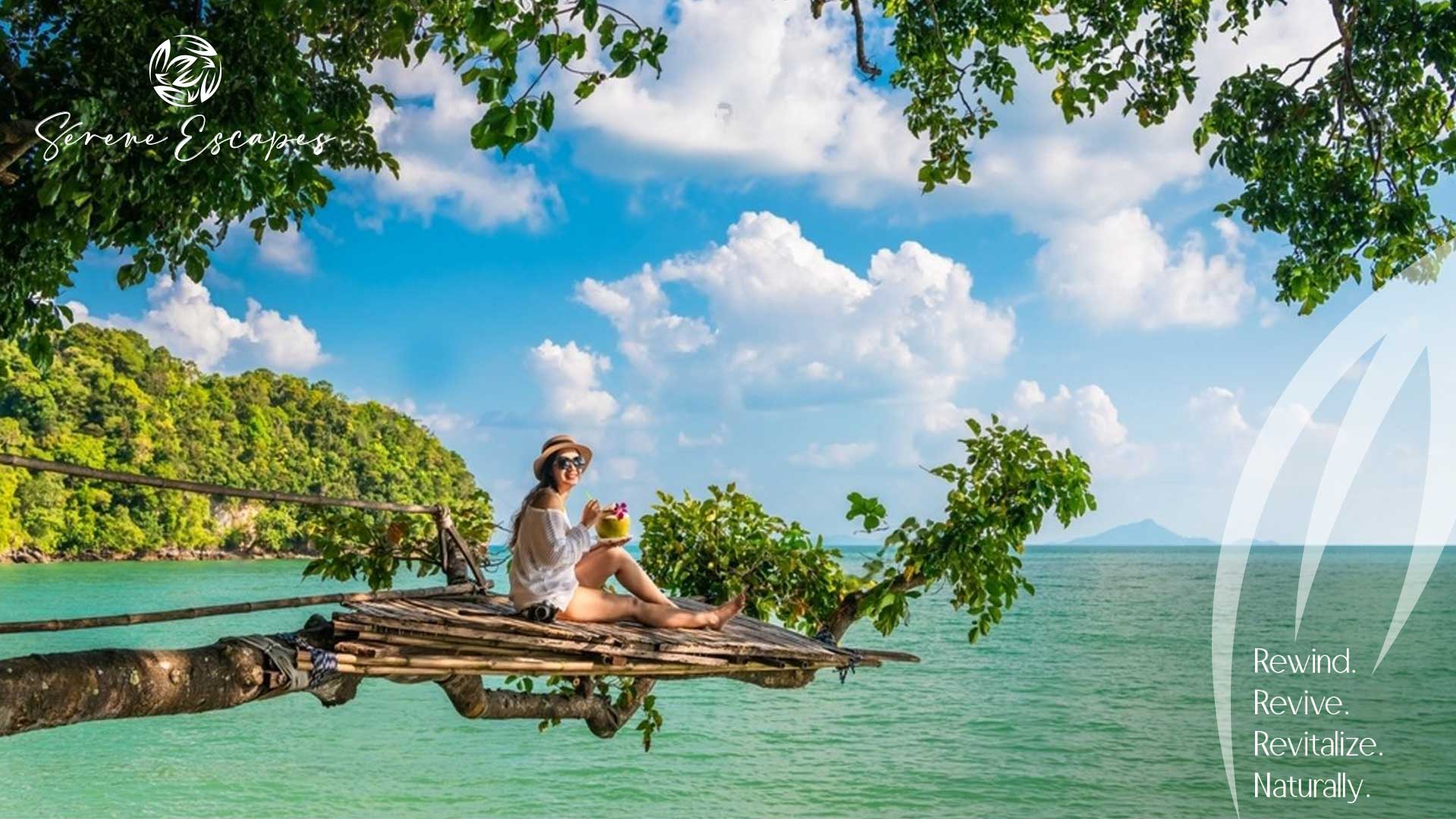
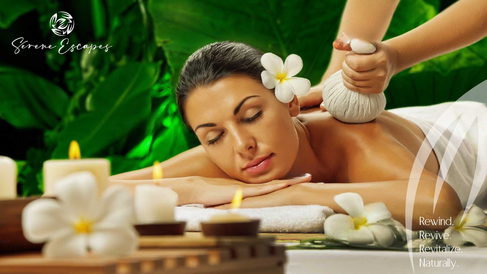
Drawing from the serene landscapes of Porquerolles, Italy, Serene Escape’s imagery blends nature’s tranquility and modern luxury. Each visual tells a story of peace, beauty and rejuvenation.
Brand Tagline
“Rewind, Revive and Revitalize” – A promise that Serene Escape delivers with every interaction, emphasizing moments of peace, rejuvenation and luxury.
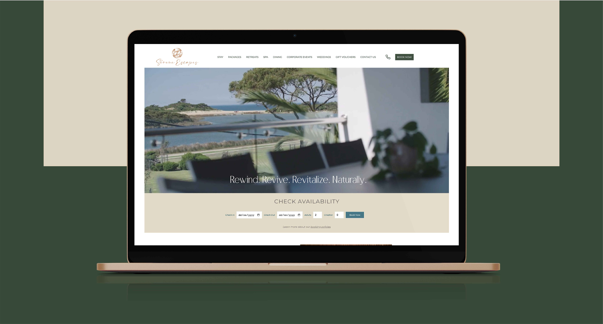
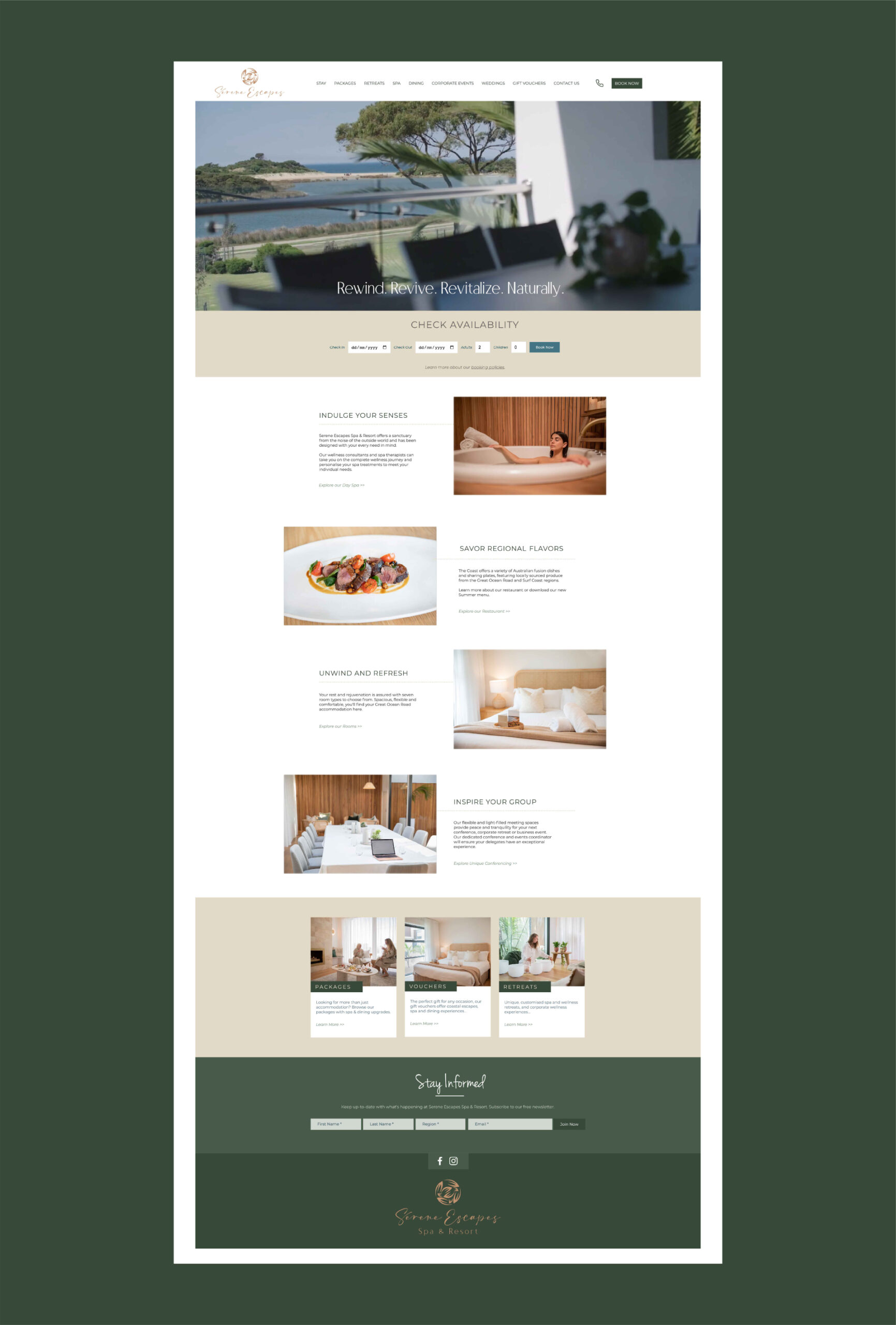
Website & Web Portal
Serene Escape’s digital presence, crafted in collaboration with Owl Studio and MI Worldwide, is a digital oasis of tranquility. With its serene interface and interactive elements, the website offers visitors an immersive experience, echoing the brand’s commitment to tranquility and rejuvenation.
Brand Communications
Serene Escape’s communication strategy seamlessly integrates its brand philosophy. From the tranquil website design to the interactive digital campaigns, every touchpoint is crafted to offer an experience of relaxation and rejuvenation, reinforcing the brand’s promise to be a sanctuary of tranquility.
KEY VISUALS
OUTDOOR
WEBSITE