Marketing Campaign
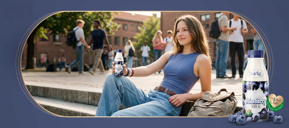
Harlig Yogurt
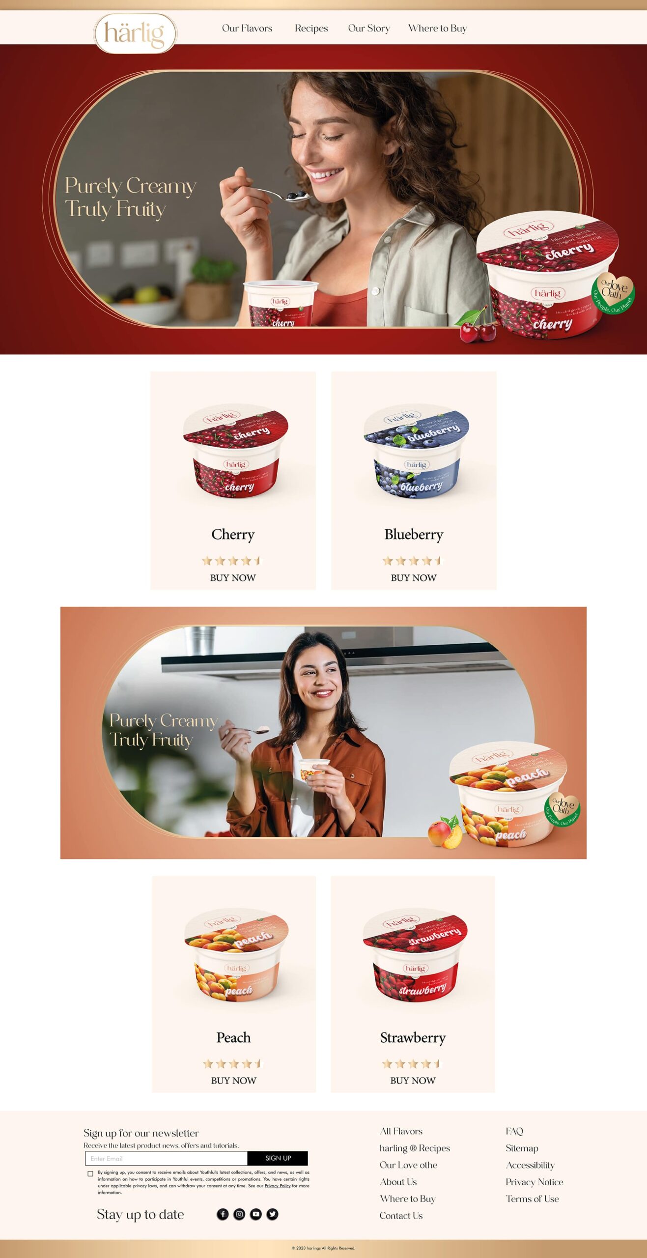
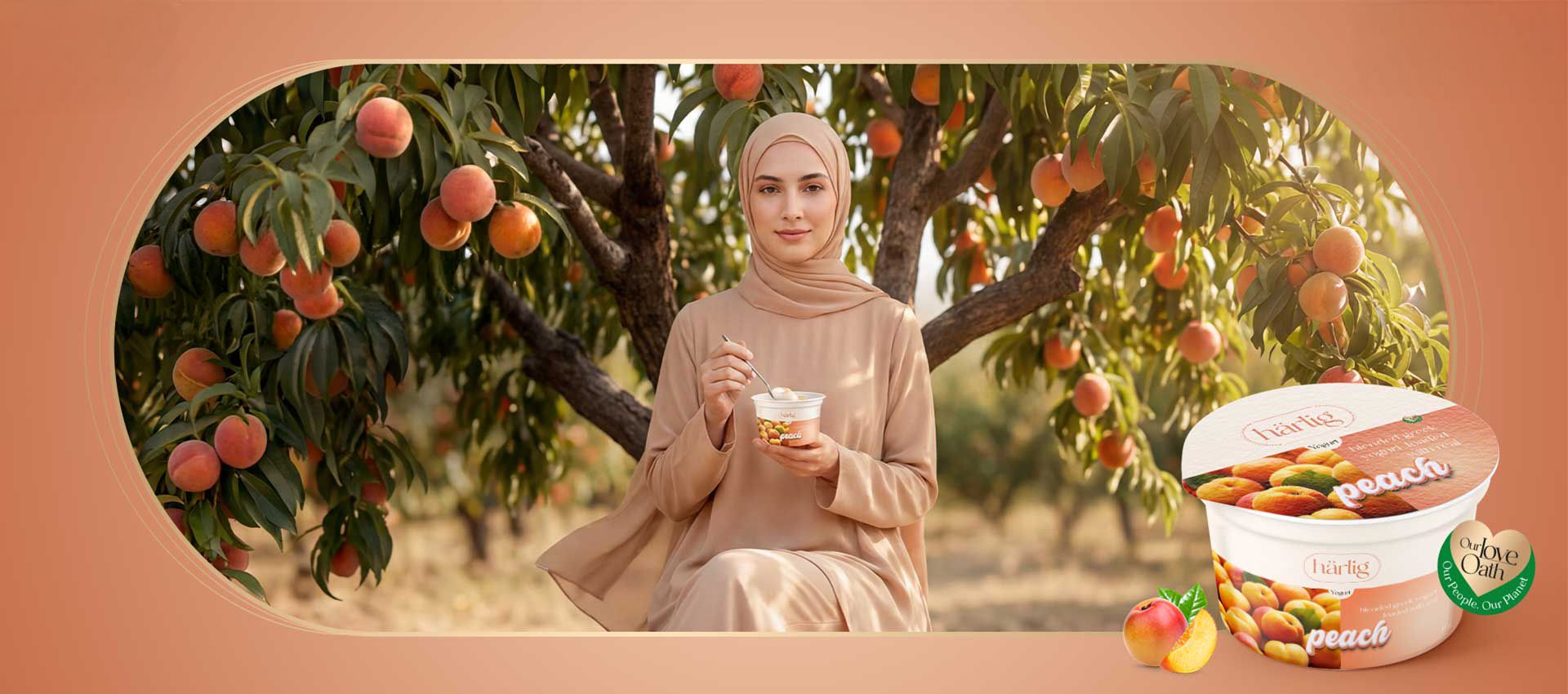
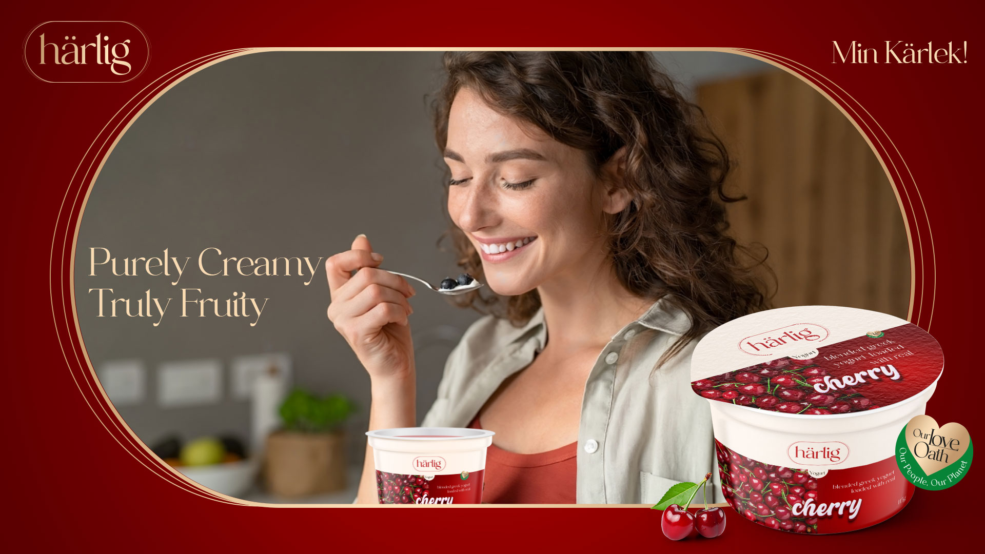
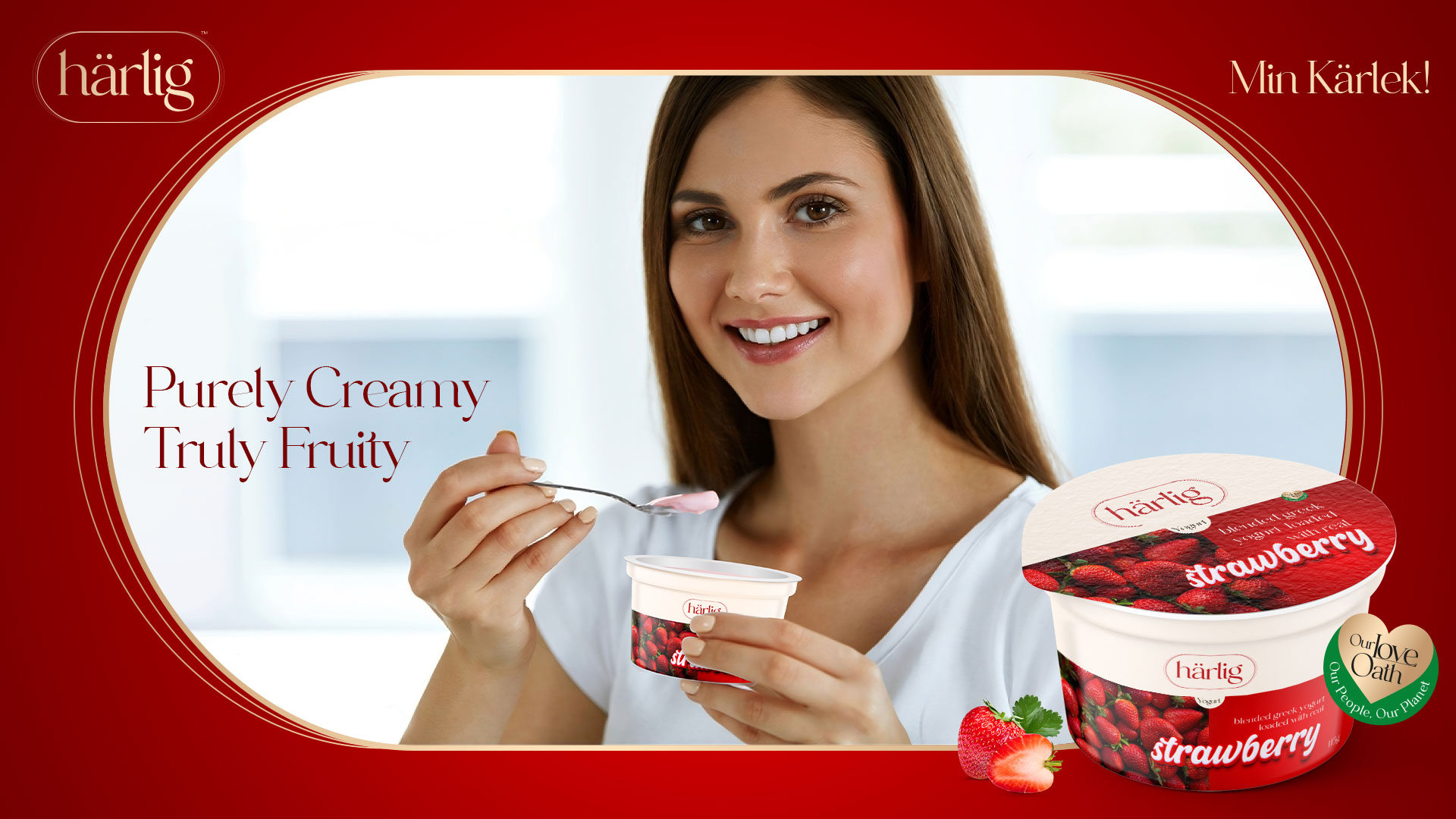
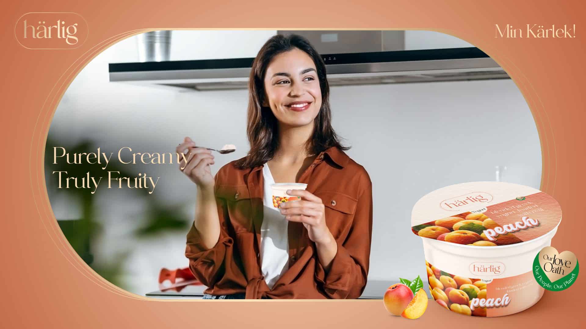
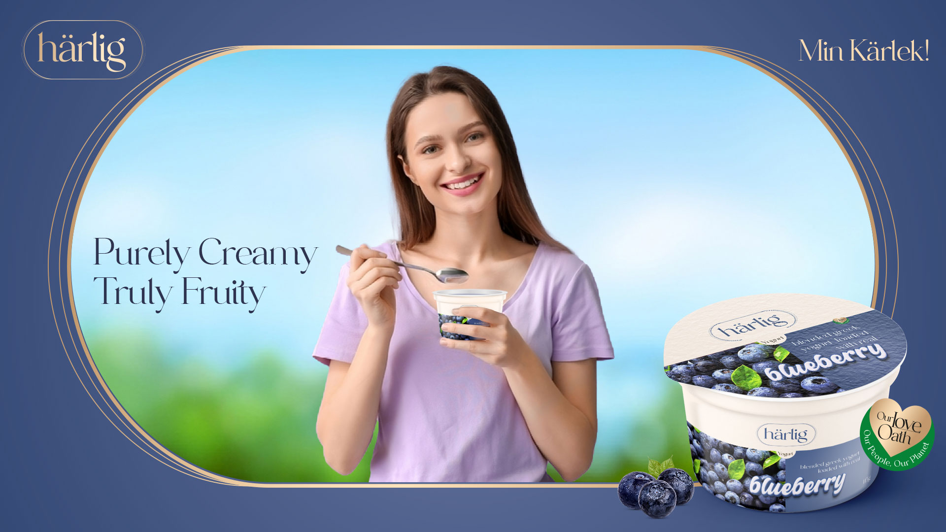
Härlig introduces its luxurious range of Greek yogurt, perfectly blended with luscious fruit chunks. This product is a harmonious marriage of creamy, rich Greek yogurt and the natural sweetness of fresh fruits. It’s not just yogurt; it’s an experience of pure indulgence, Härlig style.
Project Scope
Brand Strategy & Positioning
Brand Portfolio & Architecture
Brand Identity & Imagery
Brand Style Guidelines
Packaging & Label
Messaging & Tone-of-Voice
Brand Concepts & Communications
Brand Tagline
Website & E-commerce
Retail Branding & Merchandise
OOH – Signage & Billboard
Marketing Collateral
Brand Philosophy
Brand Naming
Brand Identity Development
Design Philosophy
Visual Storytelling Design Elements
Top White Panel Strip
- This refined strip runs gracefully across the top of the packaging.
- It serves as a pristine backdrop for the “Härlig” logo, radiating sophistication.
- The color of the “Härlig” logo dynamically changes to mirror the flavor’s color code, creating a harmonious visual connection.
- The clean, uncluttered space is a nod to Härlig’s minimalist design philosophy.
Flavor Color Representation
- The bottom section of the packaging is thoughtfully bifurcated.
- One half showcases a solid color, indicative of the yogurt’s flavor, ensuring intuitive flavor recognition.
- The other half visually displays the luscious fresh fruits, such as bunches of strawberries, peaches, blueberries, cherries, etc., emphasizing the product’s freshness and authenticity.
Stylized Font
- The flavor descriptor is elegantly presented in a contemporary lowercase font.
- Positioned centrally on the packaging, this typography is accentuated in a pristine white color with a bold outline matching the flavor’s color. This design choice not only enhances visibility but also aligns with Härlig’s modern brand image.
Product Descriptor
- The phrases “Blended Greek Yogurt” and “Loaded With Real” are strategically placed atop each flavor name on the solid color block.
- This bold placement, combined with the visual of the fresh fruits, serves as a clear and enticing indicator of the genuine fruit content within.
This packaging concept encapsulates Härlig’s commitment to purity, luxury and authenticity, promising consumers an experience that’s as delightful visually as it is in taste.
Brand Sustainability Approach: Harlig's Love Oath
“At Härlig, our love for the planet is as deep as our passion for yogurt. We are committed to sustainable practices, ensuring that every spoonful delights the senses and respects our environment.
Pure Loved Base: Dive into the pristine foundation of Grade A milk and cream that sets Härlig yogurt apart as a testament to love and quality.
Nature’s Love Palette: Our commitment to nature is unwavering. We source the finest fruits, ensuring that our Greek yogurt’s real taste and nutritional values are preserved. This dedication to authenticity guarantees a genuine burst of nature in every spoonful.
Sustainability Love Symphony: Our dedication extends beyond just sourcing the best ingredients. In collaboration with farmers, we provide modern agricultural techniques, ensuring the cultivation of the highest quality berries and fruits. This partnership guarantees fresh produce and fortifies our bond with the community. Every flavor of Härlig yogurt tells a story of joint effort, love and a commitment to Mother Earth and our community.”
Brand Essence
Brand Imagery
Brand Tagline
Web Design & E-commerce
Brand Communications
PRODUCTS
KEY VISUALS


OUTDOOR
WEBSITE