
Marketing Campaign
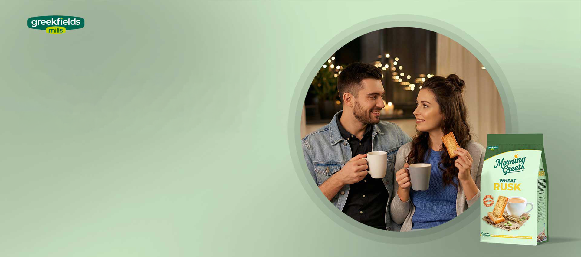
Morning Greets Rusk Bread
The third generation of Greek Fields Mills, a trusted name in food commodity trading, sought to transform their business by creating a brand that would bring their quality to consumers directly. Without a marketing background, they turned to Knight Owls to help realize this vision. Owl Studio guided Greek Fields in defining a brand purpose that would resonate with today’s health-conscious consumers, developing a strategy cantered on “nurturing mornings with nature’s goodness.” Together, we gave birth to Morning Greets—a brand name and identity that welcome each day with wholesome, natural ingredients.
From creating a holistic marketing and communication strategy to shaping product categories and launch plans, Owl Studio worked closely with Greek Fields Mills, crafting a brand narrative that balances tradition with the innovation needed in today’s market. Launching first with breakfast offerings like cereals, breads and rusks, Morning Greets embodies a commitment to quality, sustainability and the power of a great start to each day.
Project Scope
Brand Strategy & Positioning
Brand Portfolio & Architecture
Brand Identity & Imagery
Brand Style Guidelines
Packaging & Label
Messaging & Tone-of-Voice
Brand Concepts & Communications
Brand Tagline
Website & E-commerce
Retail Branding & Merchandise
OOH – Signage & Billboard
Marketing Collateral

Brand Philosophy
Naming the Brand
Brand Logo & Identity
- White & Blue Logo The logo, set in a white and blue finish, exudes freshness and natural goodness. It prominently features the rising sun, capturing the brand’s essence.
- Logo Layout The word “Morning” is placed at the top with a sunrise sketch, settled in a curve above the big curvy “Greets” lettering.
- Unique Font Styling The font used for “Morning Greets” is elegant yet approachable, designed to convey trust and warmth.
- Bold Curve Lettering for Logo Specially crafted bold curve lettering forming the logo insignia, with white fonts encapsulated by thick blue color outlining, representing the dawn of a new day.
- Rising Sun in Yellow Lines A rising sun depicted in yellow lines with blue color around, symbolizing an early morning feeling and a fresh start.
Brand Essence
Brand Usage Guide
Packaging Concept
Design Philosophy
Brand Imagery
Visual Storytelling Design Elements
- Wheat Field and Light Blue Sky: Depicting a serene morning scene with a vast wheat field and a light blue sky to convey freshness and natural origin.
- Bowl at the Bottom with Berries and Milk Splash: Featuring a bowl of berries, milk splash and cereal biscuits at the bottom to highlight the product.
- Yellow Curve Top Border Panel: A distinctive yellow curve top border panel, slit by a green outline, emphasizing the natural and healthy aspect.
- Wheat Motif Background: Incorporating a subtle wheat motif in the background to reinforce the connection to wholesome, natural ingredients.
LOGO / STATIONARY

BREAD
PACKAGING
KEY VISUALS


OUTDOOR
RUSK
PACKAGING

KEY VISUALS


OUTDOOR
WEBSITE