Marketing Campaign
She Lipstick
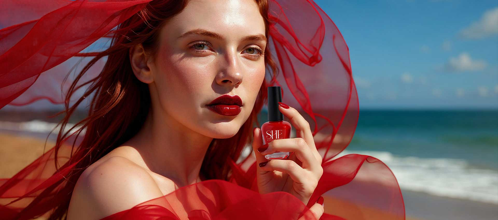
For SHE Essentials, OWL Studio developed a visually evocative thematic campaign celebrating the power of red, bold, expressive, and, unapologetically confident.
The campaign focuses on Lipstick and Nail Polish, translating the brand’s essence into a striking visual narrative where beauty and nature coexist in perfect balance.
Project Scope
Brand Strategy & Positioning
Brand Portfolio & Architecture
Brand Identity & Imagery
Brand Style Guidelines
Packaging & Label
Messaging & Tone-of-Voice
Brand Concepts & Communications
Brand Tagline
Website & E-commerce
Retail Branding & Merchandise
OOH – Signage & Billboard
Marketing Collateral
Concept and Theme
Red is portrayed not merely as a color, but as an emotion, confident, fearless and, timeless.
The campaign explores how bold beauty can exist in harmony with nature, allowing red to emerge as a powerful expression of individuality and strength.
Creative Direction
Each visual was carefully composed to elevate the products beyond cosmetics, transforming them into symbols of self-expression and confidence.
Location and Ambience
The serenity of nature amplifies the vibrancy of red, allowing it to stand out with clarity and strength. Light, space and movement contribute to a sense of freedom, reinforcing the emotional depth of the campaign.
Visual Language
- Cinematic natural light aesthetics
- Strong contrast between red tones and, coastal hues
- Minimal yet expressive beauty styling
- Fluid movement inspired by wind and, fabric
- Seamless product integration featuring Lipstick and Nail Polish
Deliverables
- Brand Film and TV Commercial
- Campaign Key Visuals
- Outdoor and Billboard Adaptations
- Digital and Social Media Assets
All visuals were developed as part of a unified campaign system, ensuring consistency across every platform.
Brand Message
The brand message celebrates red as a symbol of confidence and expression, encouraging bold beauty that exists in harmony with nature and emotion.
Closing Note
KEY VISUALS