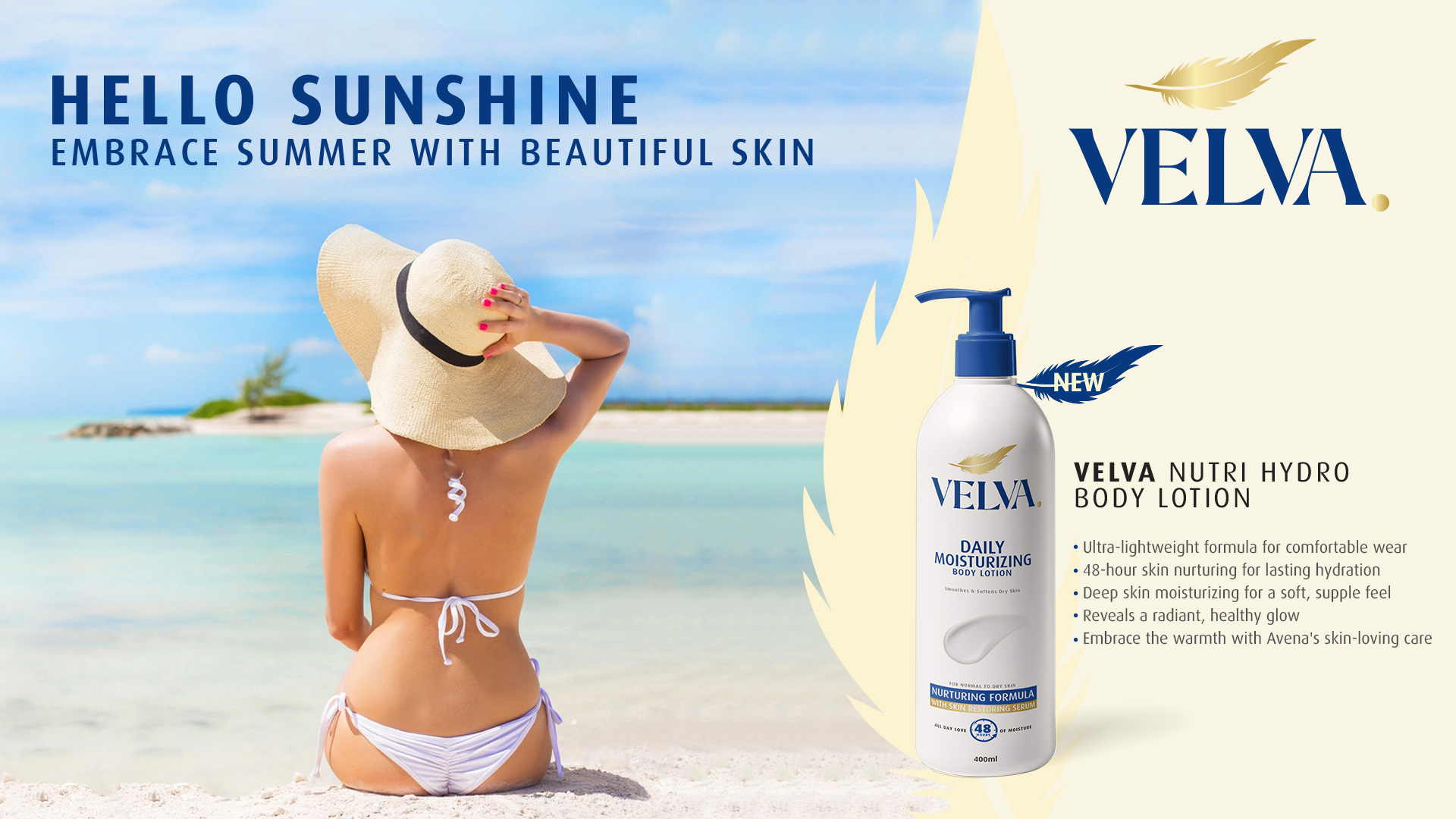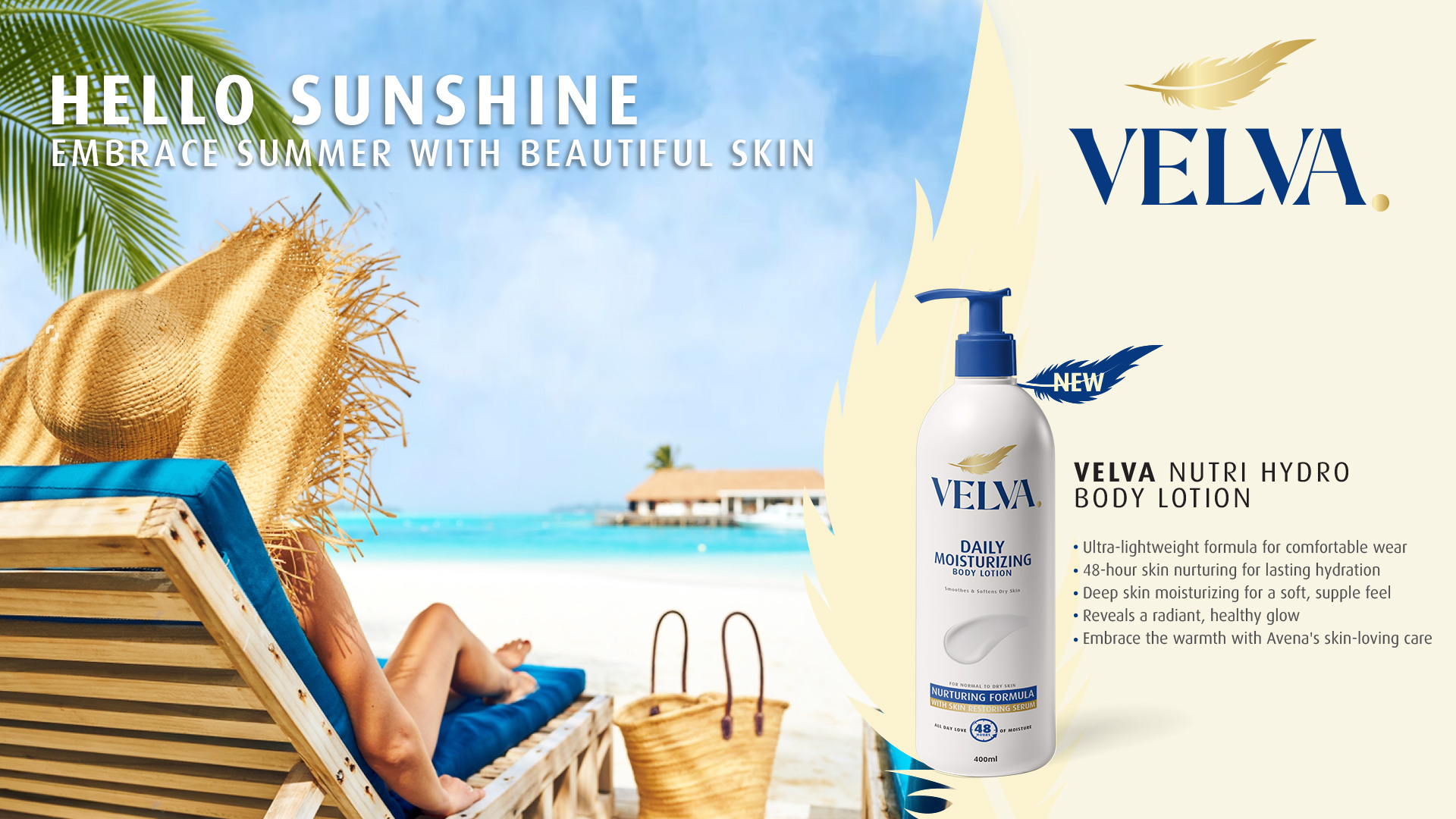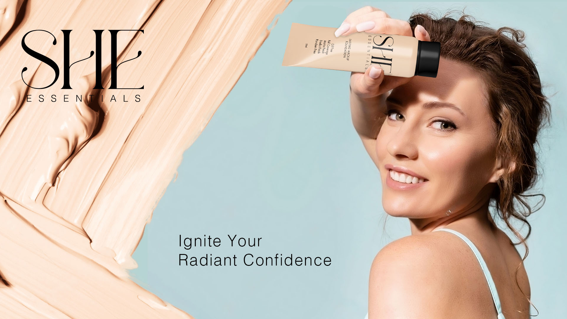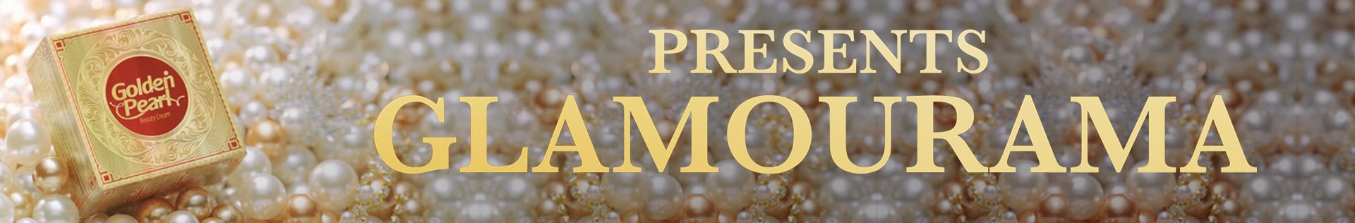

Marketing Campaign
Swedish Nutra
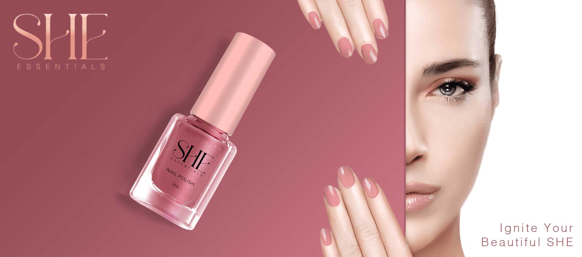
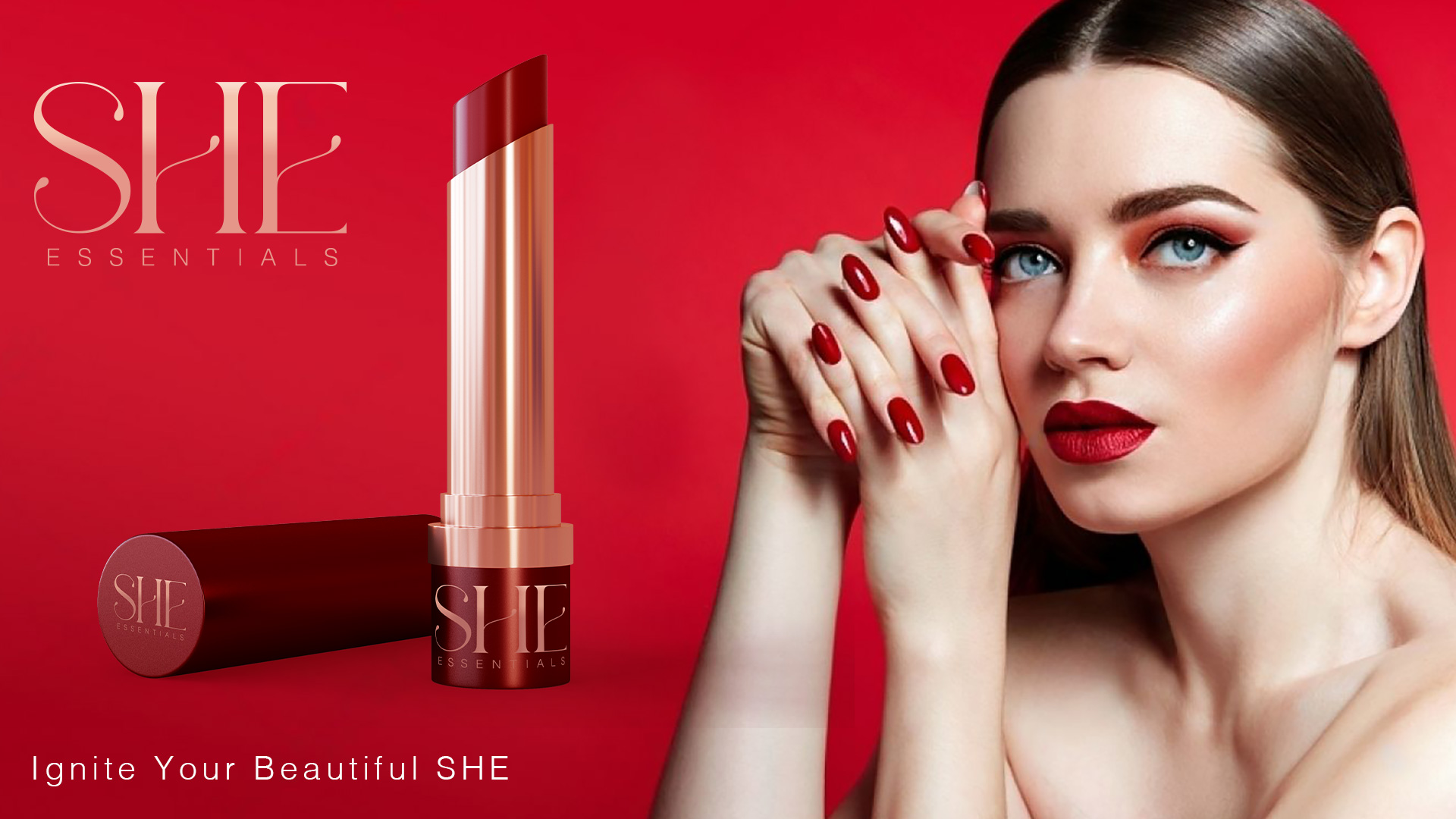
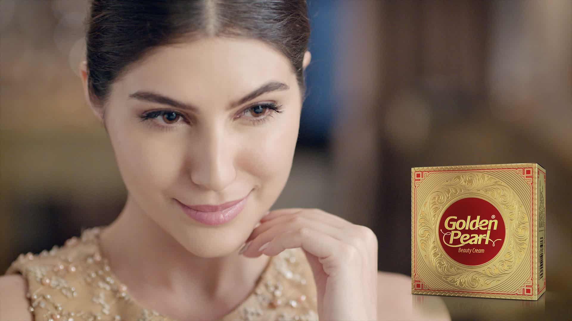
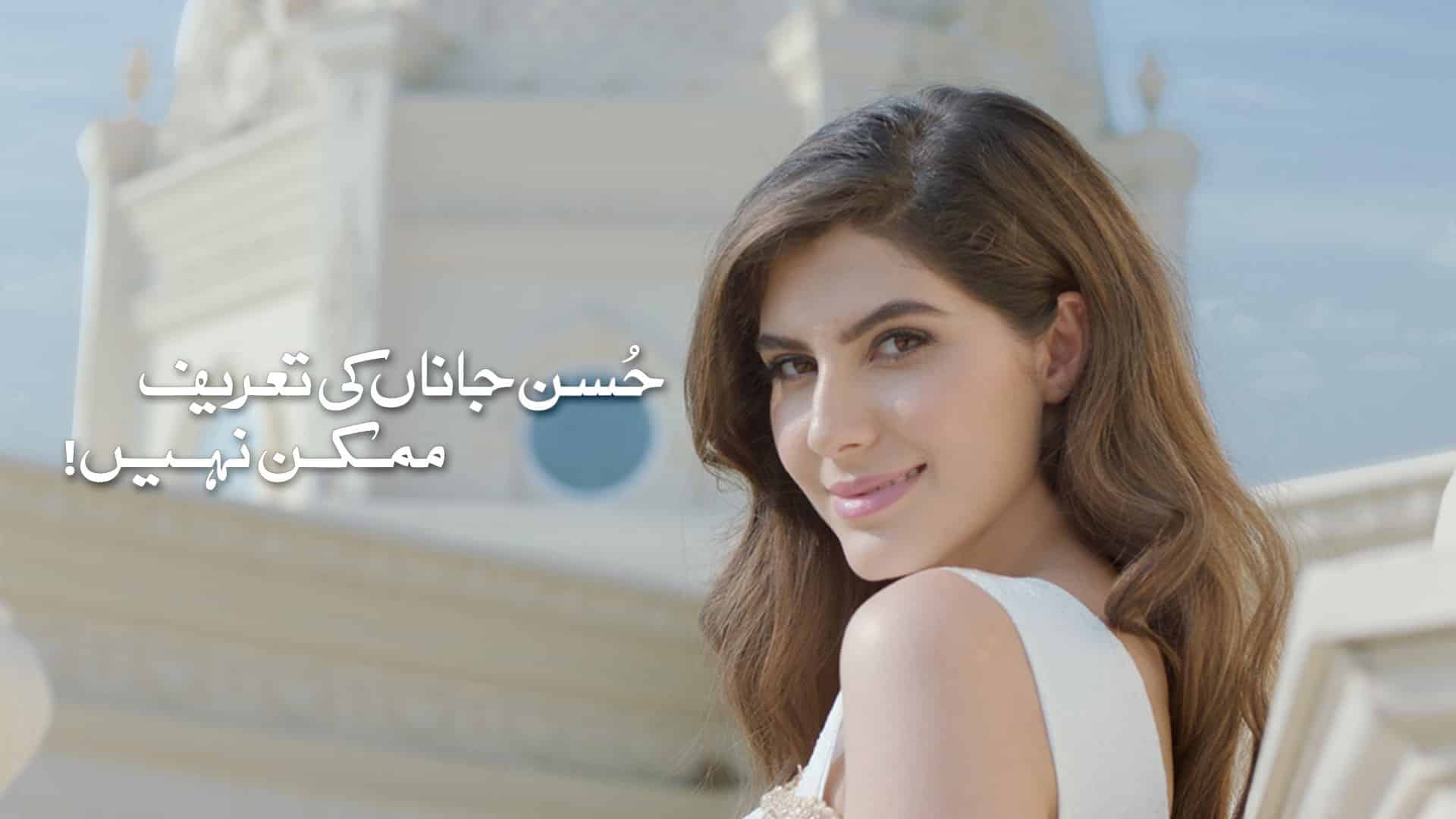
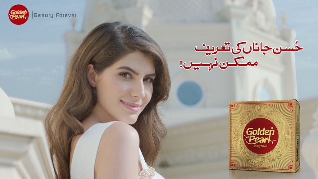
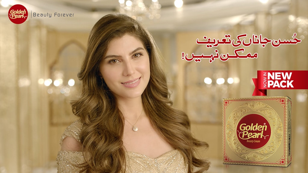
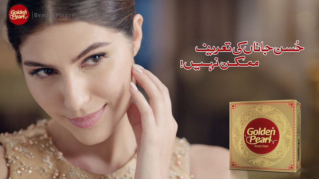
Swedish Nutra brings together advanced European science and nature-powered ingredients to redefine modern beauty from within. Designed for women who demand visible results without compromise, Swedish Nutra transforms daily self-care into a luxurious beauty ritual.
Rooted in Swedish innovation, our formulations blend cutting-edge skincare science with clinically proven actives, delivering nourishment at a cellular level. From age-defying renewal to effortless glow, every product is crafted to support skin that looks smoother, firmer and visibly radiant — at every stage of life.
Swedish Nutra is more than beauty. It’s confidence, clarity and care — bottled with precision.
Project Scope
Brand Strategy & Positioning
Brand Portfolio & Architecture
Brand Identity & Imagery
Brand Style Guidelines
Packaging & Label
Messaging & Tone-of-Voice
Brand Concepts & Communications
Brand Tagline
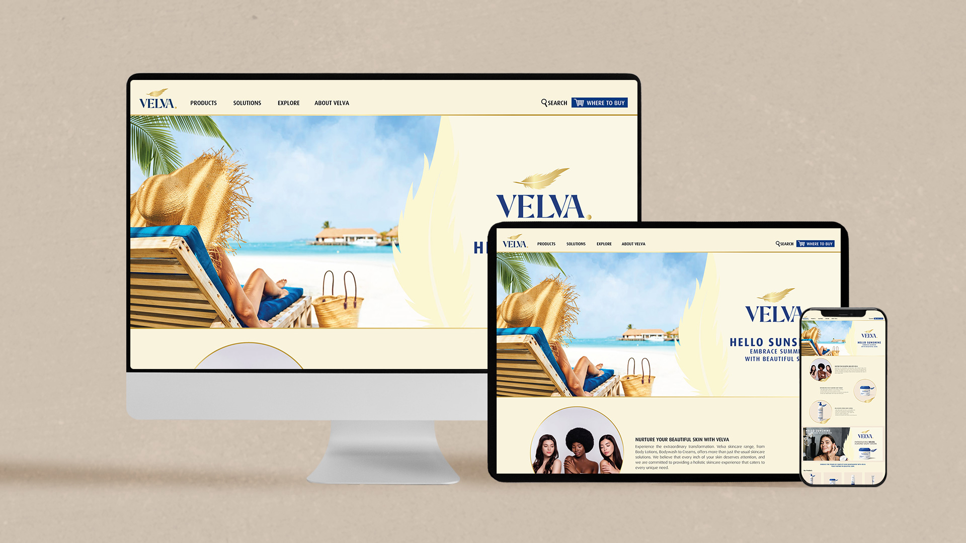
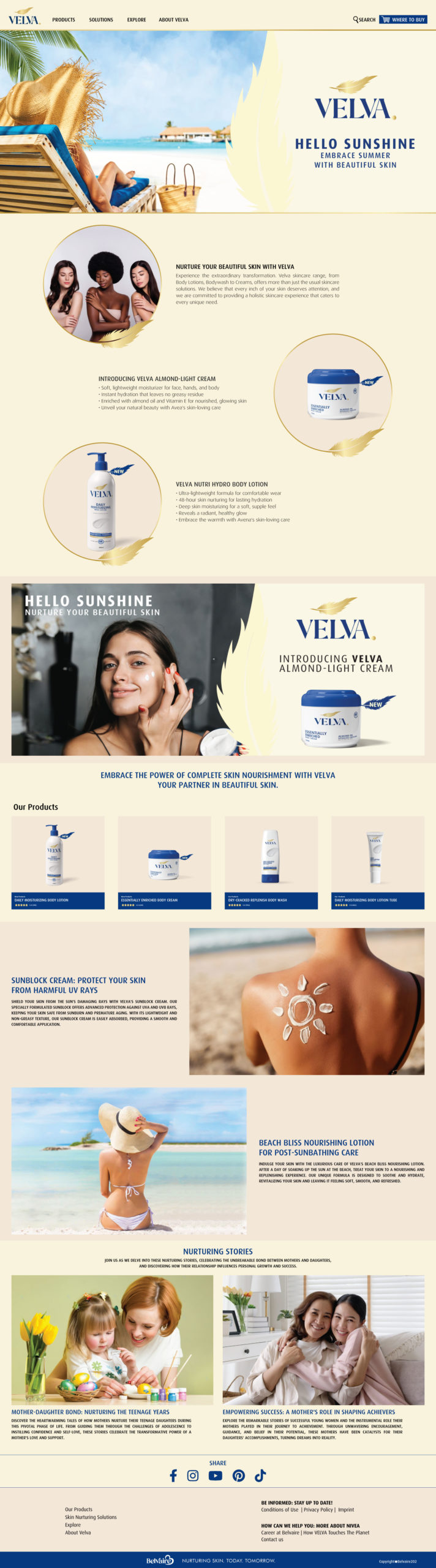
Website & E-commerce
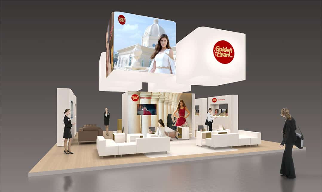
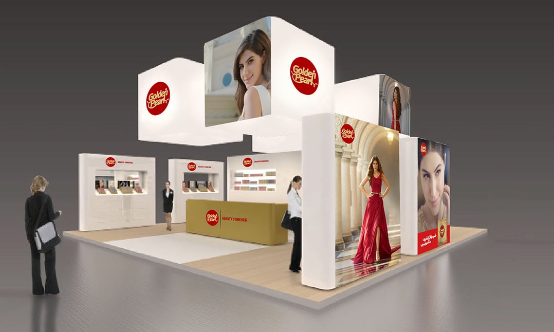
Retail Branding & Merchandise
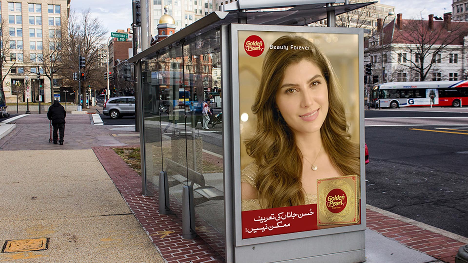
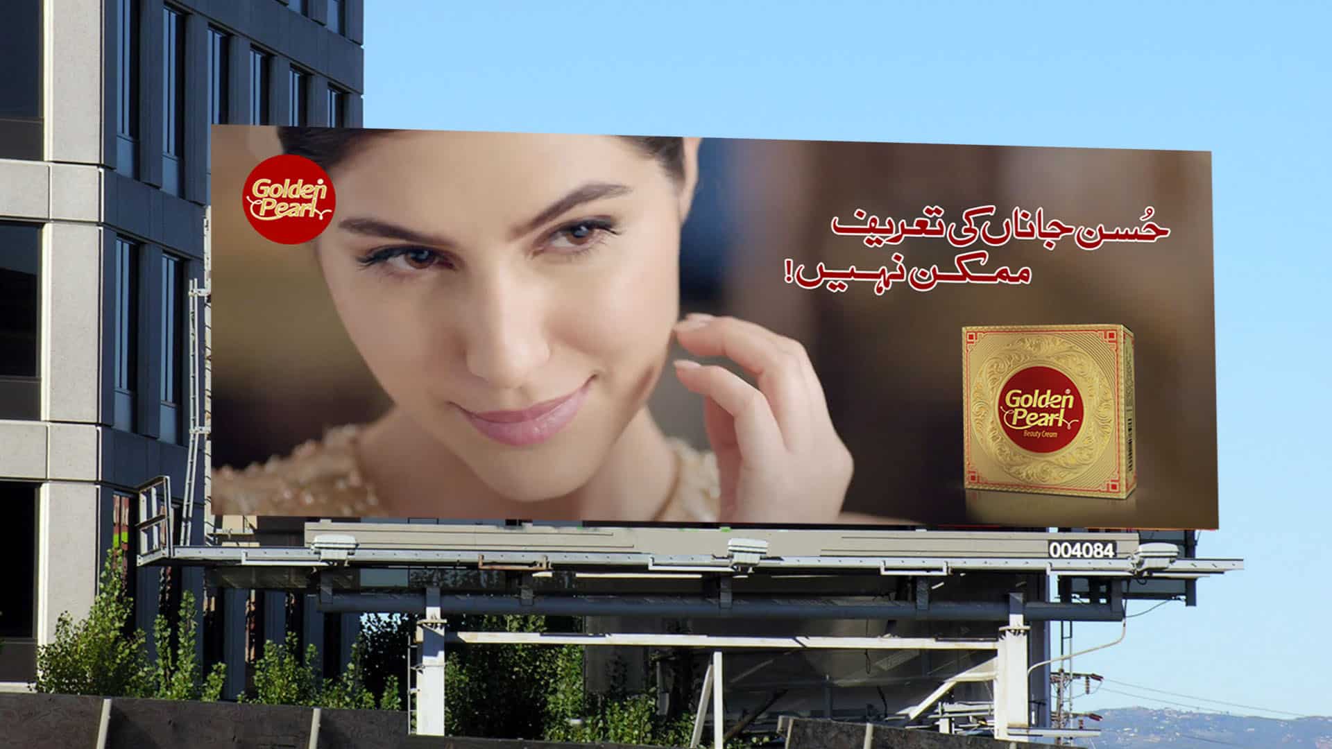
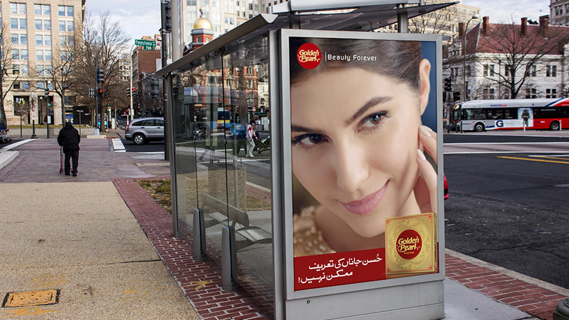
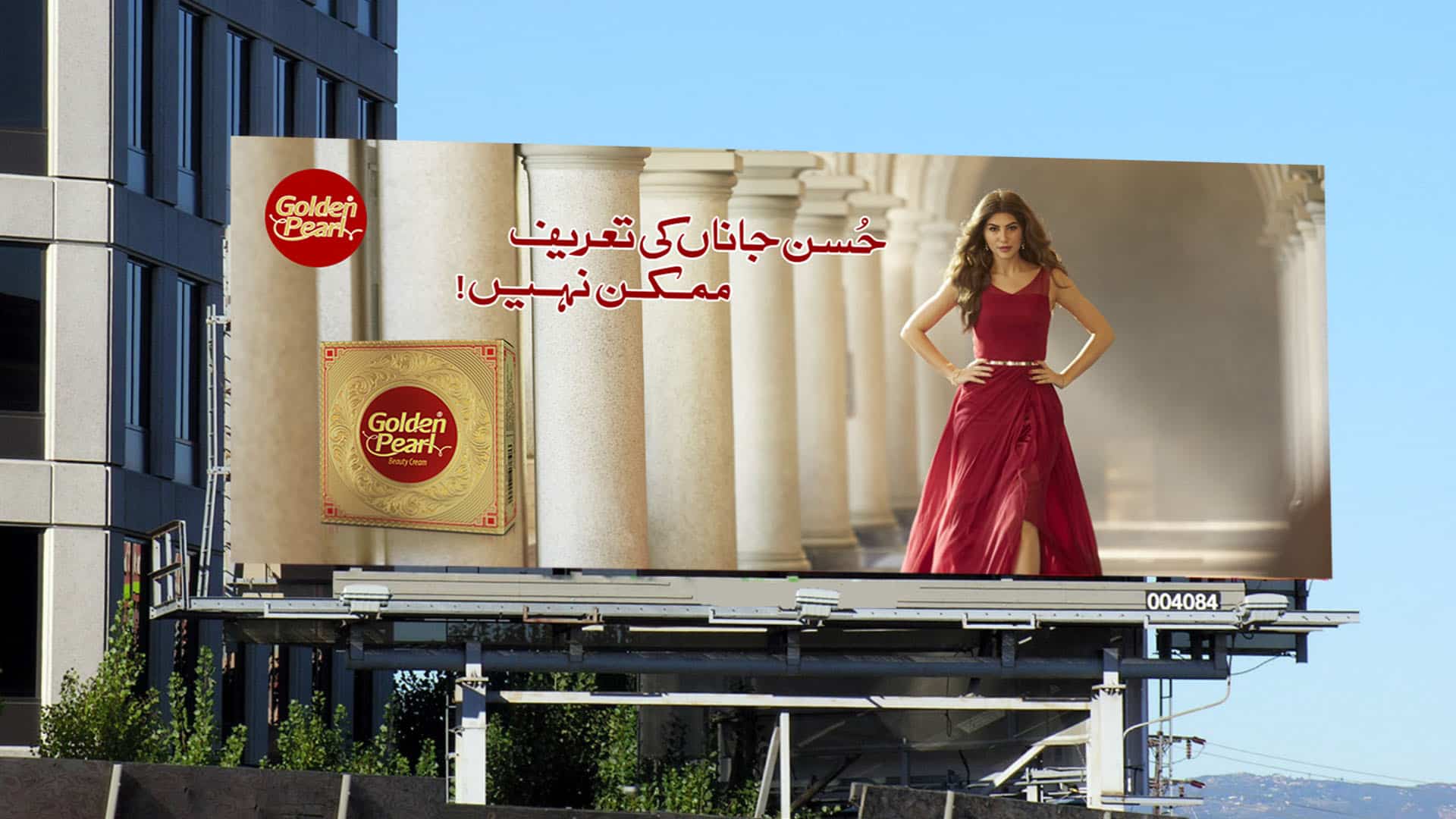
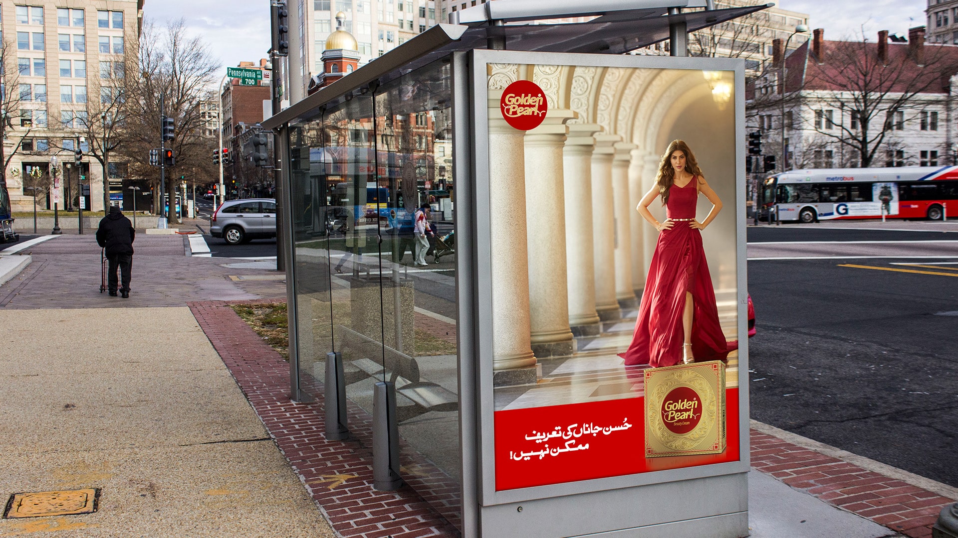
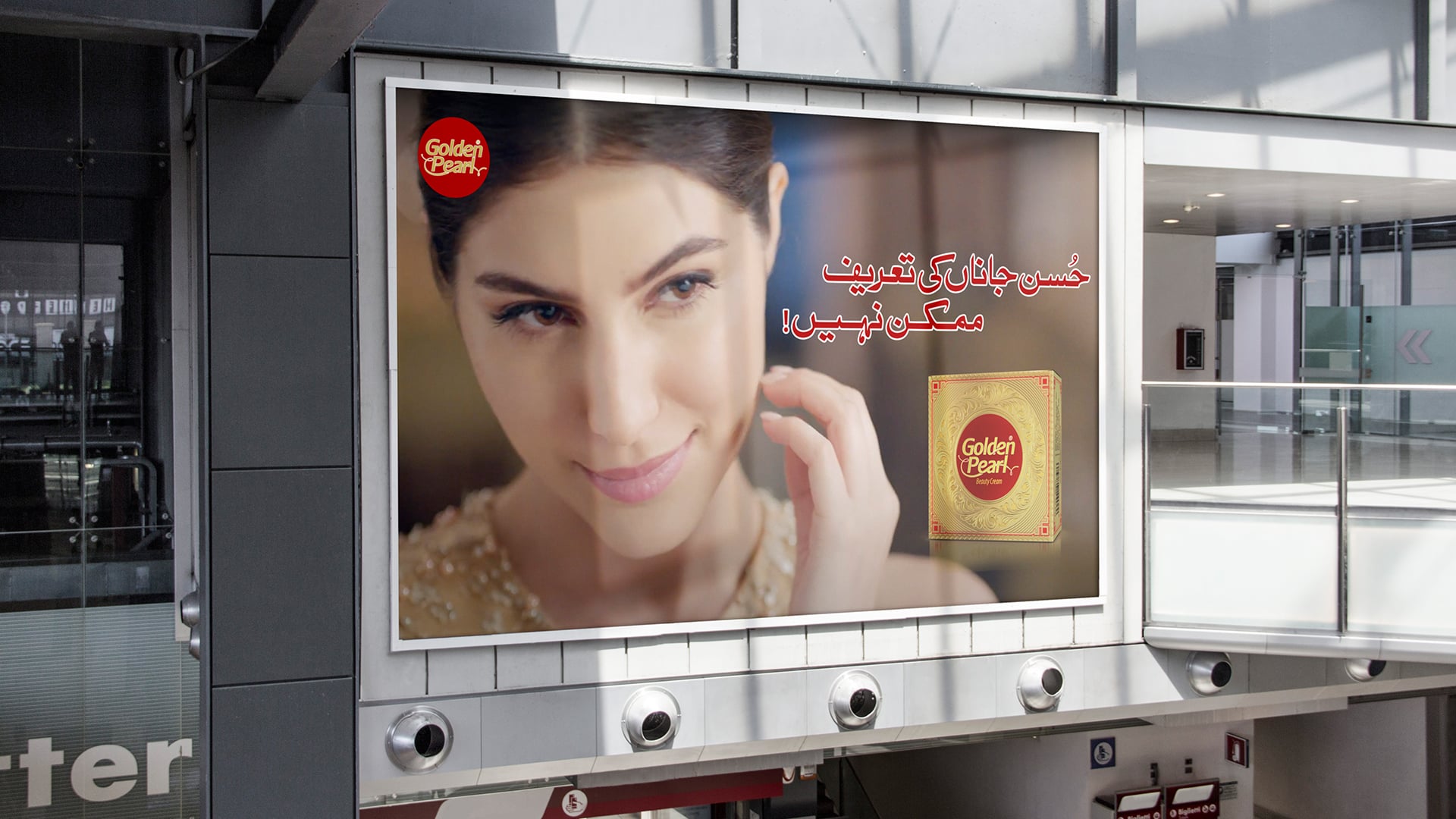
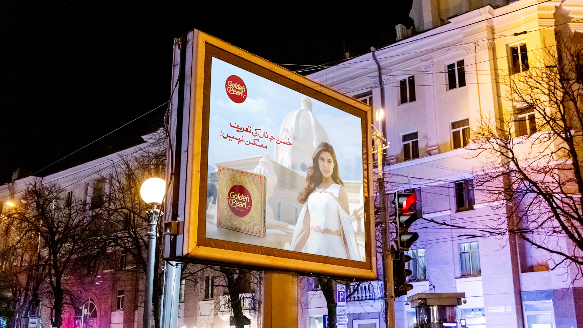
OOH – Signage & Billboard
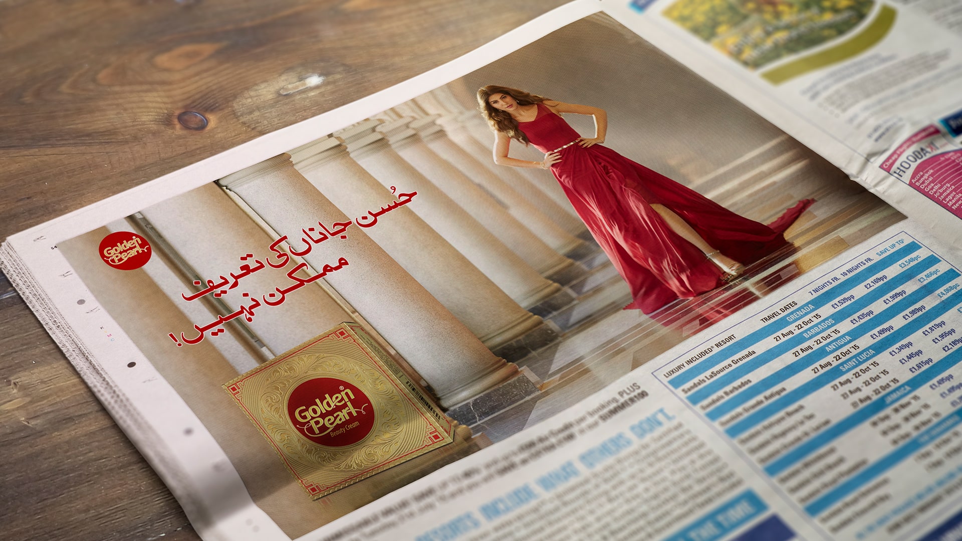
Marketing Collateral
Concept and Theme
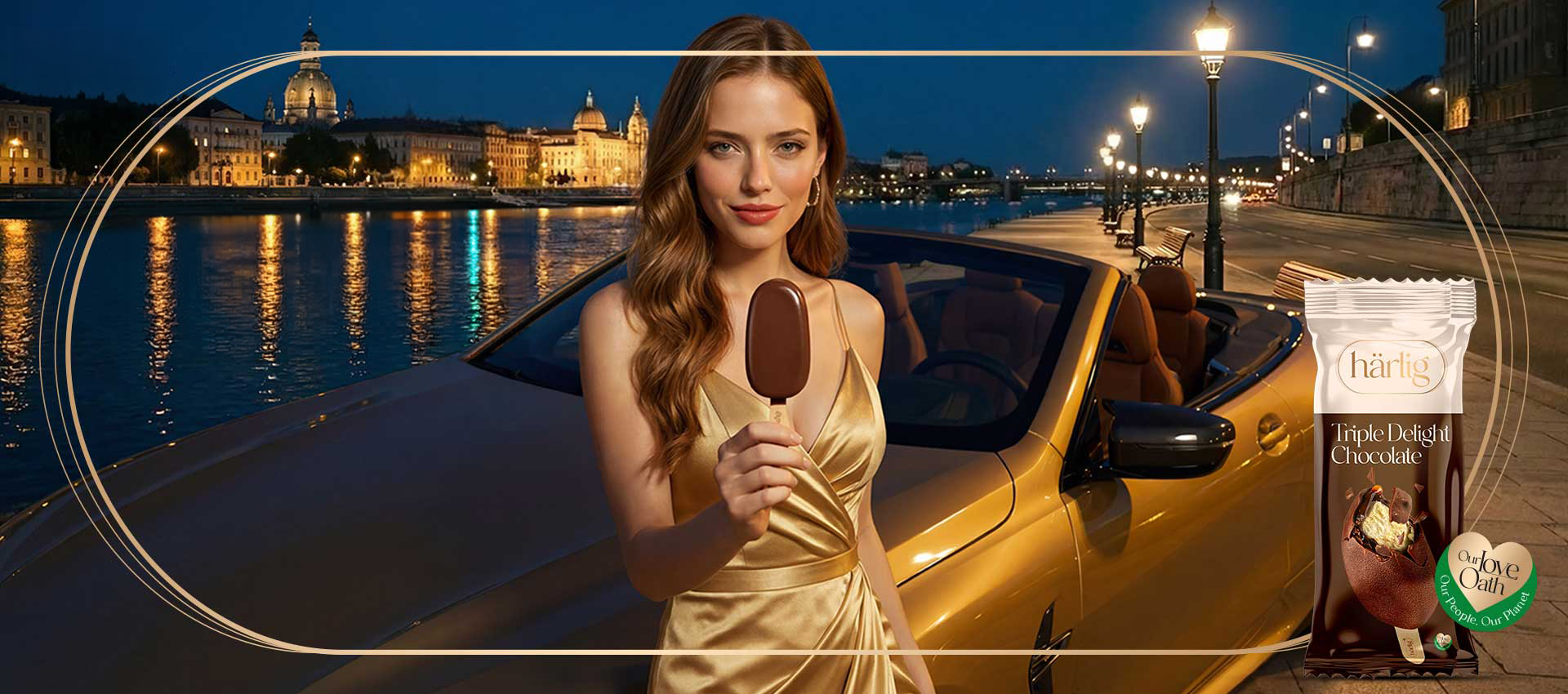
The concept explores self-love as the most powerful story one can tell.
It frames indulgence not as excess, but as a conscious celebration of achievement, identity and personal growth.
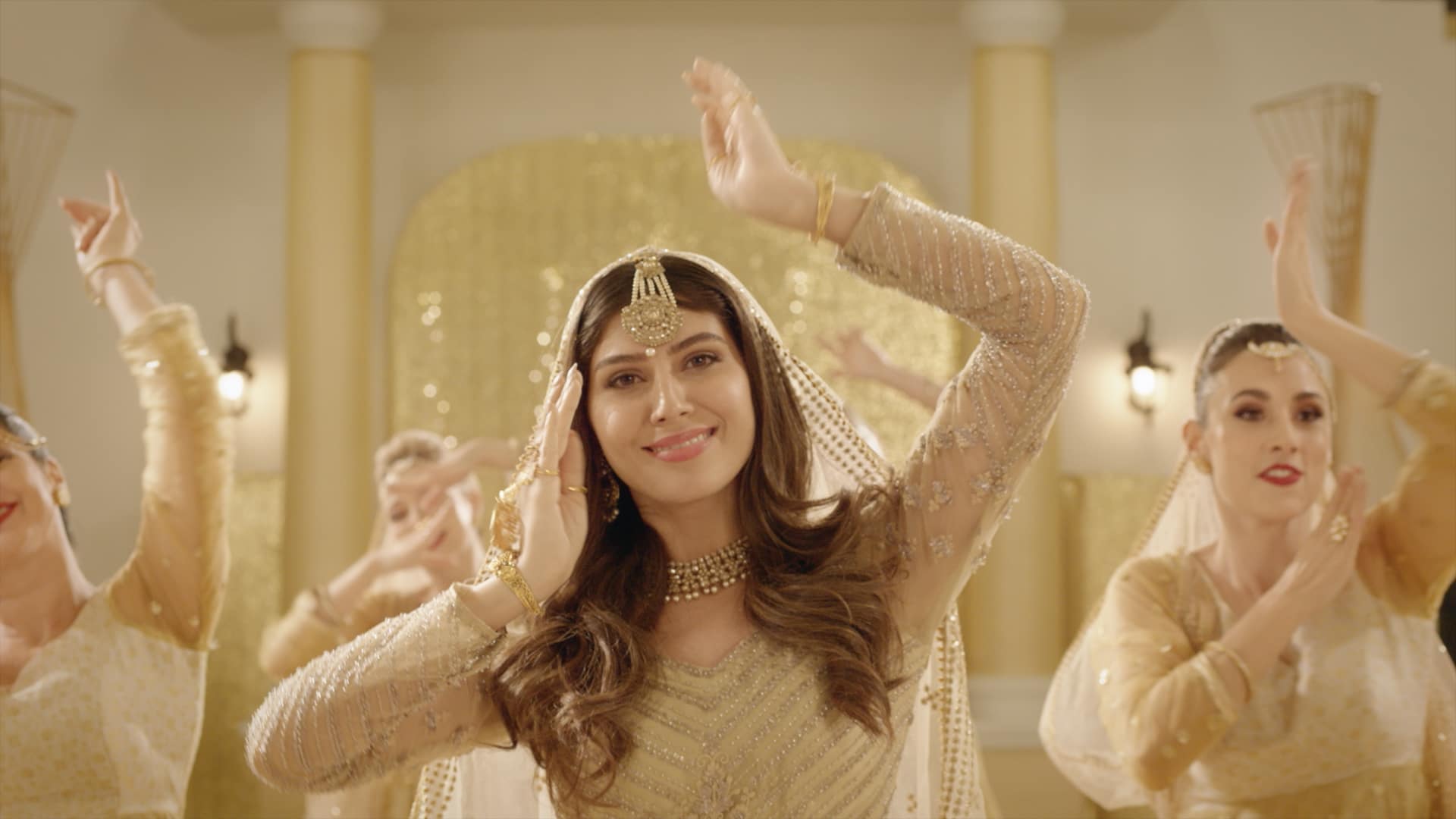
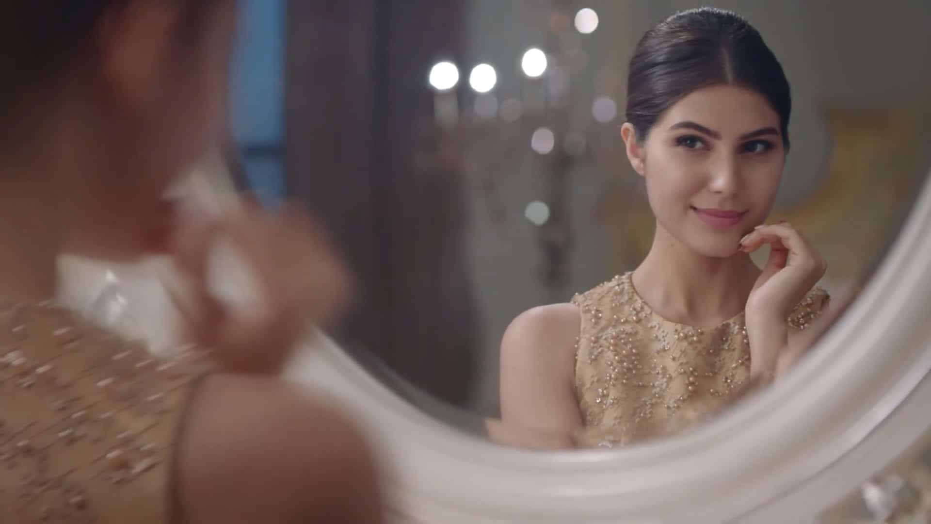
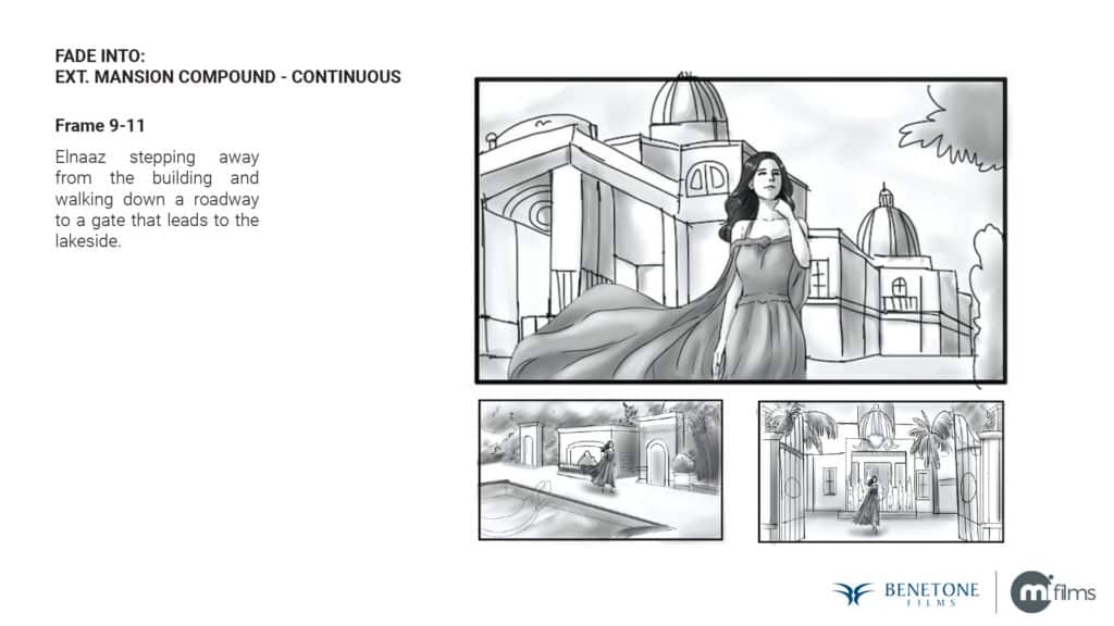
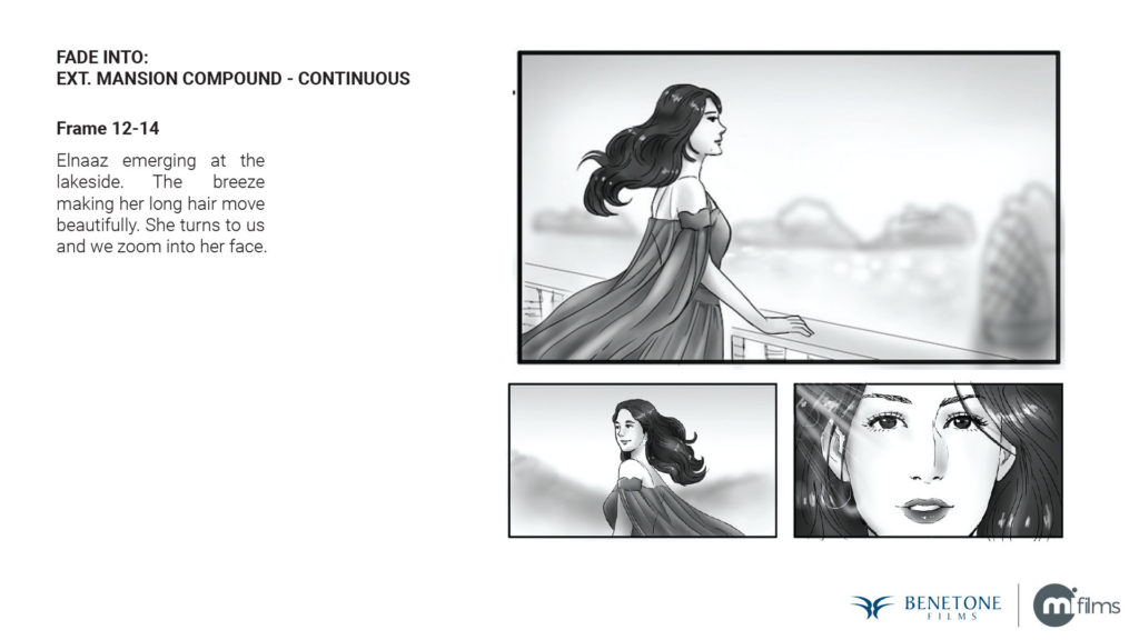
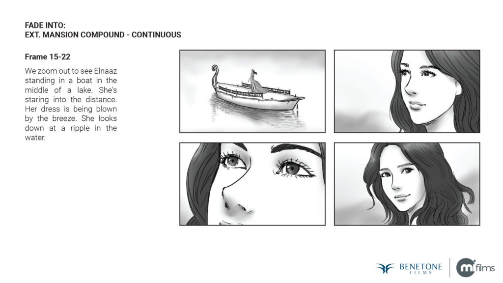
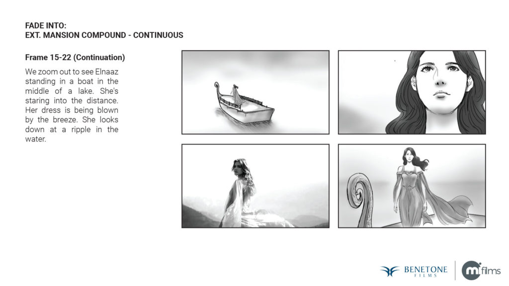
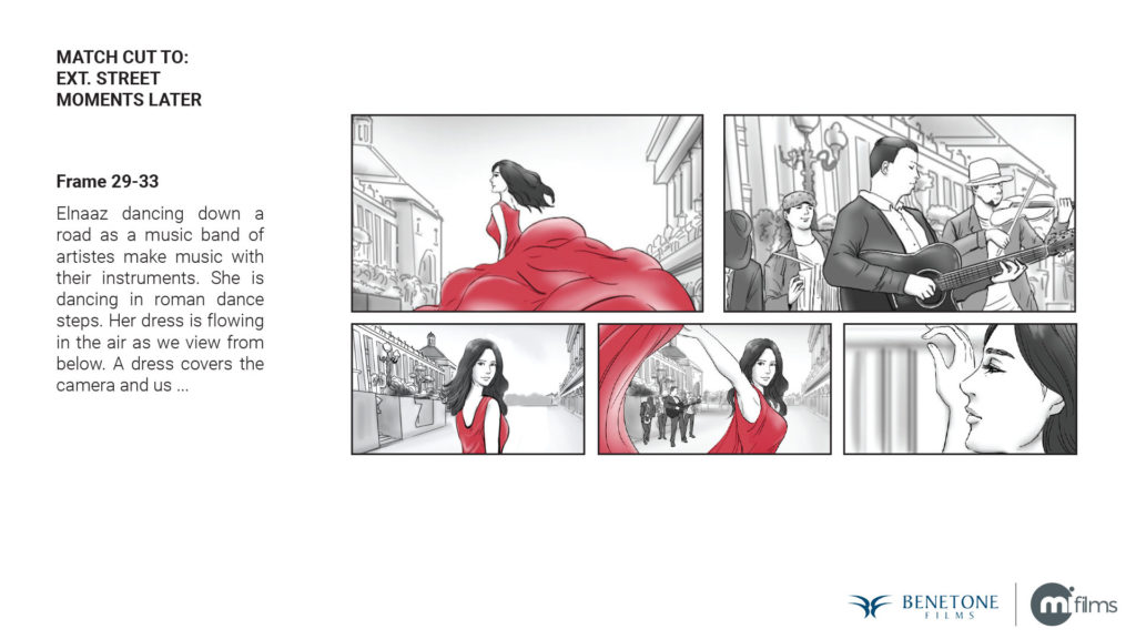
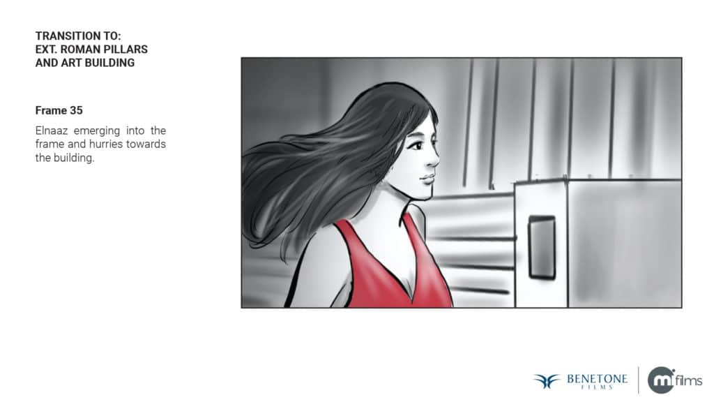
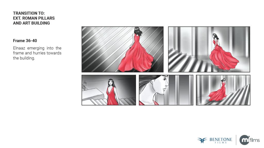
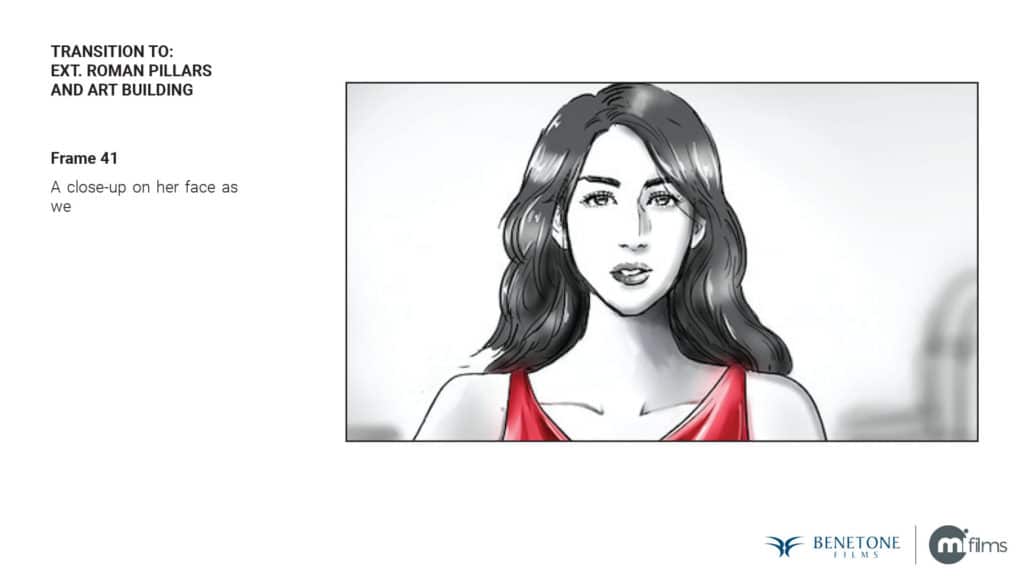
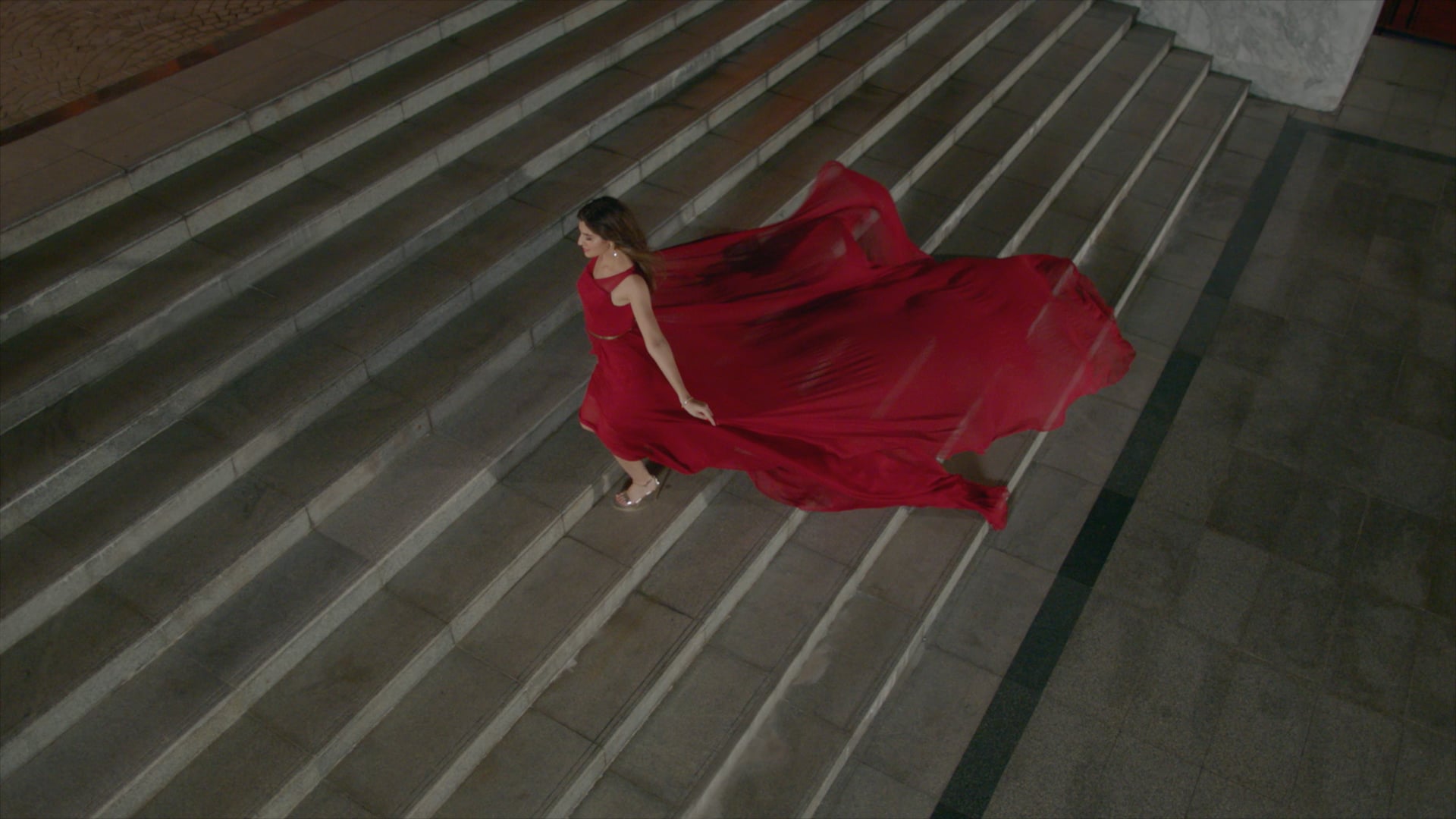
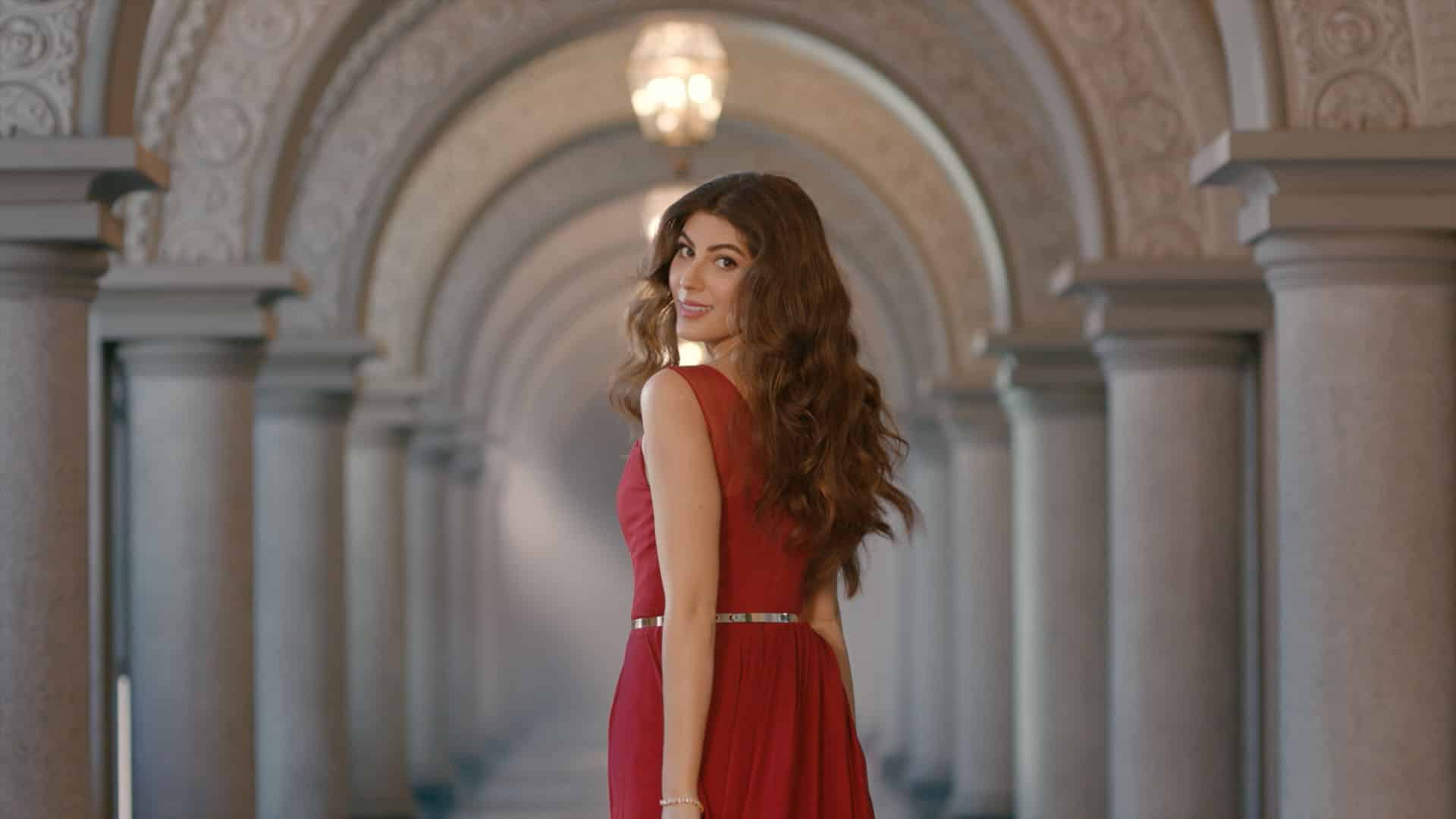
The narrative follows a film star in a quiet moment of triumph, choosing to pause, indulge and honour herself. Through this lens, Härlig becomes a symbol of a luxury break taken unapologetically, a golden moment owned entirely by the individual.
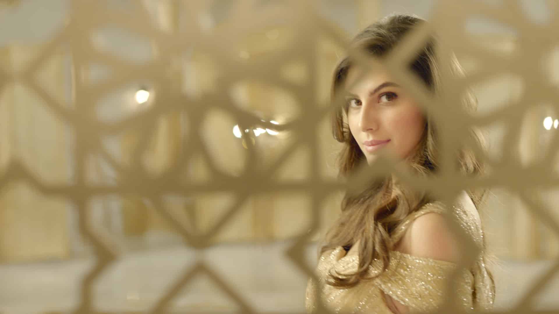
Creative Direction
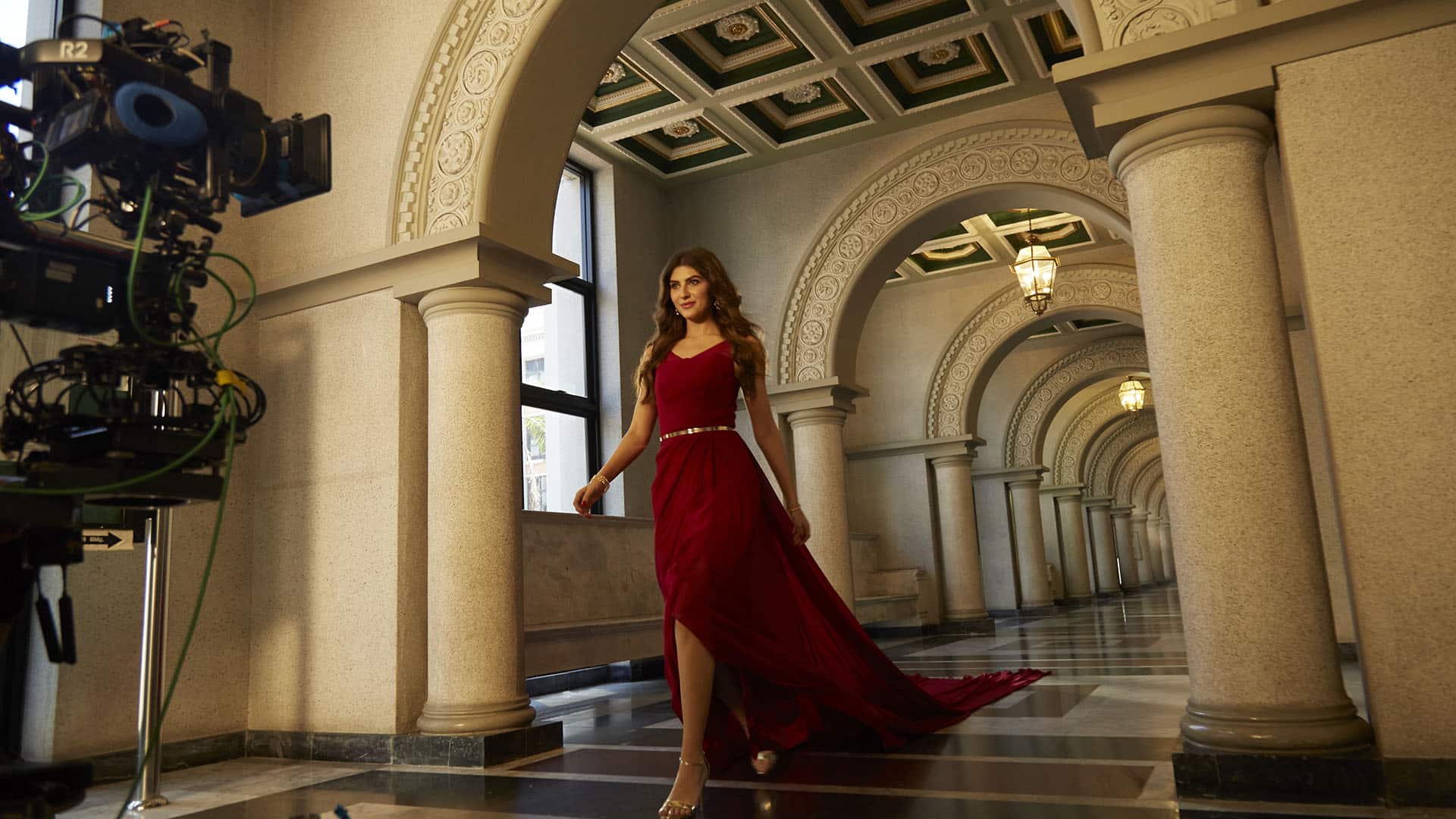
The storytelling moves fluidly between high-energy motion and intimate stillness, allowing moments of indulgence to feel intentional and deeply personal.
Sensory macro visuals elevate the product experience, with high-speed shots capturing the richness of chocolate coating over a vanilla core. Texture, gloss and movement are treated with precision, reinforcing indulgence through visual craftsmanship.
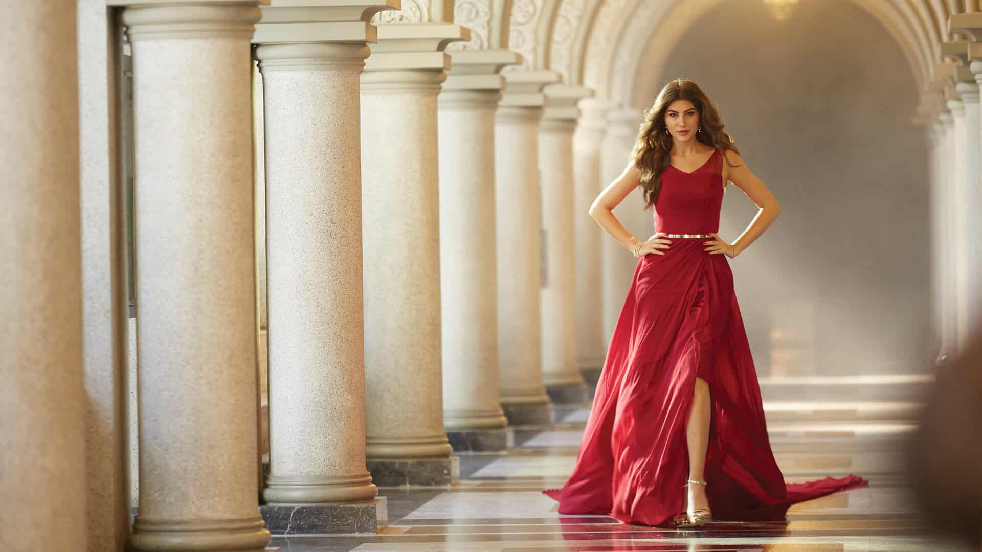
Location and Ambience
A convertible drive through the city establishes freedom and success, while quieter moments on a riverside bench ground the story in reflection and self-acknowledgment.
These environments create a balance between glamour and intimacy, reinforcing the idea that true luxury lies in moments chosen for oneself.
Visual Language
- Cinematic nighttime cityscapes with golden highlights
- High-speed macro visuals of chocolate and vanilla textures
- Luxury styling with controlled, elegant movement
- Intimate close-ups capturing emotion and presence
- Confident product framing within aspirational lifestyles
Deliverables
- Brand Film
- Campaign Key Visuals
- Outdoor and Billboard Adaptations
- Digital and Social Media Assets
All visuals were developed as part of a unified communication system, ensuring consistency across every platform.
Brand Message
The brand message expresses Härlig as a celebration of self-love and indulgence, where taking time for oneself becomes an act of confidence, evolution and personal reward.
Closing Note
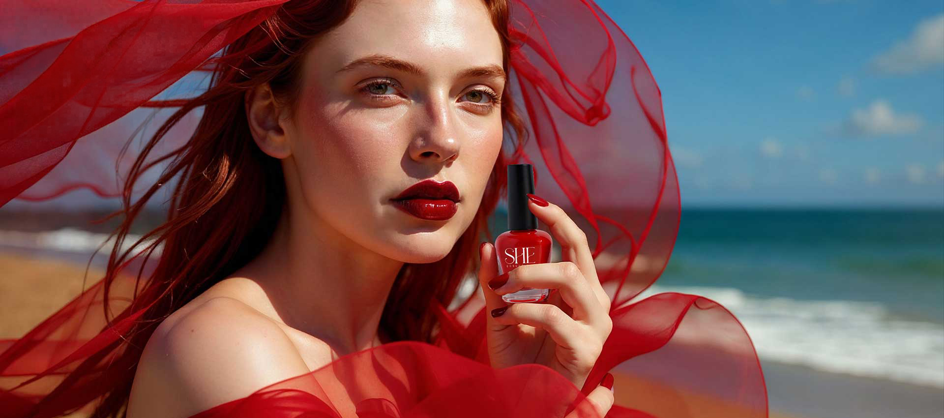
MARINE BEAUTY
SHOTS


KEY VISUALS


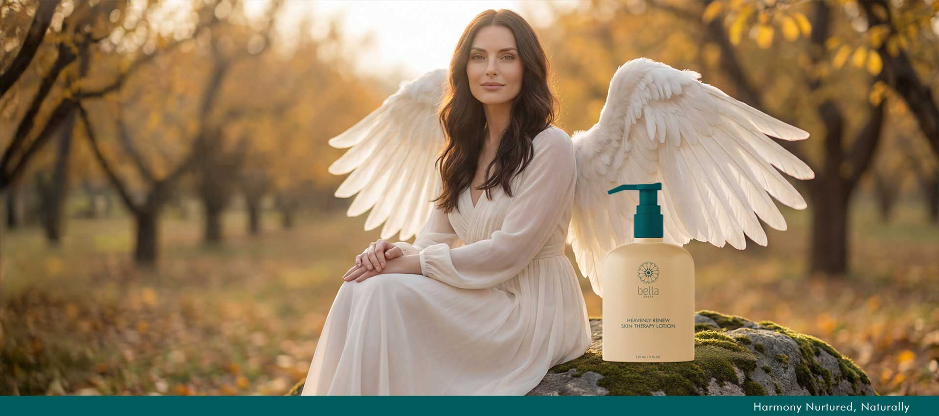
GOLD RETINOL
SHOTS


KEY VISUALS