360º INTEGRATED MARKETING CAMPAIGN

The Rebirth of Iconic Brand
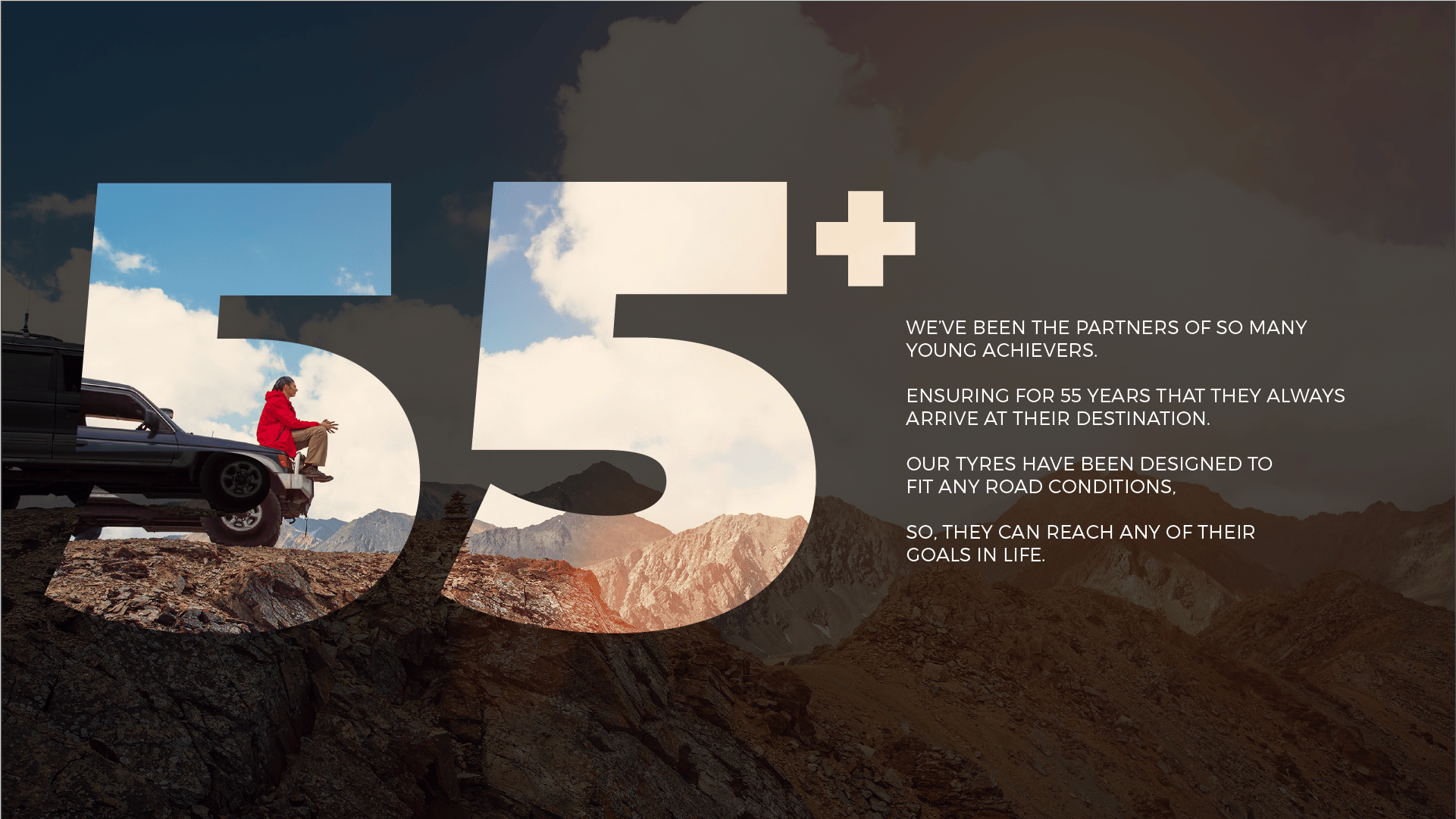
The Rebirth, Rebranding and Creative Transformation from Perception Re-Shaping to Transition of 55-year-old iconic global brand General Tyre into GTR, the No.1 Selling Tyre Brand.
A brand formerly owned by General Tyre & Rubber Company / Continental AG Germany.

Deliverables:
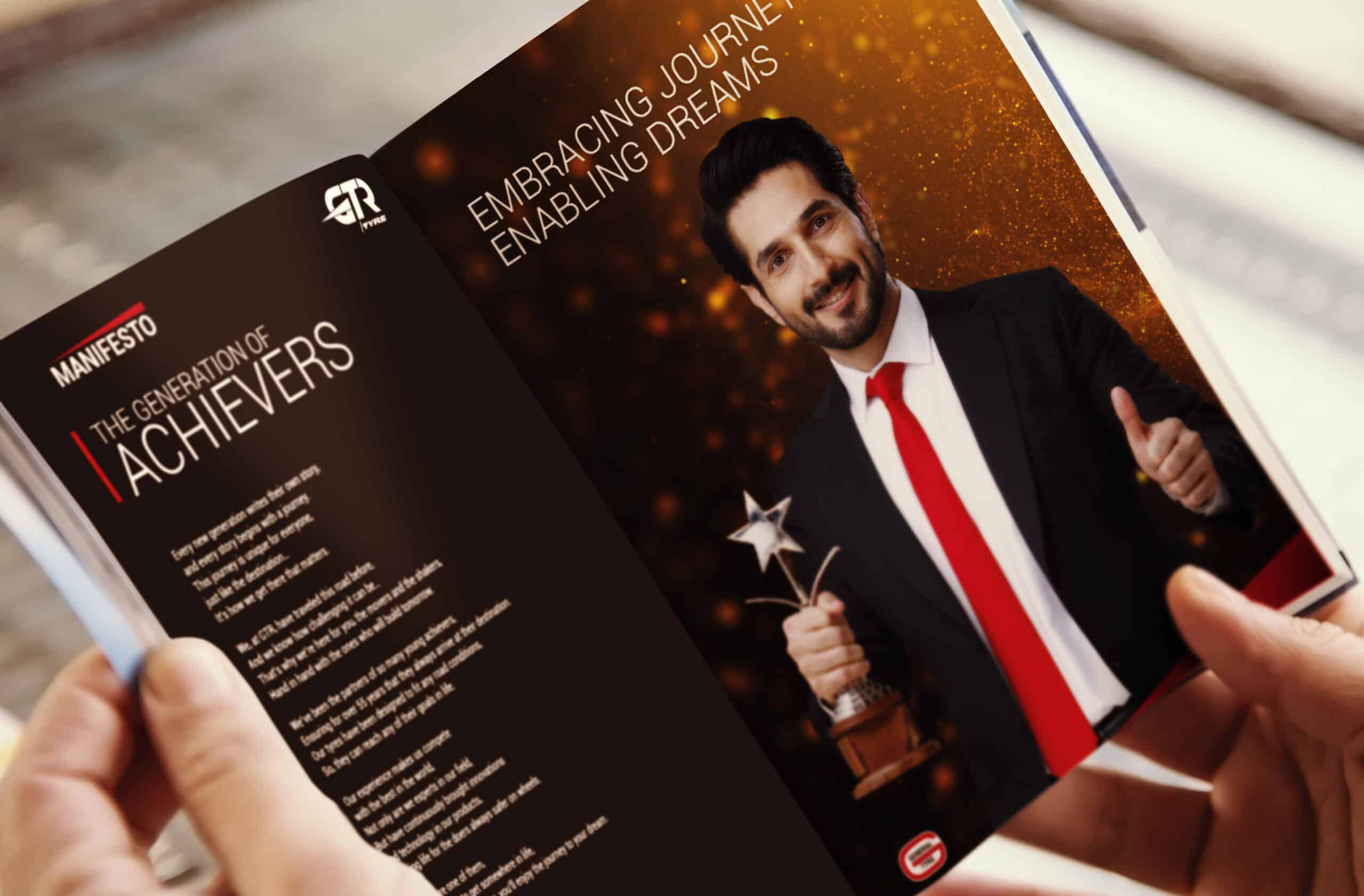
Cultural Branding
Brand Manifesto
Brand Culture Strategy
Brand Anthem
Brand Capsule
Branding
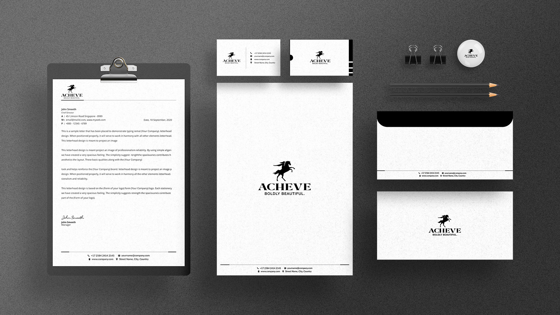
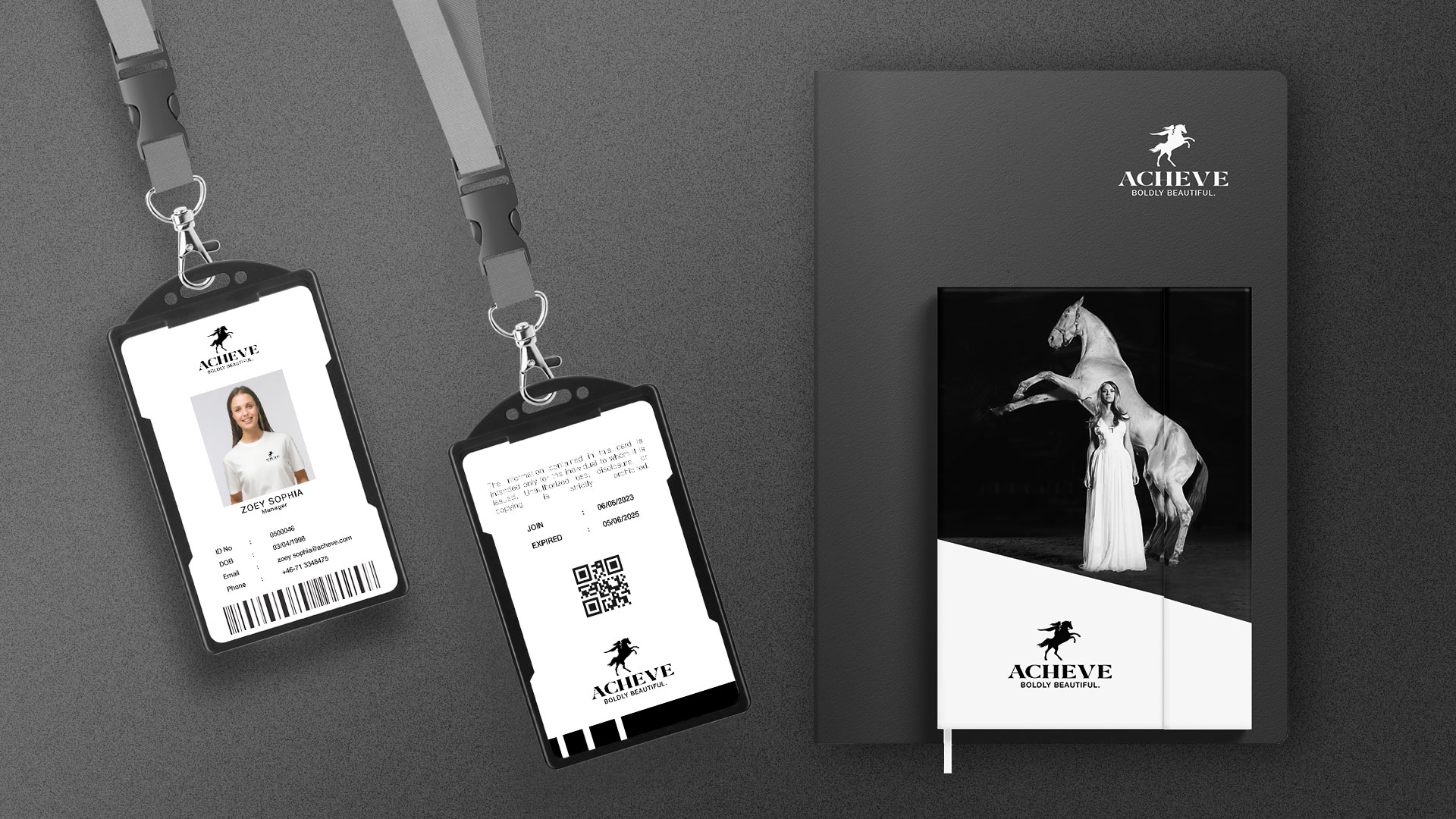
Brand Identity & Stationary
Brand Styling Guide
Label & Packaging
Product Cataogue
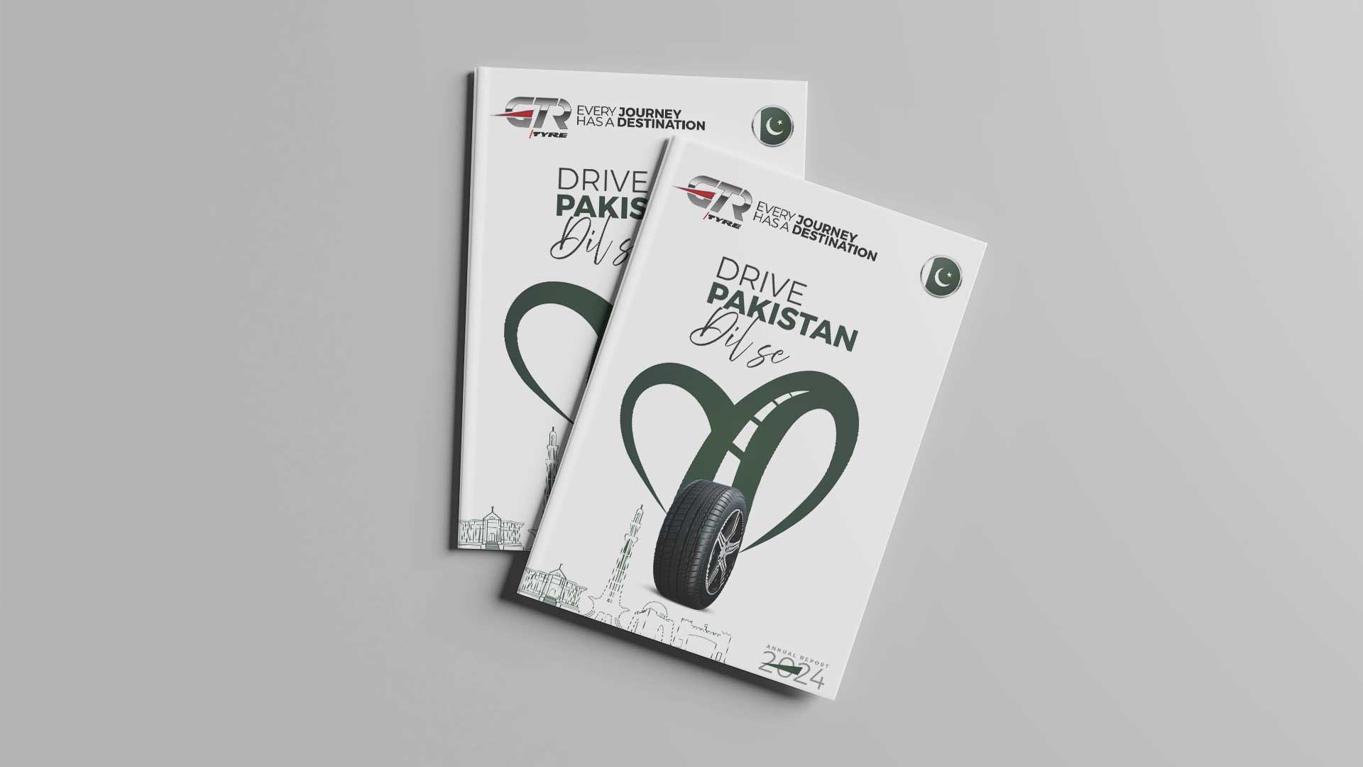
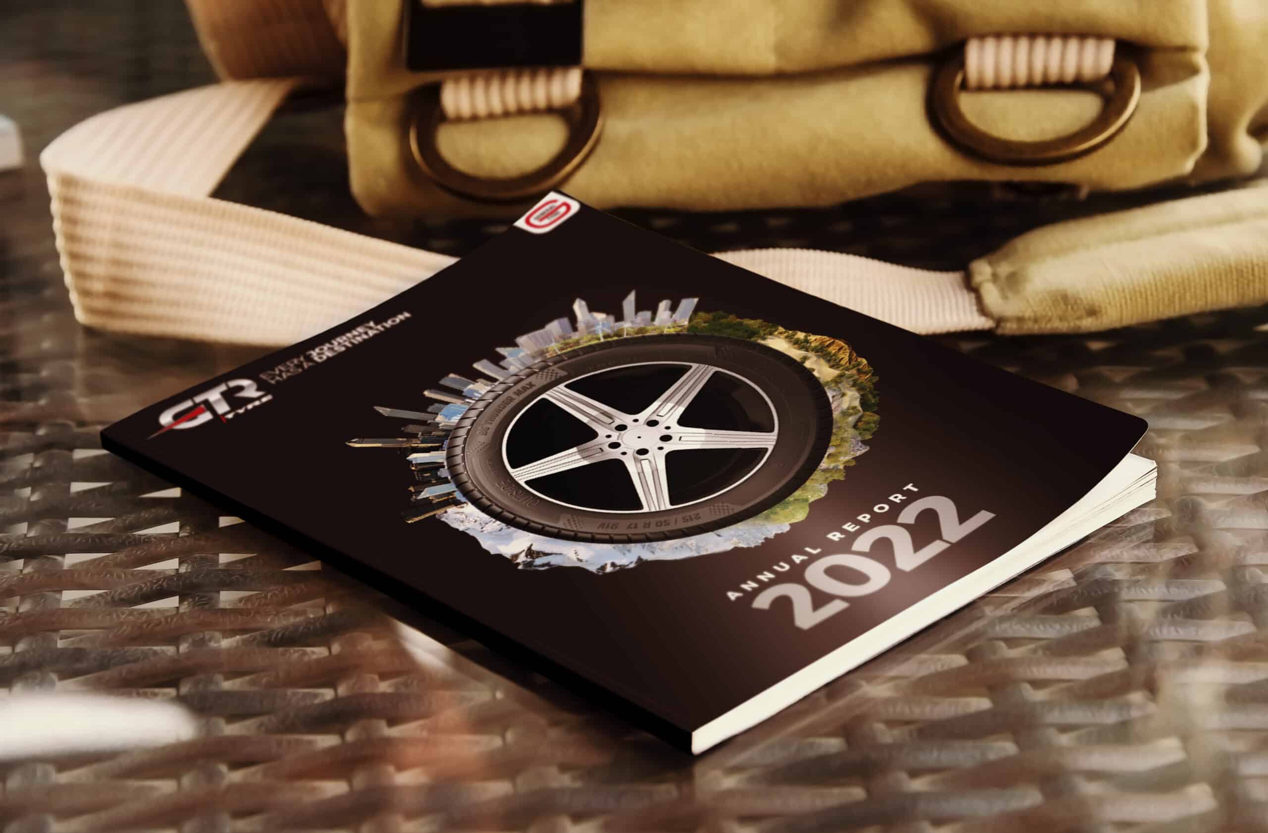
Annual Report
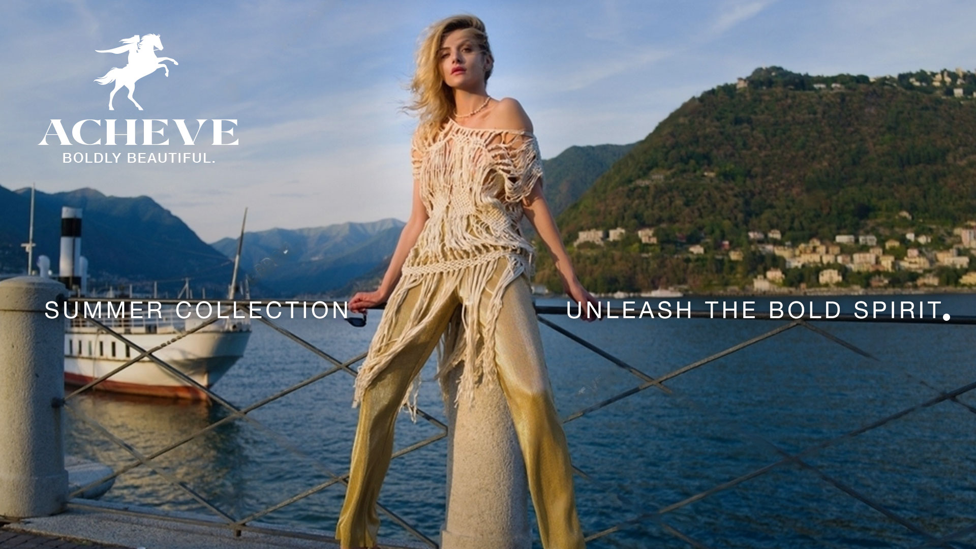
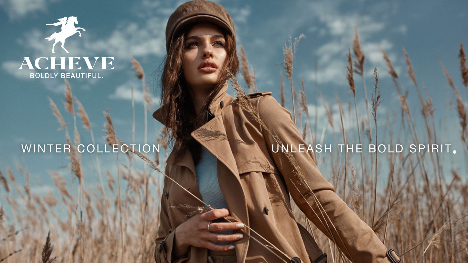
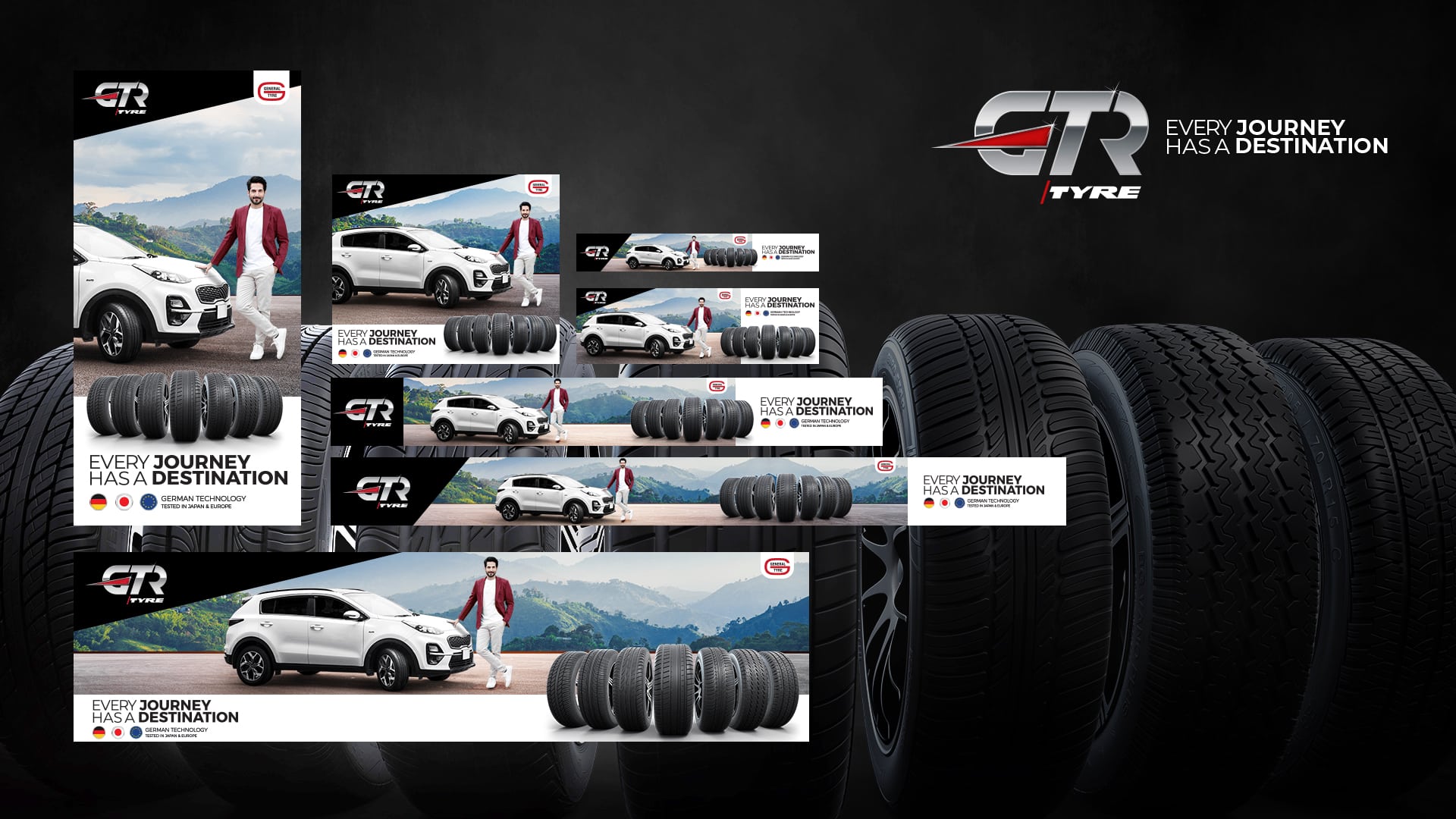
Key Visuals
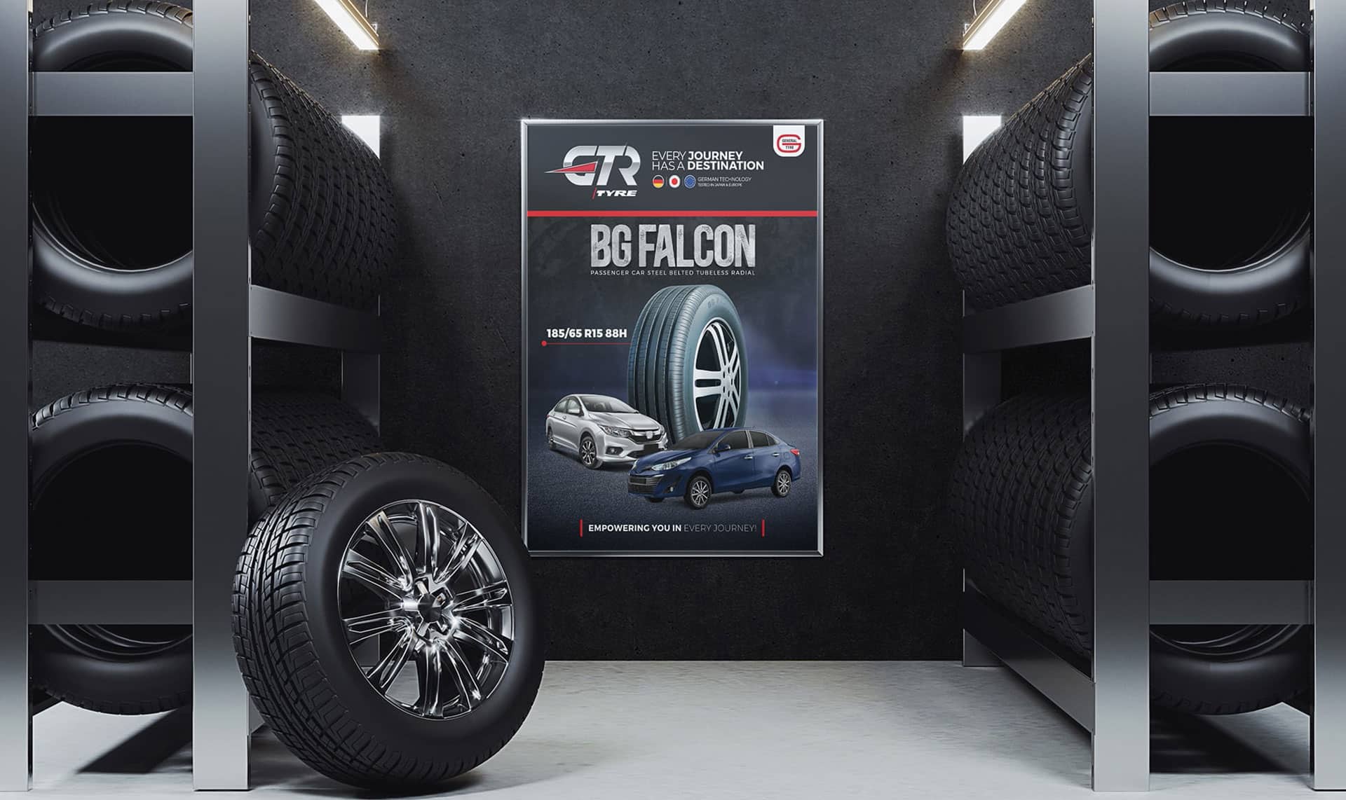
Retail Branding
Office Branding
Pylon Tower
Tyre Displays
Give Aways
Creative
Creative Transformation
Perception Reshaping
Creative Platform
Ideation & Storytelling
Ad Films
Brand Identity Revealing Video
Corporate Documentary
PR Video
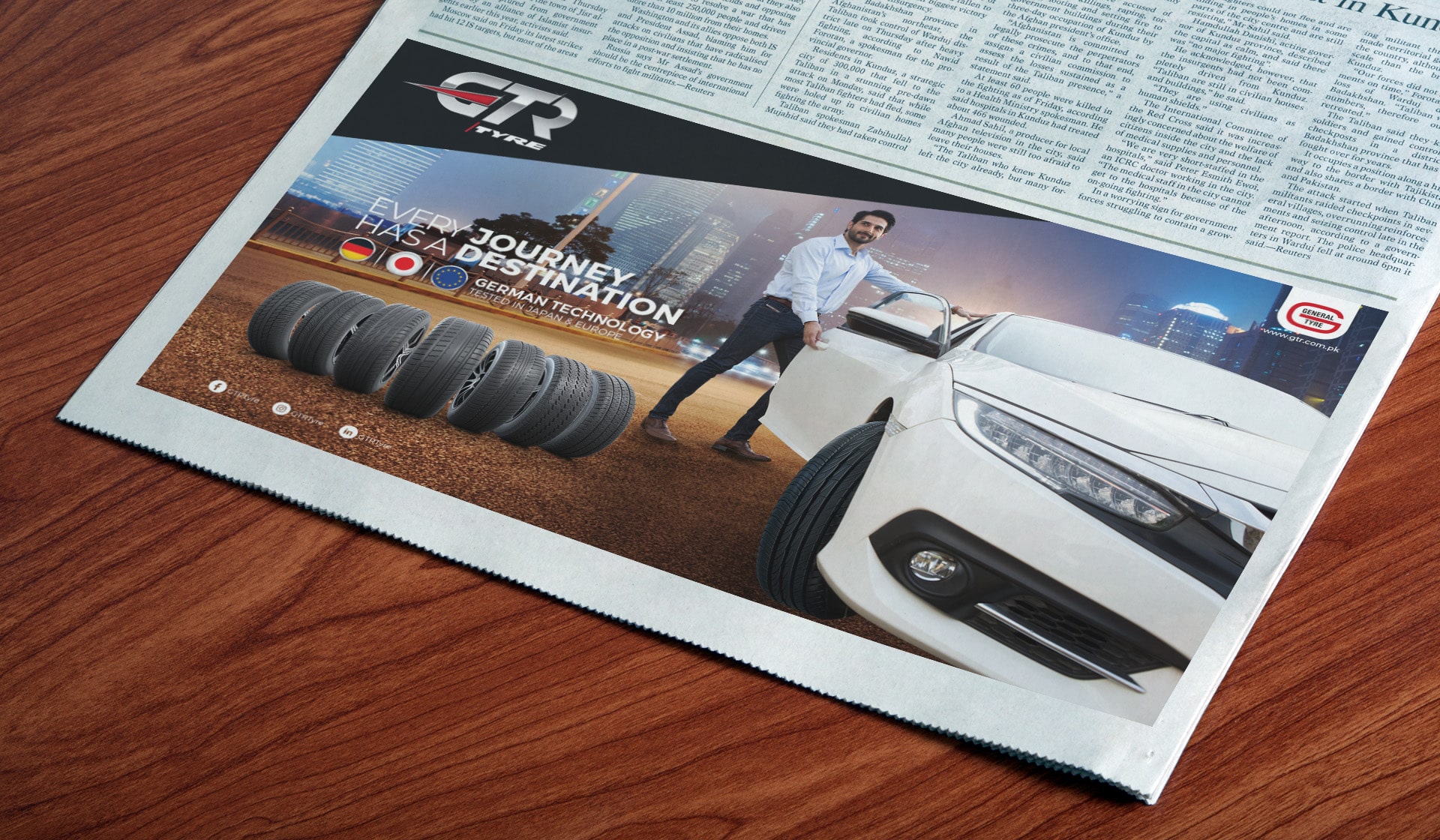
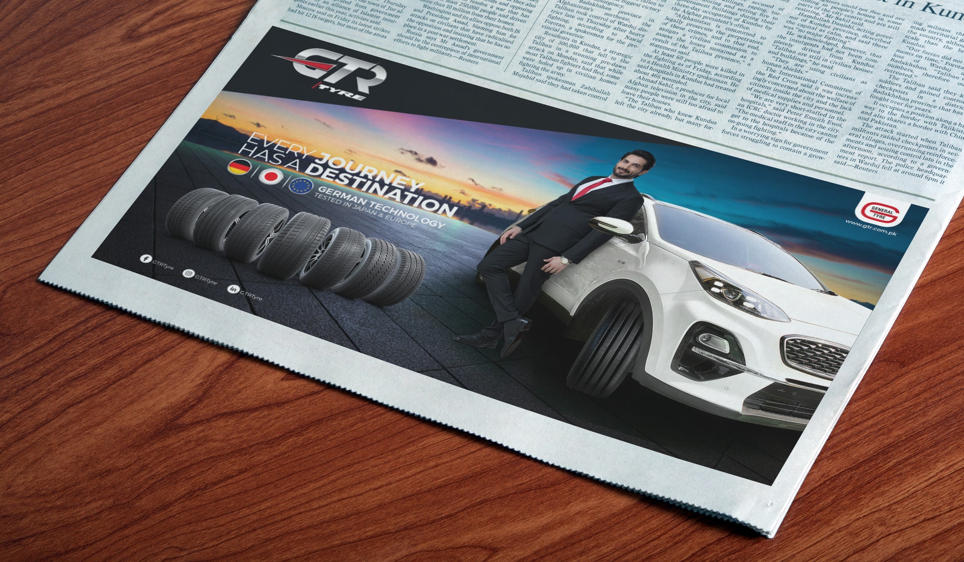
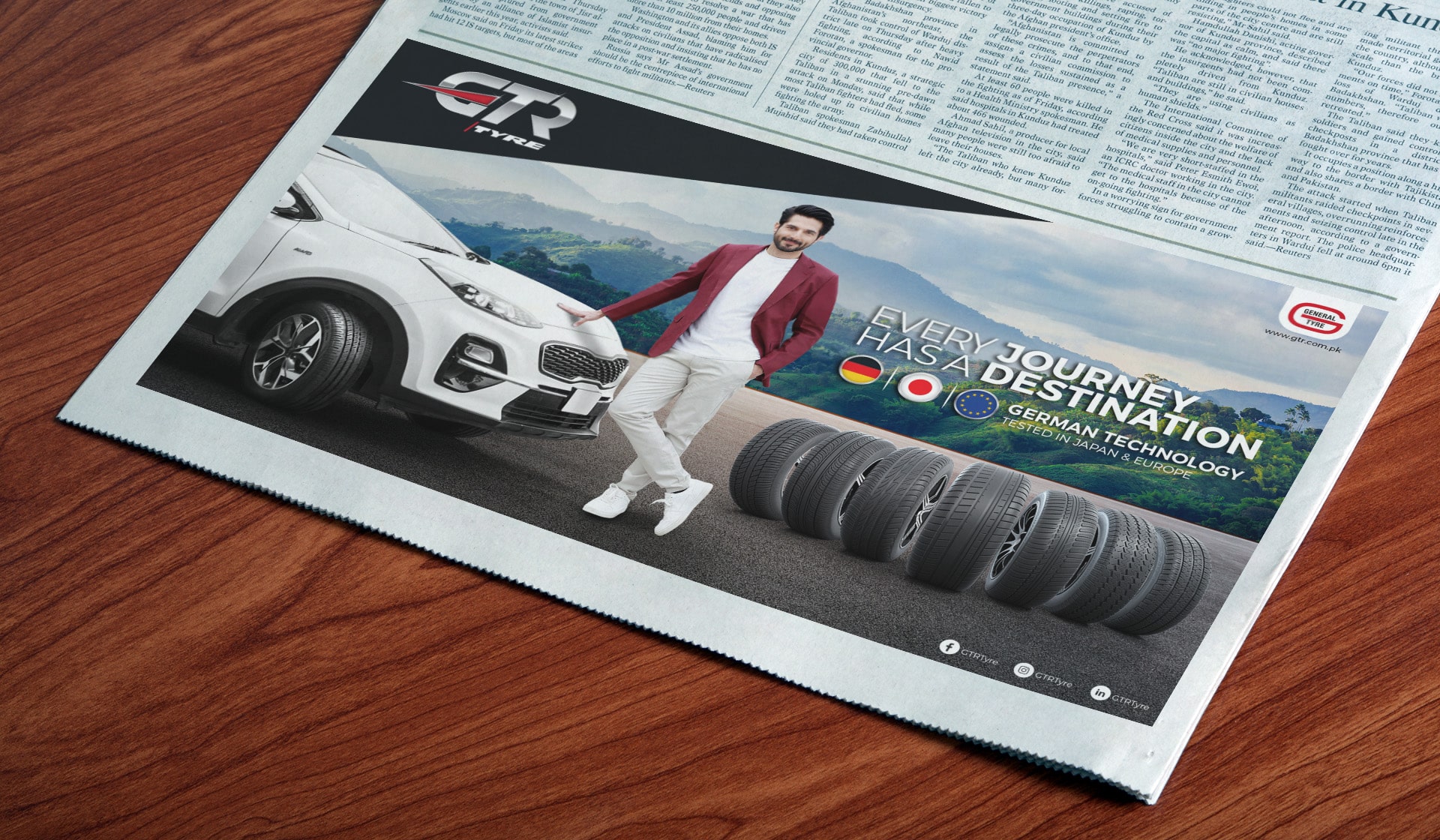
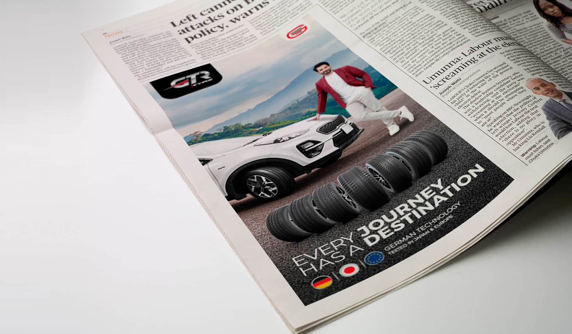
Print Ads & OOH
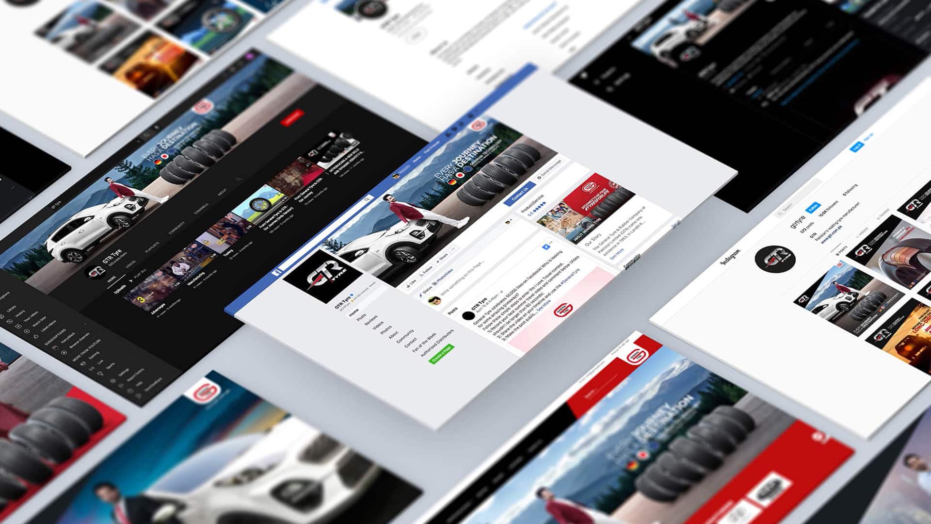
Digital & Social
Digital
Digital & Social Marketing
Event
Logo Revealing Ideation
Invitation Card
Dealer Achievemnt Certificats
Annual Sales Conference
Float Activation
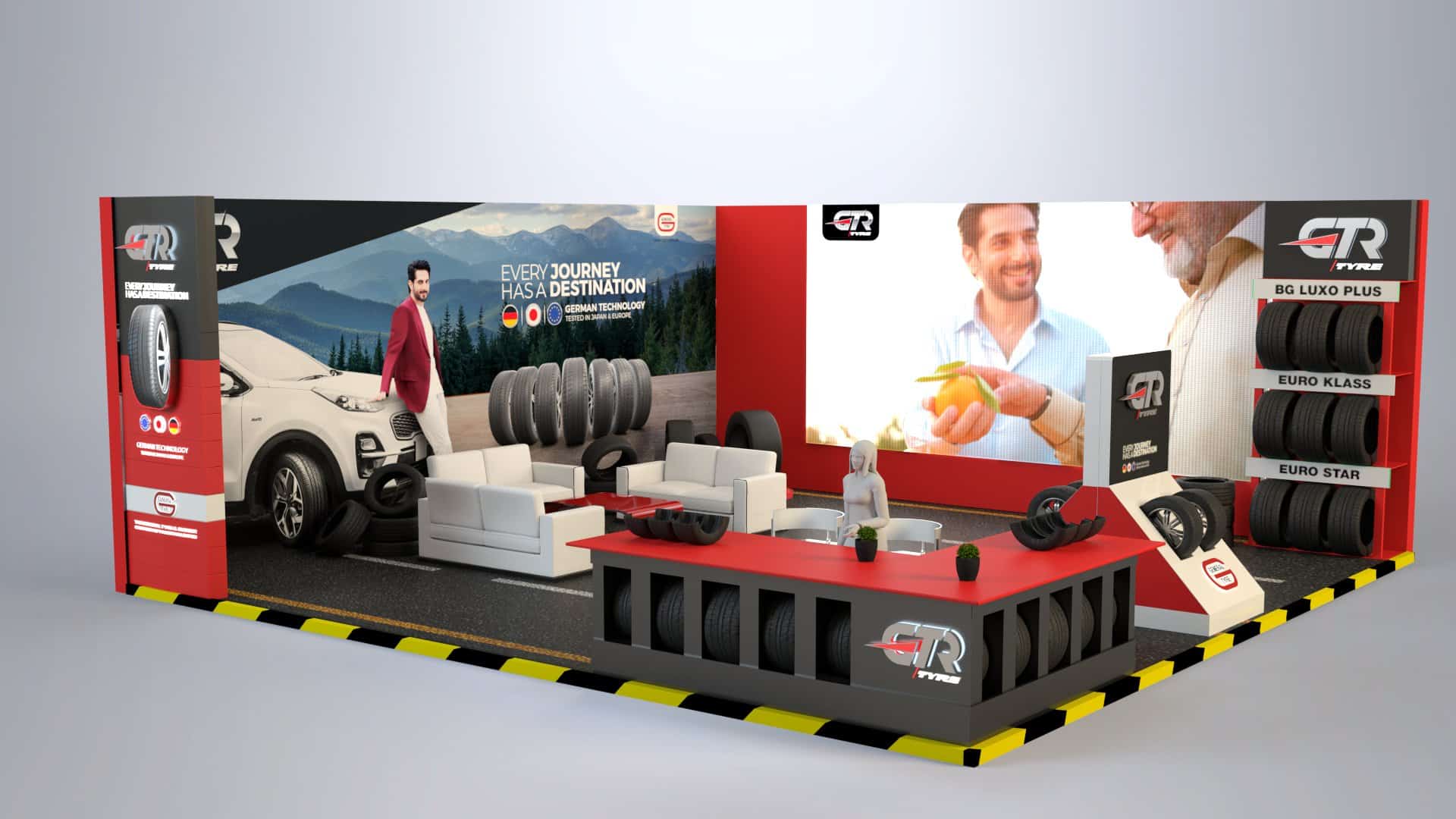
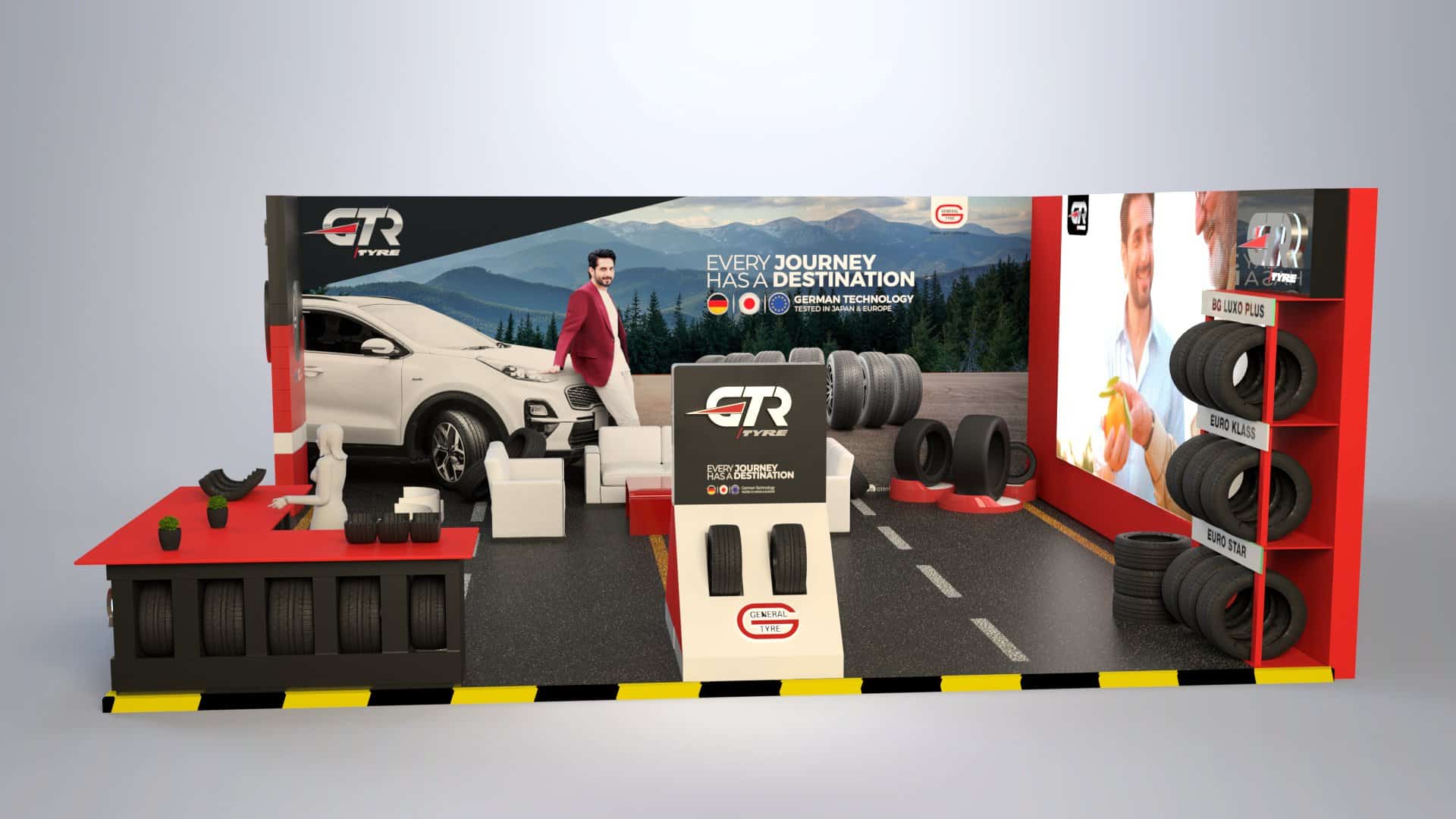
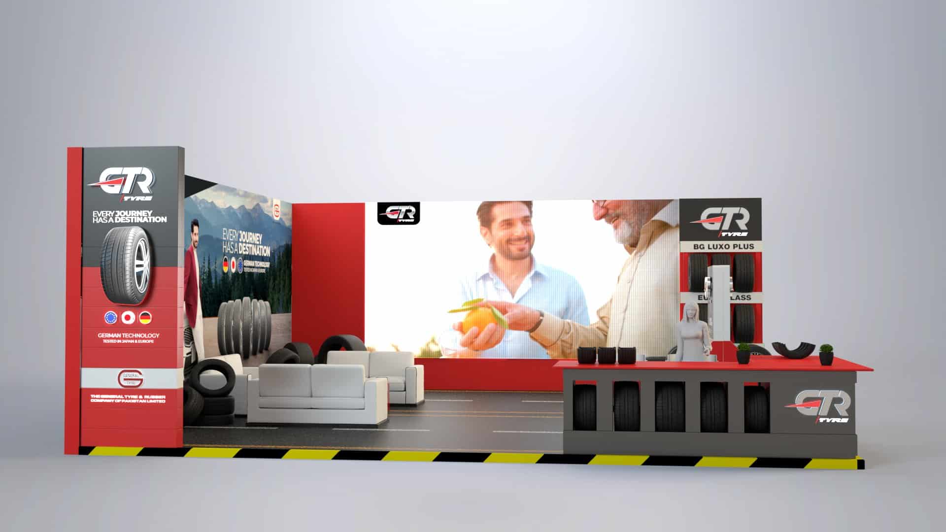
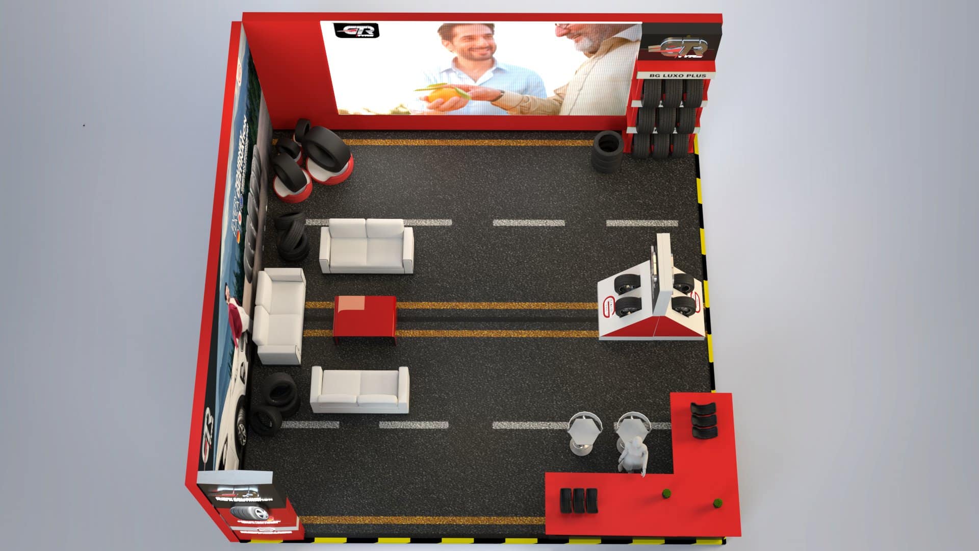
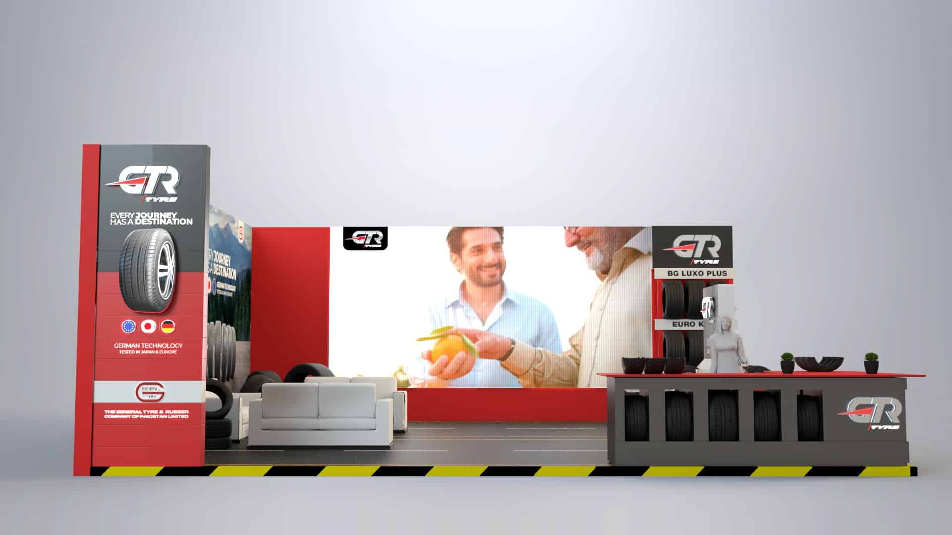
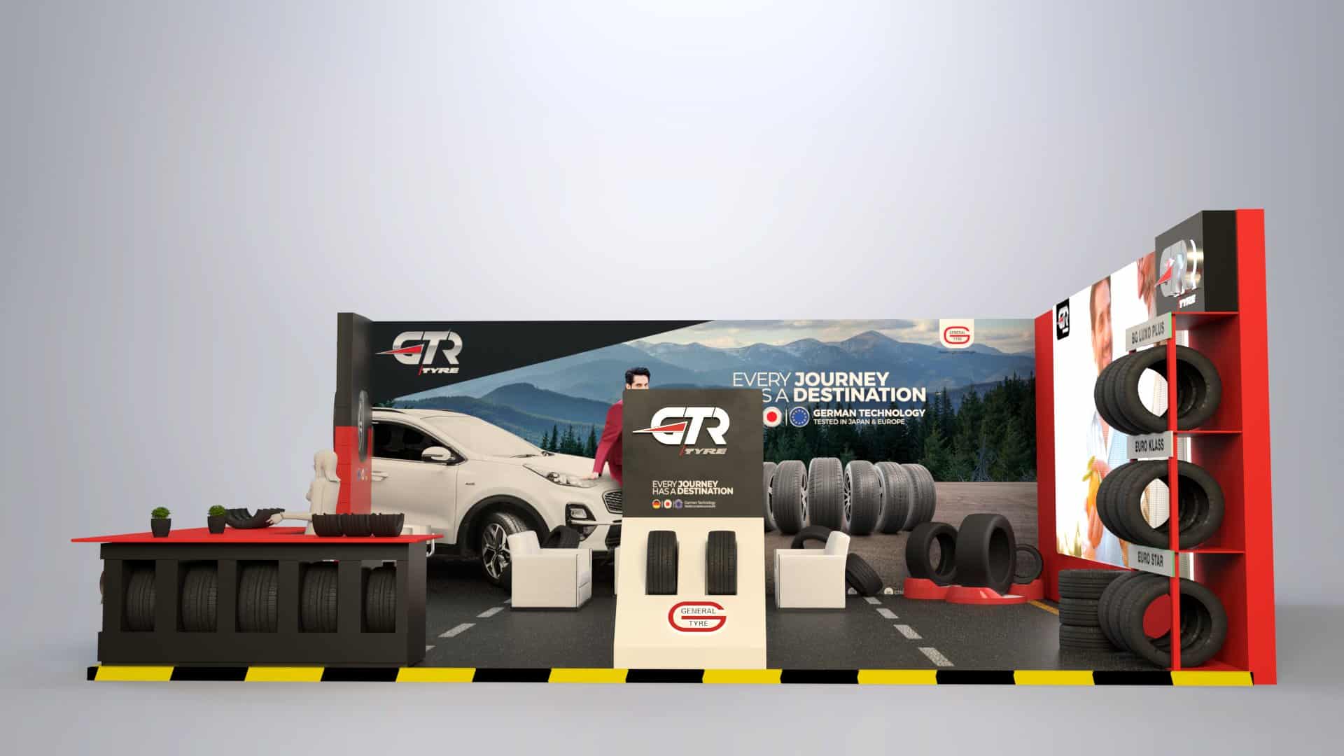
Expo Exhibition Stall
Productions Management
Anthem Film
Ad Film
Corporate Film
Identity Revealing Film
Identity Revealing Event Video
PR Video
3D Tyre Range Animations
Production Designing & Planning
Director Board & Treatment Note
Celebrity Management
Digital Shoutouts Celebrity
Shoot & Post Production
Media
Digital & Social
Media Buying & Planning
PR
PR Coverage TV
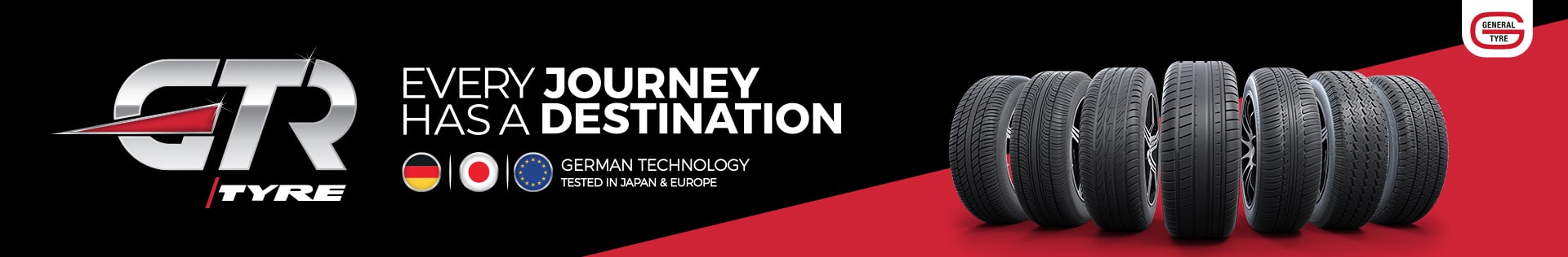
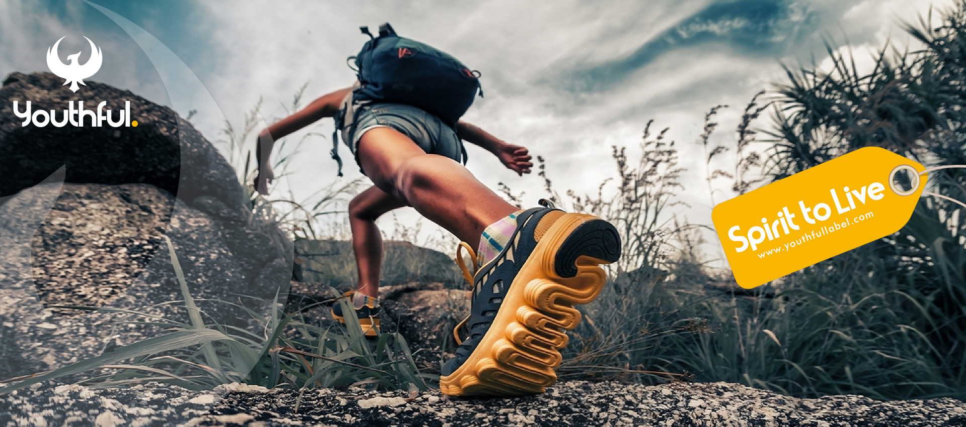
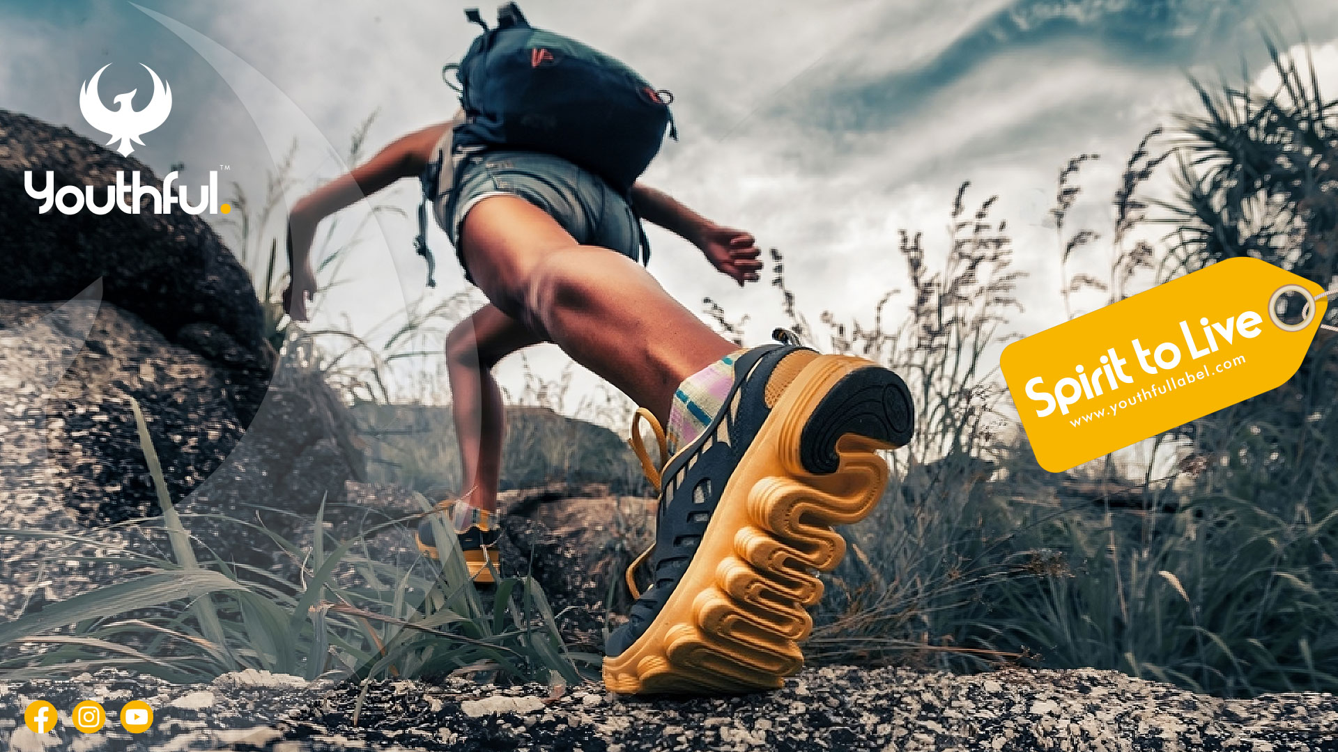
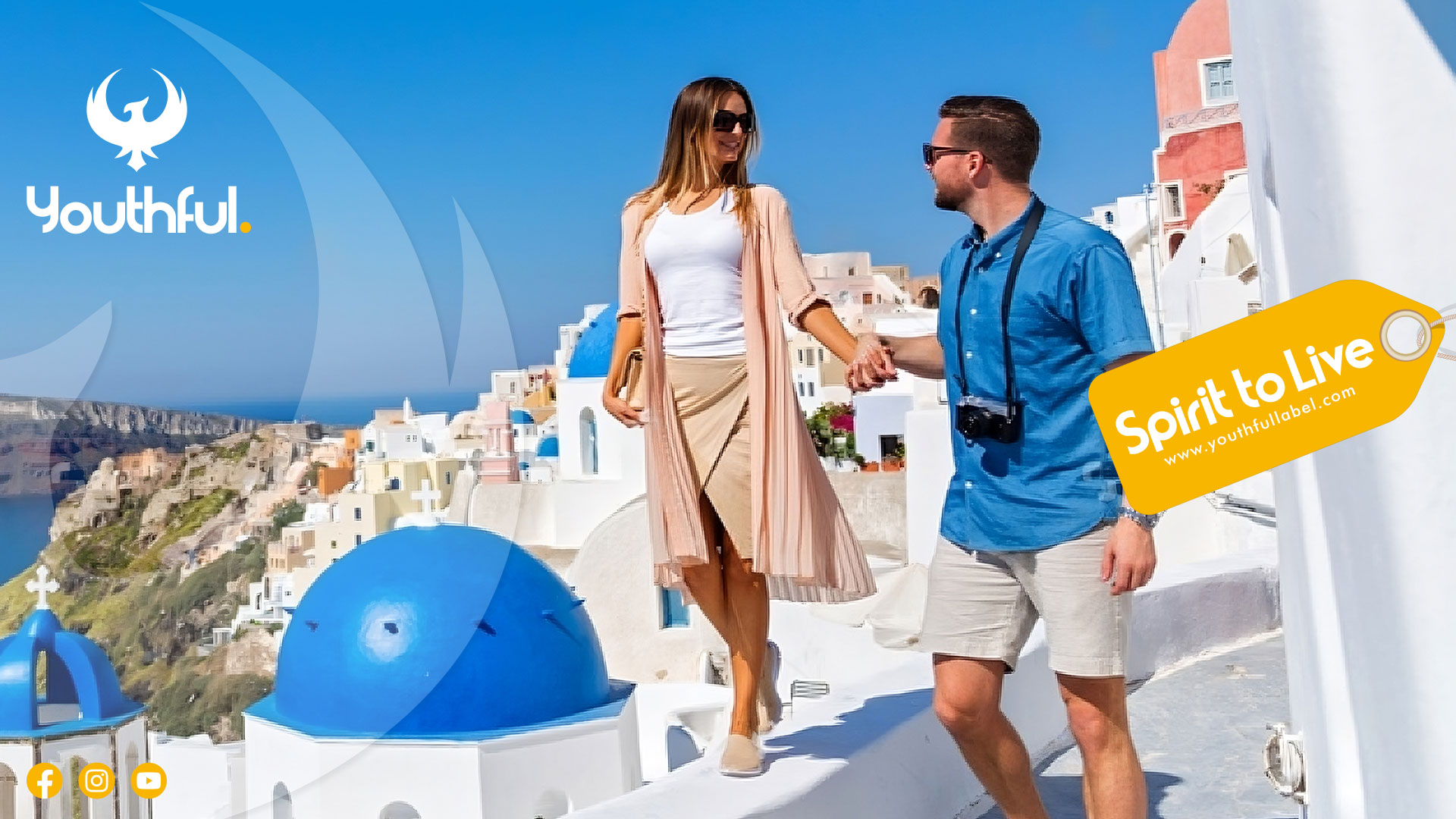
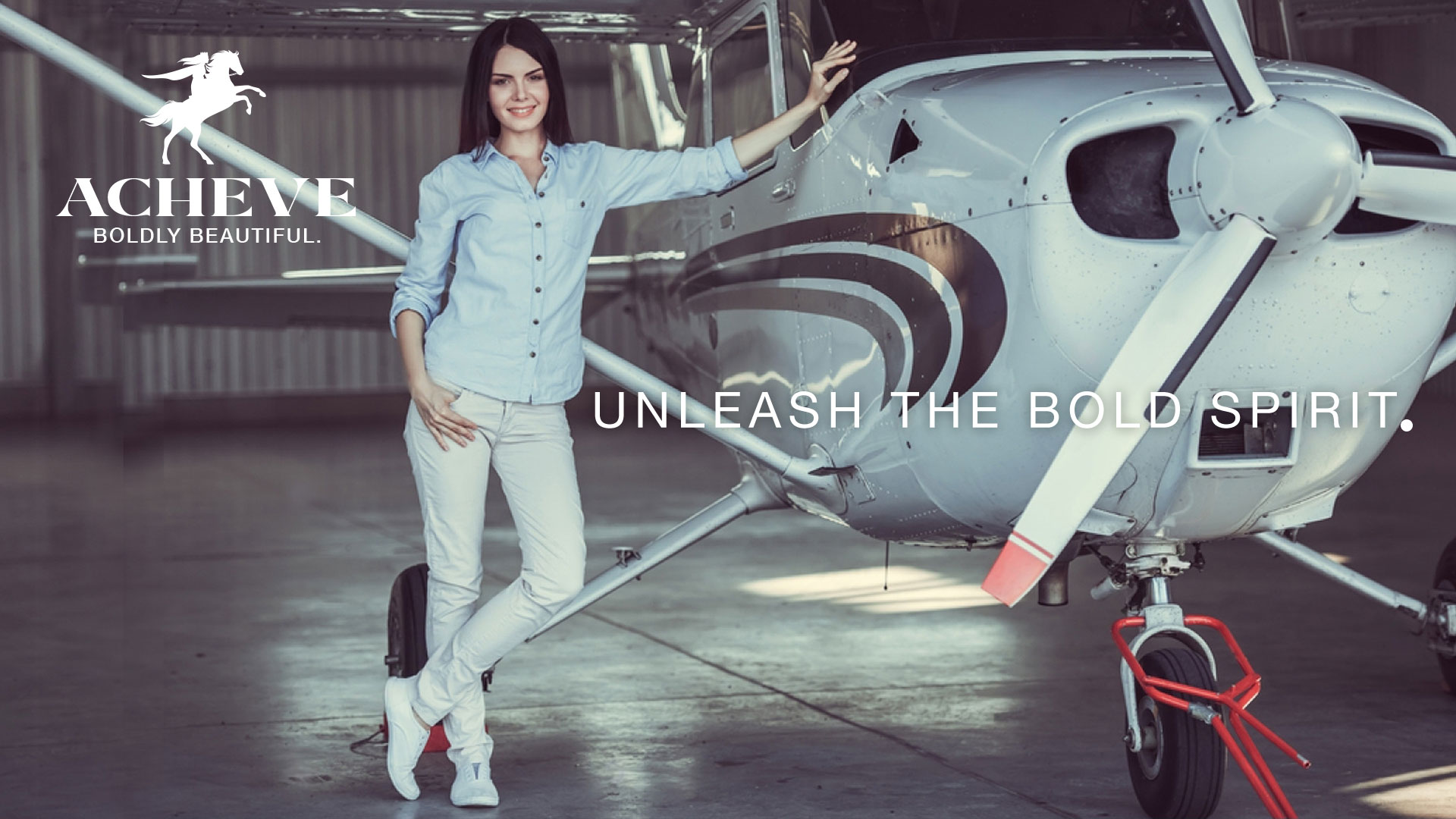
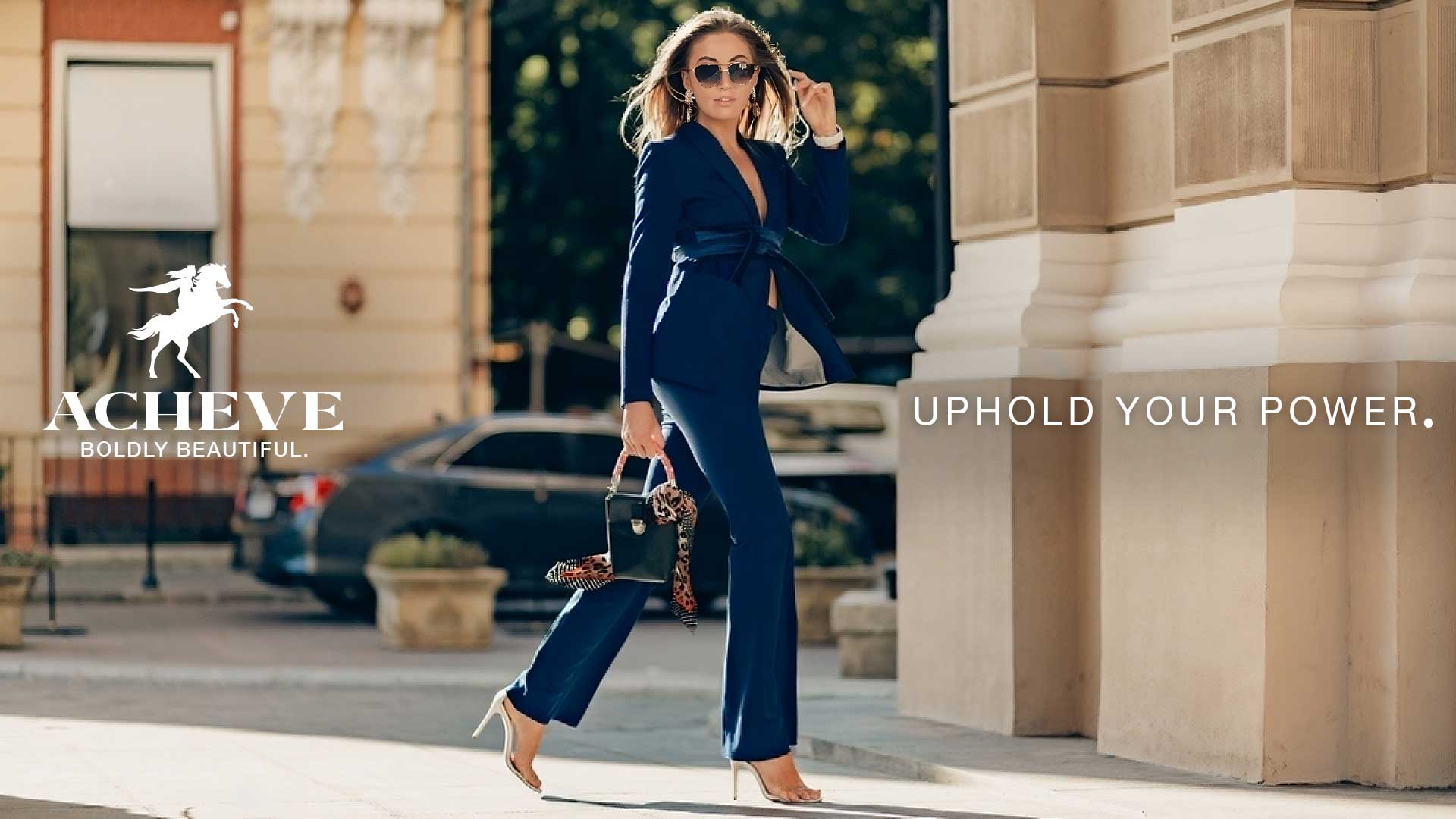
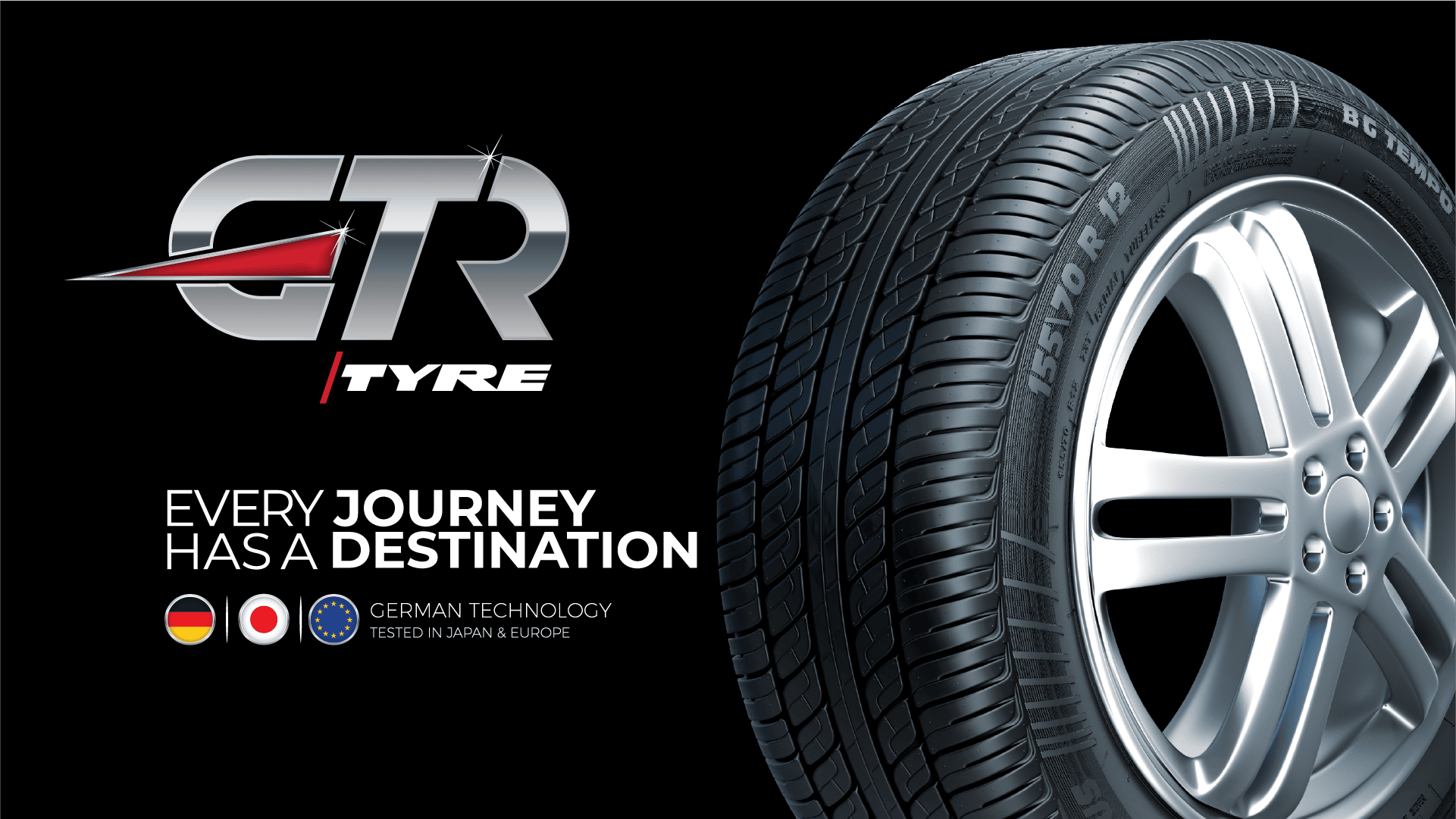
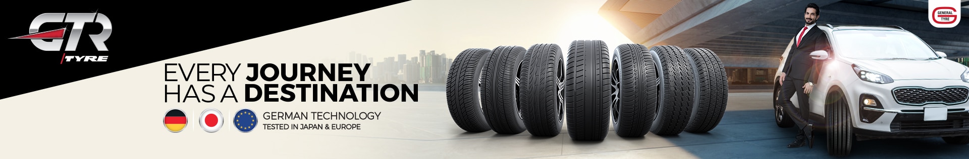
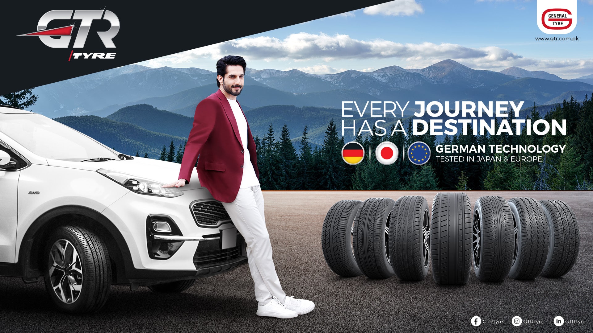
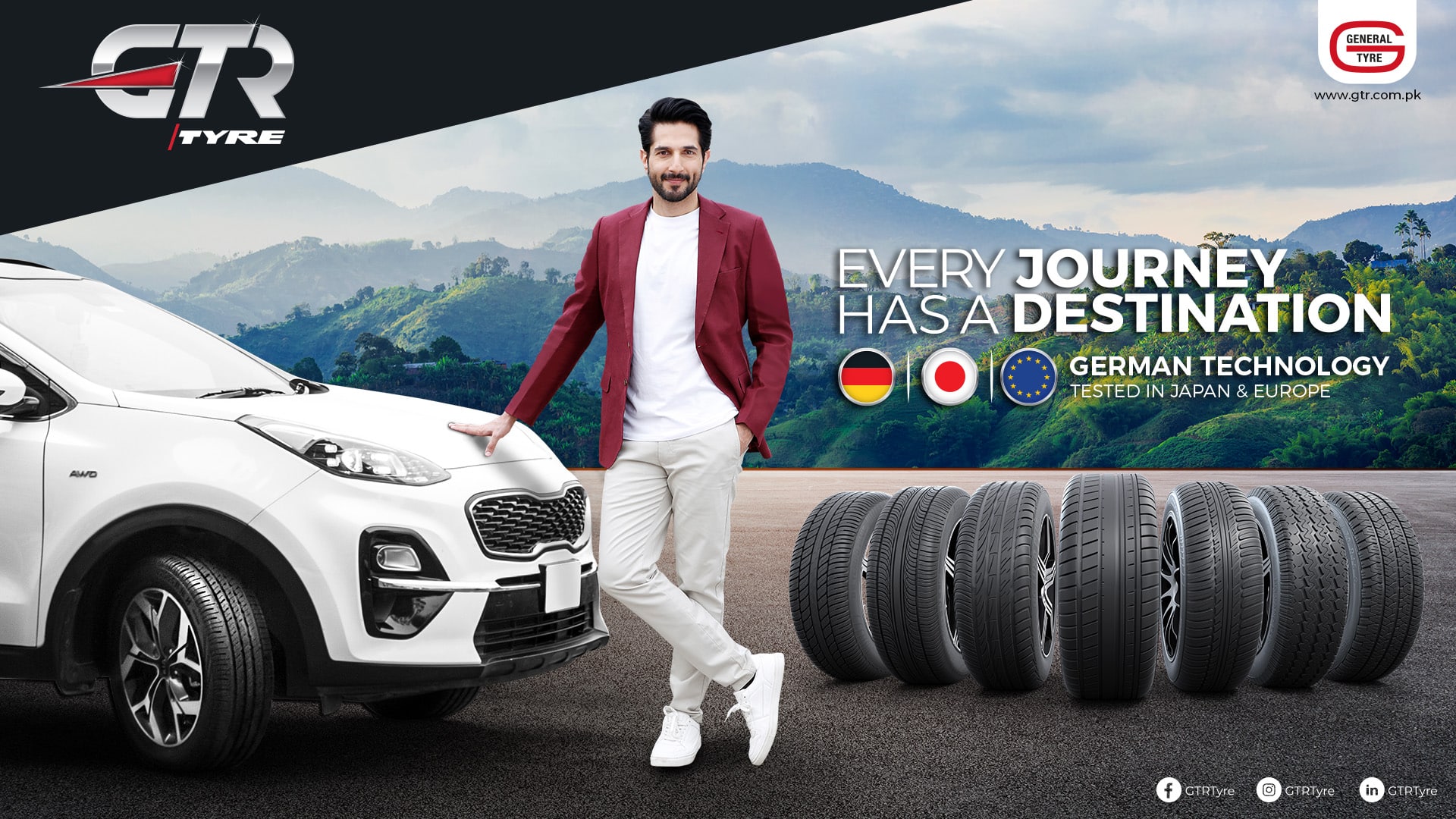
GTR
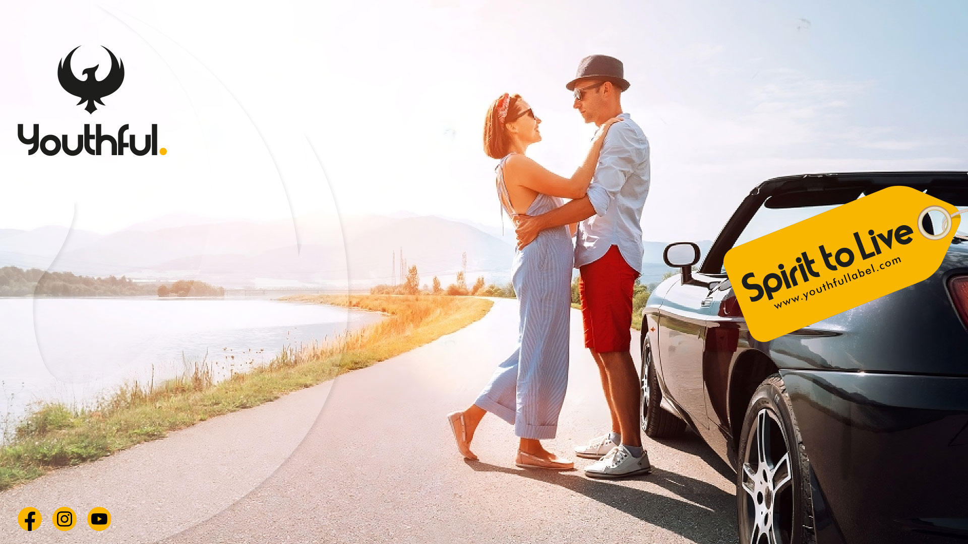
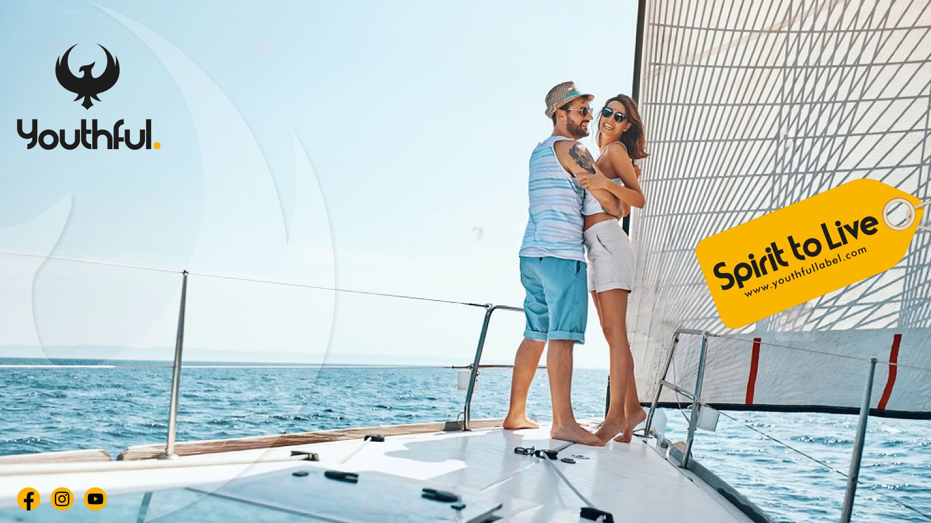
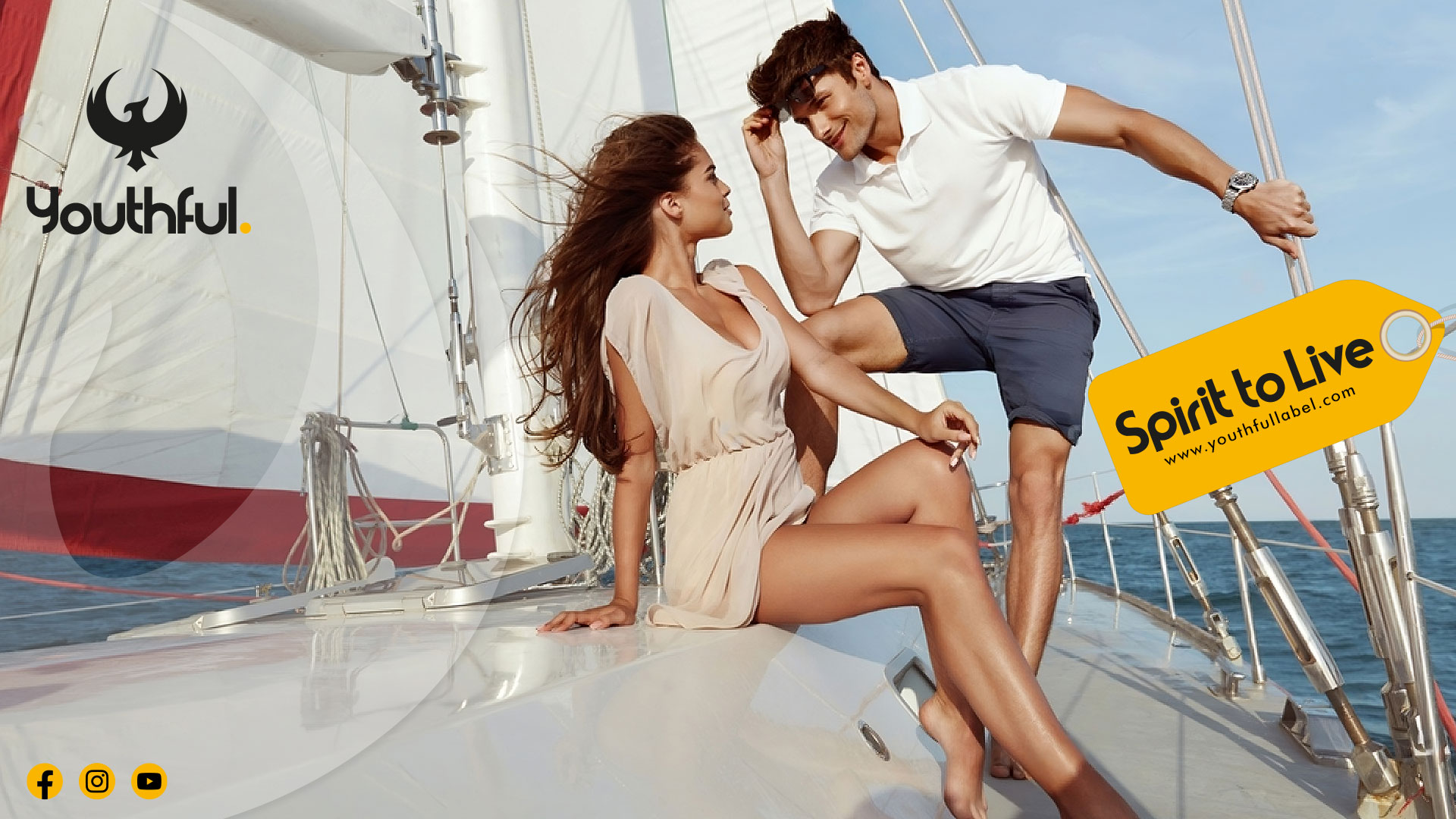
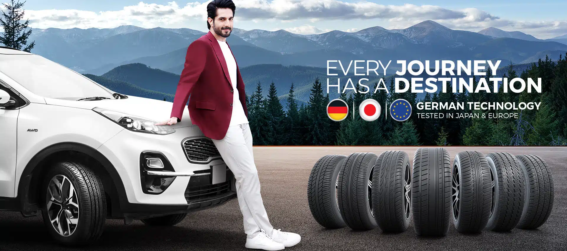
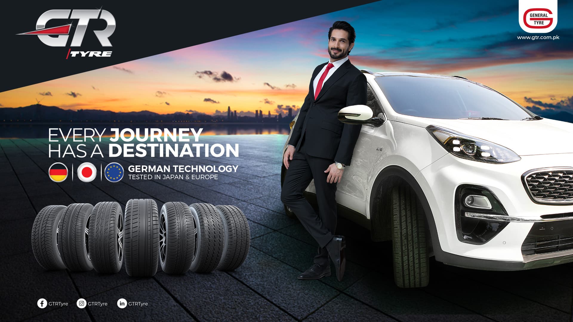
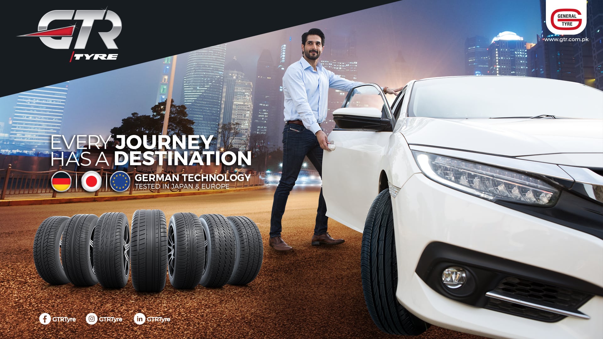
Every Journey Has A Destination
The Challenge
GTR
Every Journey Has A Destination
The Solution
Our Approach
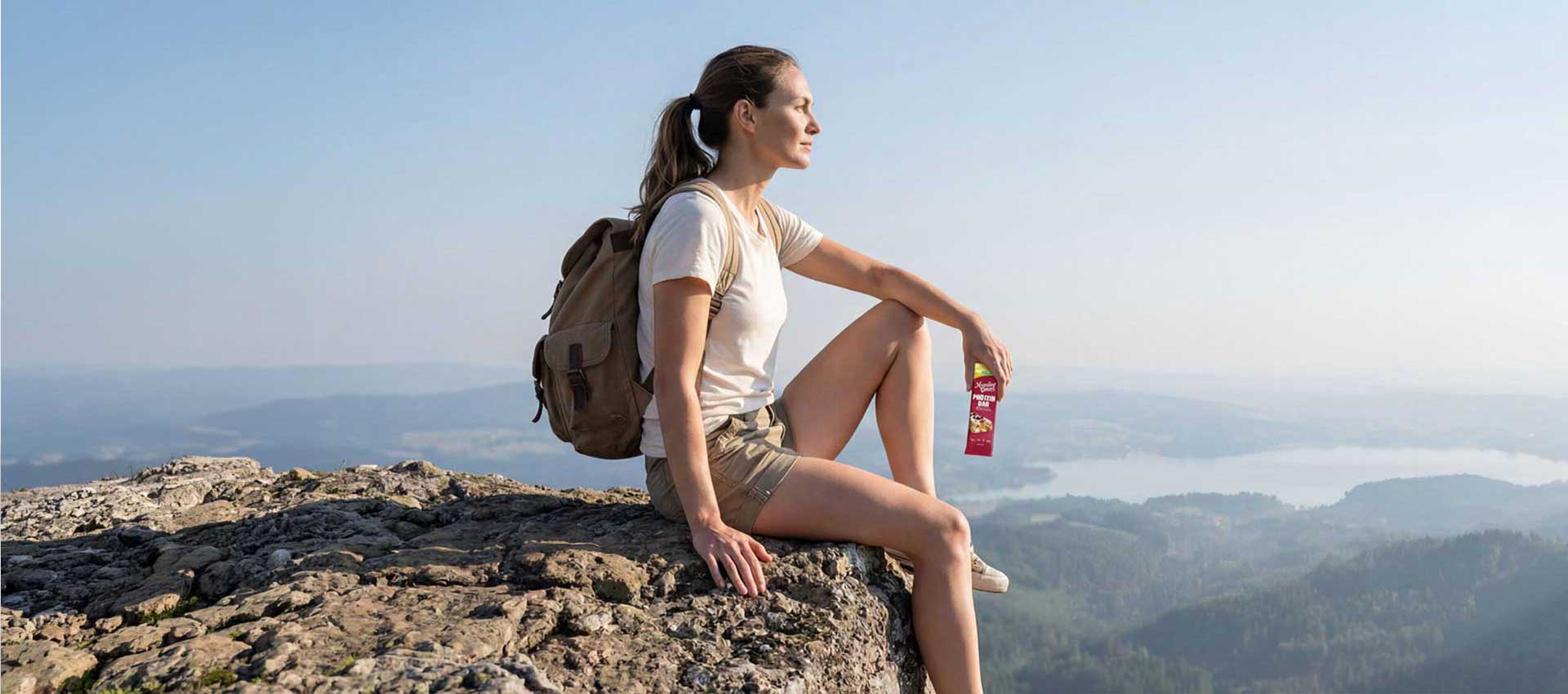
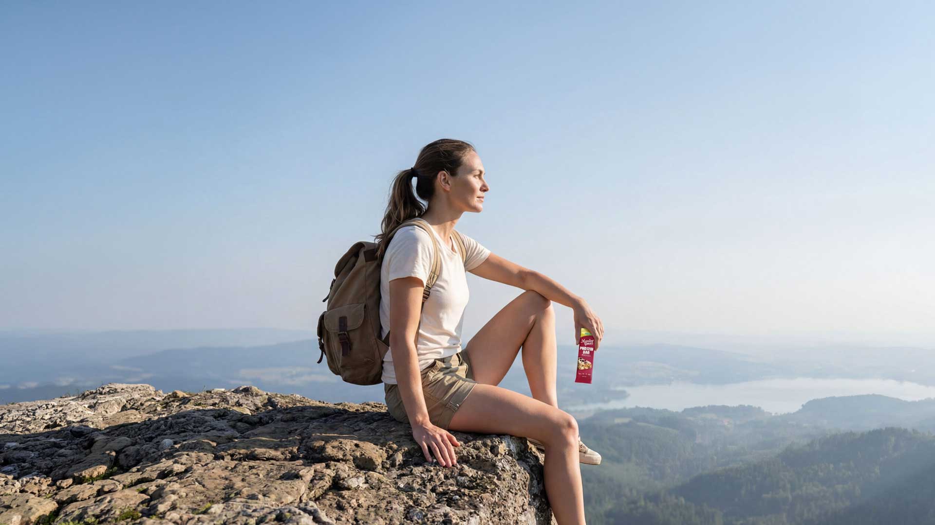
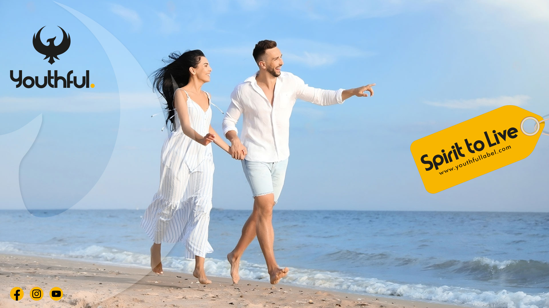
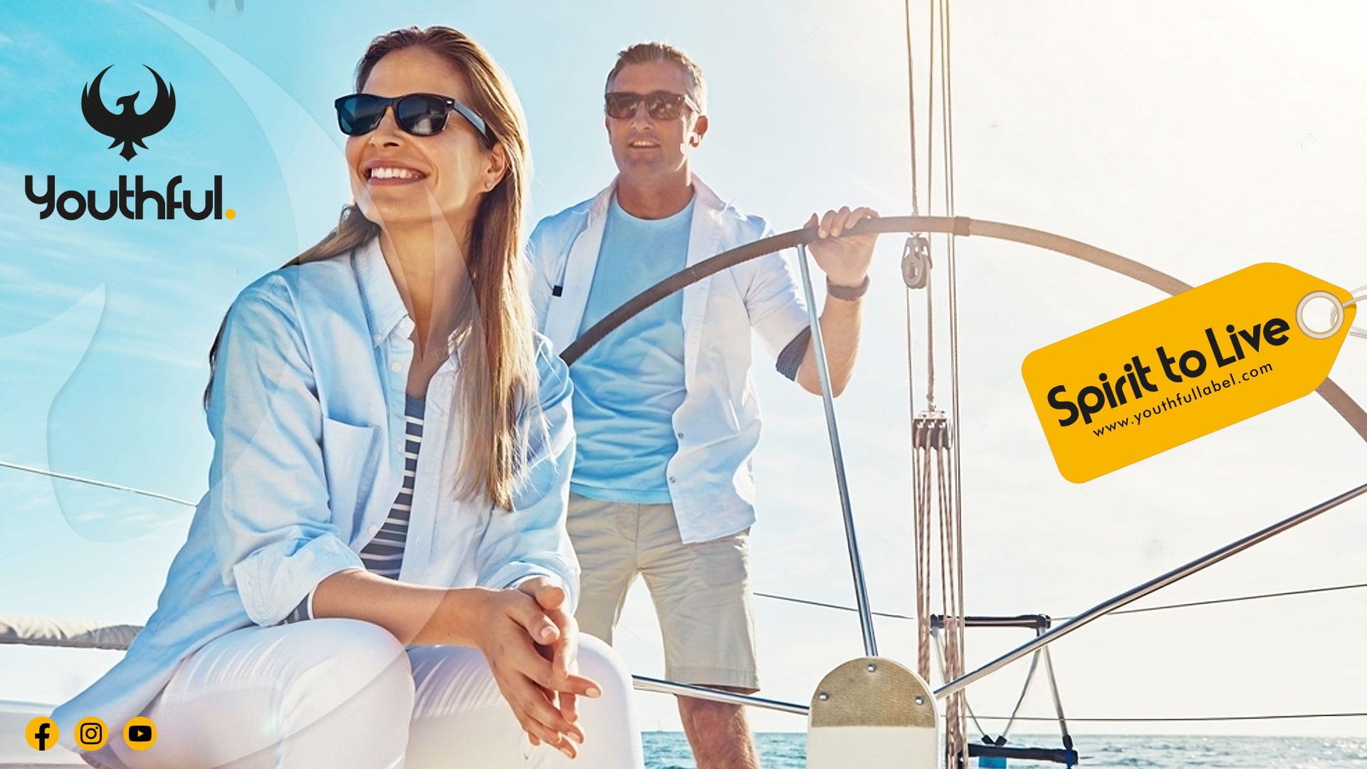
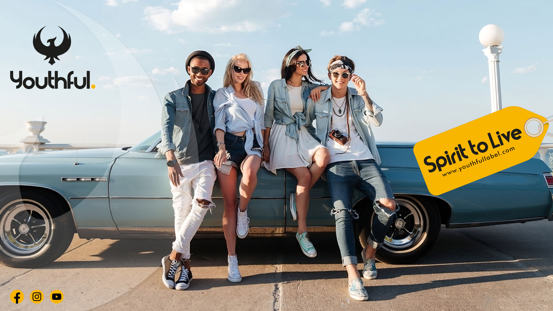
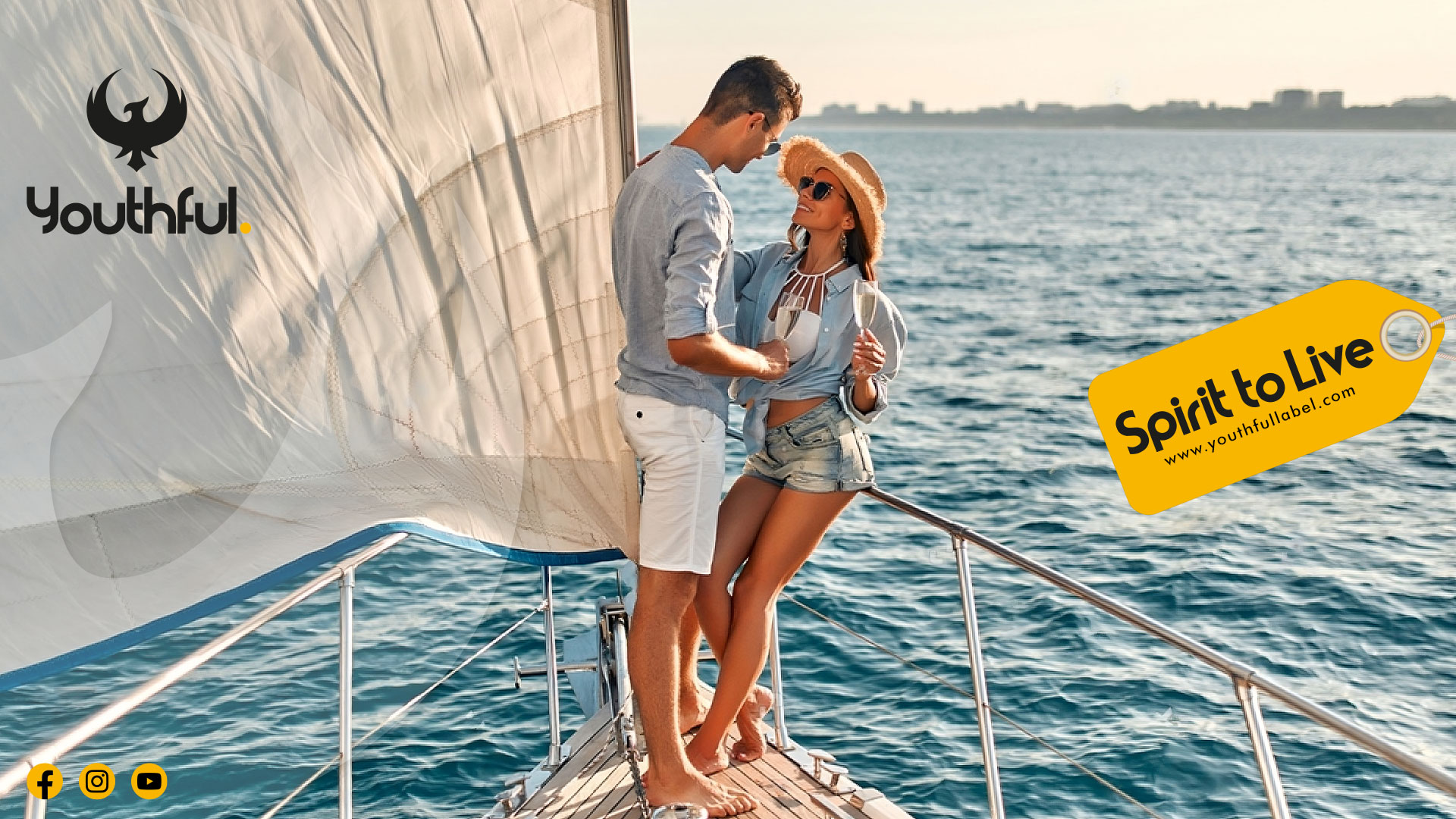
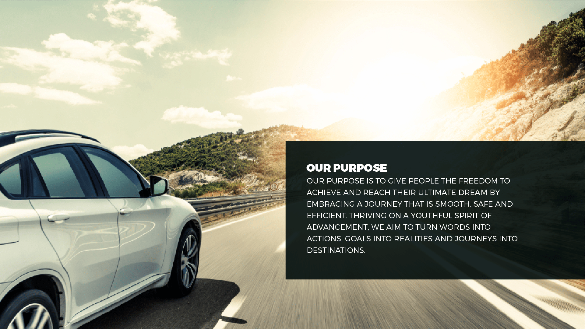
GTR gives youth the ability to move forward, alleviating their worries and making their journey safer, all while empowering them to reach their ultimate destination—their dreams.
Brand Culture Hive
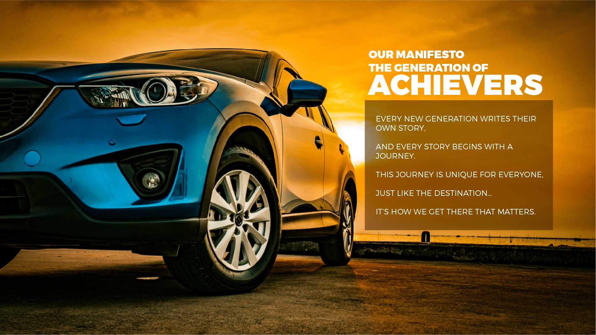
Brand Culture Network’s strategic toolkit, the Brand Culture Hive, was used to shape the brand purpose, manifesto and culture strategy. This toolkit helped craft the brand narrative and establish the creative direction: “The Generation of Achievers”. Our mission was to create communications that inspire and amplify this brand journey across all mediums.
Brand Purpose
Manifesto
Rebirth & Rebranding of iconic Brand
Brand Identity
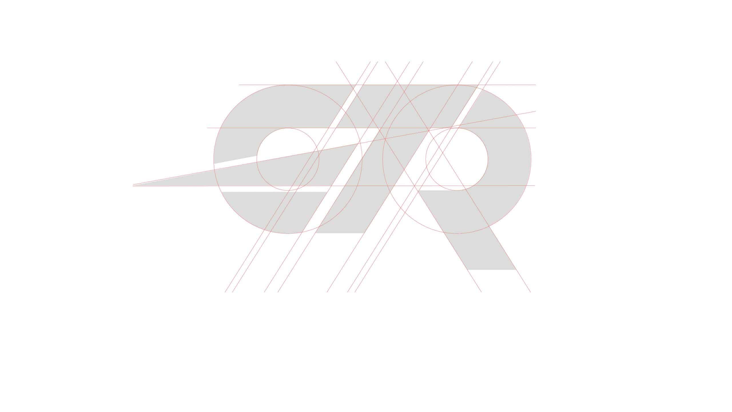
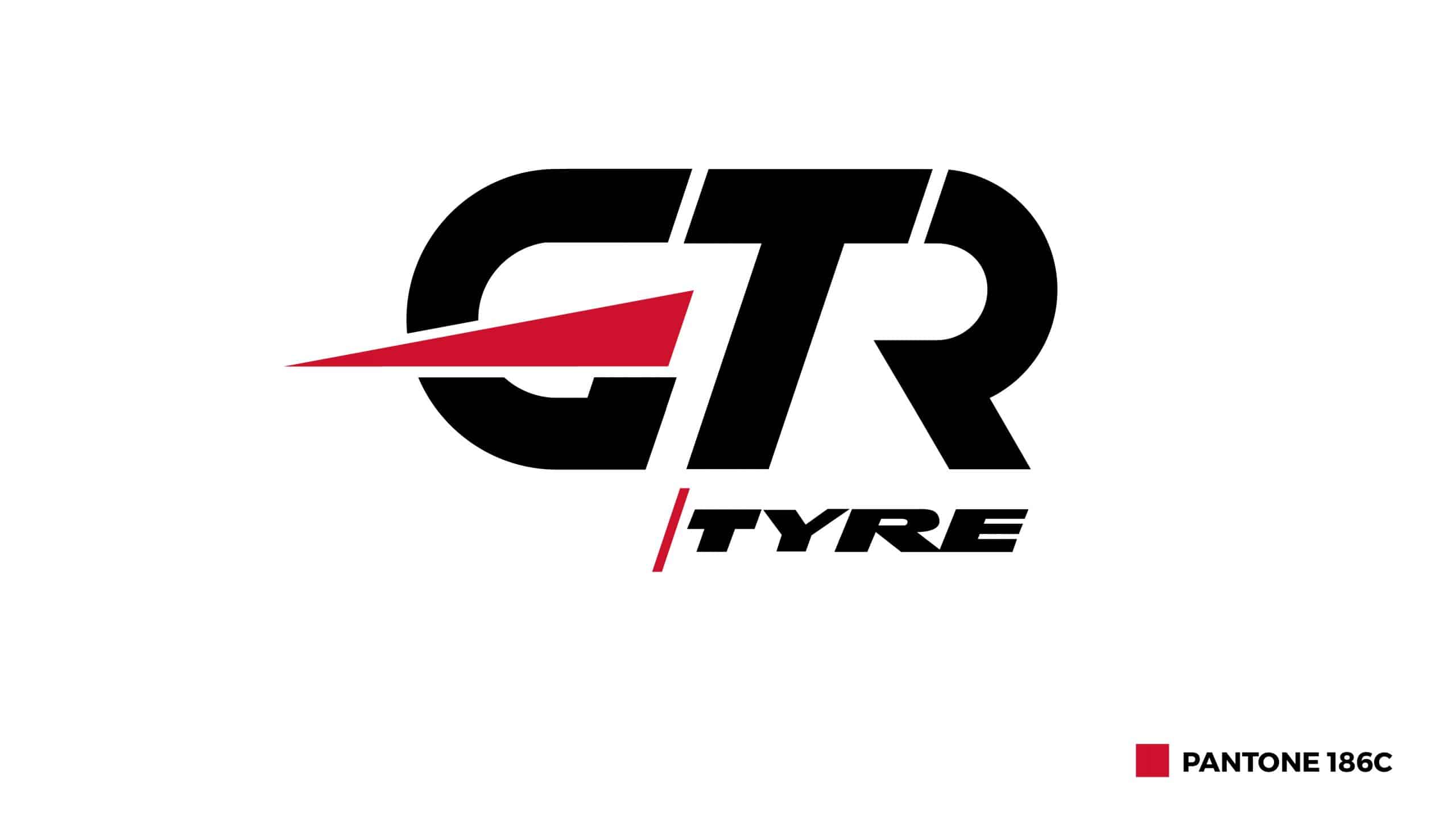
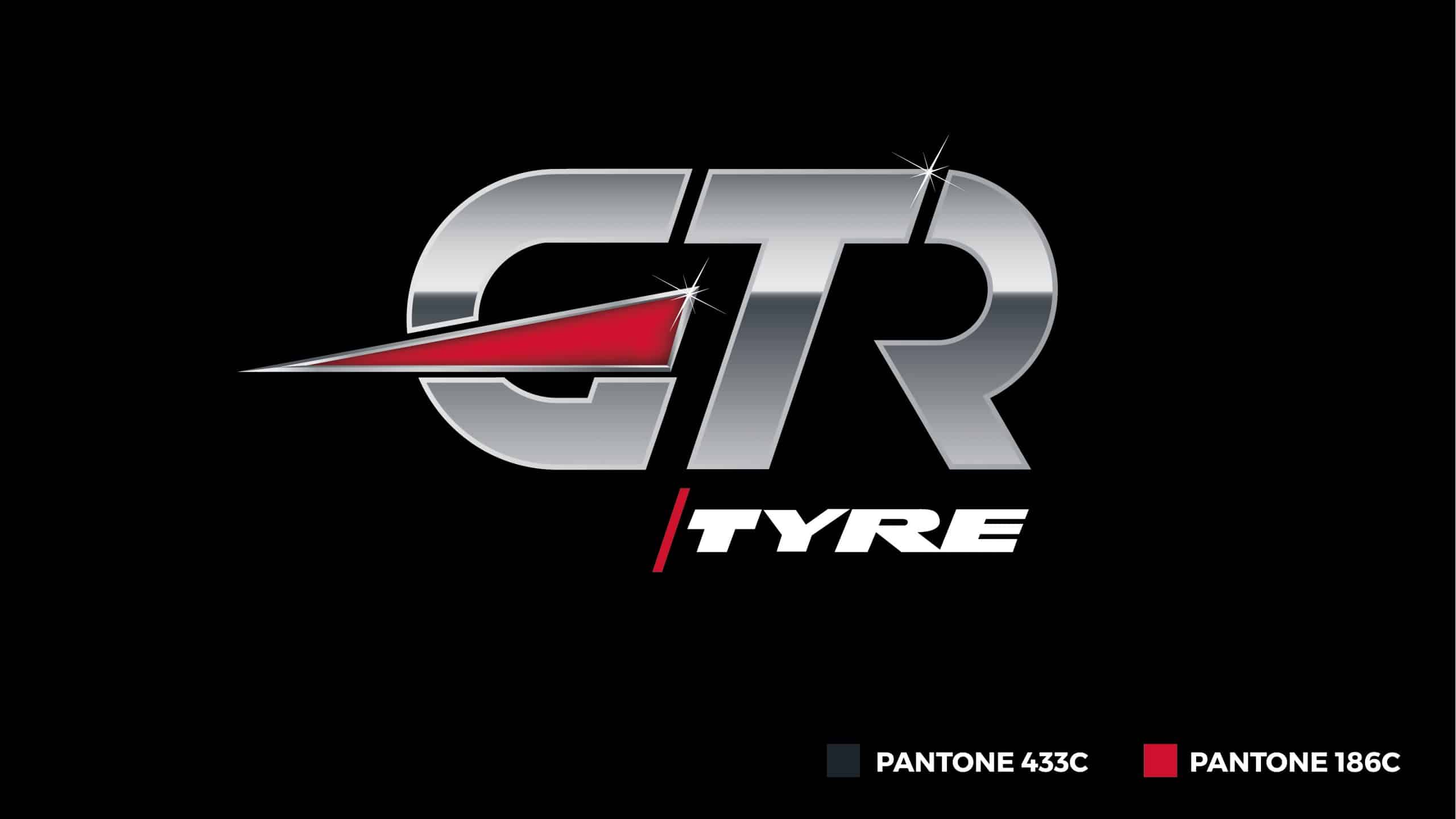
Two intersecting circles are skillfully manipulated to craft the iconic letters “GTR”. A standout feature is the red rectangular triangle seamlessly integrated into the design, forming the central part of the letter “G”, symbolizing the “Generation of Achievers” who are always on the move towards excellence.
The metallic treatment of the lettering exudes a sense of modernity and strength, set against a stark black background. The word “Tyre” is elegantly juxtaposed in white, separated by a sleek slash line, anchoring the brand’s core offering.
Beyond its visual appeal, the logo embodies the enablers of dreams, empowering the generation of achievers to embrace their journey. This sentiment reinforces the brand’s commitment to being more than just a tyre brand but a partner in life’s journey.
Stationery
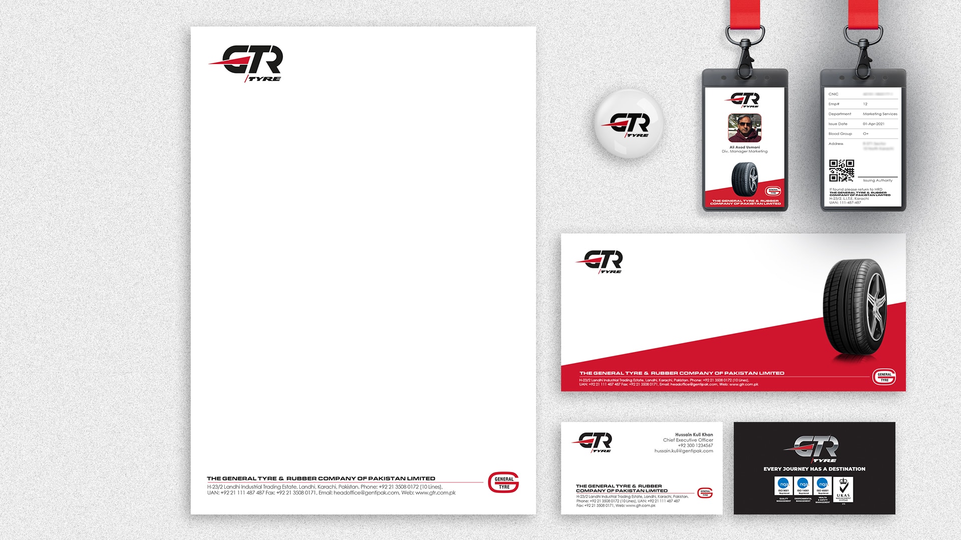
Labels

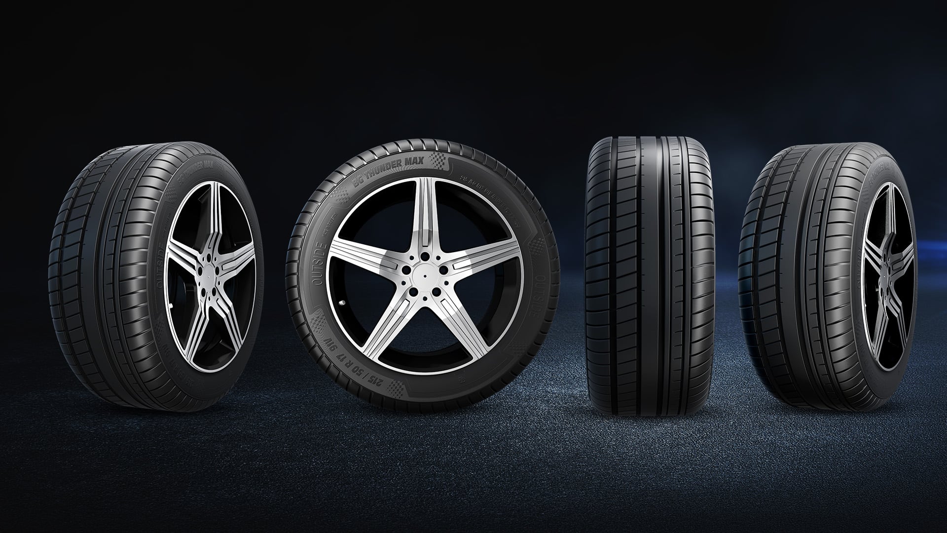
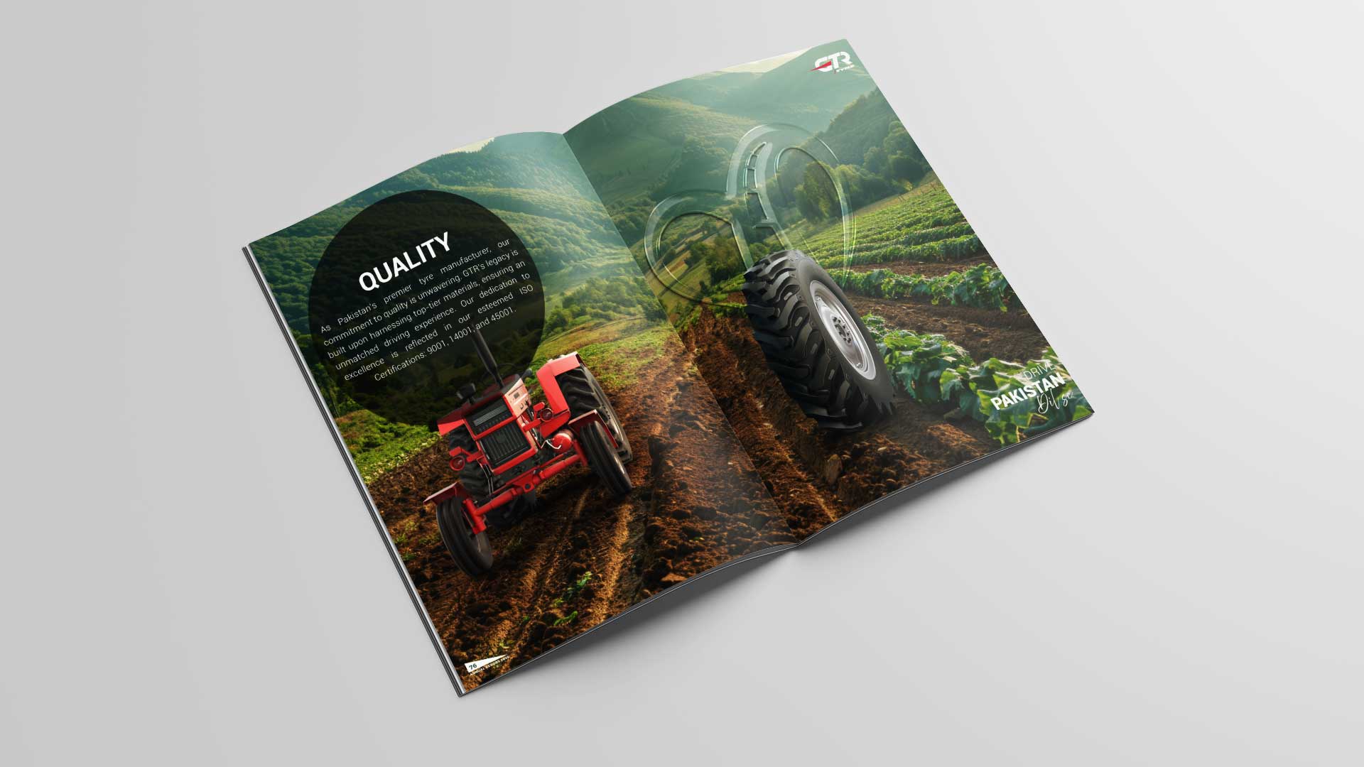
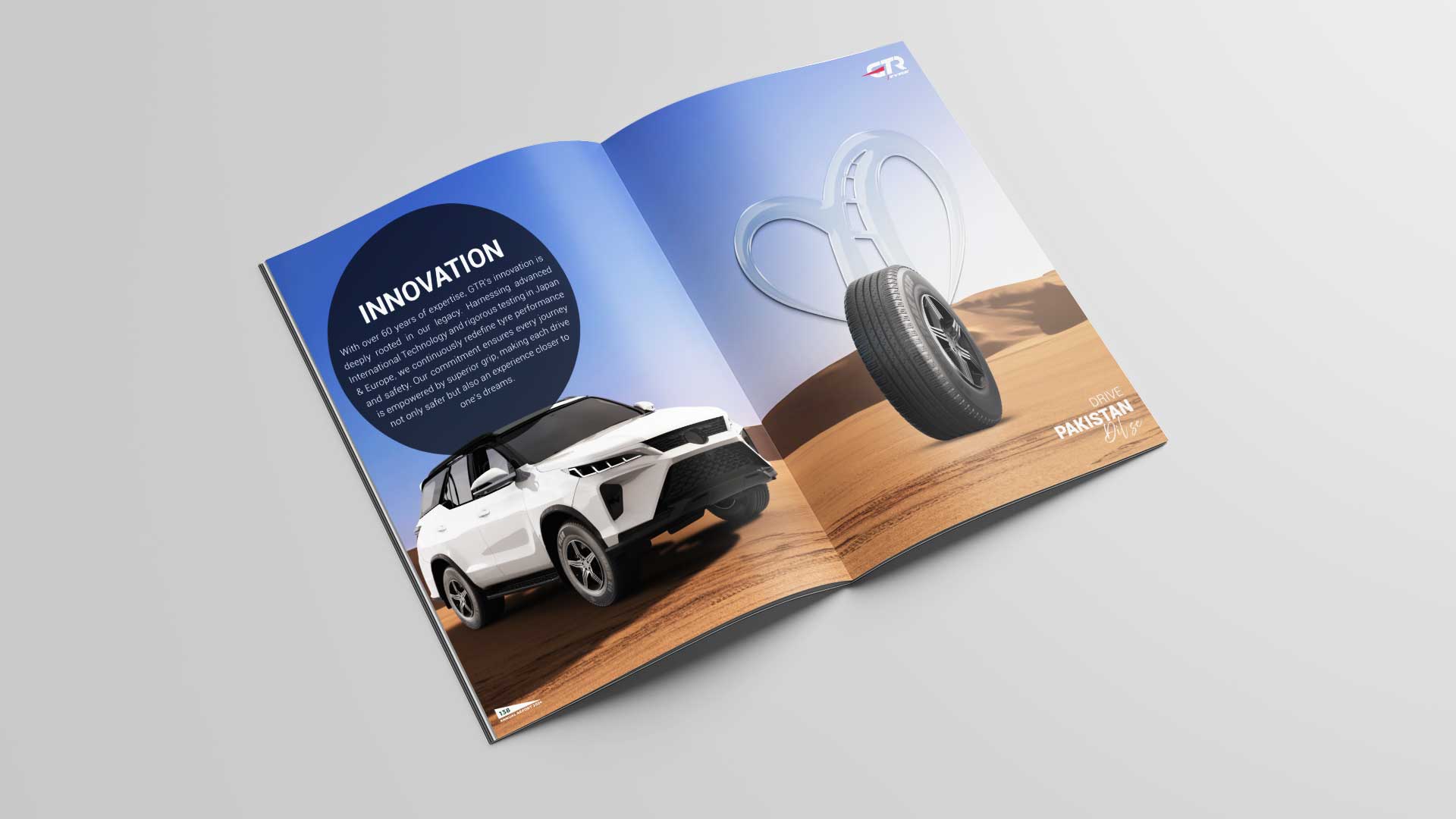
3D Tyres
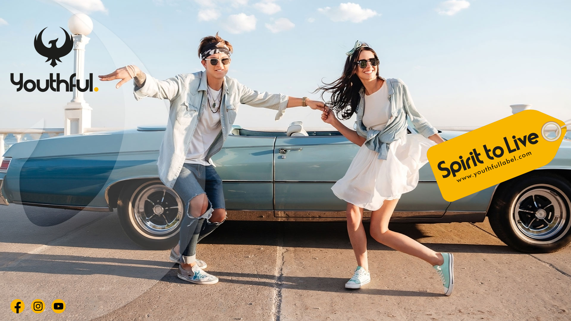
Bringing our creative platform to life
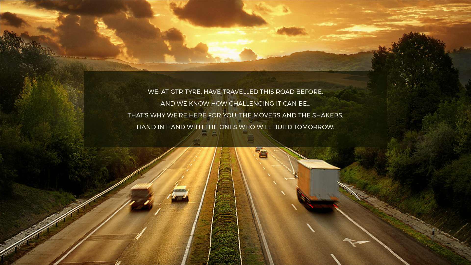
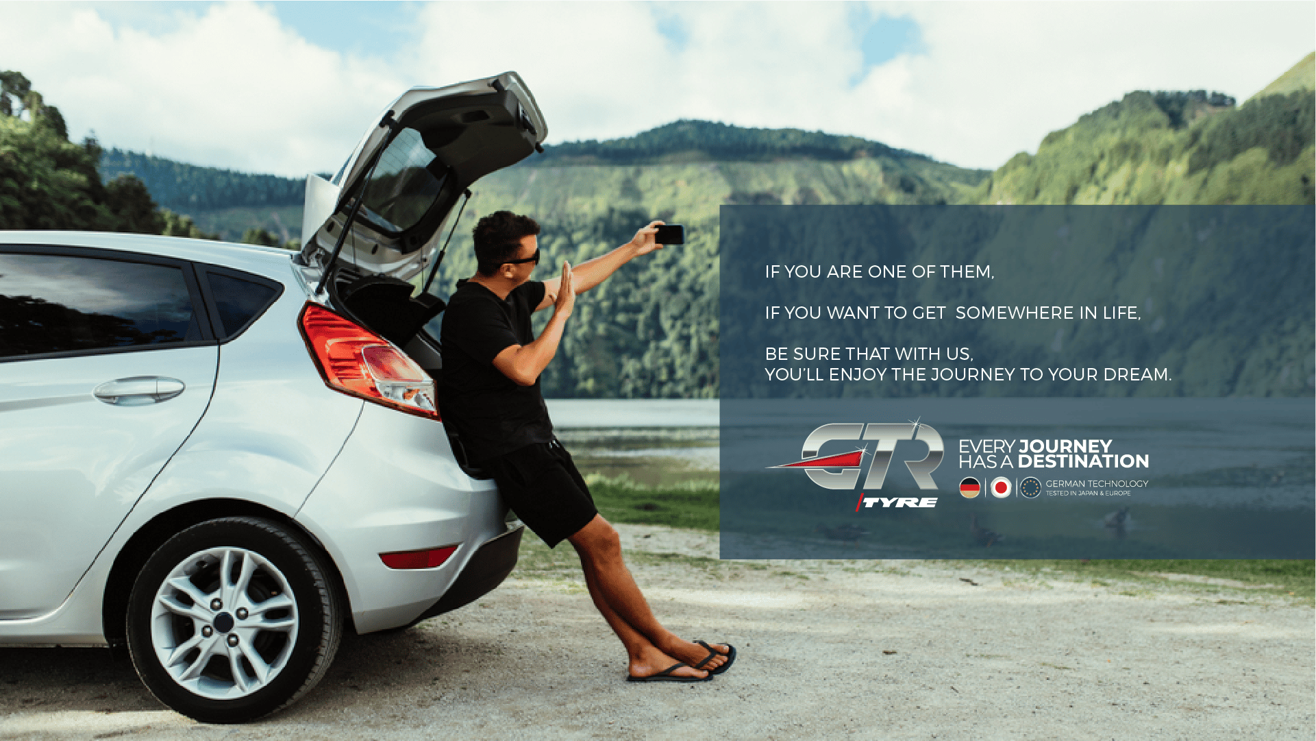
Through captivating storytelling, we brought the creative platform to life with the tagline, “Every journey has a destination.” The campaign follows the journey of a young achiever, showcasing beautiful landscapes, robust infrastructures and rough tracks—symbolizing the challenges of life’s journey. As a reliable journey partner, GTR Tyre ensures safety, comfort and a smooth ride, empowering young achievers to reach their dreams.
We collaborated closely with our strategic partners and communications platforms to ensure the brand message resonated deeply across all channels.
Achieving The Unachieved
- Brand Culture Network | A Brand-First Marcom Agency
- Creativecom | A Brand-First Creative Agency
- Media Idee | A Brand-First Amplification Agency
- MI Films Worldwide | A Brand-First Production Agency
- Founder, Chief Creative & Filmmaker: Ehmer Kirmani
- Co-Founder & ECD: Laur Barbu
- Executive Director – MENA: Xahid Rashid
NETWORK GLOBAL TEAM
- Creative Director (Copy): Jonathan Olivier
- Lead Strategists: Tuudor Lonut
- Brand Culture Strategists: Hasita Raisinghani
- Chief Architect & Designer: Ar. Purnia Farrukh
- Business Director: Sophia Melek
NETWORK REGIONAL TEAM
- Creative Director Amplifications: Shakeel Qureshi
- Art Director: Syed Imran Uddin
- Associate Creative Director: Syed Arsalan Ali
- Account Manager: Abeer Ullah Ansari
- Project: Team: Hussain Shakil, Muhammad Rashid & Faizan Rehman
MEDIA PULSE & MEDIA MATTERS TEAM
- Founder & CEO: Aleem Durrani
- Director: Natasha Durrani
- Business Director: Adeel Raza
- Account Director: Mohammad Ashar Noman
- Account Manager: Syed Muhammad Masud
- CEO/MD: Hussain Kuli Khan
- Executive Director Marketing: Muhammad Amin Khan
- GM Marketing Services: Ali Asad Usmani
- Marcom Consultants: Mahmood Nanji & Aleem Duraani
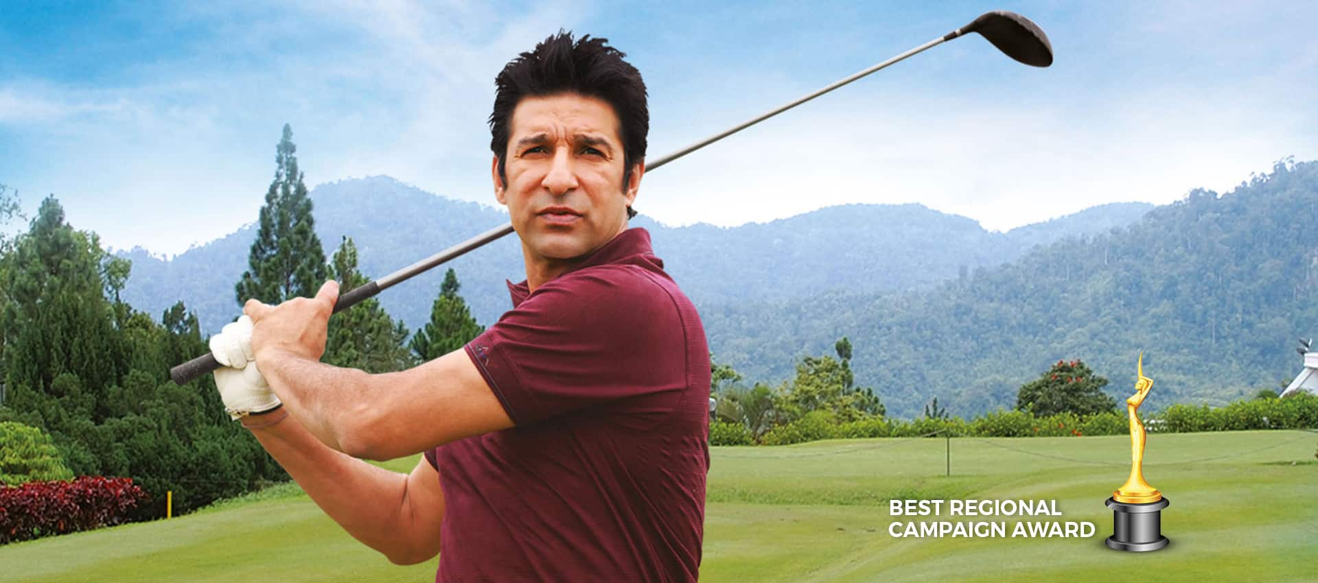
- Featuring Film & TV Star: Bilal Ashraf
FILM PRODUCTIONS TEAM
- Ideation, Storytelling & Direction: Ehmer Kirmani
- Managing Partner: Farrukh Kemall
- Art Direction Film: Ar. Purnia Farrukh
- Executive Producer: Sherry Brik
- Creative Producer: Shakeel Qureshi
- DOP: Zain Haleem
- AD: Syeda Maryam & Ather Zaidi
- Project Manager / BTS: Reehana Latif
- Camera Car: Islamuddin
- B-Roll DOP: Ali Haider Baloch
- Celebrity Management: Syed Noman Alam
- Fashion Stylists: Vardah Aziz
- Makeup: Nadeem William
- Stills: Iftikhar Ahmed
- Sound: Mono Productions
- Composer: Asif Noorani
- Vocalists: Sebastian & Juan
- Voice Over: Nad-e-Ali
- Color Grading: Zari Mohd @ Big Foot
- Production House: MI Films Worldwide
360º Integrated Marketing Campaign
Thematic TVC
GTR Zalmi TVC | The Generation of Achievers
Our Journey - Documentary
GTR Tractor Tyre
GTR Launch Event Identity Revealing
GTR
Every Journey Has A Destination
The Result
The transformation resulted in a 3X acceleration in growth, far exceeding industry benchmarks and solidifying GTR’s position as the No.1 selling tyre brand.
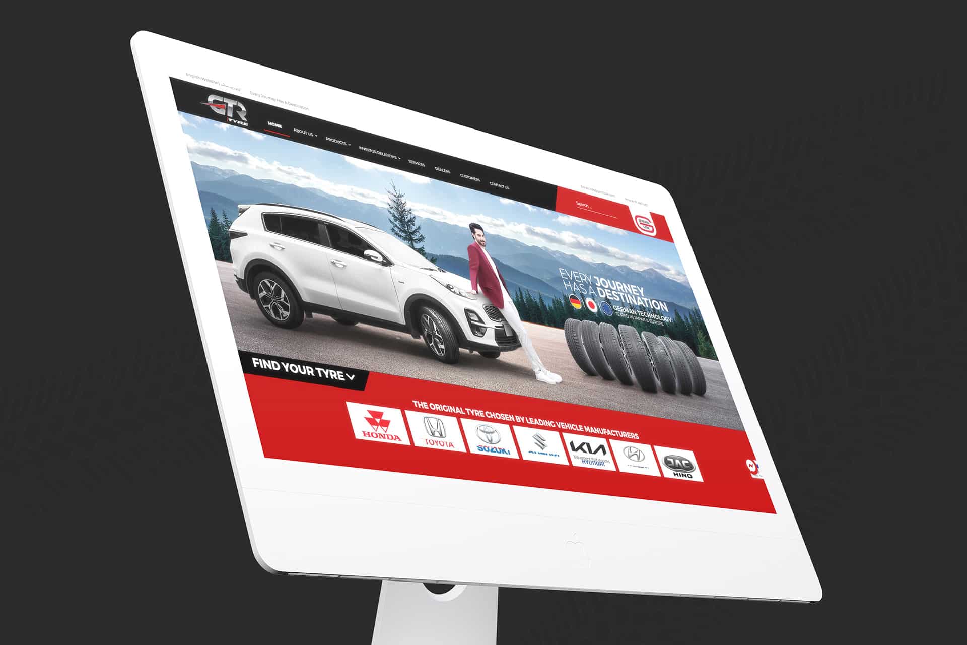
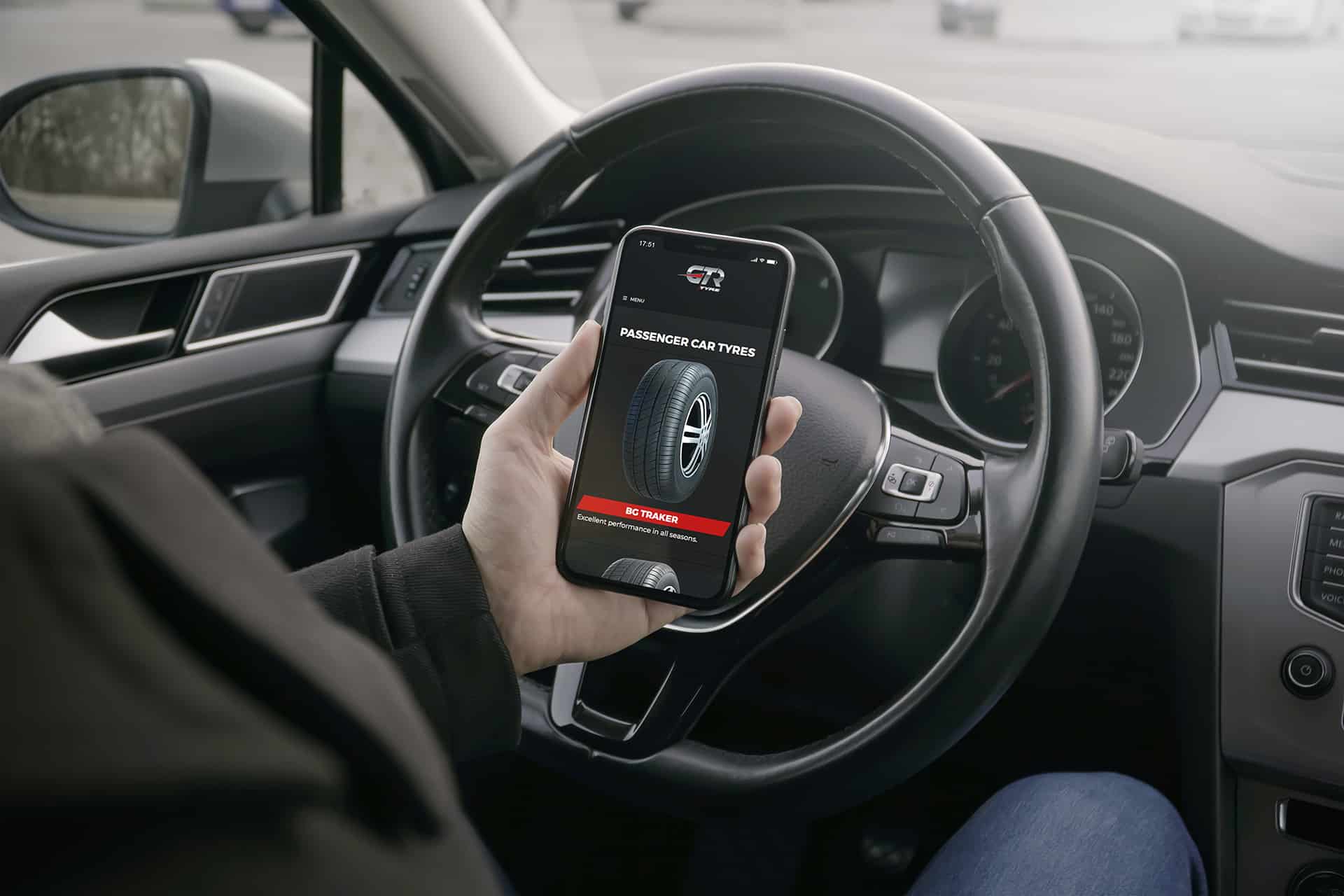
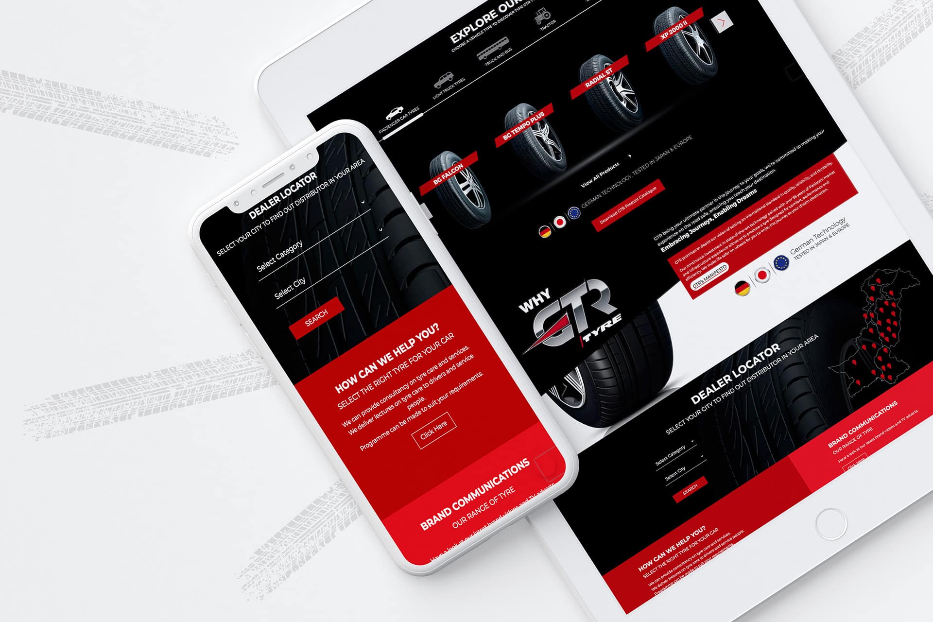
Digital Transformation
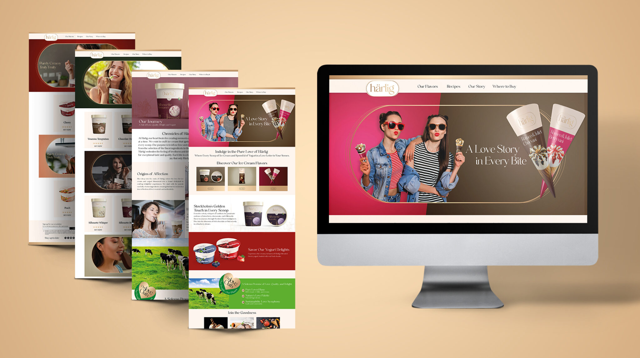
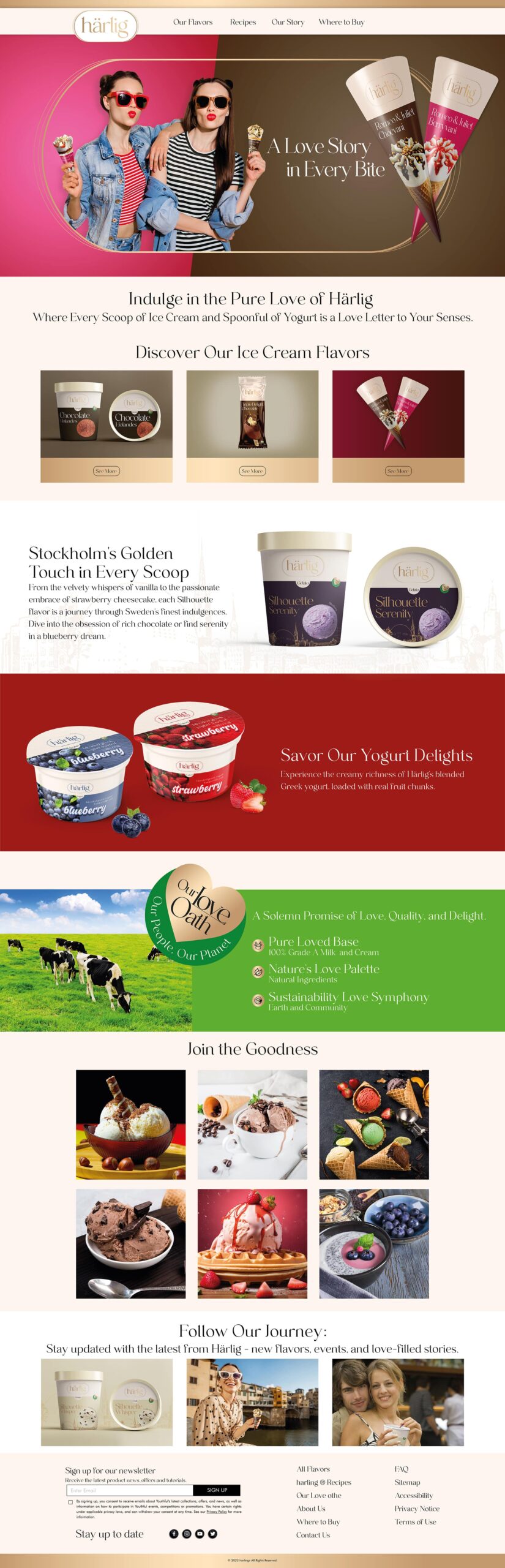
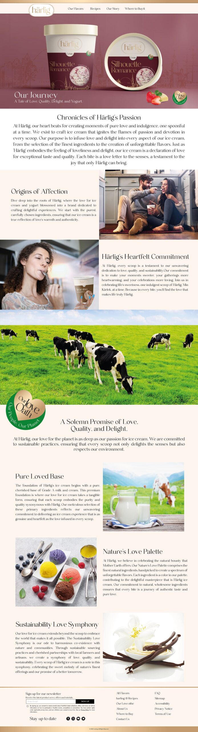
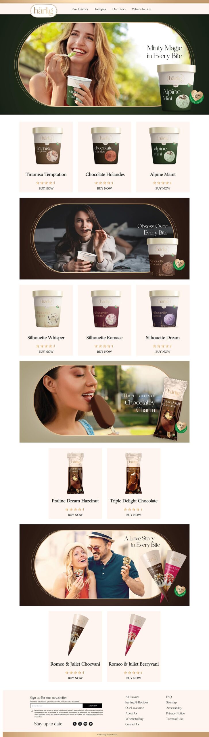
A critical component of the rebrand was the digital transformation of the GTR website. In collaboration with Media Idee, we reimagined the website to reflect the brand’s new dynamic, sleek and modern aesthetic, while maintaining the grit and reliability of GTR Tyre. This transformation made it easier for users to navigate tyre options and explore designs, offering a seamless and purpose-driven experience for the modern consumer.
A Digital Experience Reinvented for a Purpose-Led Brand
By diving deep into GTR’s brand story, product portfolio, customer base and competitive landscape to re-architect a digital presence that would not only reflect the brand’s vision but scale across regional markets and diverse customer needs.
This wasn’t just a redesign — it was a complete digital overhaul, building GTR.com.pk into the digital hub of Pakistan’s No.1 selling tyre brand. From form to function, every detail was meticulously designed to align with GTR’s bold new vision.
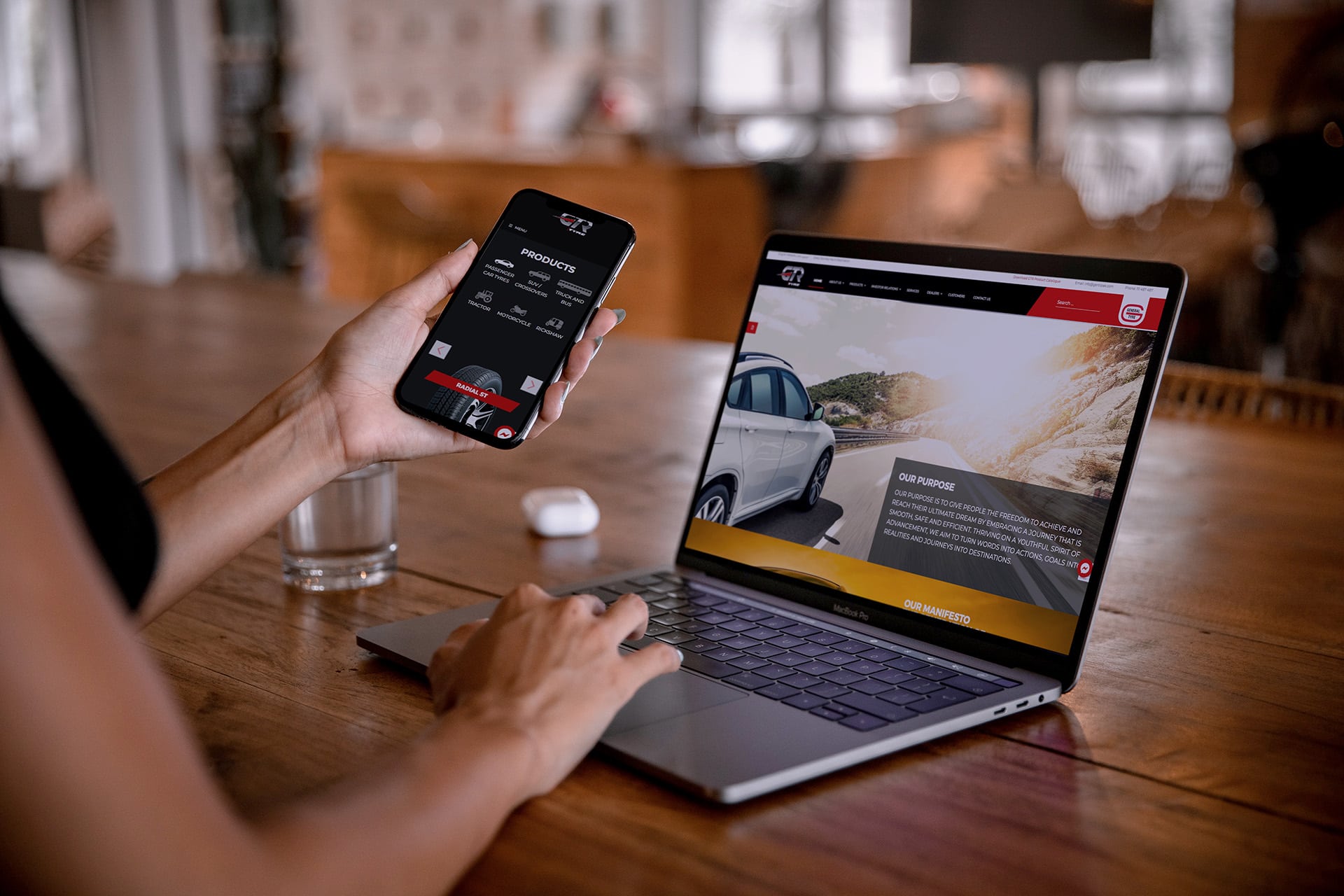
An Experiential Journey Accelerated on the Digital Landscape
It stands as a benchmark for automotive digital transformation in Pakistan, reinforcing GTR’s leadership and resonating with a new generation of drivers and achievers — because every journey has a destination.
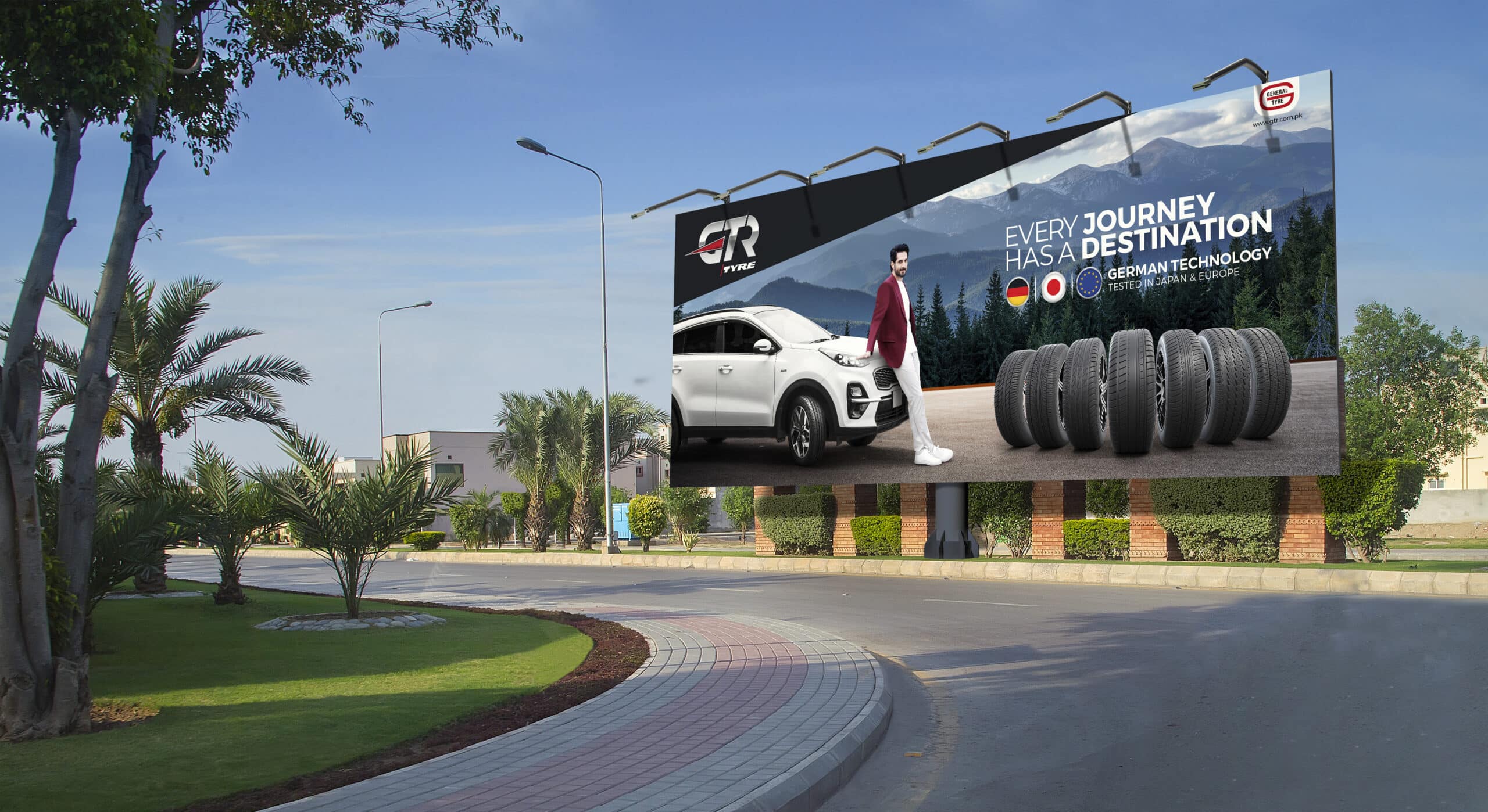
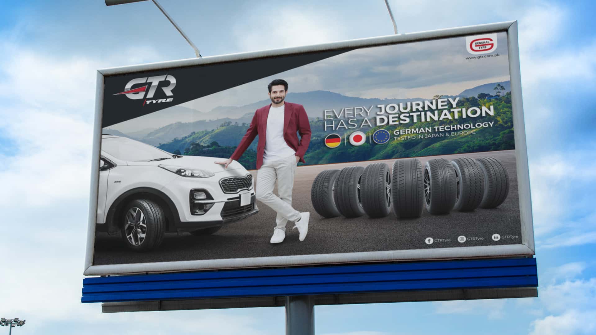
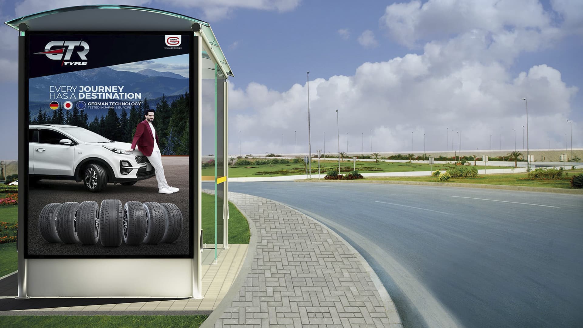
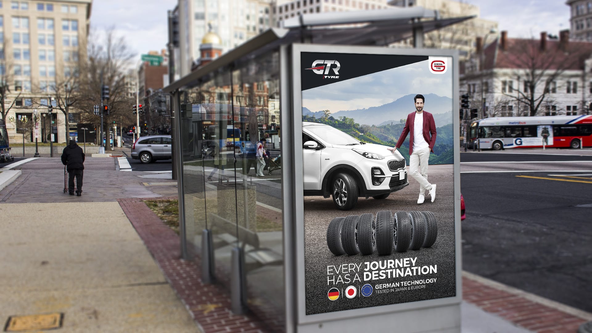
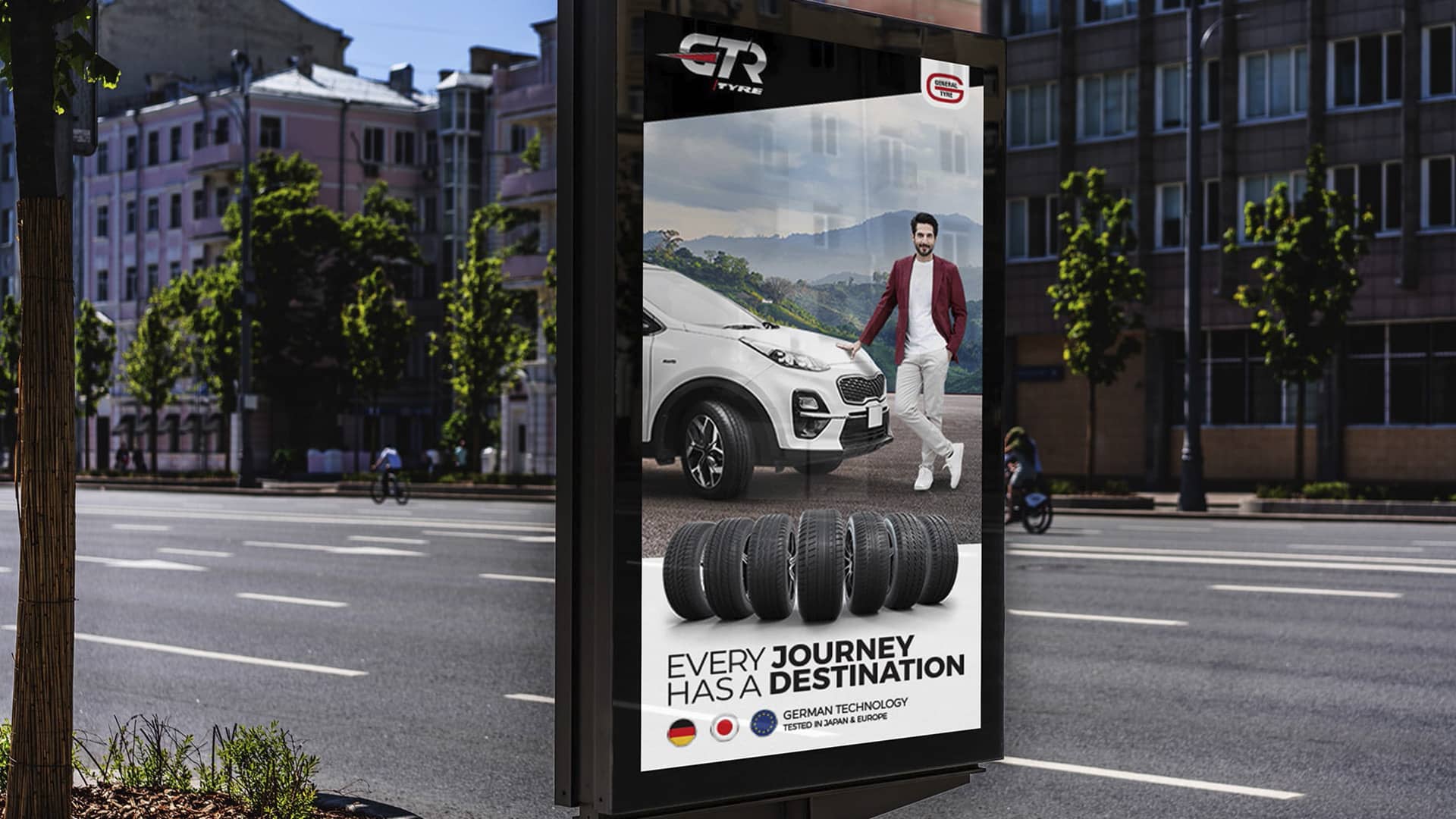
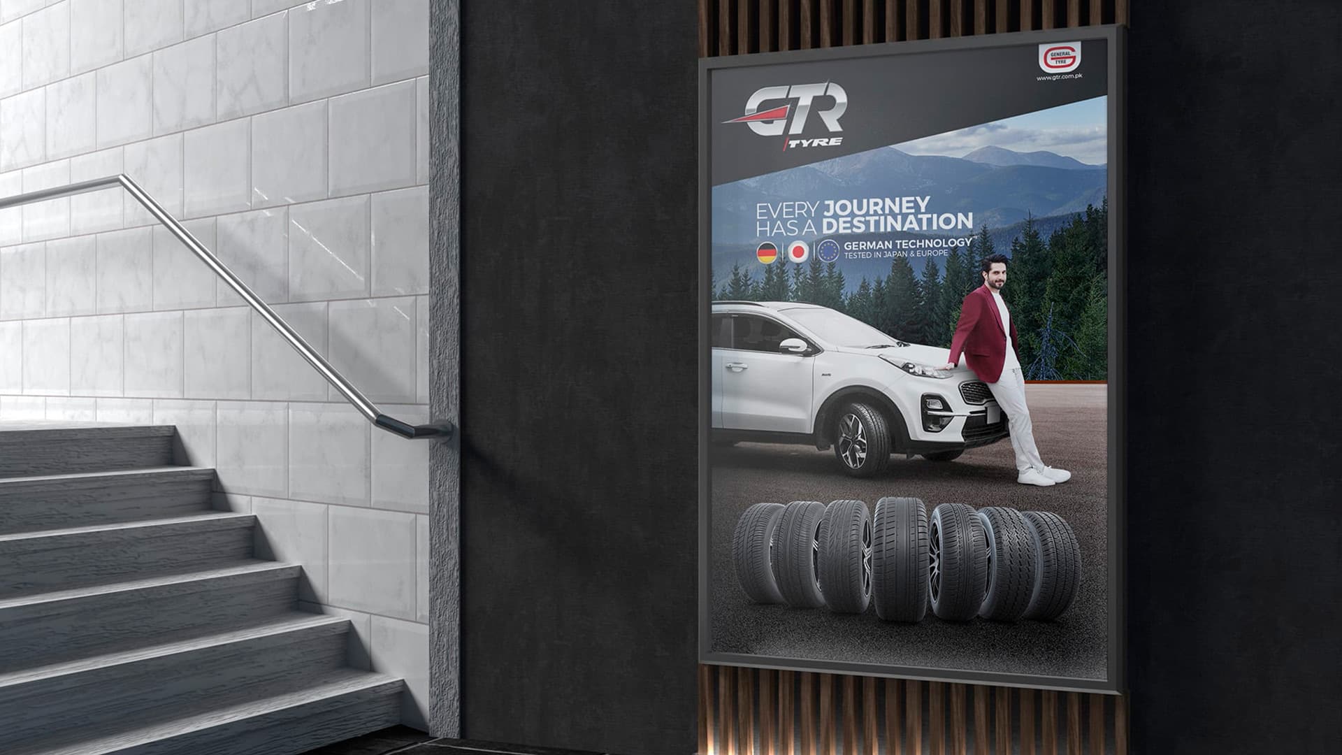
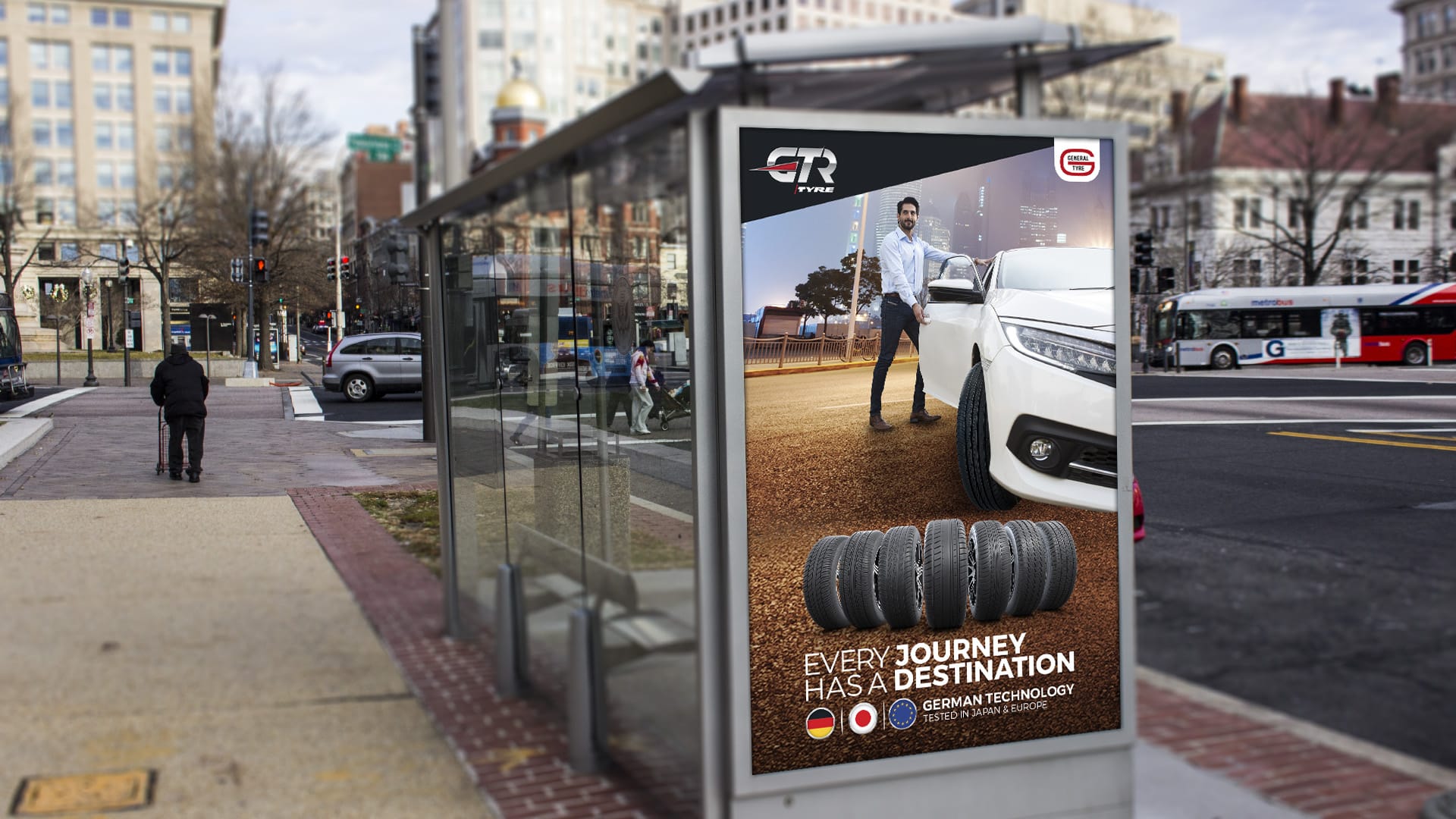
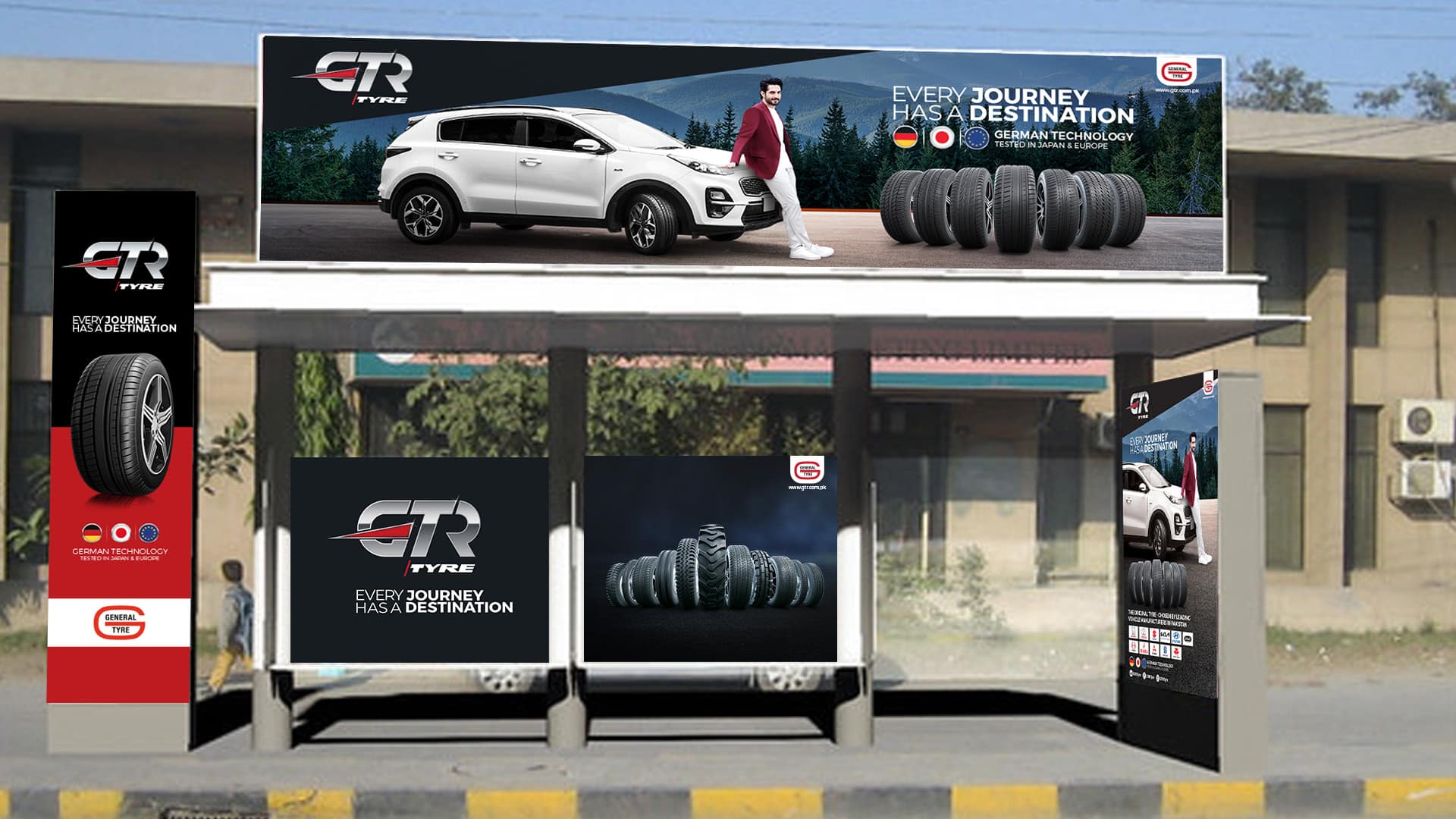
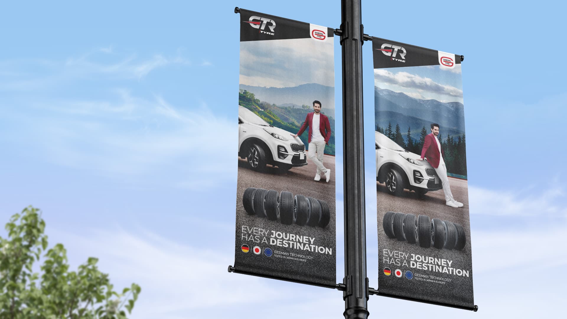
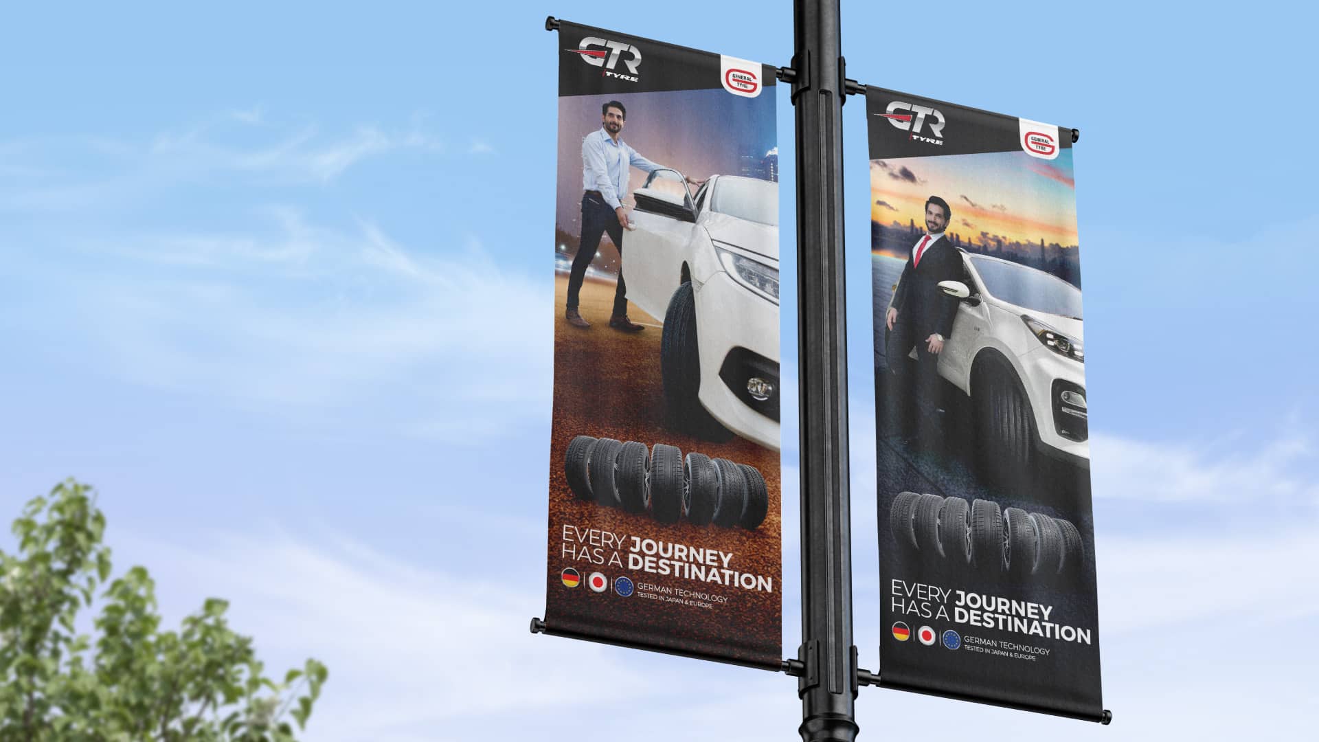
DOOH
Digital Achiever Pylon
Digital Achiever Streamers
Digital Achiever Billboards
DOOH Content & Out-of-Home Visibility
To match the scale of GTR’s rebrand and launch, Media Idee in collaboration with its network agencies delivered a multi-format DOOH campaign that brought the brand’s bold new identity to life across Pakistan’s urban landscape.
This wasn’t just about visibility — it was about creating iconic touchpoints that made the GTR transformation unmissable in the real world.
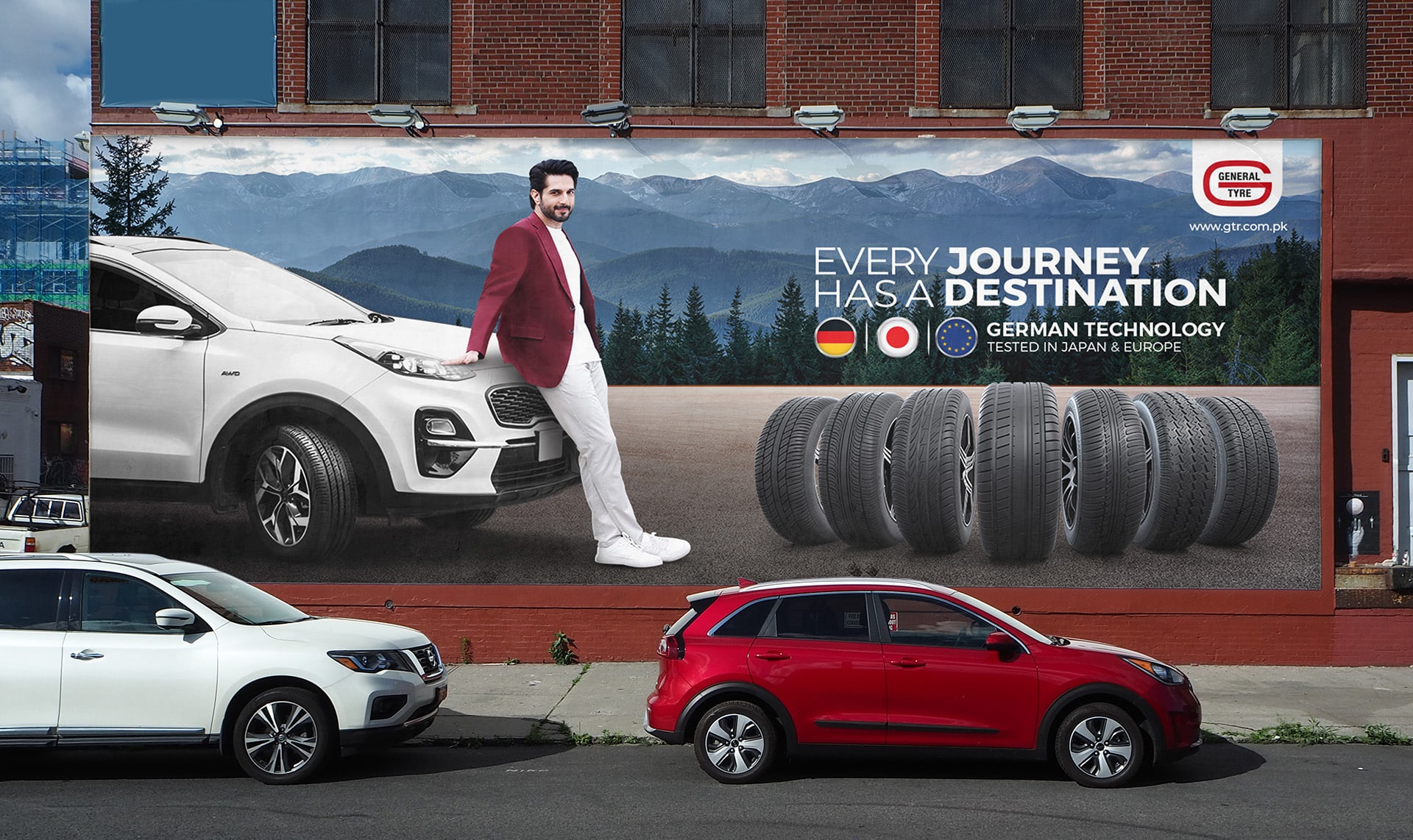
OOH Traditional
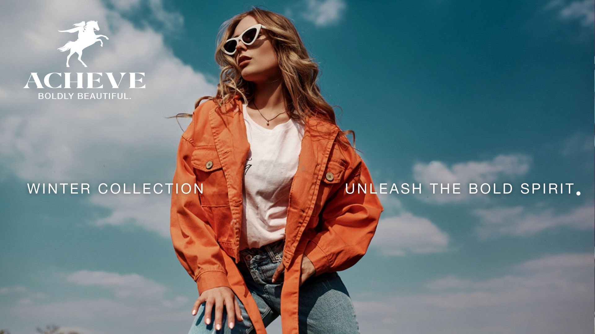
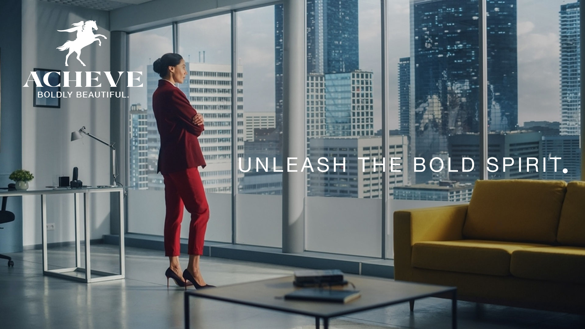
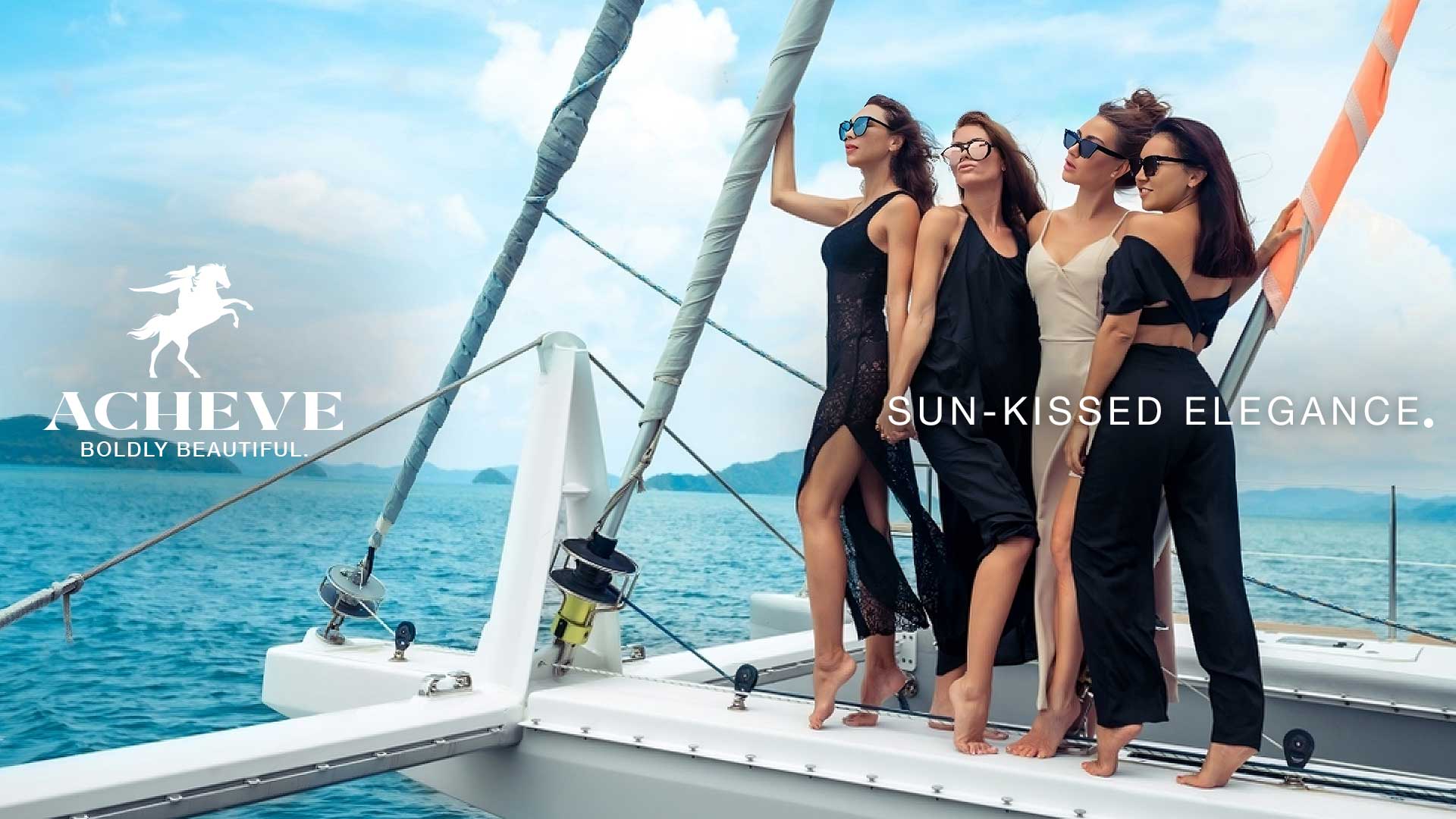
Key Visuals
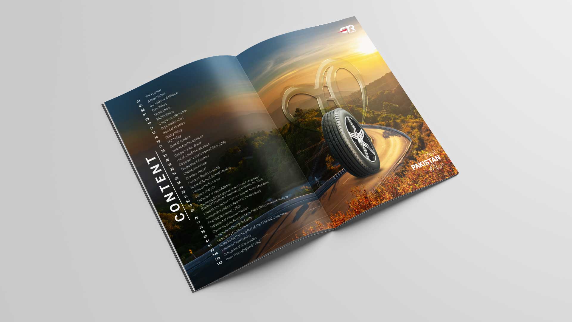
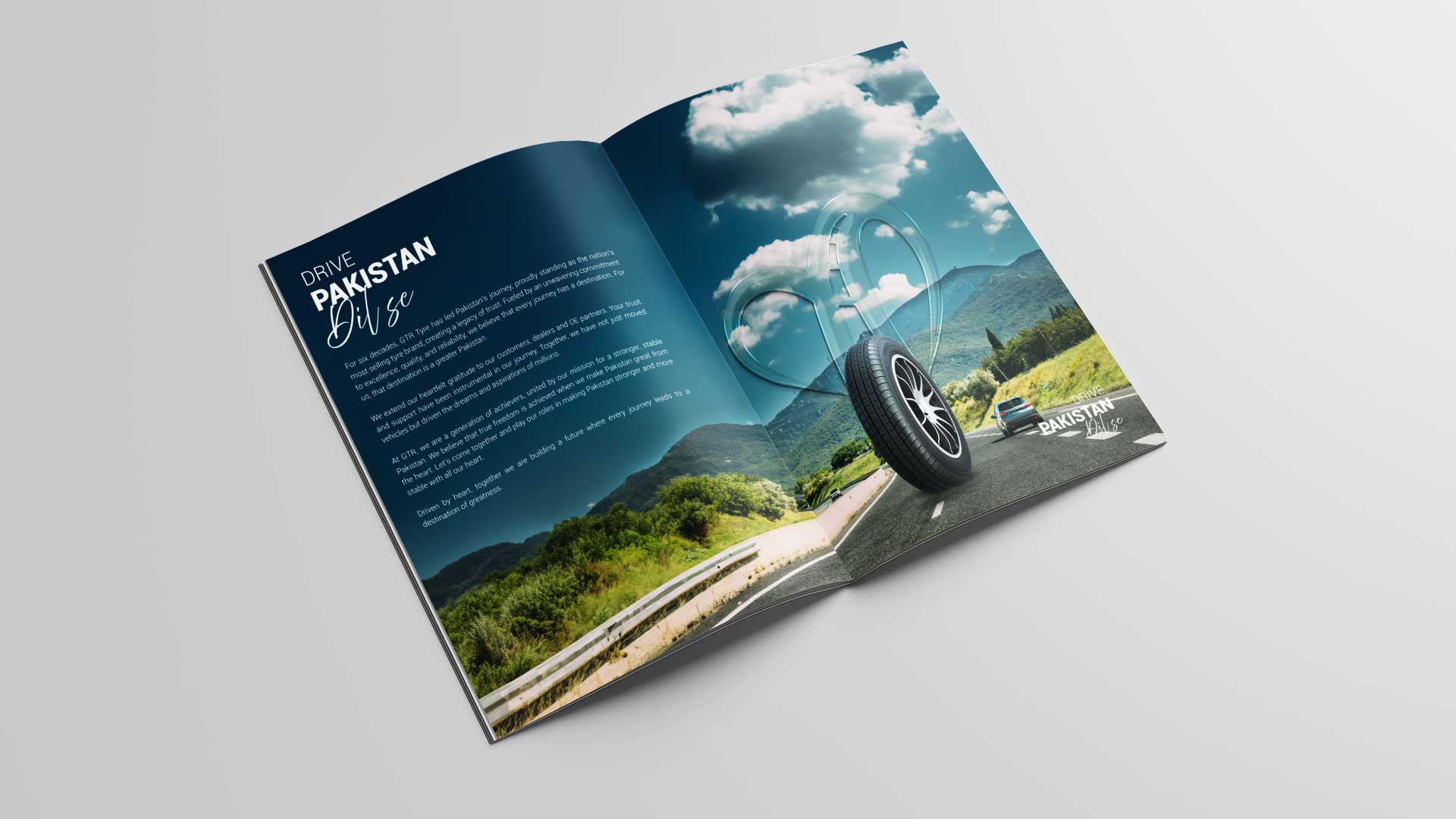
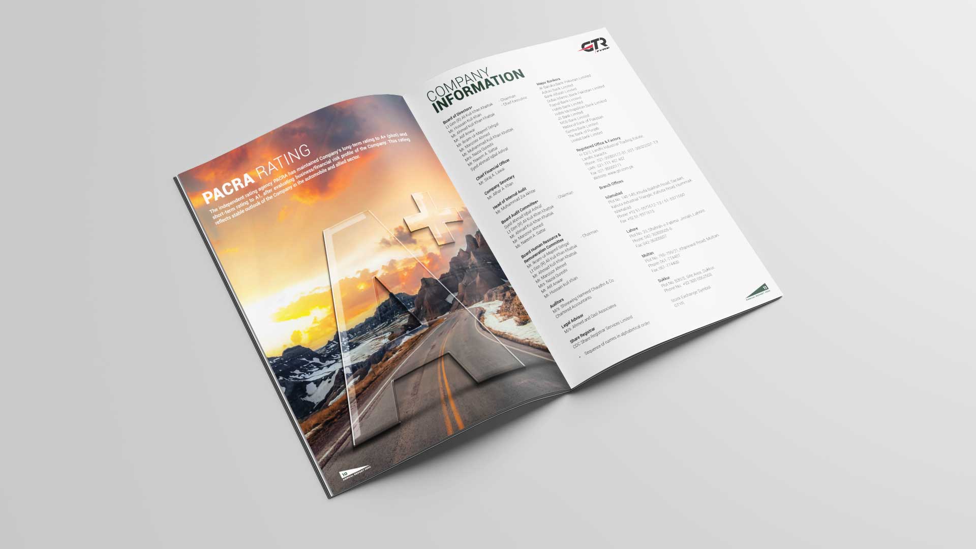
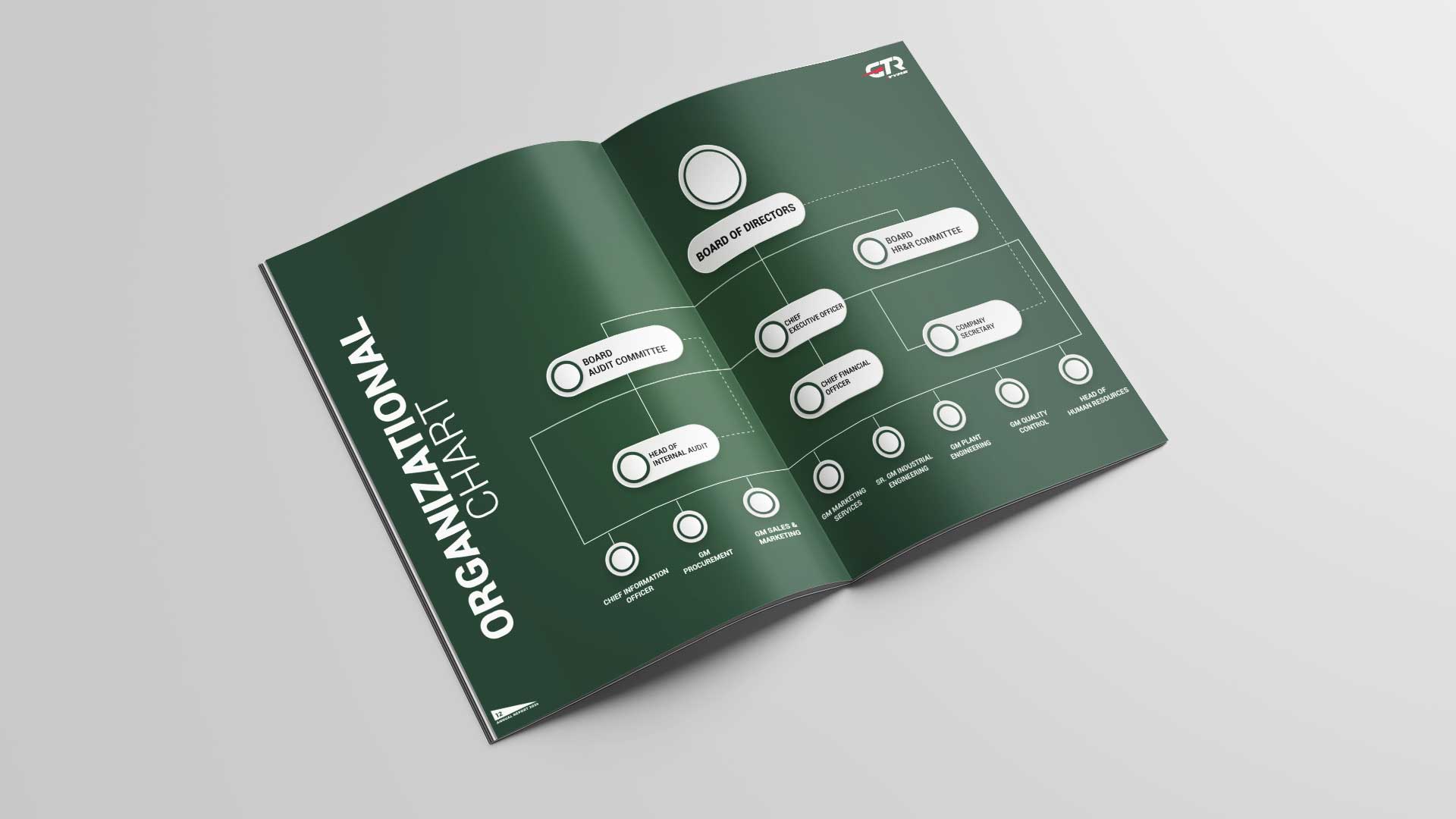
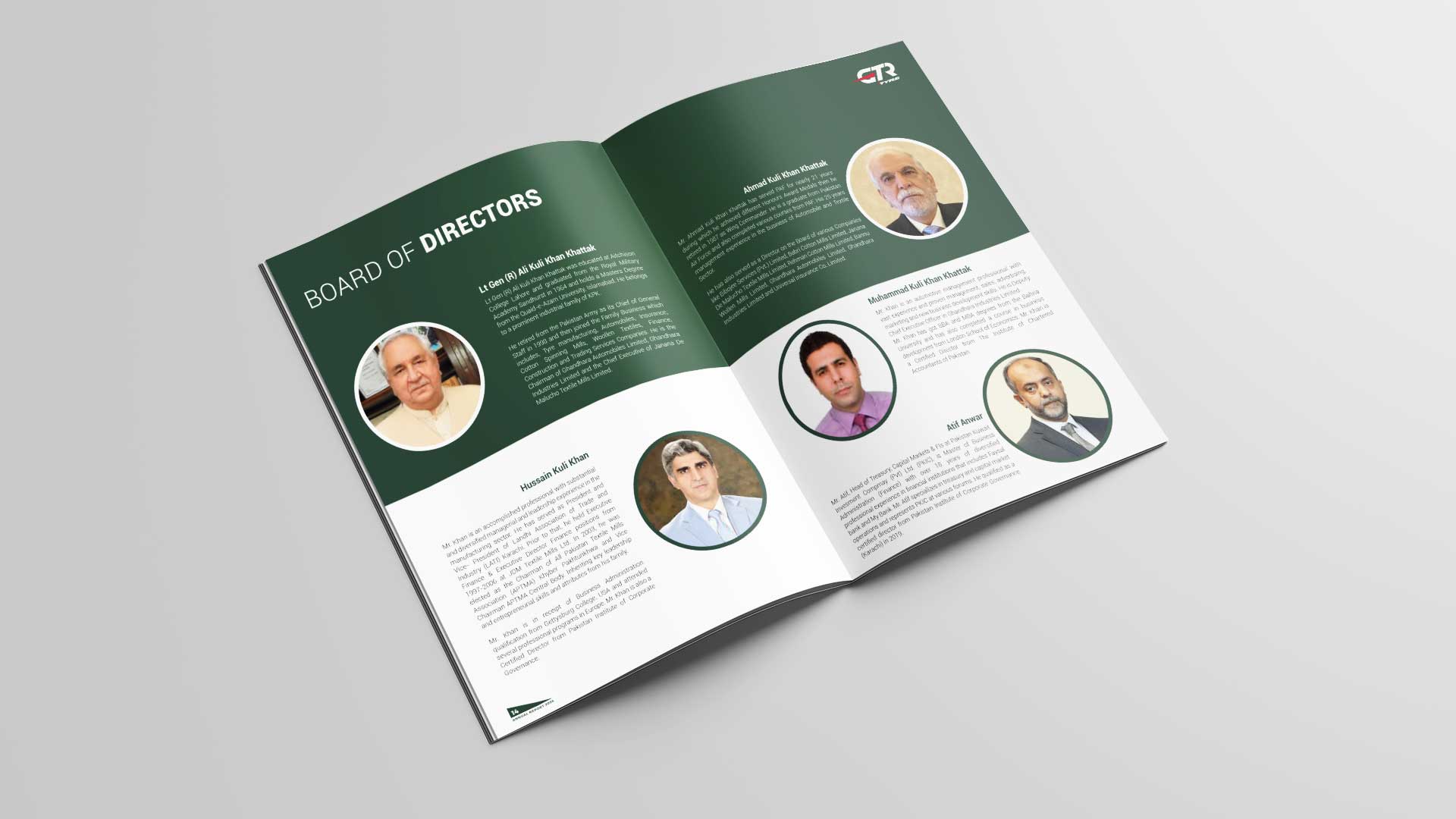
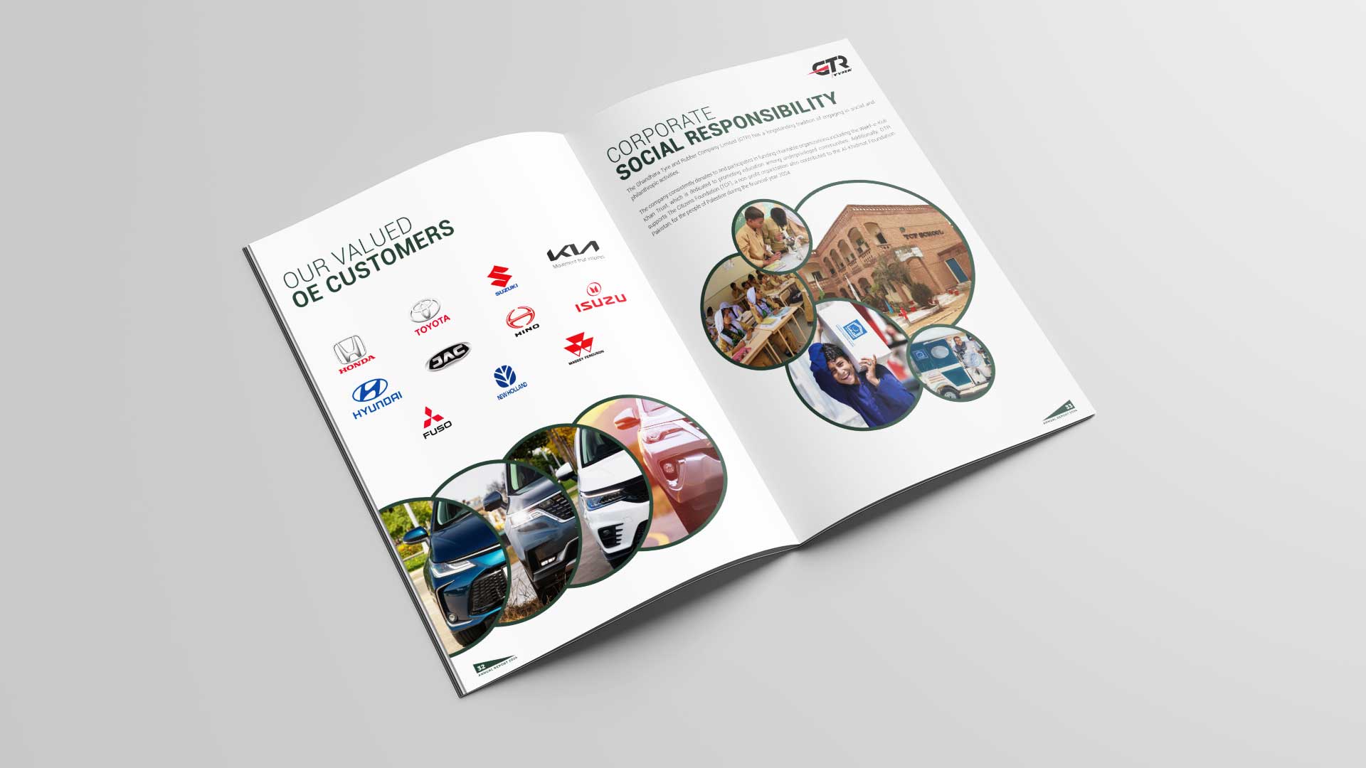
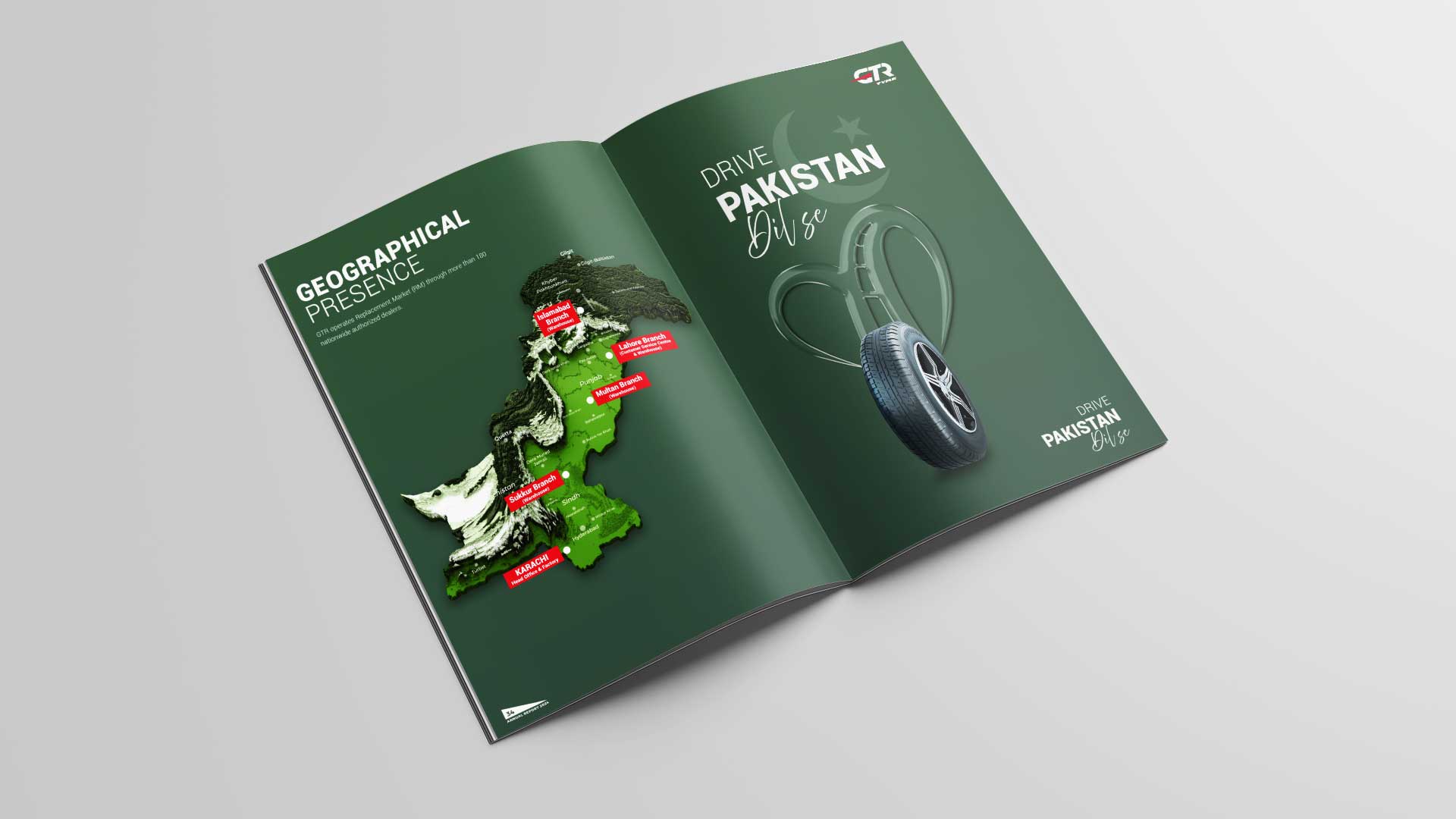
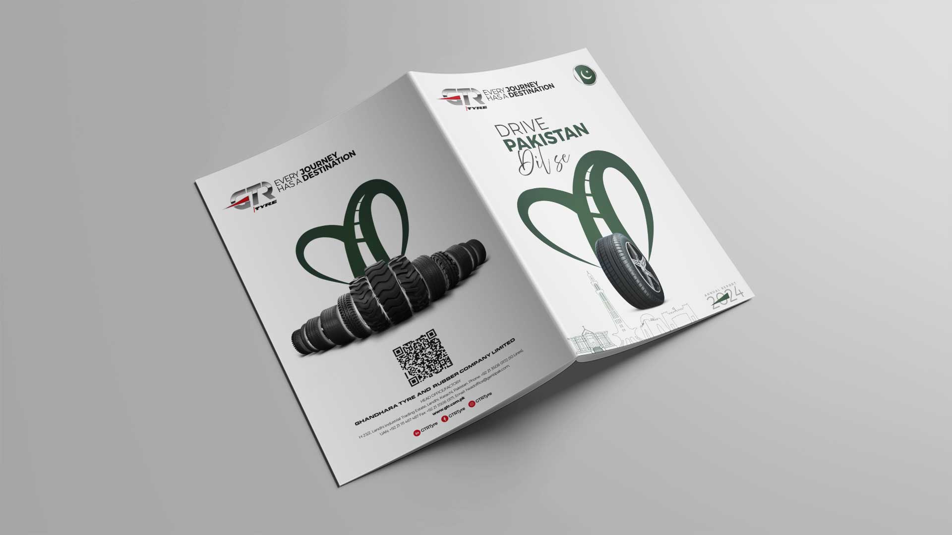
Annual Report 2024


Print Ads
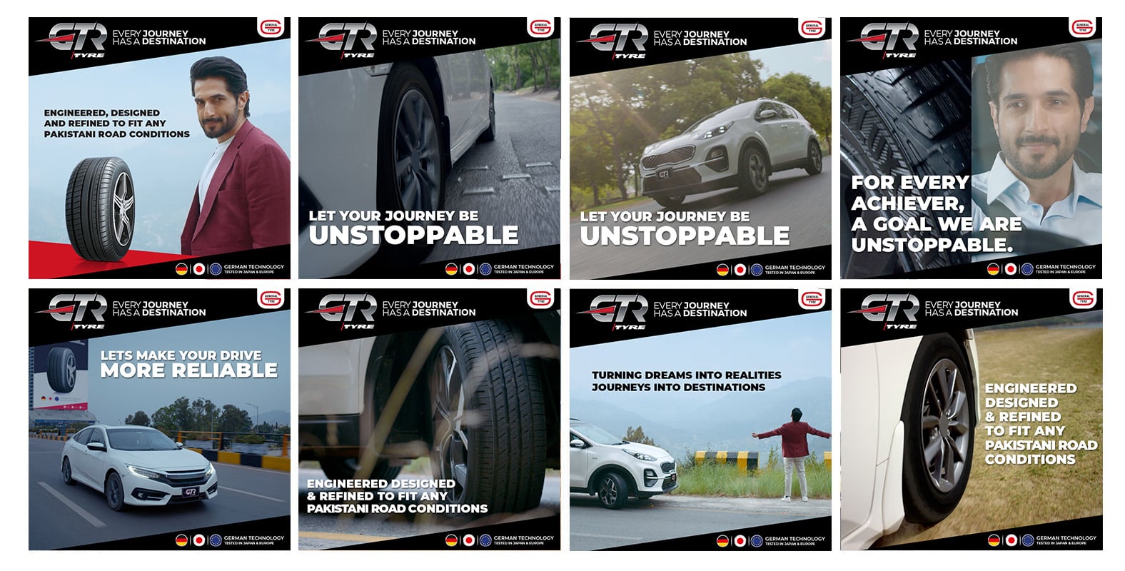
Always-On Digital & Social Campaigns
Beyond launch, Media Idee, in collaboration with its network of creative and film production agencies, has remained GTR’s digital performance engine — consistently producing a rich library of purpose-led content across platforms.
From product awareness to patriotism, from youth empowerment to performance education — this always-on strategy ensured GTR stayed top-of-mind throughout the year.
Digital Shoutouts
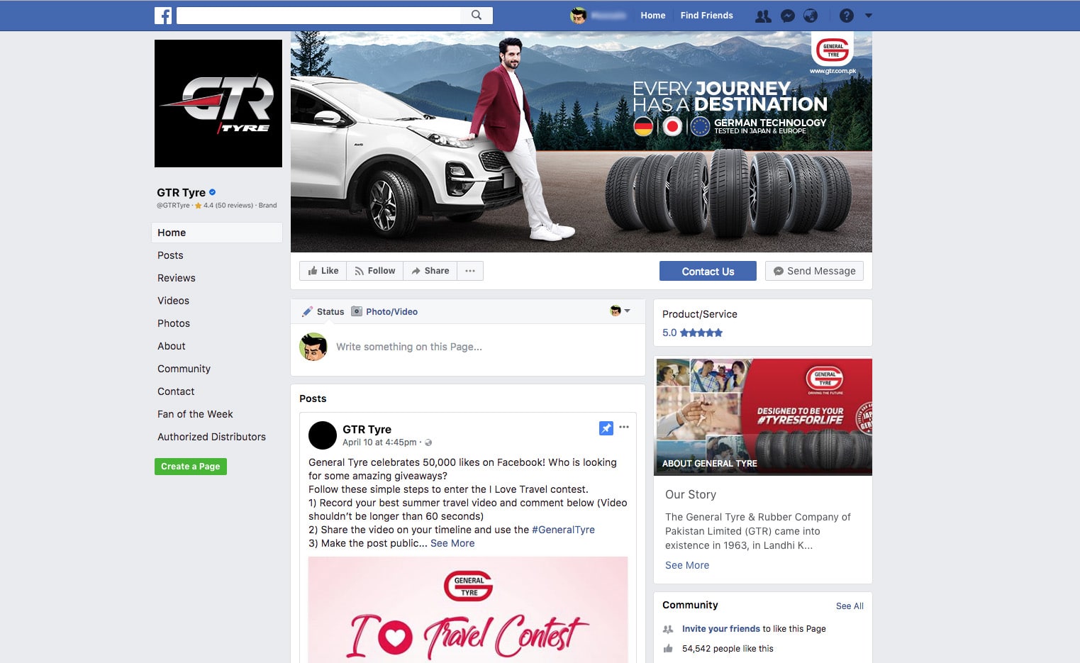
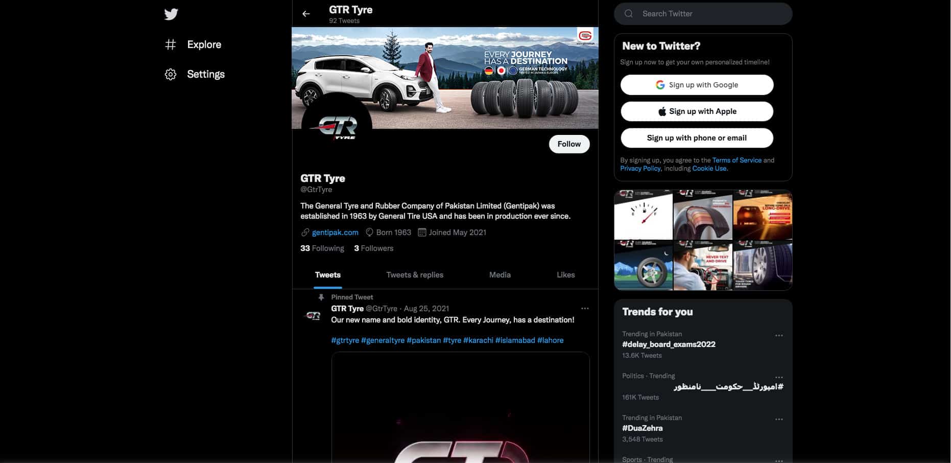
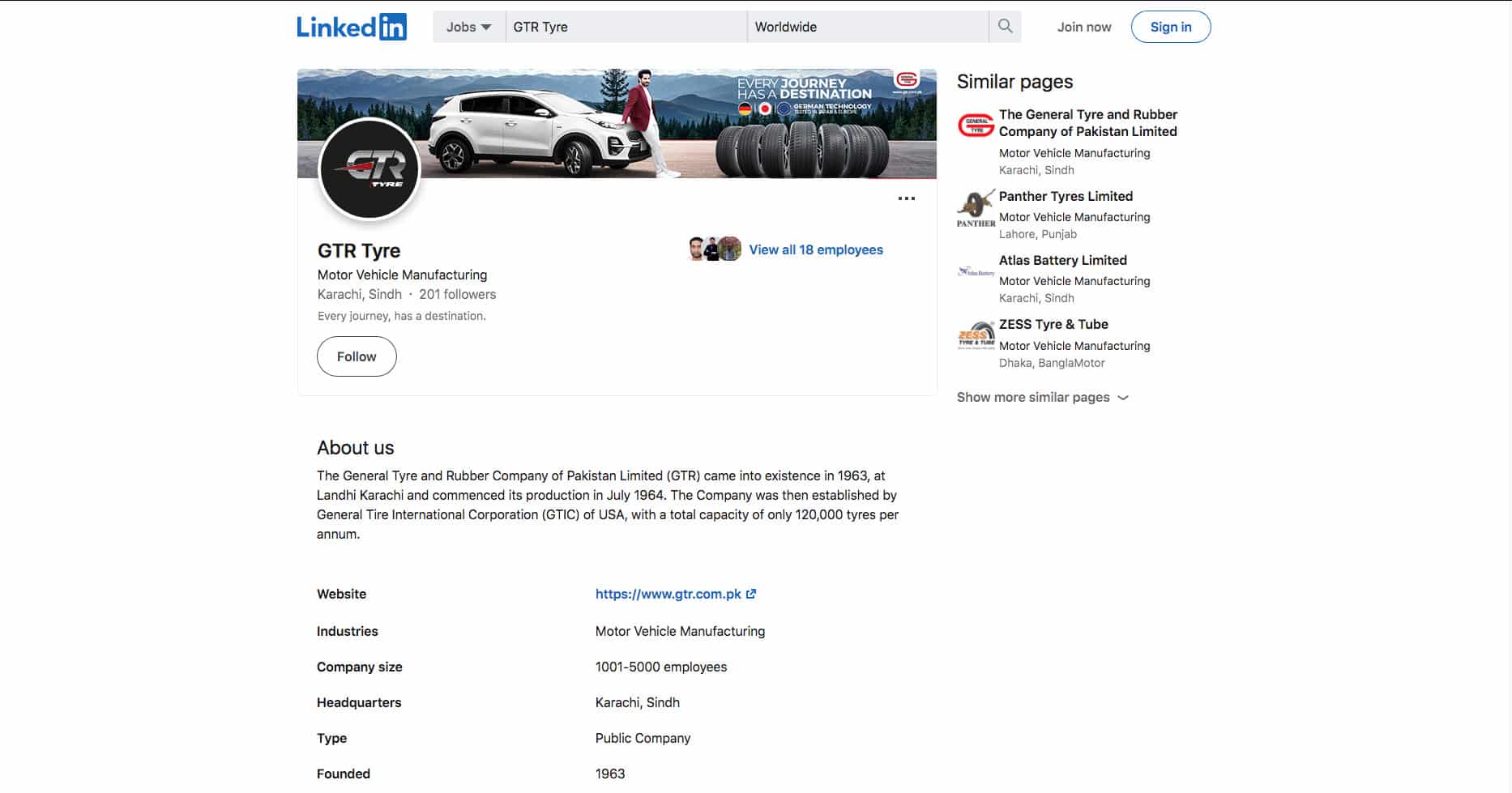
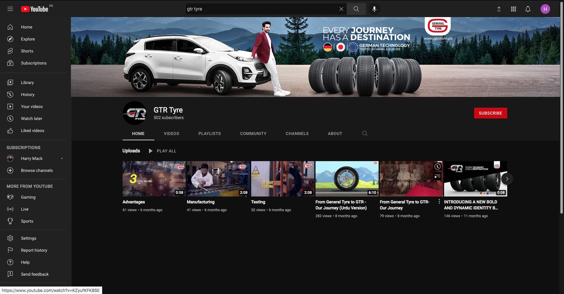
Digital Social Pages
Annual Report
Exhibition Stall
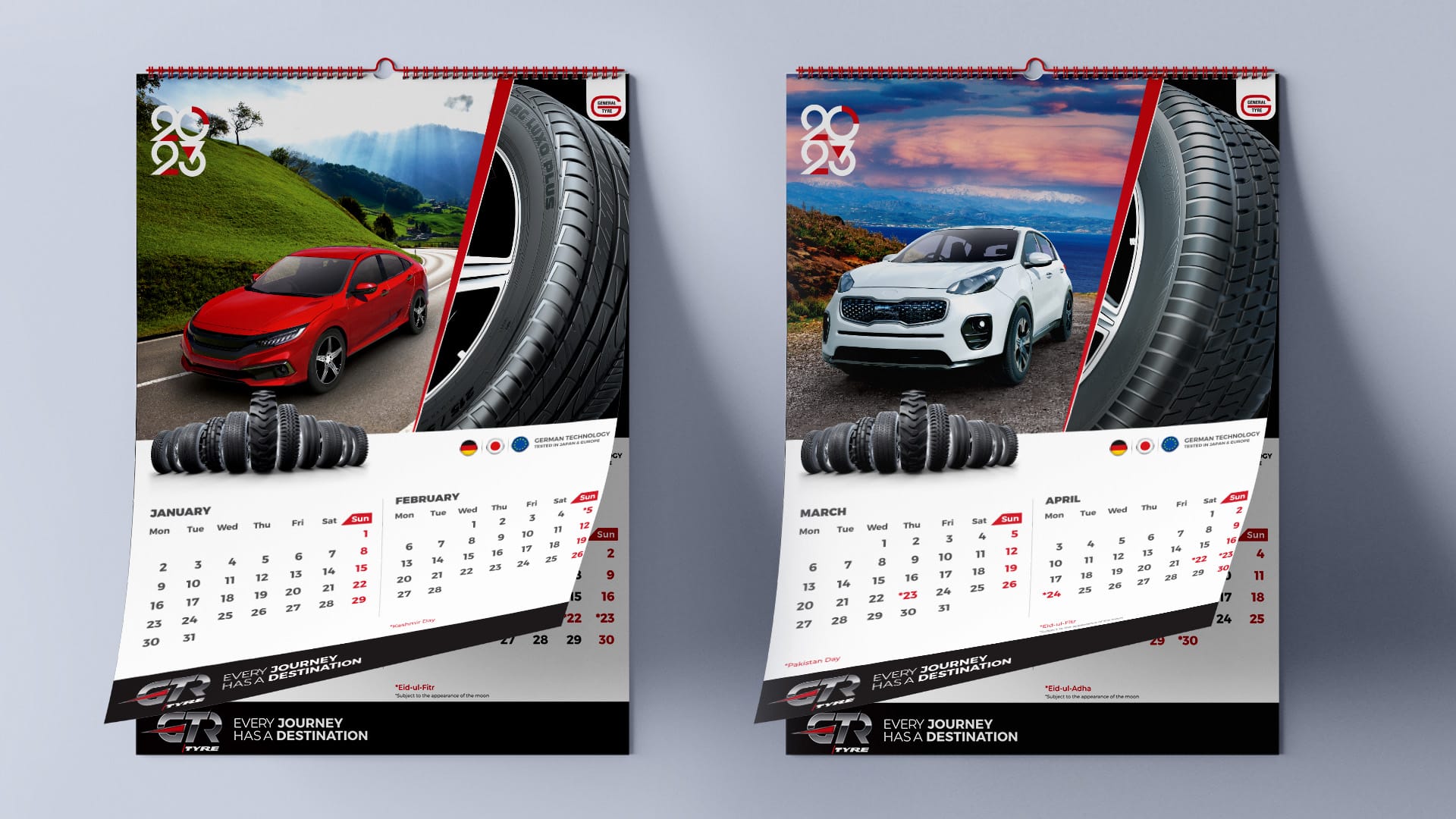
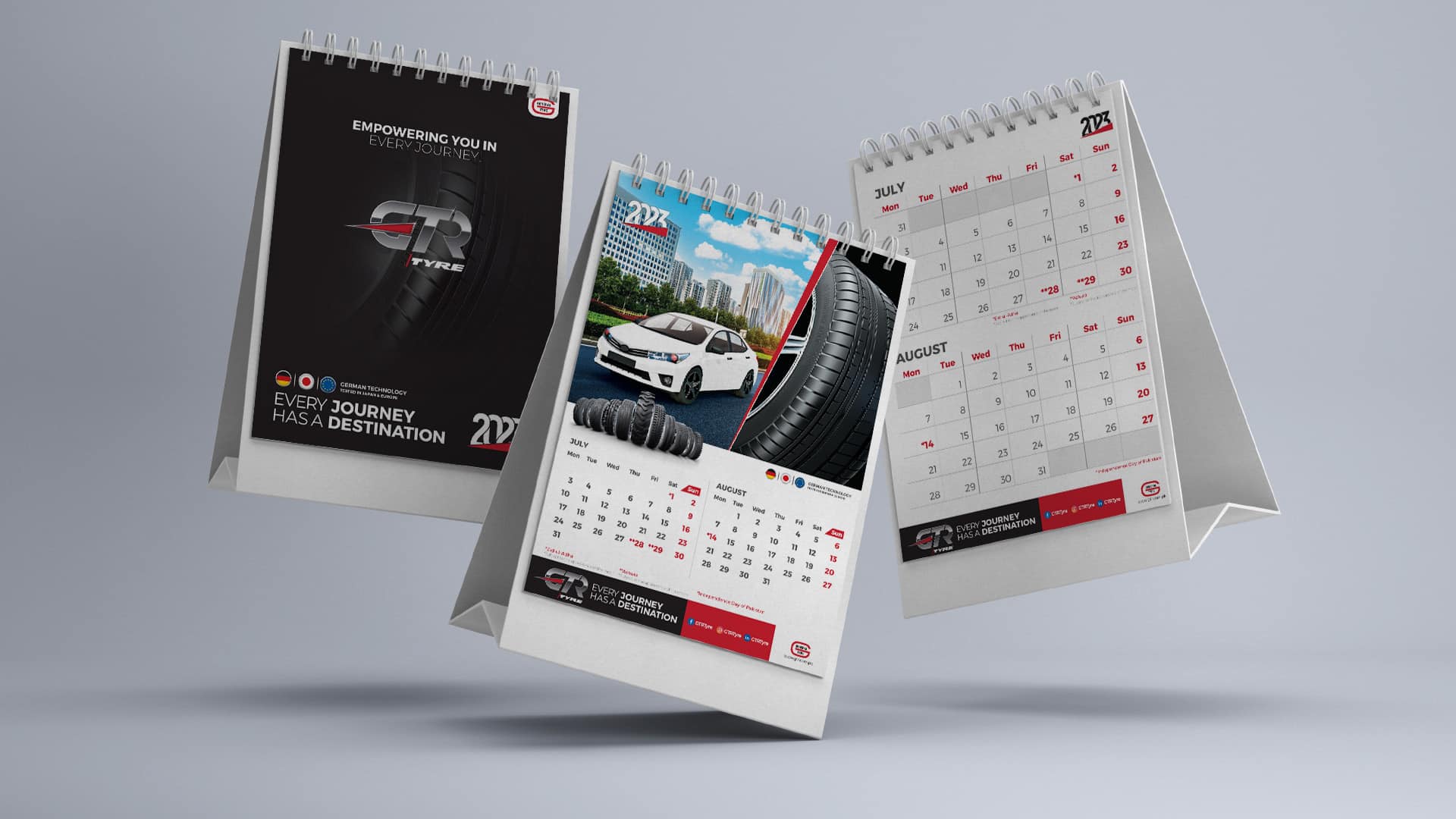
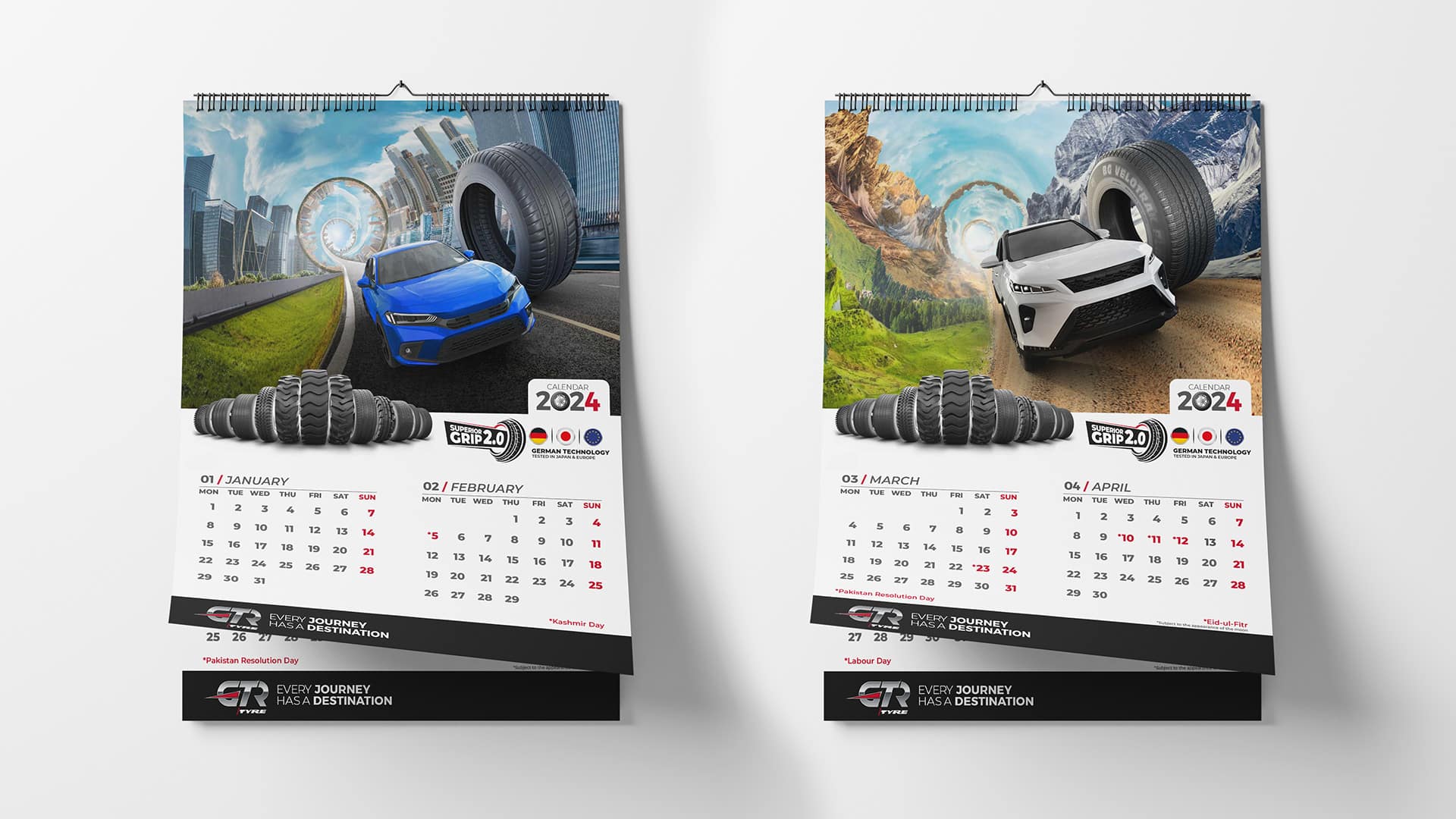
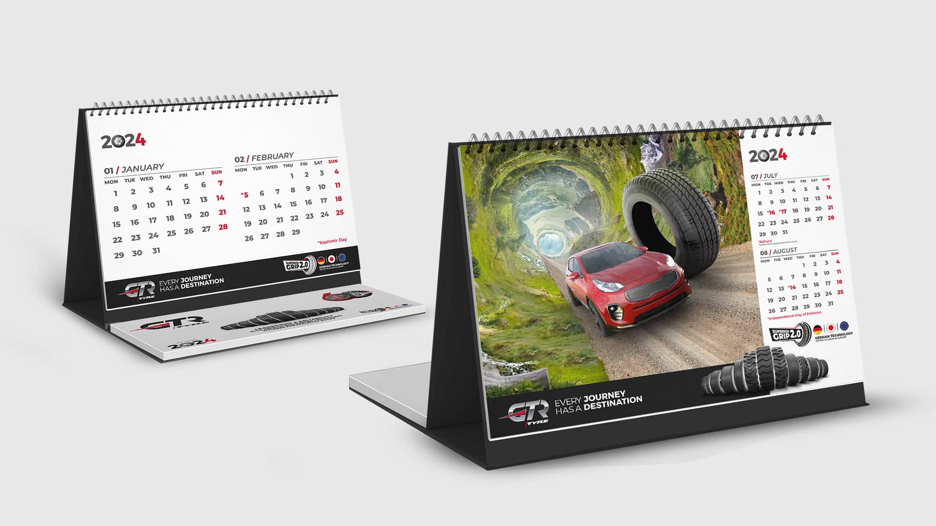
Calendar
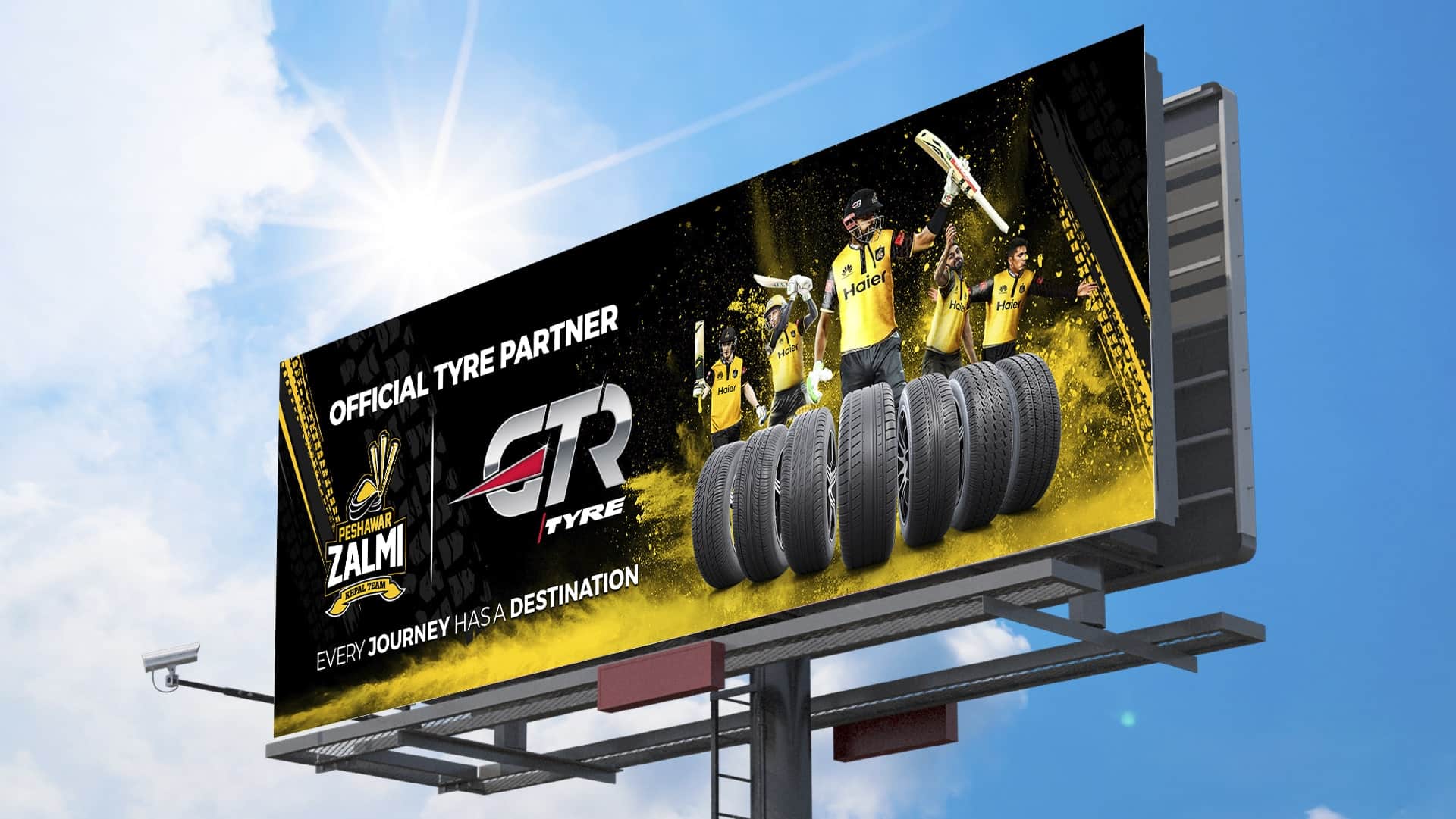
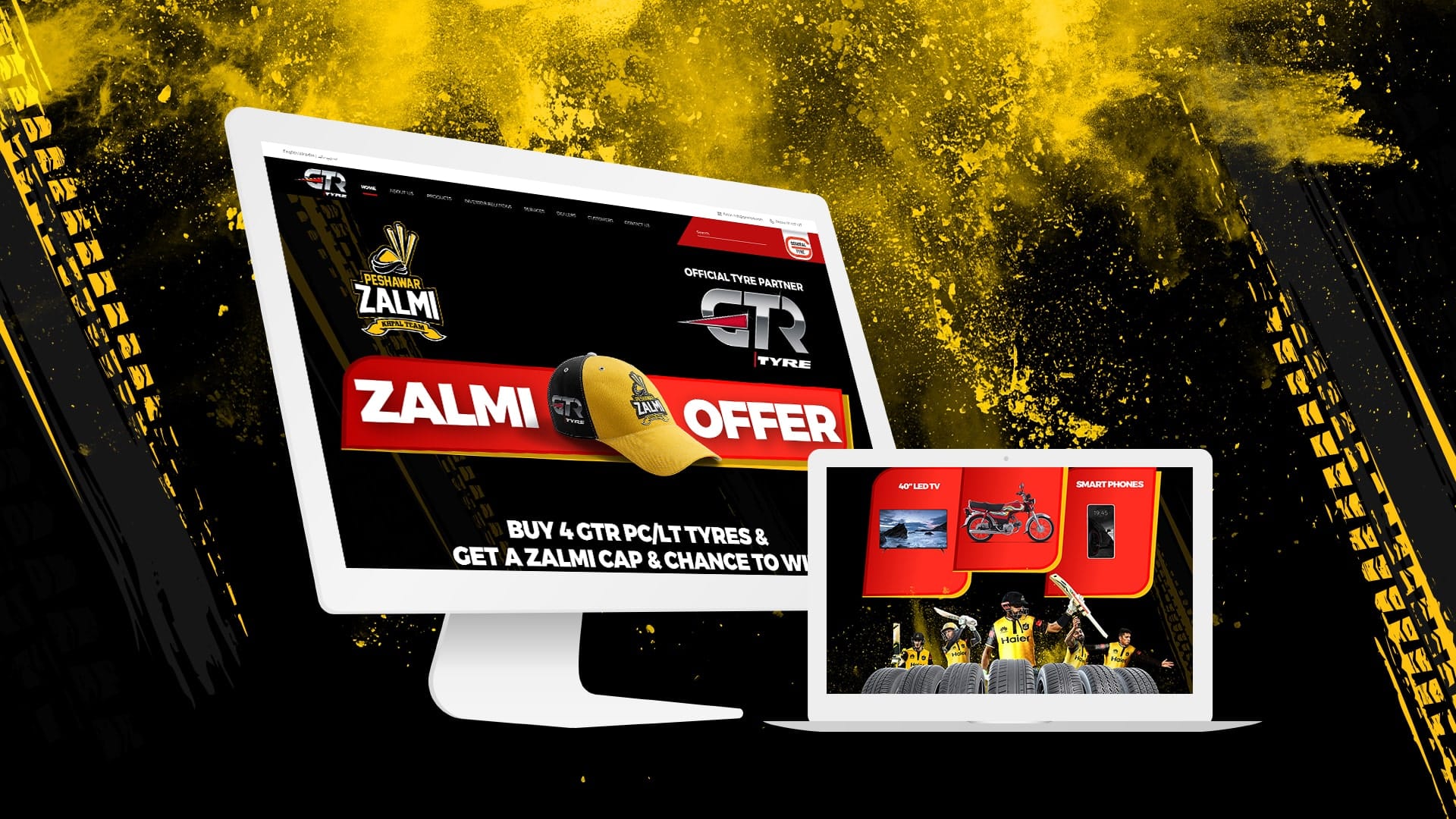
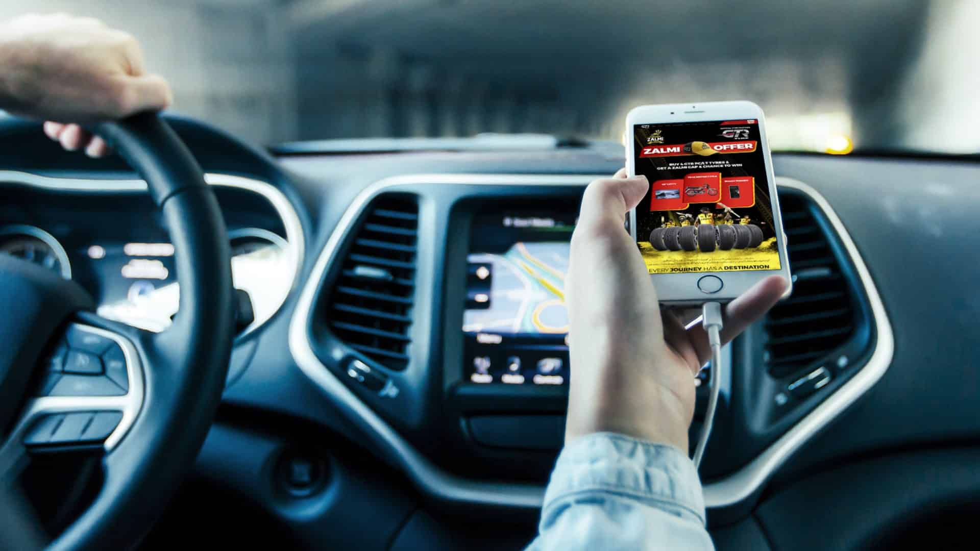
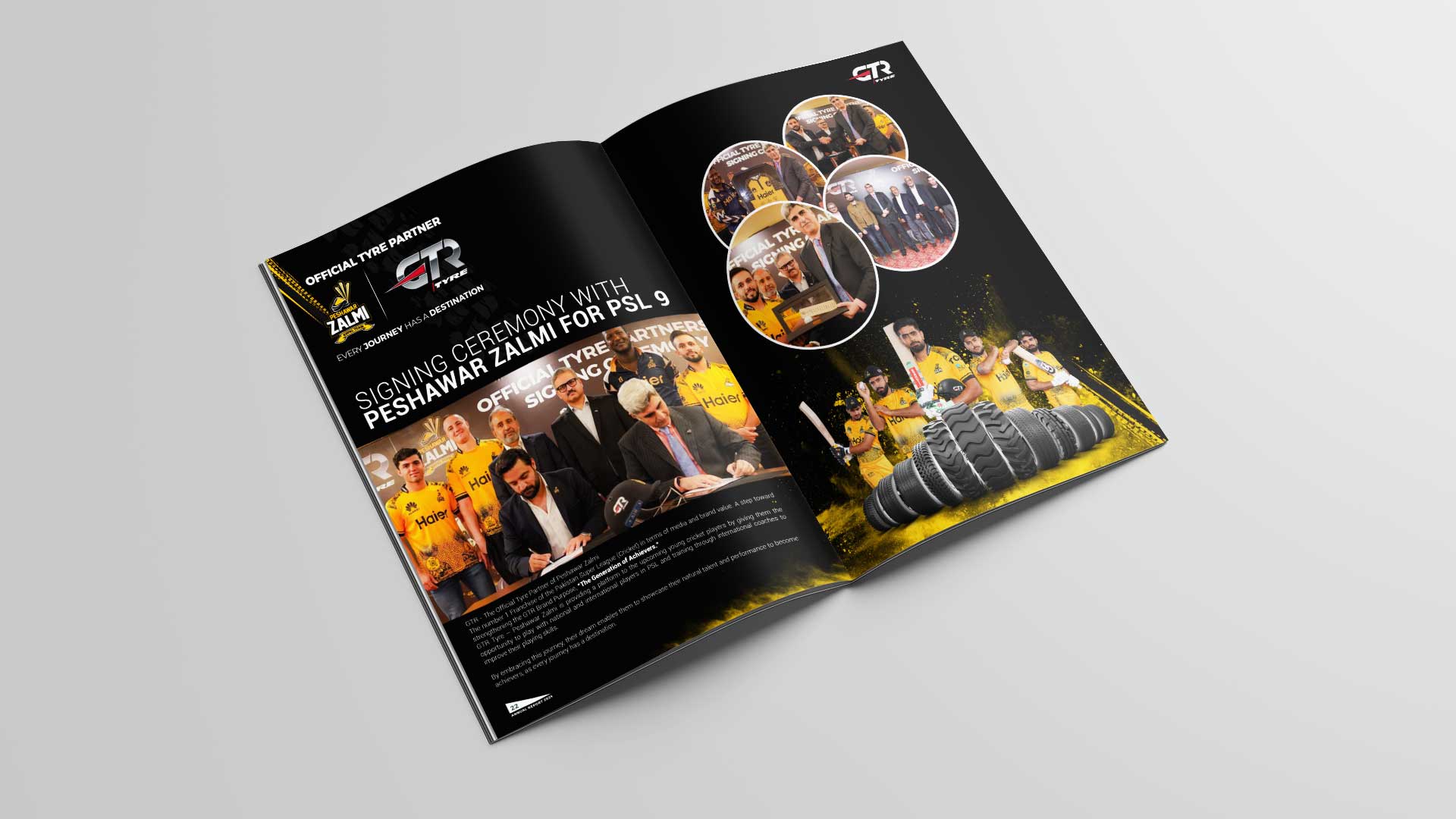
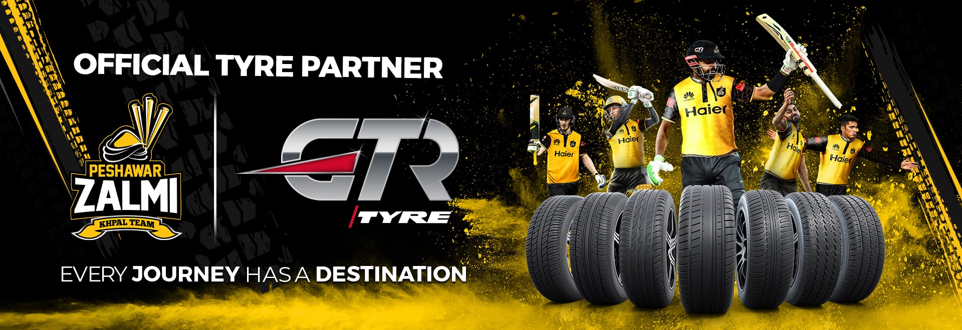
GTR - The Official Tyre Partner of Peshawar Zalmi
GTR Tyre – Peshawar Zalmi is providing a platform to the upcoming young cricket players by giving them the opportunity to play with national and international players in PSL and training through international coaches to improve their playing skills.
By embracing this journey, their dream enables them to showcase their natural talent and performance to become achievers, as every journey has a destination.
To amplify this platform and speak directly to Pakistan’s youth, Media Idee, in collaboration with the creative and AI-production teams from its network agency partners, crafted a visually groundbreaking series of digital and social videos for PSL Seasons 9 & 10.
These weren’t just sports tie-ins — they were AI-enhanced narratives, blending technology, sport and brand philosophy into engaging, high-performance stories.