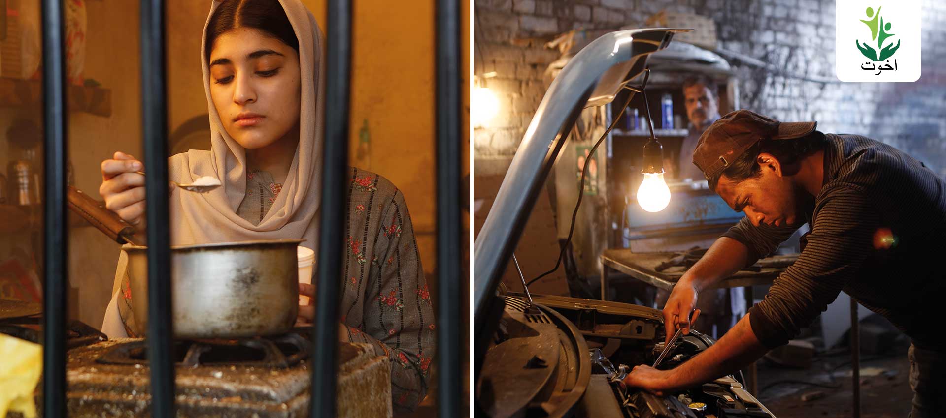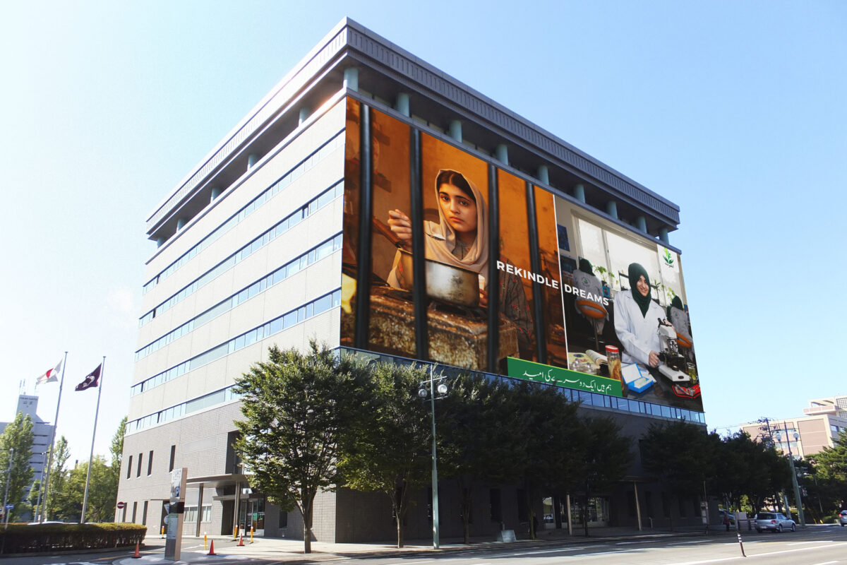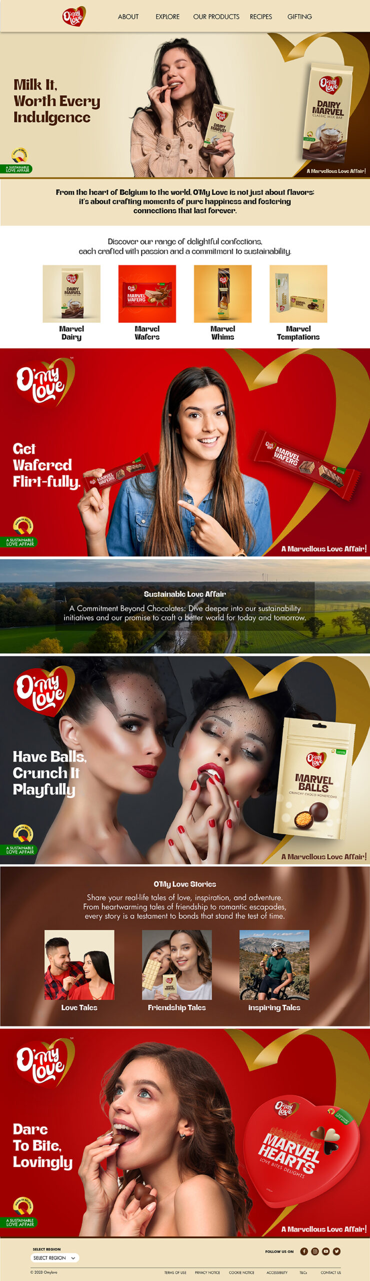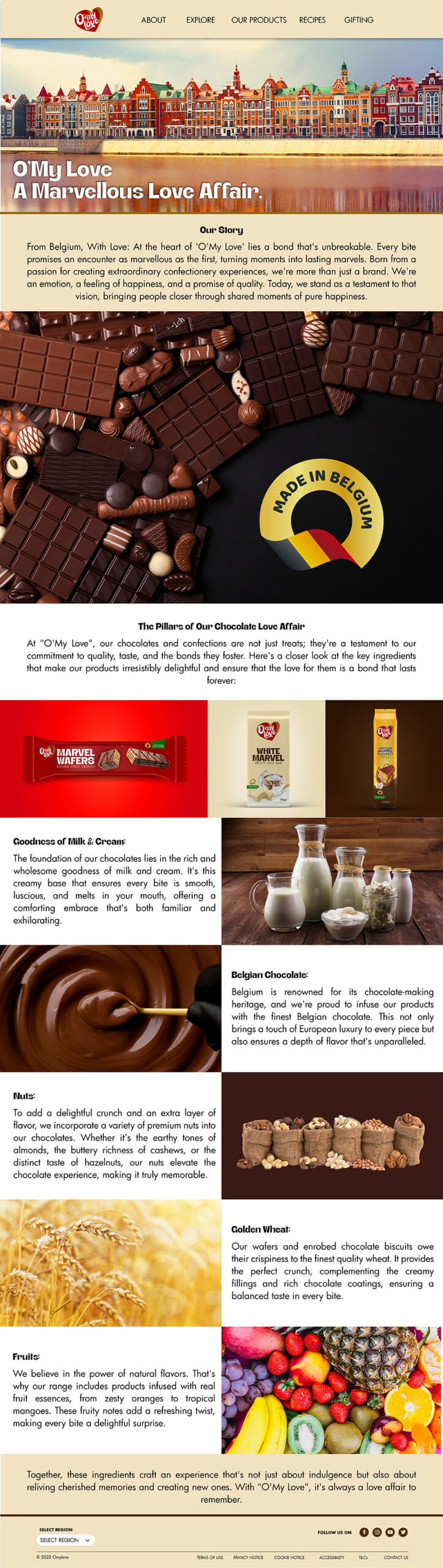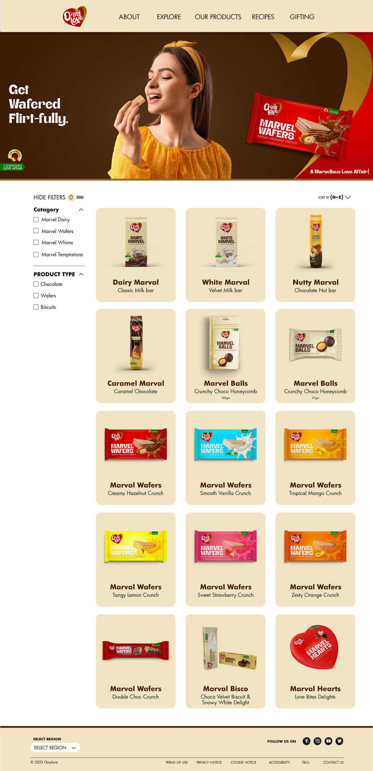
Marketing Campaign
New Product Launch
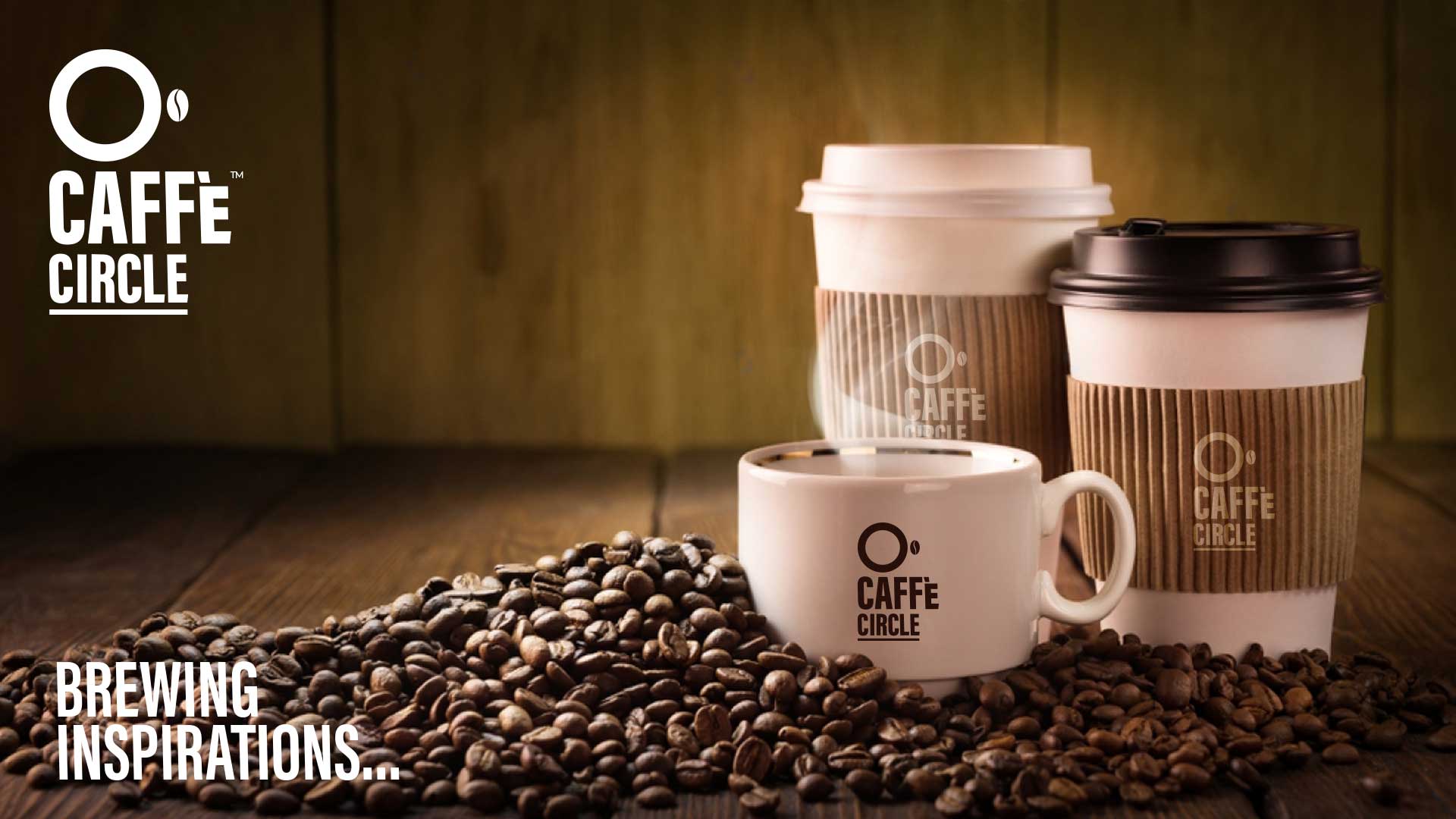
Pizza Italiana
Crafting Authenticity: The Pizza Italiana Story
In a market saturated with emerging pizza brands, Pizza Italiana sought to carve a niche by emphasizing its genuine Italian roots. To differentiate themselves from the multitude and to boldly showcase the authenticity of their Italian origin, they approached Owl Branding Studio. Our task was to revamp their identity, ensuring it resonated with Italy’s rich traditions and authentic flavors.
Project Scope
Brand Purpose
Brand Strategy & Positioning
Brand Portfolio & Architecture
Brand Identity & Imagery
Brand Style Guidelines
Brand Strategy & Positioning
Brand Portfolio & Architecture
Brand Identity & Imagery
Brand Style Guidelines
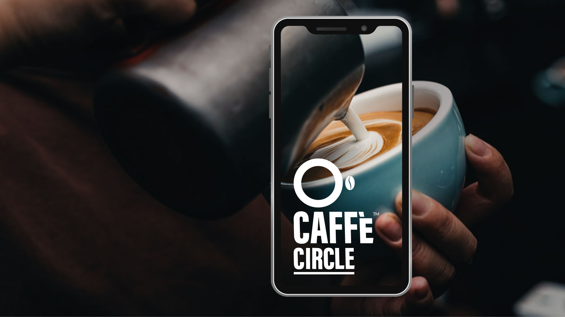
Logo Creation
Packaging & Label
Messaging & Tone-of-Voice
Brand Concepts & Communications
Brand Tagline
Packaging & Label
Messaging & Tone-of-Voice
Brand Concepts & Communications
Brand Tagline
Experiential Designs
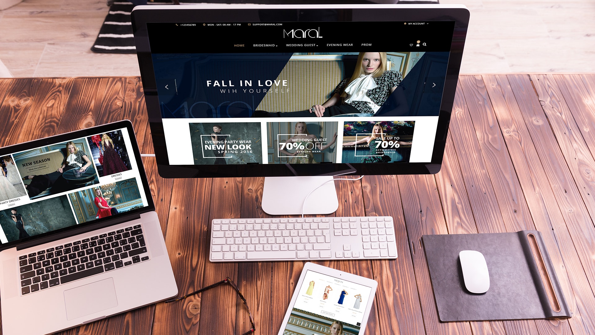
Website & E-commerce
Retail Branding & Merchandise
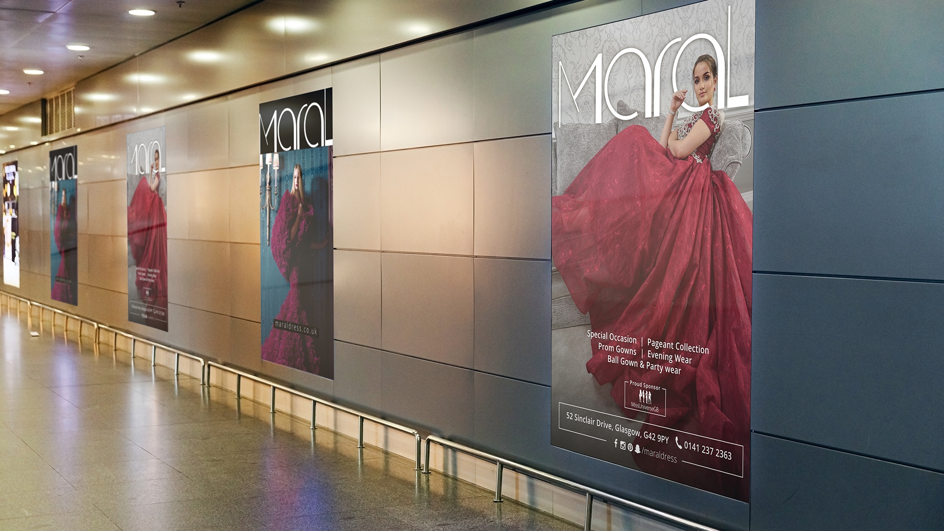
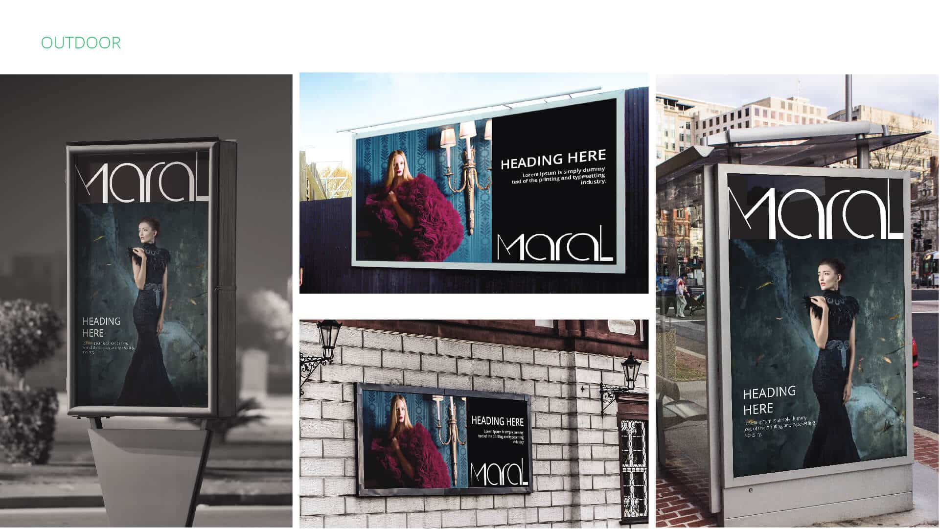
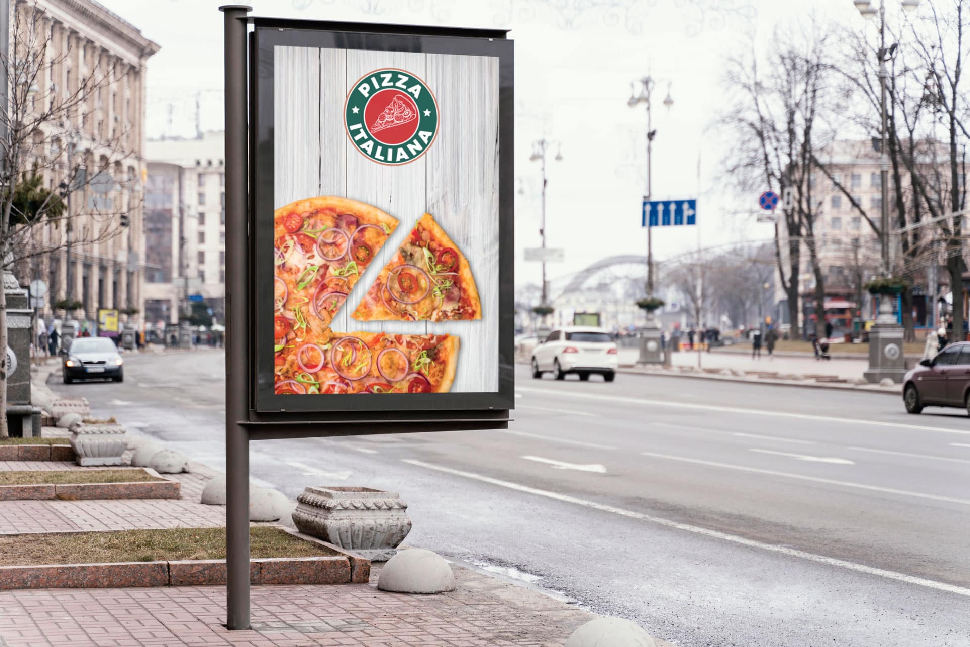
OOH – Signage & Billboard
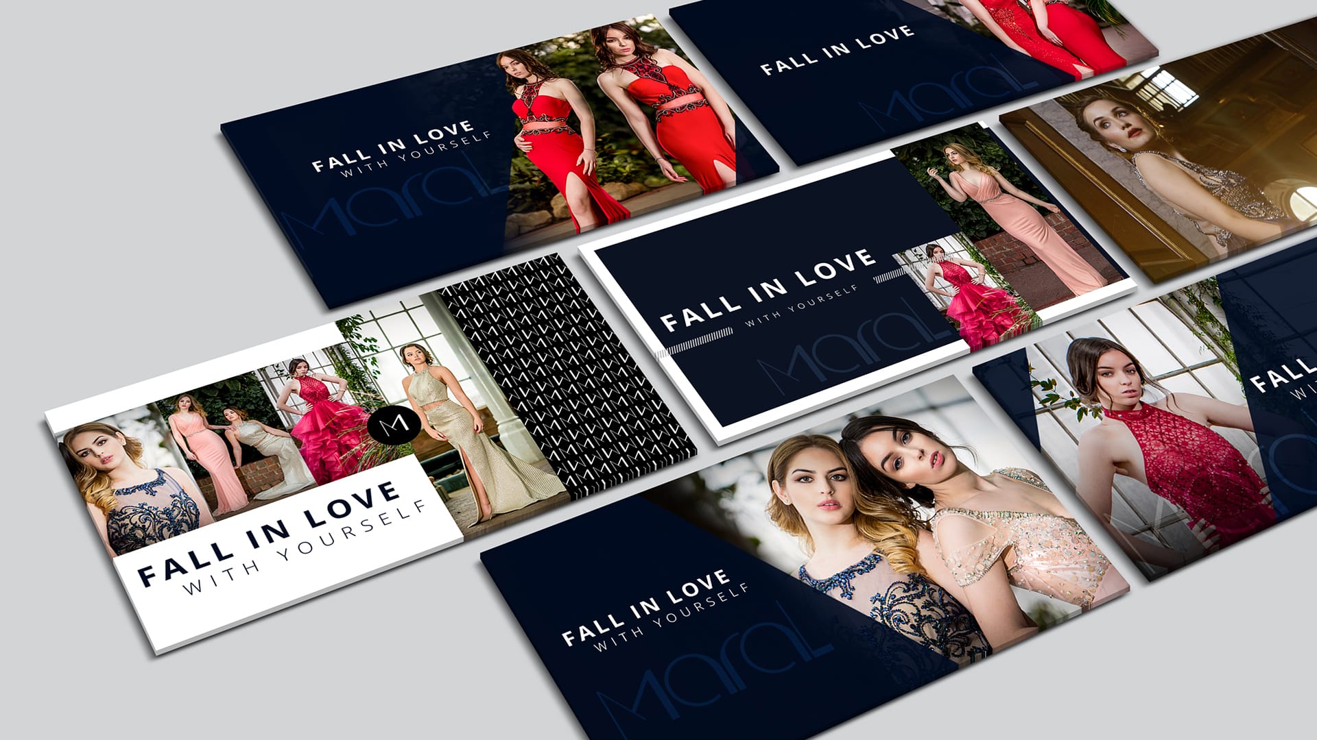
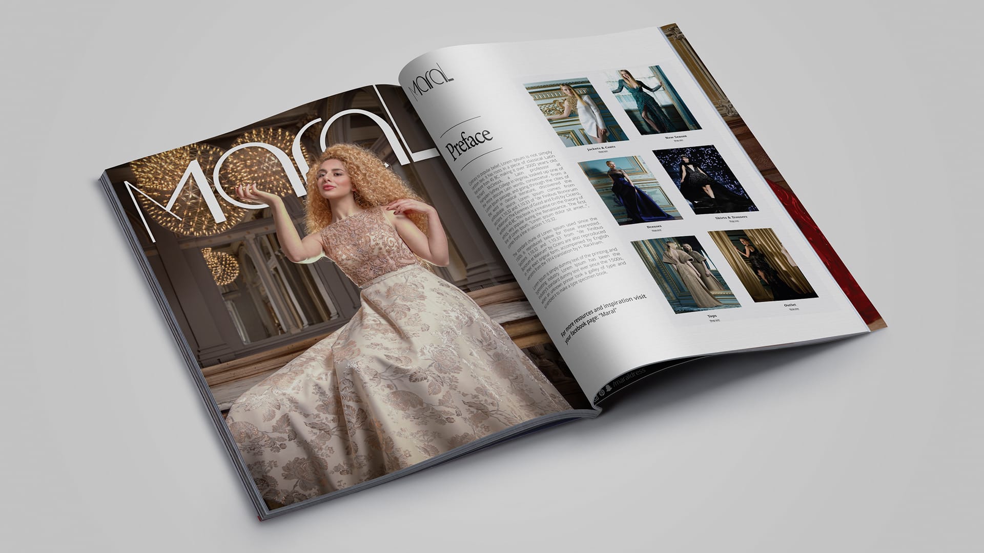
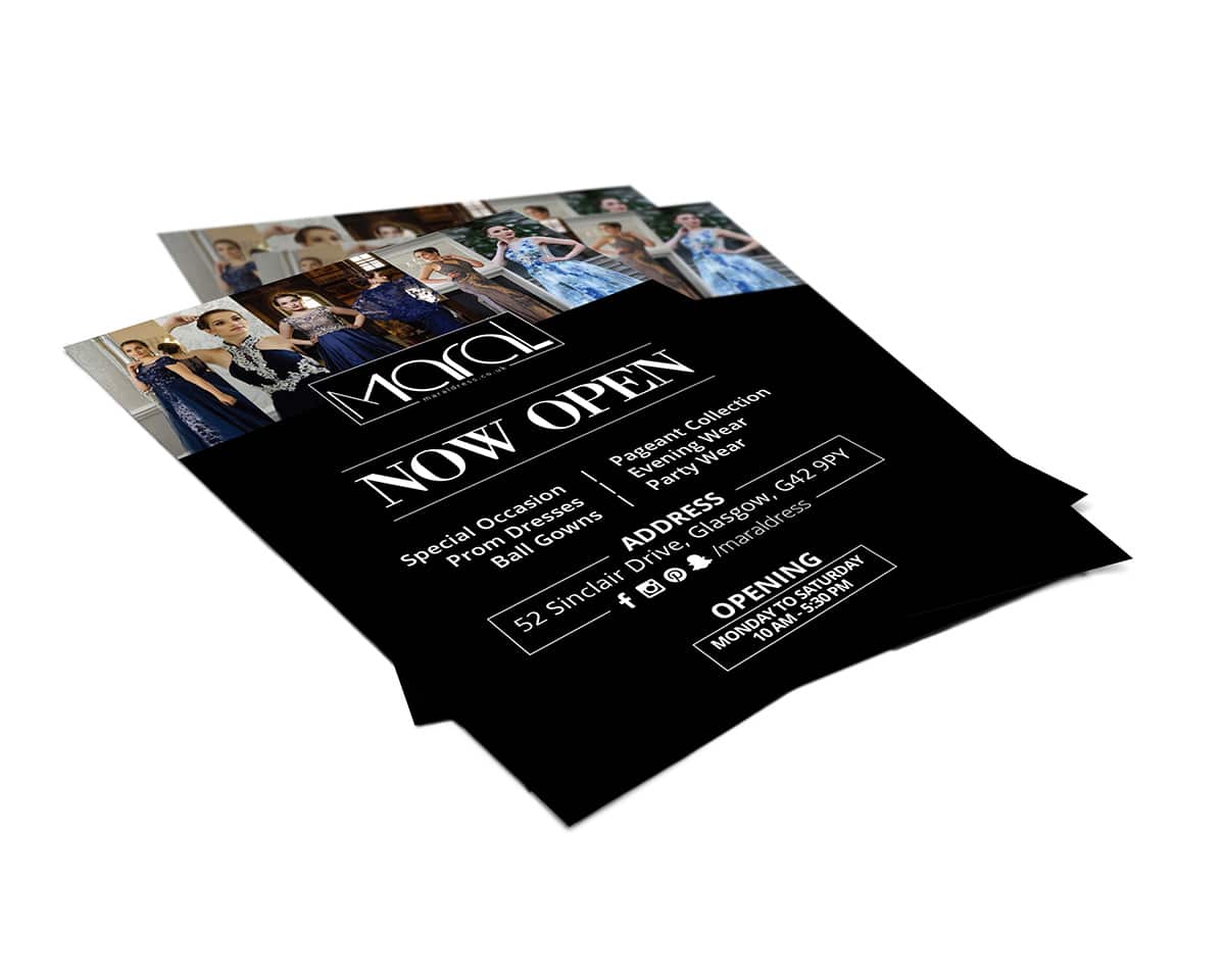
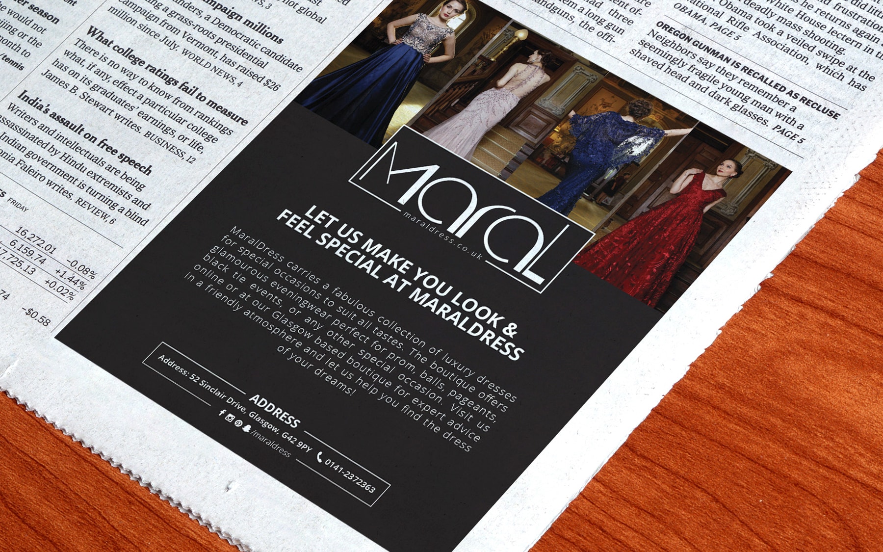
Marketing Collateral
Website & E-commerce
Retail Branding & Merchandise
OOH – Signage & Billboard
Marketing Collateral
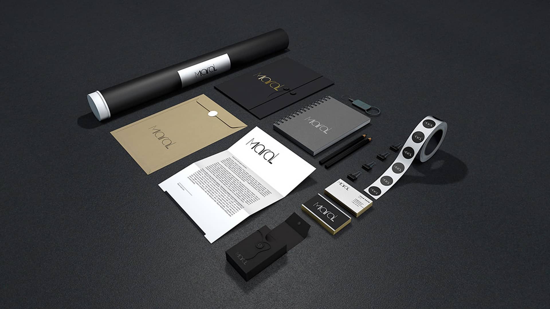
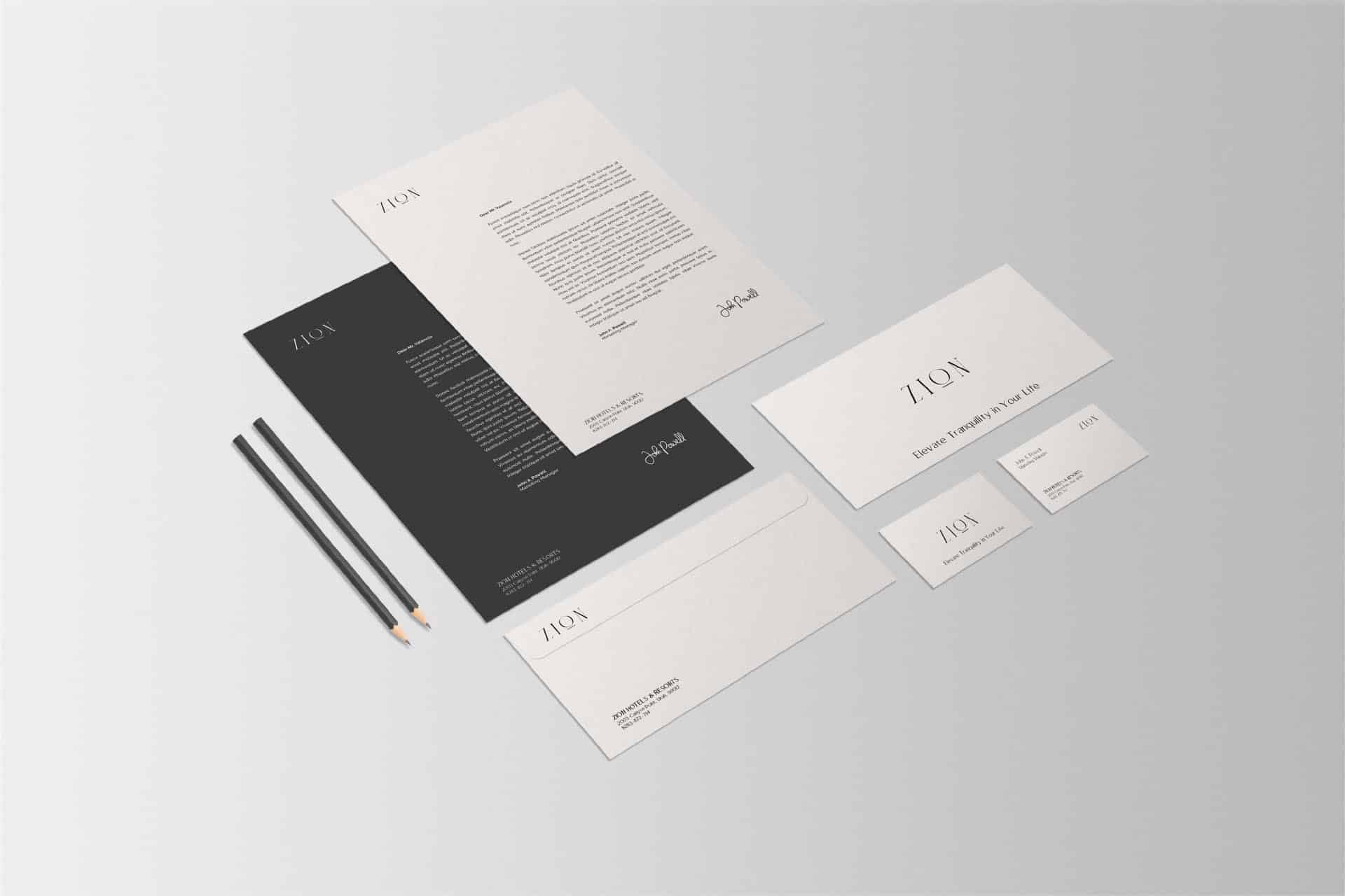
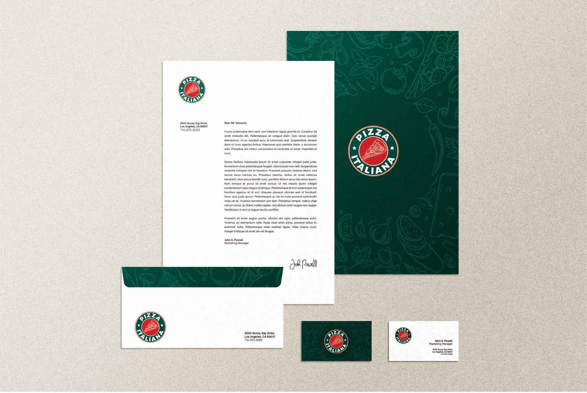
LOGO / STATIONARY

Brand Philosophy
Pizza Italiana is more than just a culinary establishment; it’s a tribute to authentic Italian culinary craftsmanship. Every pizza celebrates age-old Italian traditions, crafted with passion and dedication, delivering a meal and an experience that transports diners to the heart of Italy.
Brand Identity Development
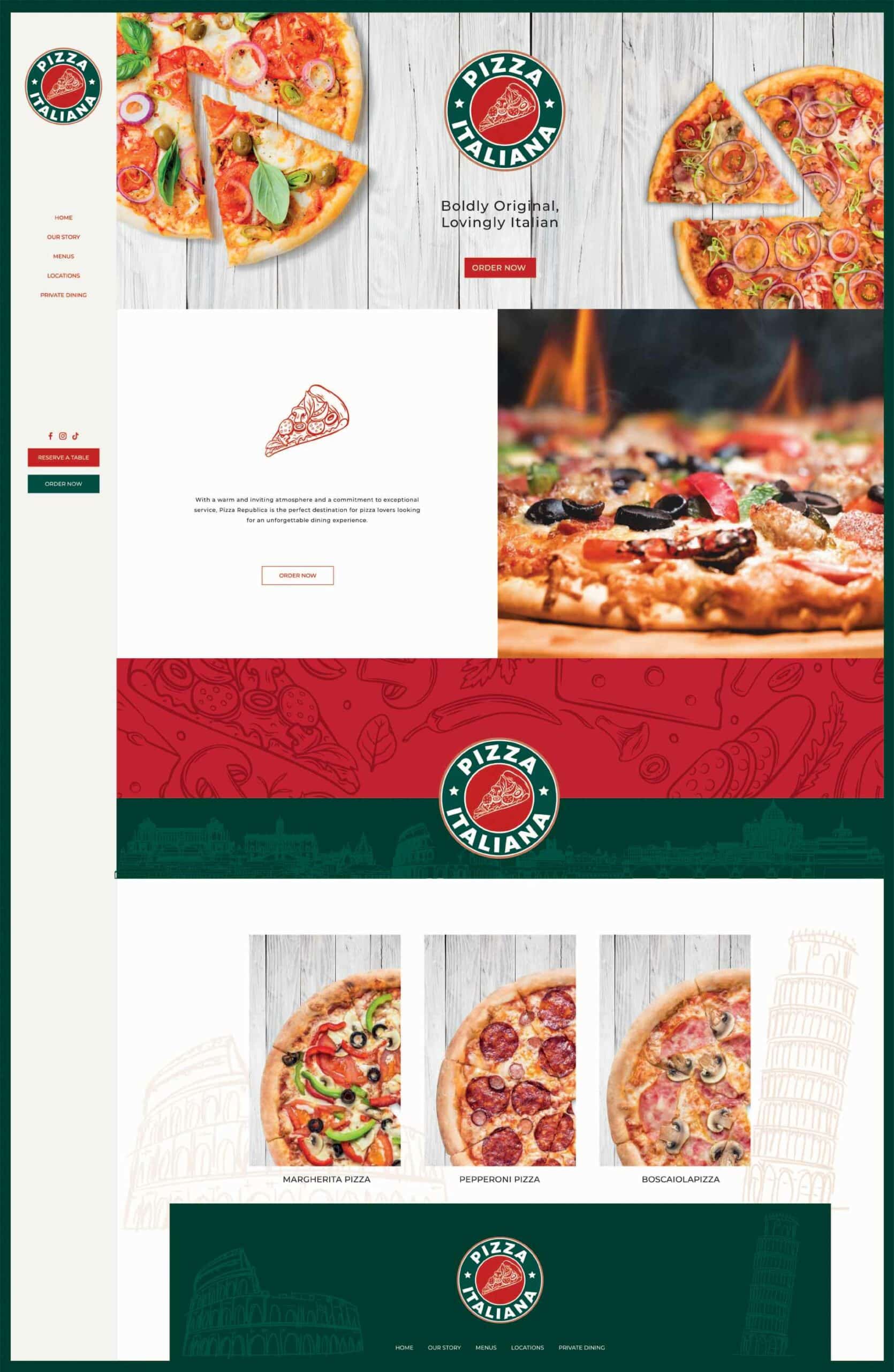
Our branding strategy for Pizza Italiana was a harmonious blend of tradition and innovation. The logo, with its vibrant colors and distinct design, encapsulates the essence of Italy, while the outlet branding provides a visual feast reminiscent of the streets of Rome or the countryside of Tuscany.
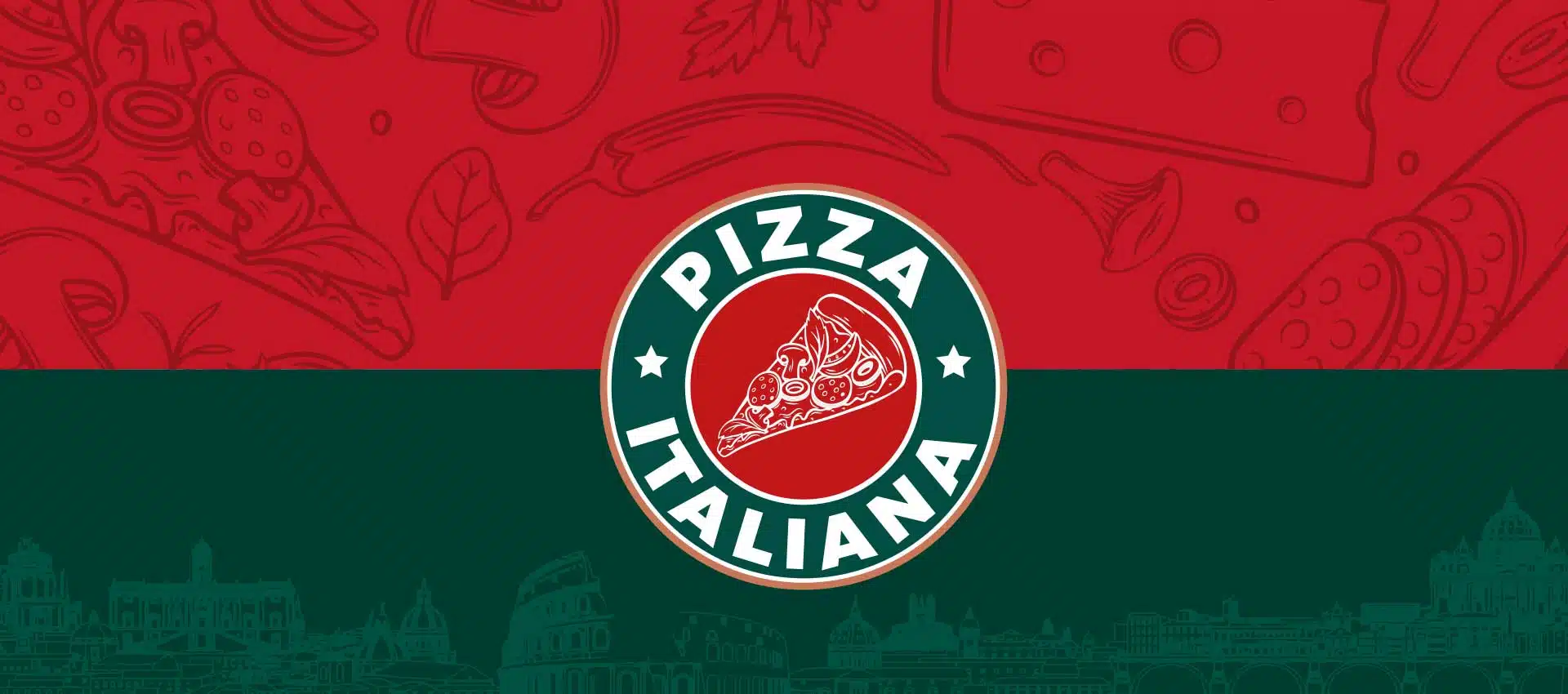
Logo Concept
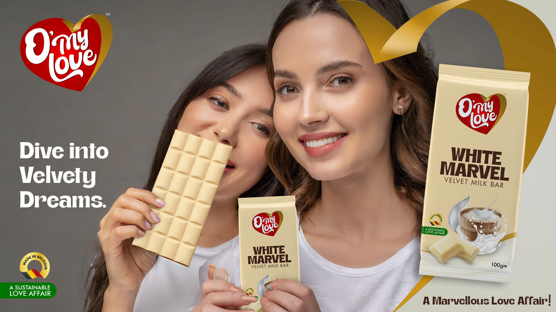
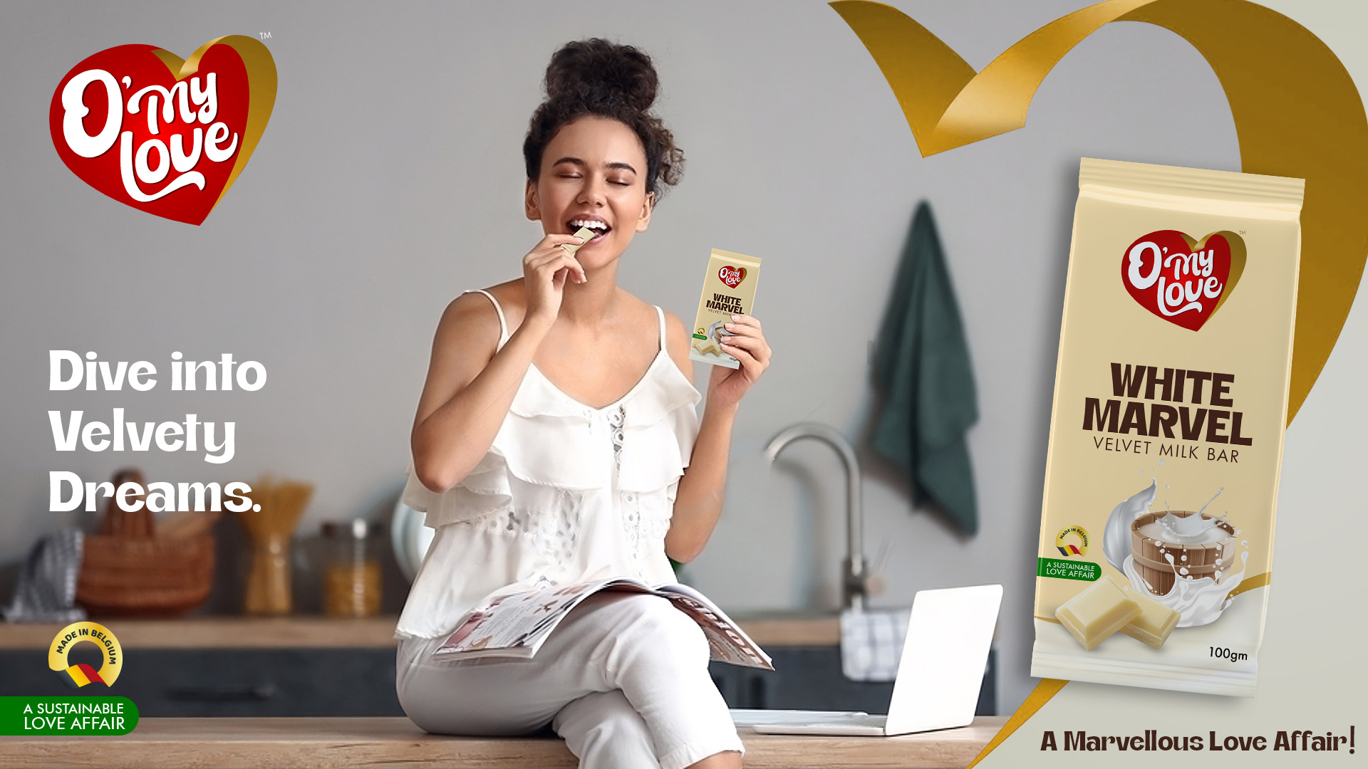
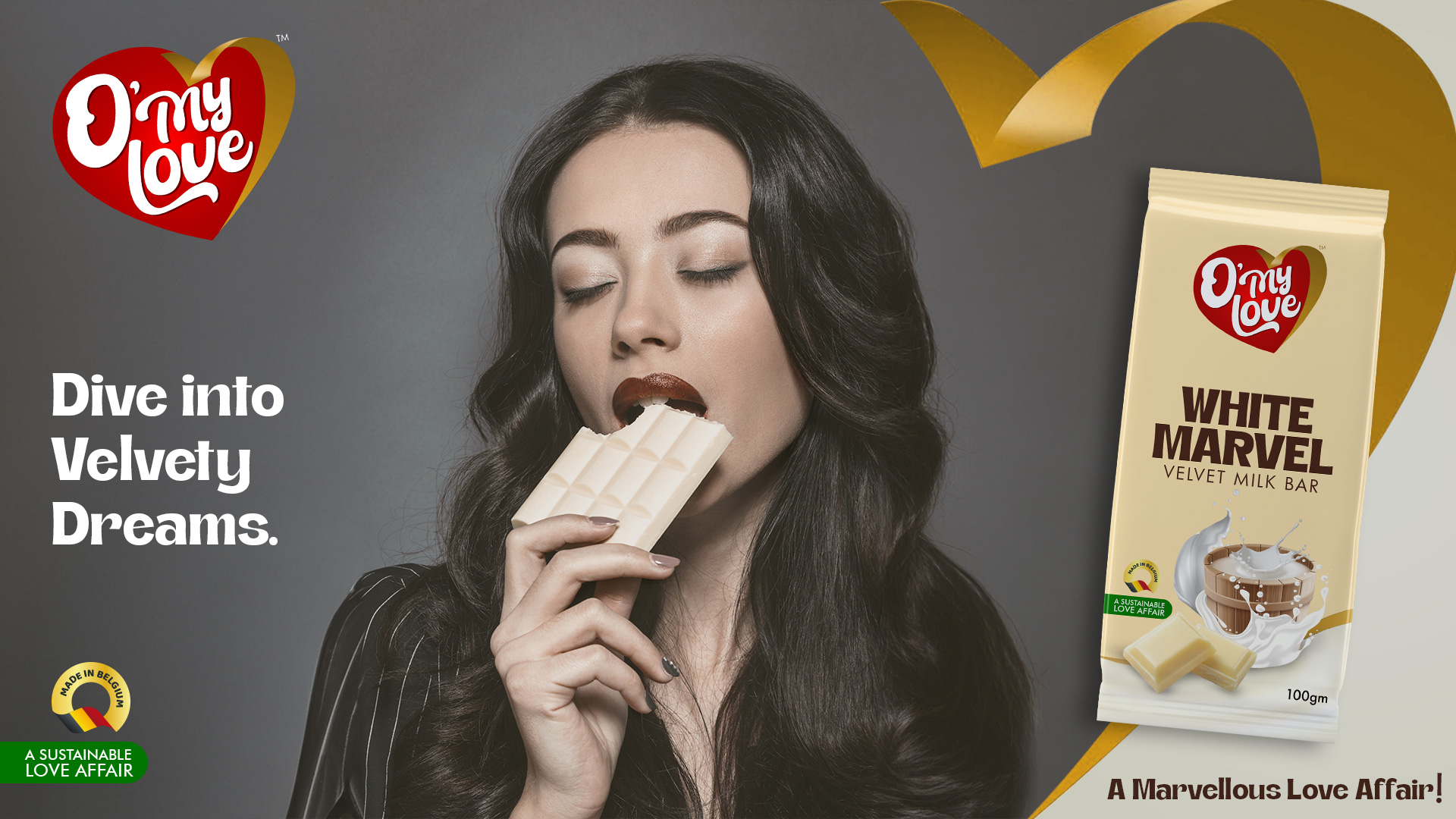
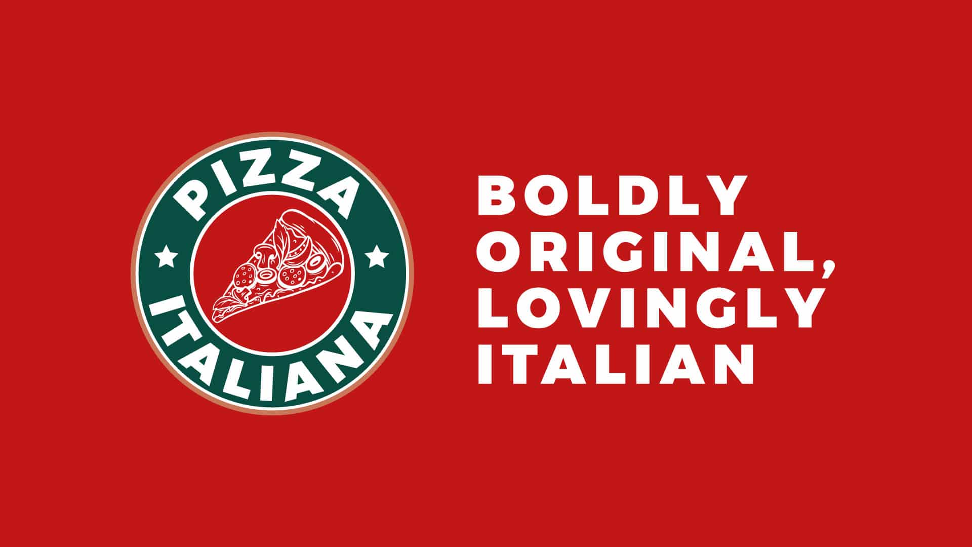
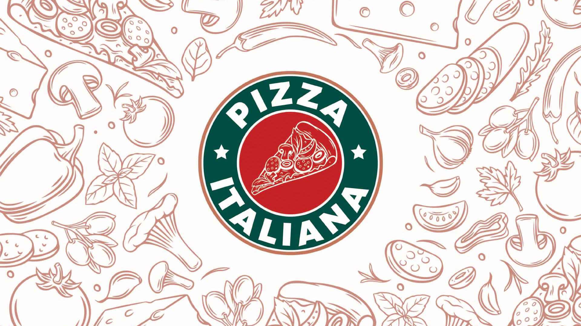
Drawing inspiration from Italy’s vibrant culture and colors, the logo integrates the nation’s flag colors: red, green and white. At its core, a red circle showcases a white pizza slice, symbolizing the heart of the brand. The green band encircling this core boldly inscribes “PIZZA ITALIANA” in reverse white, punctuated by two stars, adding a touch of elegance and distinction.
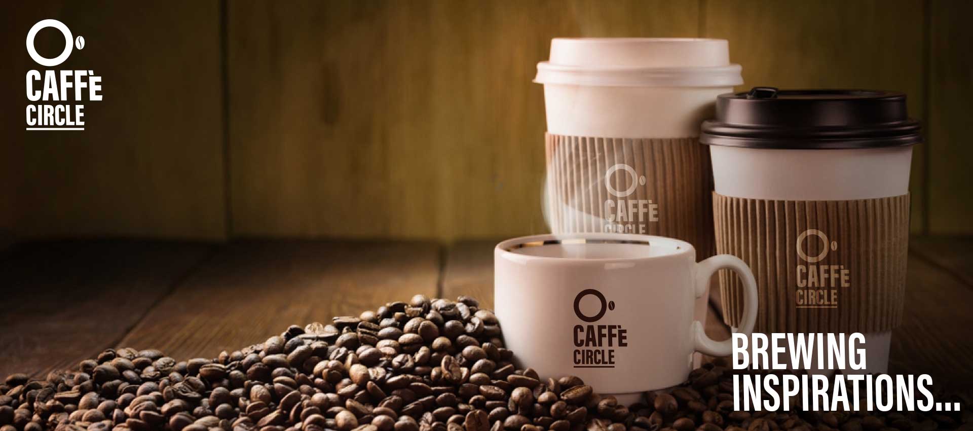
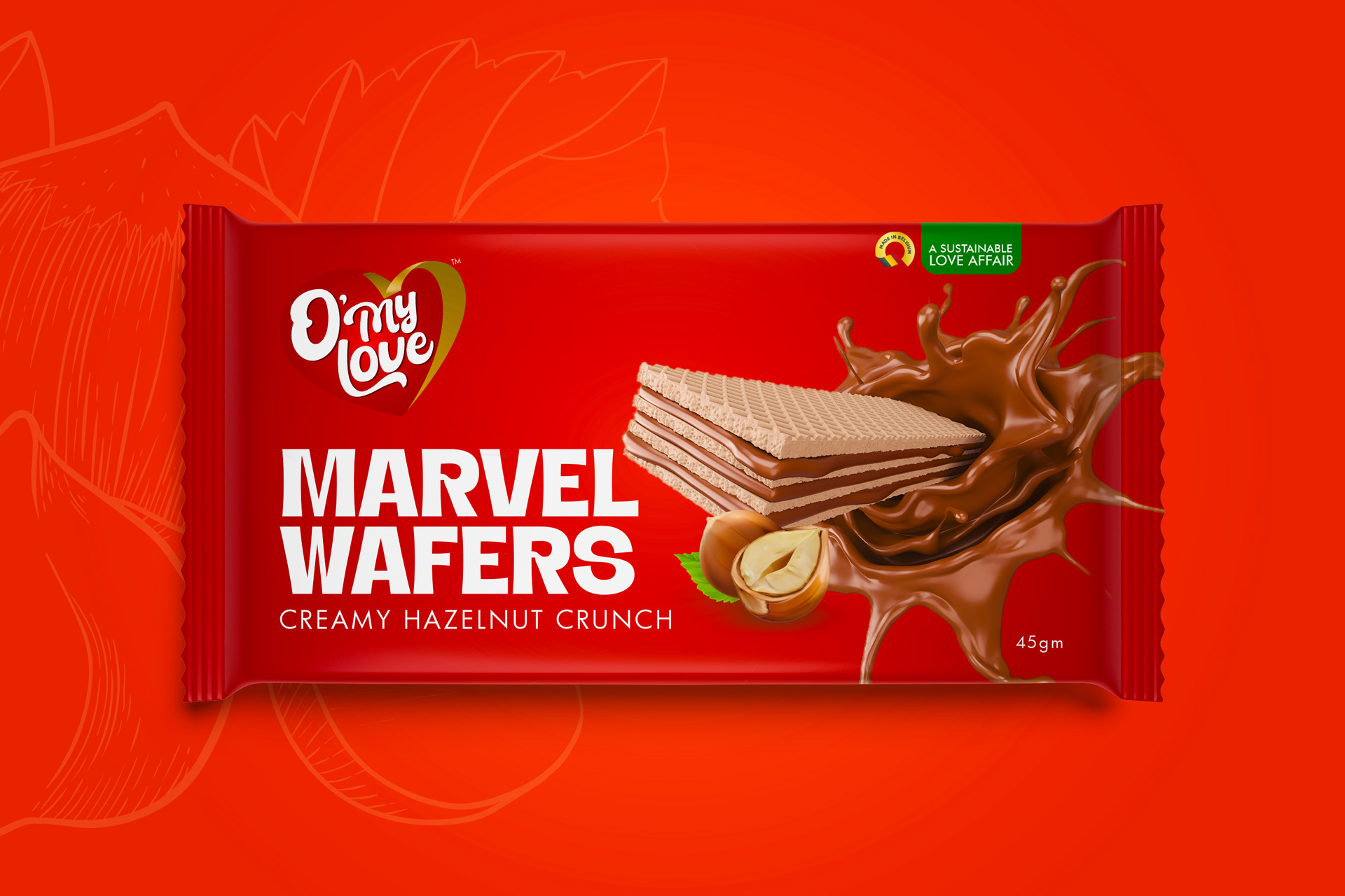
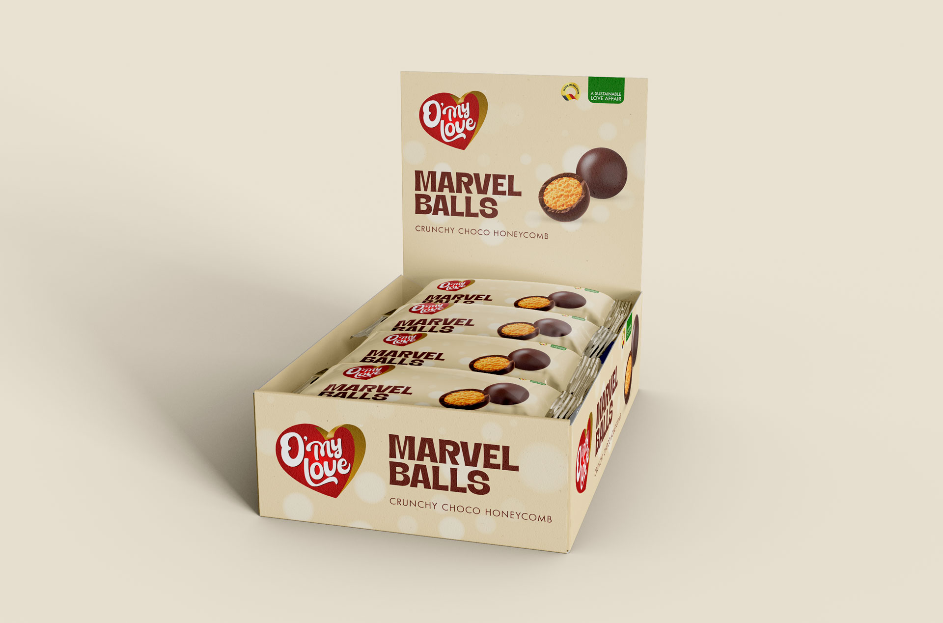
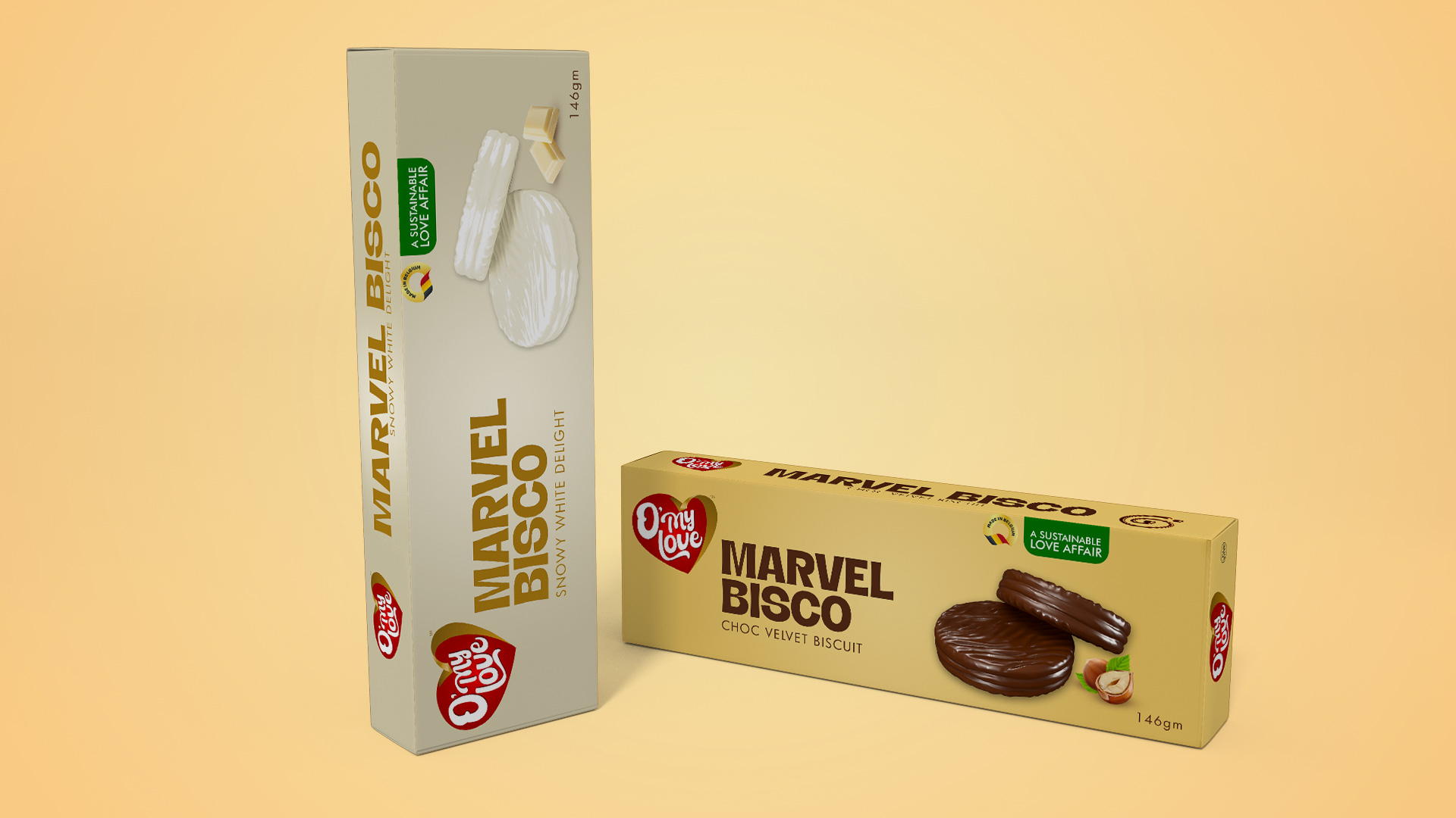
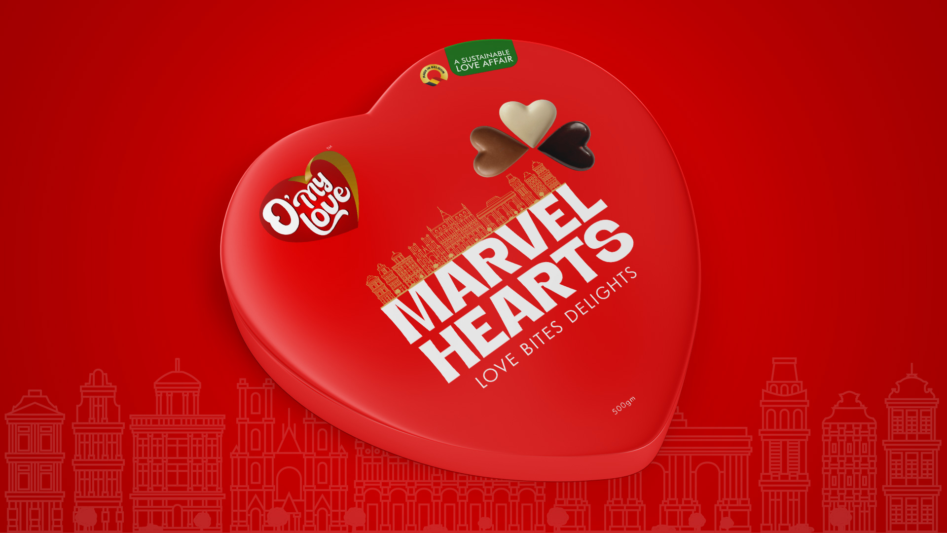
Packaging Concept
The packaging design emphasizes the brand’s commitment to authenticity and quality. Using recyclable materials, the packaging features minimalist designs that highlight the brand’s Italian essence, ensuring that the product inside is the star.
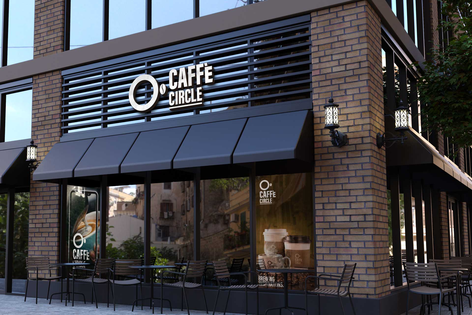
Outlet Branding
We meticulously designed the outlet branding for Pizza Italiana, encompassing every element from menu boards, counters and wardrobes to the finer details that enhance the customer experience. Each design element was crafted to resonate with the brand’s Italian essence, creating a cohesive and immersive brand environment.
Brand Imagery
We crafted a distinctive brand imagery that depicts the authentic Italian culinary journey. Every image tells a story of tradition, passion and culinary excellence, from the ingredients to the final dish.
Brand Tagline
“Boldly Original, Lovingly Italian” – Perfectly captures the essence of Pizza Italiana. It speaks to the brand’s commitment to maintaining the authenticity of Italian flavors while innovating and setting themselves apart in a crowded market.
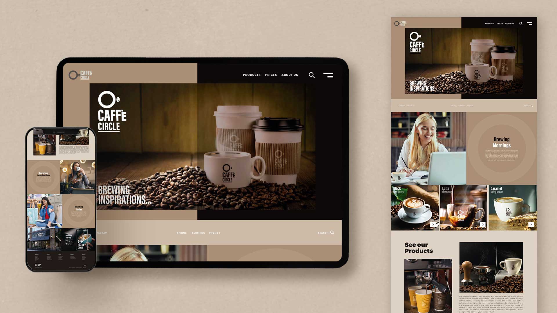
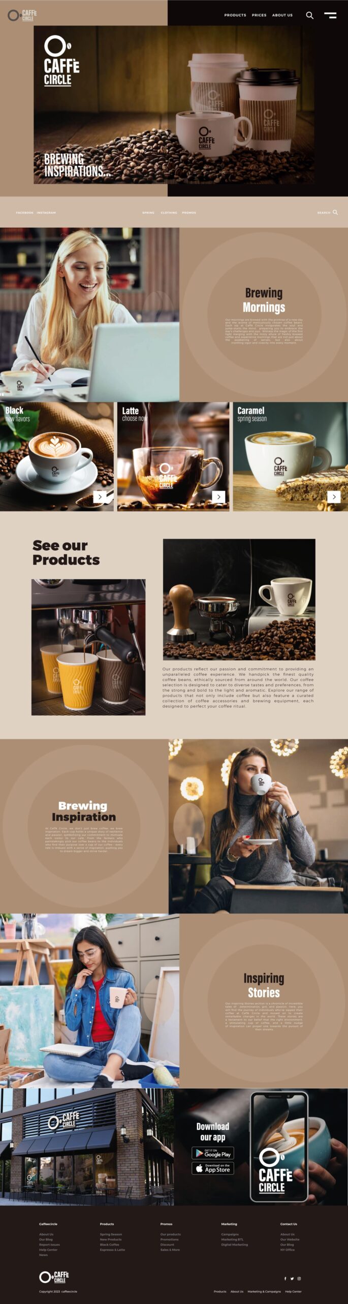
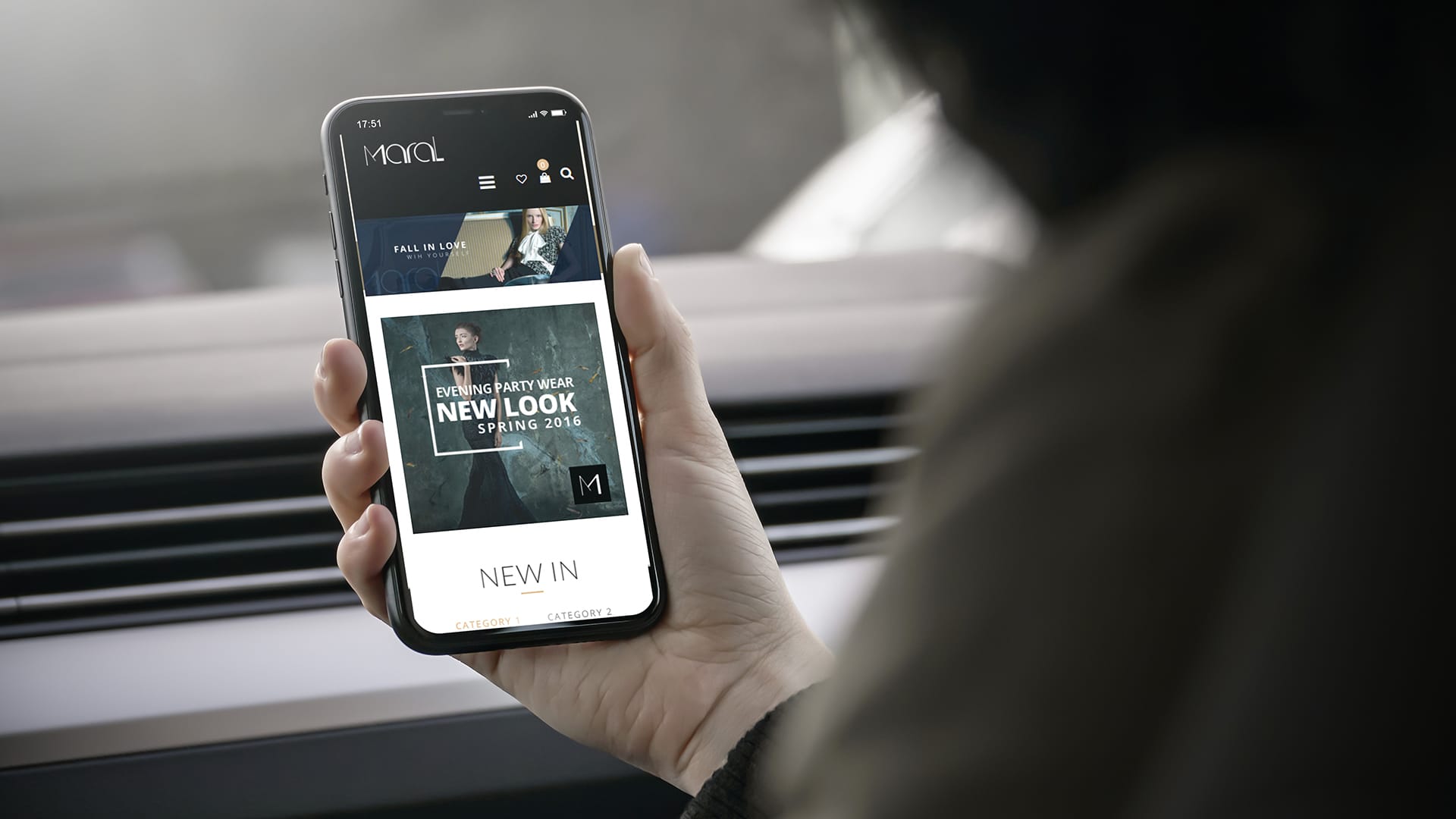
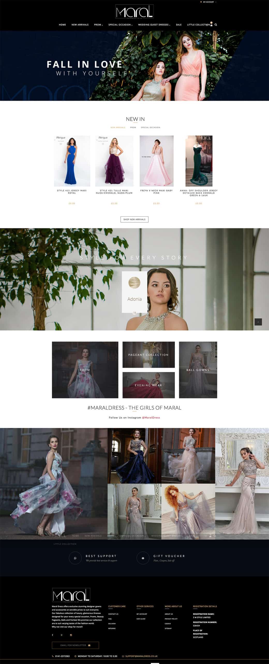
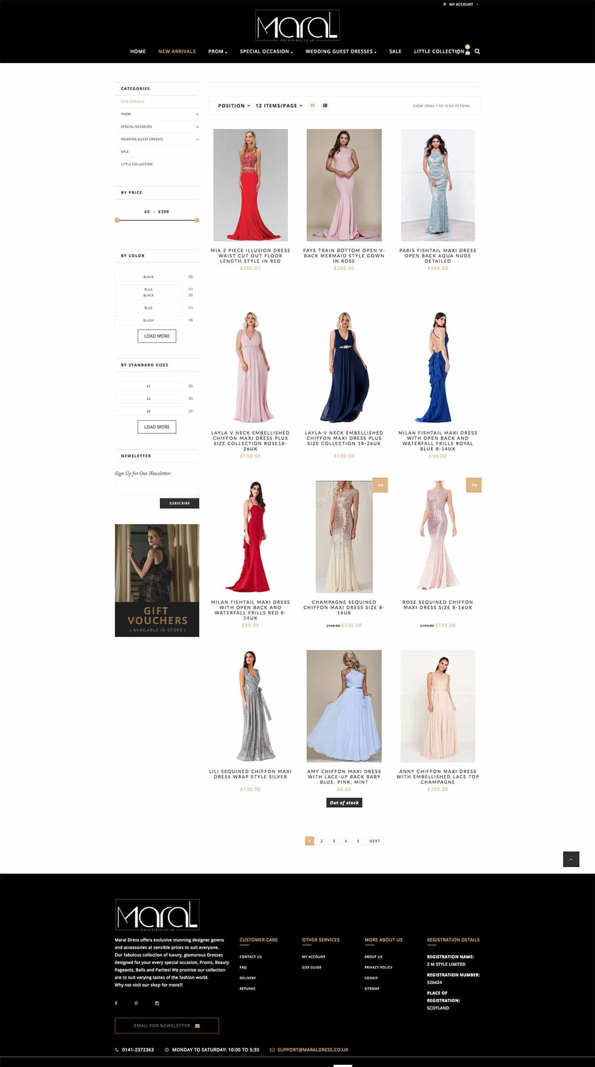
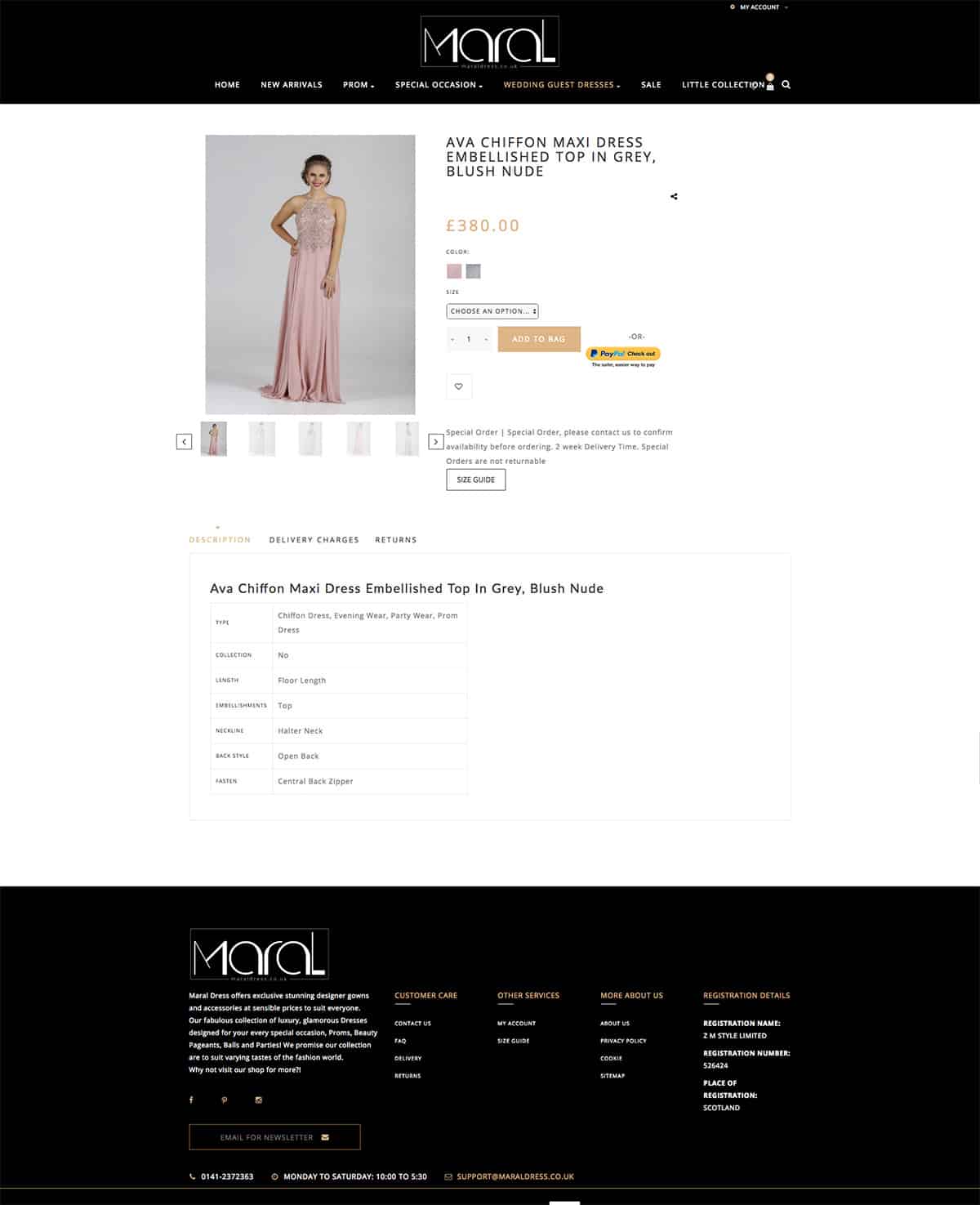
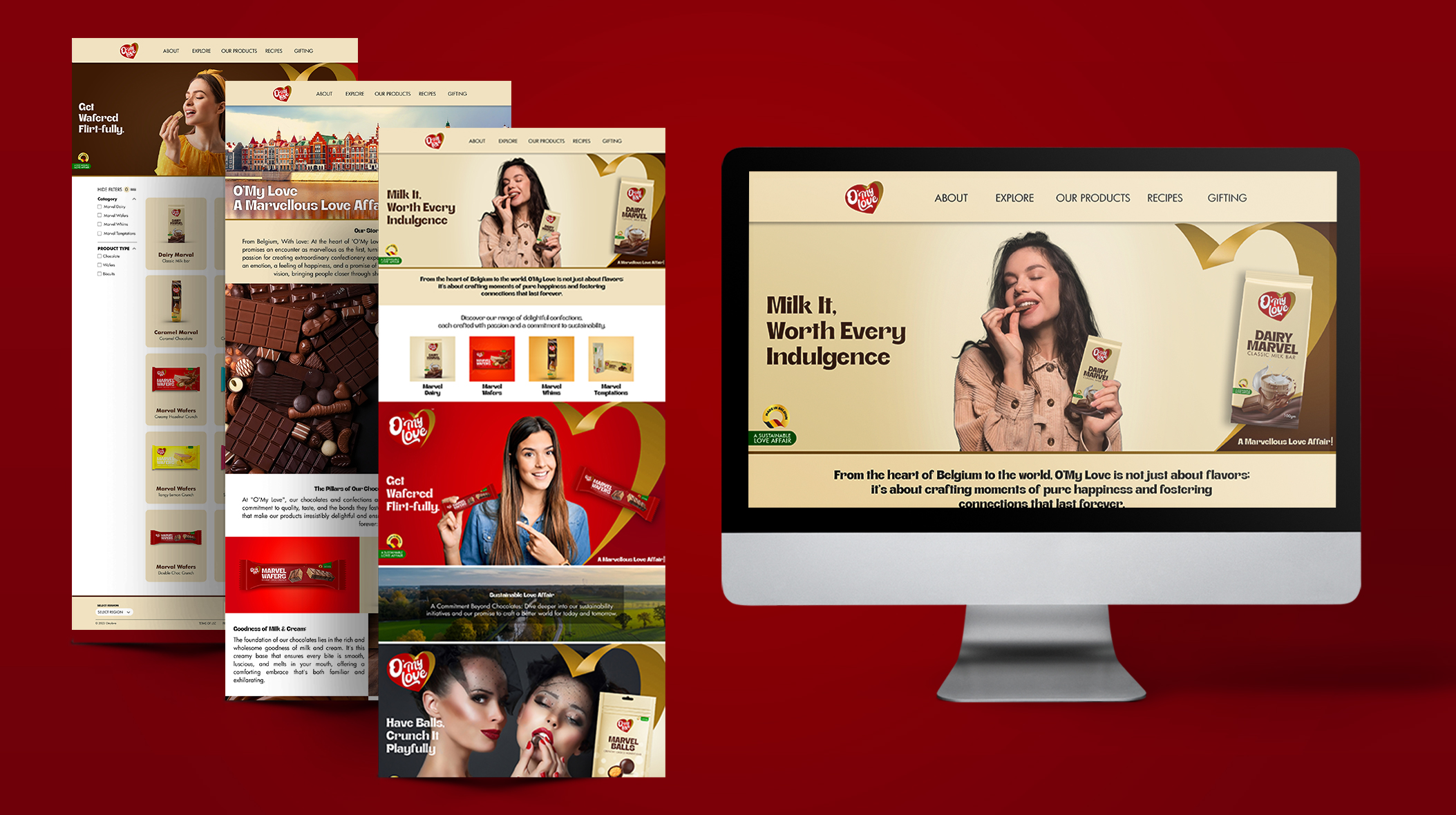
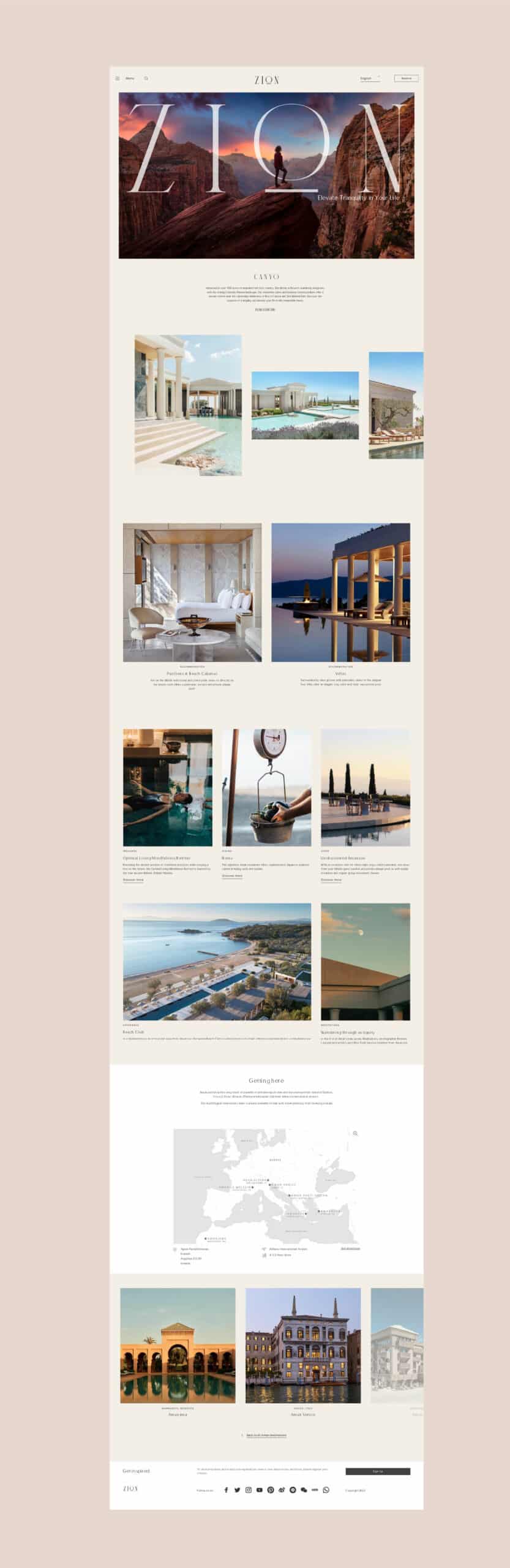
Web Design & E-commerce
The digital platform for Pizza Italiana is a culinary journey through Italy. The user-friendly website showcases the diverse menu, from classic Margheritas to innovative gourmet pizzas, ensuring a seamless and delightful browsing and ordering experience.
Brand Usage Guide
We developed a comprehensive brand usage guide to maintain consistency across all touchpoints. This guide ensures that the brand’s essence is communicated uniformly, be it in print, digital, or physical spaces.
Brand Culture
Pizza Italiana fosters a culture that celebrates the rich culinary heritage of Italy. Through engaging campaigns and interactive brand experiences, we cultivated a brand culture that encourages patrons to immerse themselves in Italy’s authentic flavors and traditions.
Brand Communications
In collaboration with the Brand Culture Network, we crafted a compelling brand narrative for Pizza Italiana. The branding prominently features the ingredients that go into crafting each pizza, emphasizing freshness and authenticity. The communication strategy showcases the art of pizza-making, from kneading the dough to the final bake, all set against lively Italian music. This narrative culminates with the brand’s tagline, reinforcing the brand’s commitment to delivering genuine Italian flavors.
OUTDOOR

STORE / PACKAGING
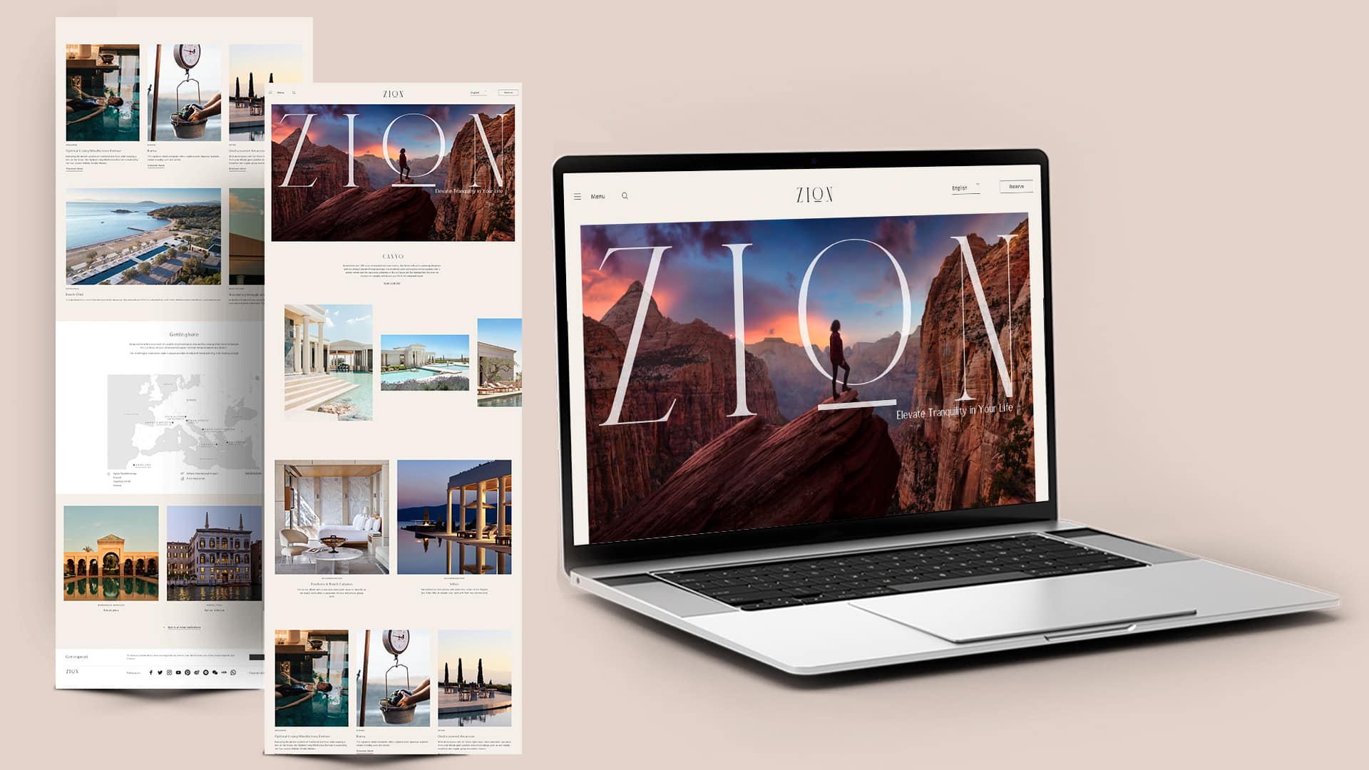
WEBSITE