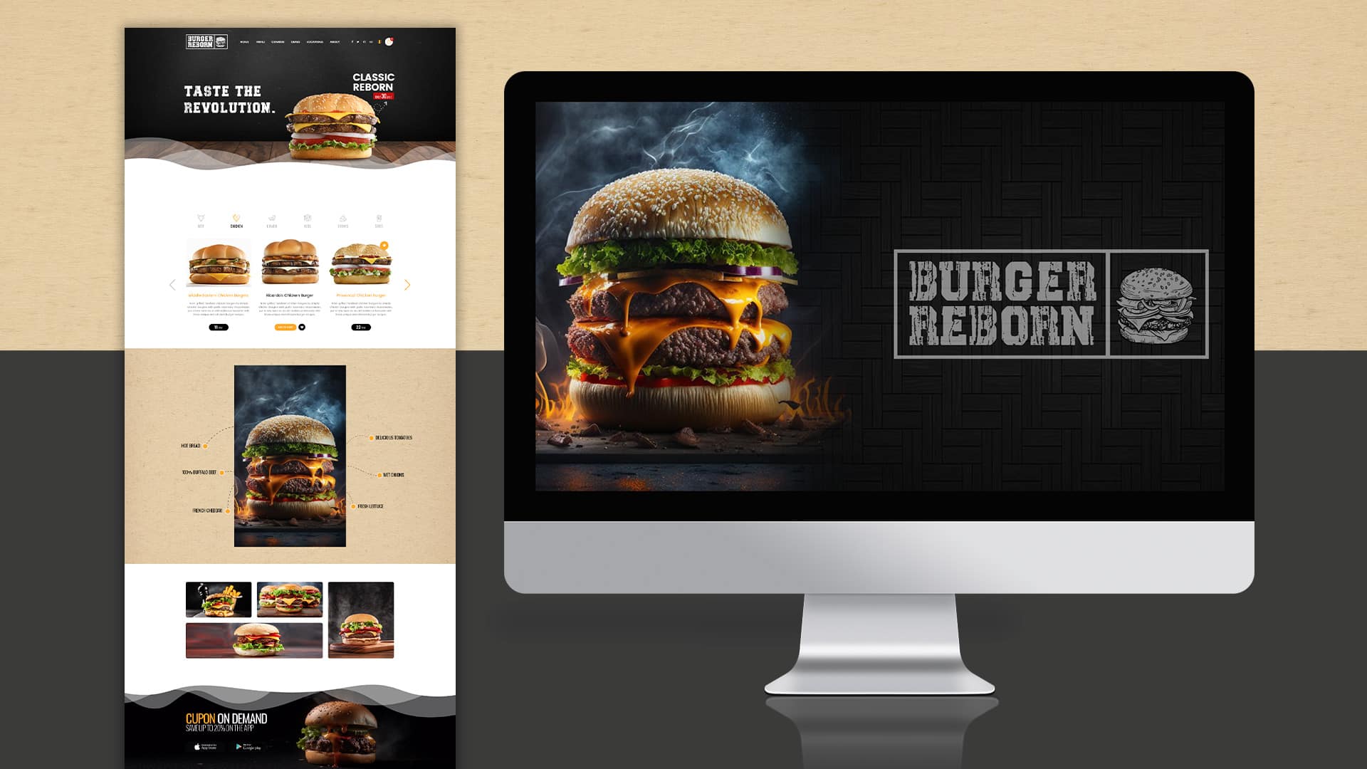
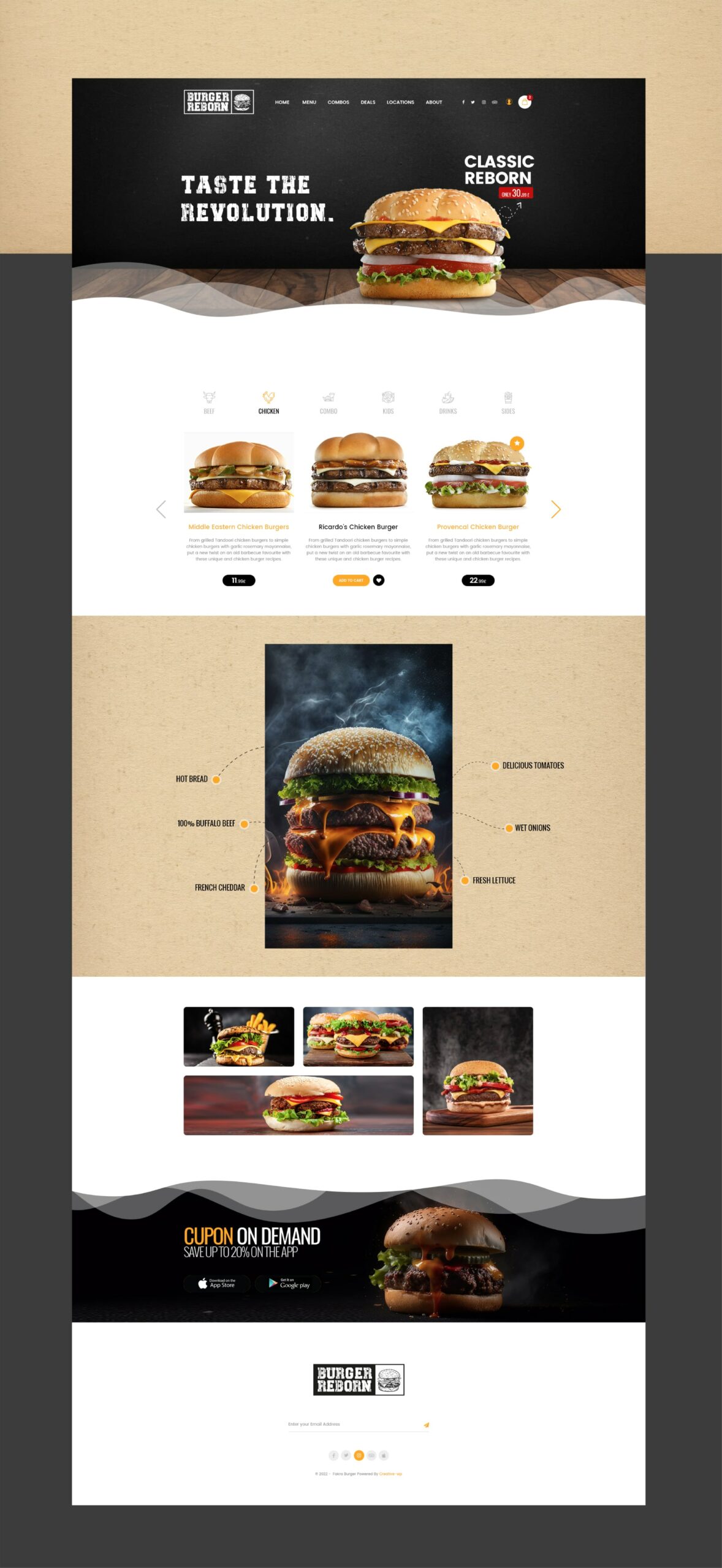
TCS


Digital

Digital Experiential Journey

Shopping Thats Click

The First E-Marketplace

TCS wanted to revolutionize how people & businesses do shopping/retail in Pakistan and needed the right partners.
Media Idee and our network branding agency Creativecom was hired as strategic, creative & digital partner to launch the E-commerce business of TCS.

We have worked on Marcom’s Branding strategy by deriving Brand Nomenclature, Brand Identity, Brand Imagery and Creative & Communications platforms.

We have suggested the platform of ‘Empowerment’ with the brand promise “Shopping that Click,” whereby the consumer controls the shopping experience.

The visual executions based on the empowerment platform showed people in control due to shopping from TCS Connect. TCS Connect offered a deal of 10% cash back to support the launch.

We have developed full-fledged 360 marketing campaigns for the launch. We are working on follow-up digital and social campaigns to promote the e-commerce business, from increasing the traffic on the website to generating sales and creating consumer engagement and experiential digital journey.

For the first time, the trend of seasonal and occasional sales festivals was introduced on digital platforms in Pakistan by TCS Connects, which other eCommerce players later followed.

Deliverables:

Branding & Strategy

Brand Nomenclature

Brand Identity & Stationary

Brand Styling Guide

Brand Imagery & Voice

Communication Strategy

Brand Capsule

Creative

Creative Platform

Ideation & Storytelling

Art Direction & Imagery

Copy & Content Writing

Marketing & Sales Kits

Brochure

Key Visuals

Digital & Social Campaigns

Seasonal Campaigns

Promotional Campaigns

Thematic Print Ads & OOH

Digital

Web Design

User Experience

User Interface Design

Art Direction

Digital Marketing

Digital & Social Marketing

Email Marketing

TCS Connect-Advertising and Promotion

DIGITAL AND SOCIAL

TCS Connect-Weekend Hot Deals

DIGITAL AND SOCIAL

Generate sales by dropping the prices on a basket of goods every weekend, this is the premise behind the weekend hot deals. The campaign is running successfully and has become a feature that fans wait for with anticipation.
The weekly hot deals have increased TCS Connect’s customer base as well as its Facebook fans have grown.

TCS Connect – Dedicated to Mom

DIGITAL AND SOCIAL

Mother’s Day is a universal holiday and Media Idee decided to use it as a platform to engage the Facebook fans of TCS Connect. Choosing an emotional approach, we decided to create a competition where the fans would send in their entries in the form of both a story and a picture expressing their love and pay tribute to their moms. The campaign engaged the fan base and created equity for the brand.

TCS Connect-Eid Festival 2013

DIGITAL AND SOCIAL

TCS Connect- Winter Wonderland

DIGITAL AND SOCIAL

TCS Connect-Samsung Galaxy S4

DIGITAL AND SOCIAL

In order to launch the most awaited smartphone of the year on TCS Connect we created a campaign that focused on the S4’s amazing features.
The campaign included Facebook posts as well as display ads on various sites with a high visit rate for the target audience

TCS Connect-7 Days of Gift Ideas

DIGITAL AND SOCIAL

Mother’s day means two things emotion and commercialism, this campaign linked both, a basket of various products were created that included all the brands that a mother could wish for earrings, perfume, rings and more. The fans were encouraged to buy from the gifts and win the chance to get a voucher.

TCS Connect-Cinderjutt

DIGITAL AND SOCIAL

In order to promote the play Cinderjutt, we organised a competition where the fans had to answer questions related to the characters and the play’s plot. This contest not only generated awareness about the play but created a high level of interest and engagement with fans competing to win passes.

TCS Connect-Hero Bakra Contest

DIGITAL AND SOCIAL

To associate ourselves with Eid, we launched a Hero Bakra competition where the objective was to send a picture of your Bakra in a heroic pose. This 1 week competition, generated over 20,000 likes for TCS Connect, 1.2 million people were reached during the campaign, including over 340,000 due to the virality of the campaign.
240 entries were submitted and voted on and generated positive sentiment for the brand throughout the blogosphere.

TCS Connect - Trick or Treat

DIGITAL AND SOCIAL

Halloween

We were pioneers in associating a local brand with international events such as Halloween. Taking a cue from the popular “Trick or treat” game, we developed an app which when users would click would either treat them with a discount or ‘scare’ them.
The game proved to be very popular with over 6,000 likes generated in a span of just 5 hours. 350,000 people were reached and over 2,000 played the game.
The game also had a direct effect on sales with the till then highest single day traffic and sales due to voucher redemption

TCS Connect - Laddoo Bites Social Campaign

DIGITAL AND SOCIAL

To associate TCS Connect with the Shaadi season, the Laddoo Bites campaign was developed. The objective was to curate the most interesting stories from our fans, no matter what relationship they had to the bride or groom – cousins, sisters, in laws, fathers, mother’s could all participate in the campaign and give their unique perspective to the wedding.
For the first time in Pakistan, regional languages were used to derive affinity to the brand, with stories being accepted in six different languages including Seraiki, Punjabi, Pashto, Sindhi, Baluchi as well as English and Urdu. The language on the page was changed from just English to all languages and Moderators replied in the language of the communicator.
Within just 5 days of the 10 day campaign, fans had grown by 8,000, reach had exceeded 600,000 and over 150 entries were received all organically.
We created variations of the campaign insignia to reflect the nature of the story submitted. Happy laddoo characters for a funny story, sad ones for an embarrassing one.
See the full campaign and stories at: https://www.facebook.com/media/set/?set=a.402891166449864.92352.162589387146711&type=3

TCS Connect-Eid Festival 2012

DIGITAL AND SOCIAL

For the first time ever in the history of Pakistan, TCS Connect developed the concept of having online deals with a limited time of one day i.e. 24 hours.

TCS Connect-Azadi Offer-14/14/14

DIGITAL AND SOCIAL

Mediaidee devised a campaign to celebrate Pakistan’s Independence day 2012, based on offering 14 Samsung Galaxy S3 phones at 14% discount.
The offer which was valid for the 14th of August only was hugely successful. Even to today, people remember the S3 deal and many have asked for a similar deal on other popular phones.

CTCL

Marketing Campaign

New Product Launch

CTCL

Elevating Corporate Excellence

Nestled in the vibrant heart of Lahore’s business district, the Corporate Trade Center Lahore (CTCL) emerges as an epitome of modernity intertwined with tradition. Positioned on the renowned Davis Road, CTCL is a testament to Lahore’s rich cultural legacy, seamlessly blended with cutting-edge amenities. Our collaboration with Owl Branding Studio was instrumental in shaping the brand identity that mirrors CTCL’s commitment to luxury, sustainability and harmonious living.

Project Scope

Brand Purpose
Brand Strategy & Positioning
Brand Portfolio & Architecture
Brand Identity & Imagery
Brand Style Guidelines
Logo Creation
Packaging & Label
Messaging & Tone-of-Voice
Brand Concepts & Communications
Brand Tagline
Experiential Designs
Website & E-commerce
Retail Branding & Merchandise
OOH – Signage & Billboard
Marketing Collateral

LOGO / STATIONARY

Brand Philosophy

CTCL is more than just a building; it’s a beacon of corporate luxury and innovation. It signifies a harmonious blend of Lahore’s deep-rooted cultural heritage with the conveniences of modern-day corporate life. Every facet of CTCL, from its eco-conscious design to its state-of-the-art amenities, is meticulously curated to offer an unparalleled business experience.

Brand Naming

Corporate Trade Center Lahore – A Statement of Prestige: The name “Corporate Trade Center Lahore” is not merely an address; it’s a declaration of prestige. It echoes the center’s prime location in Lahore and its dedication to offering a harmonious blend of luxury and sustainability. The name resonates with CTCL’s ethos of providing more than just office space—it promises an elevated corporate lifestyle.

Brand Identity Development

The brand identity of CTCL is a symphony of modern design principles and functionality. It encapsulates the essence of a luxurious corporate lifestyle, merging elegance with practicality.

Logo Concept

The logo for CTCL is a minimalist masterpiece, exuding sophistication and clarity. Rendered in sleek capital fonts, “CTCL” stands boldly, representing the center’s commitment to corporate excellence. This is an inline depiction of a tower encased within a box, symbolizing the modern business center that CTCL embodies. Beneath this design, the full name “Corporate Trade Center Lahore” is elegantly written, grounding the logo and emphasizing its prime location and stature in Lahore’s business landscape.

Brand Usage Guide

A comprehensive guide detailing the visual and verbal guidelines of CTCL ensures that the brand’s portrayal remains consistent and aligned with its core philosophy across all touchpoints.

Brand Essence

CTCL embodies the spirit of corporate luxury and innovation. It promises state-of-the-art offices complemented by a plethora of top-tier amenities. Every center element, from its design to its services, is tailored to offer a premium corporate experience.

Brand Imagery

The brand imagery for CTCL captures the center’s architectural magnificence and its commitment to offering a luxurious corporate lifestyle. The visuals emphasize the center’s modern amenities, sophisticated office spaces and strategic location in Lahore’s business district.

Brand Tagline

Elevating Corporate Excellence

Website & Web Portal

Owl Branding Studio meticulously crafted CTCL’s online presence. Every element on the site, from the user interface to the detailed descriptions, underscores the brand’s commitment to luxury, modernity and a top-tier corporate environment. The website is a digital portal showcasing the center’s unparalleled amenities and eco-friendly design.

Brand Communications

CTCL’s brand narrative reflects its commitment to offering a luxurious corporate lifestyle in the heart of Lahore. Through strategic branding initiatives, we’ve crafted a narrative emphasizing the center’s state-of-the-art amenities and dedication to fostering a vibrant business community.
Read More

KEY VISUALS

OUTDOOR

BROCHURE

WEBSITE

Omnis Capital

Digital

Digital Experiential Journey

Omnis Capital

A Fusion of Minimalism and Futurism

Omnis Capital, a renowned real estate firm, approached Owl Branding Studio with a vision to rejuvenate its corporate identity. They aspired to encapsulate their architectural prowess, seamlessly blending simplicity with a futuristic touch into their branding. The challenge was to craft a brand identity that resonated with their core values and stood as a testament to their commitment to pioneering future-forward living spaces.

Project Scope

Brand Purpose
Brand Strategy & Positioning
Brand Portfolio & Architecture
Brand Identity & Imagery
Brand Style Guidelines
Logo Creation
Packaging & Label
Messaging & Tone-of-Voice
Brand Concepts & Communications
Brand Tagline
Experiential Designs
Website & E-commerce
Retail Branding & Merchandise
OOH – Signage & Billboard
Marketing Collateral

LOGO / STATIONARY

Brand Philosophy

Omnis Capital believes in the power of architecture to shape the future. Their projects are characterized by a unique blend of simplicity and innovation, ensuring that every structure is a building and a statement of future-forward living. Their commitment lies in creating aesthetically pleasing spaces that are functional, sustainable and in tune with the evolving needs of the modern world.

Brand Identity Development

The brand’s identity was envisioned to be minimalist yet impactful, reflecting Omnis Capital’s ethos of simplicity combined with futuristic design.

Logo Concept

Drawing inspiration from the company’s name and vision, the logo was crafted using two overlapping circles, representing the initials of “Omnis Capital.” This design choice, where the circles blend into each other, symbolizes unity, completeness and the infinite possibilities the future holds. Set against a charcoal background, the logo, rendered in matte gold, exudes sophistication and elegance. The company’s name is presented in reverse white lettering, ensuring clarity and enhancing its visual appeal.

Corporate Line

“Omnis Capital: Navigating Future, Reshaping Lives.” This corporate line encapsulates the brand’s mission and vision succinctly. “Navigating Future” signifies Omnis Capital’s forward-thinking approach and commitment to staying ahead of the curve. “Reshaping Lives” emphasizes their dedication to creating spaces that have a transformative impact on the lives of their inhabitants.

Owl Branding Studio’s collaboration with Omnis Capital resulted in a brand identity that is visually striking and deeply resonant with the company’s values and aspirations. The revamped identity is a testament to Omnis Capital’s commitment to excellence, innovation and shaping the future of real estate.

Read More

OFFICE

Niho

Marketing Campaign

New Product Launch

Niho

Crafting Japan’s Culinary Legacy with NIHO

With its rich culinary traditions and meticulous artistry, Japan has always been a beacon for gastronomes worldwide. NIHO, inspired by this legacy, aspires to bring Japan’s signature cuisine to a global palate. Entrusting Owl Branding Studio with this vision, the journey to encapsulate the essence of traditional Japanese flavors, presented with a contemporary twist, commenced.

Project Scope

Brand Purpose
Brand Strategy & Positioning
Brand Portfolio & Architecture
Brand Identity & Imagery
Brand Style Guidelines
Logo Creation
Packaging & Label
Messaging & Tone-of-Voice
Brand Concepts & Communications
Brand Tagline
Experiential Designs
Website & E-commerce
Retail Branding & Merchandise
OOH – Signage & Billboard
Marketing Collateral

LOGO / STATIONARY

Brand Philosophy

NIHO is more than a culinary destination; it’s a tribute to Japan’s gastronomic heritage. Each dish is a harmonious blend of age-old traditions and modern sensibilities, offering diners an experience where every bite narrates a tale of Japan’s rich culinary past yet resonates with today’s tastes.

Naming the Revolution

“NIHO” is a homage to the land of the rising sun, encapsulating the spirit and essence of Japan. It signifies the brand’s dedication to preserving the sanctity of traditional Japanese culinary arts while introducing innovative, modern touches.

Logo Concept

The NIHO logo is a masterful blend of minimalism and symbolism. The design features two white chopsticks placed adjacent to a circle, the ingenious representation captures the essence of a dish central to Japanese dining. The whole element of the logo design is set against a warm red background, symbolizing the richness of Japanese culture and heritage. The modern typography, combined with the minimalist design, evokes the elegance and simplicity that Japanese cuisine is renowned for.

Brand Imagery

NIHO’s brand imagery is a visual symphony of Japan’s culinary landscape. It encapsulates the essence of traditional dishes, the precision of their preparation and their artful presentation, all integral to the NIHO experience.

Web Design & E-commerce

NIHO’s digital realm is not merely a website; it’s a gateway to Japan’s gastronomic wonders. Designed with an aesthetic that mirrors the brand’s clean and elegant identity, visitors are immersed in a visual narrative, showcasing NIHO’s offerings and the rich heritage behind each creation.

Brand Communications

For NIHO, our collaboration with the Brand Culture Network led to the creation a captivating brand narrative that celebrates the art and tradition of Japanese cuisine. The communication strategy highlights the meticulous craftsmanship of the chef as he masterfully prepares sushi and other iconic Japanese dishes. Each frame captures the precision, dedication and passion of crafting every dish, emphasizing NIHO’s commitment to authenticity and excellence. The imagery gracefully shifts from the chef’s artful preparations to moments where diners savor each bite, fully engrossed in the rich flavors and textures of the dishes. Expressions filled with joy and satisfaction echo the brand’s promise of delivering a genuine Japanese dining experience. Set against a backdrop of elegance and cultural richness, the narrative reinforces NIHO’s position as a purveyor of traditional Japanese flavors crafted with modern flair. This storytelling approach ensures that every interaction with the brand resonates with its ethos of celebrating the timeless beauty of Japanese culinary arts.
Read More

PACKAGING

WEBSITE

Cognoscente

Digital

Digital Experiential Journey

Cognoscente

Crafting a Luxurious Identity for Cognoscente

Cognoscente, a beacon of curated luxury, offers tailored experiences that resonate with sophistication and elegance. At Owl Branding Studio, our challenge was to craft an identity that encapsulates the brand’s commitment to unparalleled luxury and curated opulence.

Project Scope

Brand Purpose
Brand Strategy & Positioning
Brand Portfolio & Architecture
Brand Identity & Imagery
Brand Style Guidelines
Logo Creation
Packaging & Label
Messaging & Tone-of-Voice
Brand Concepts & Communications
Brand Tagline
Experiential Designs
Website & E-commerce
Retail Branding & Merchandise
OOH – Signage & Billboard
Marketing Collateral

LOGO / STATIONARY

Brand Philosophy

Cognoscente is not just a service; it’s a promise of an experience. Every interaction, every offering, is a testament to curated luxury, where the finest details are meticulously tailored to offer an unparalleled experience.

Brand Naming

The name “Cognoscente” is derived from the Italian word for “connoisseur.” It signifies a deep appreciation for the finer things in life and resonates with the brand’s commitment to offering curated luxury experiences.

Brand Identity Development

At the heart of Cognoscente’s brand identity, meticulously crafted by Owl Branding Studio, lies a commitment to curated luxury and sophistication.

Brand Tagline

“Curated Opulence” – A succinct encapsulation of the brand’s ethos, this tagline promises meticulously tailored luxury experiences.

Insignia & Motif

The “C” insignia is central to the design, rendered in a metallic rose gold finish, symbolizing the brand’s dedication to curated opulence. This insignia is accentuated by a motif at its center and both ends, creating a harmonious blend of design elements that exude elegance and distinction. This “C” insignia, paired with the motif, has been consistently utilized across the branding, ensuring a cohesive and instantly recognizable brand identity.

Typography

The brand name “Cognoscente” is presented in straight, capital letters, reinforcing the brand’s stature in the realm of high-end concierge services. Directly beneath it, the tagline “Curated Opulence” is elegantly penned in a royal handwritten font style, rendered in the luxurious rose gold color.

Color Palette

The thoughtful use of Rose Gold and Purple as the primary colors sets the brand apart. The rose gold resonates with the brand’s luxurious offerings, while the purple adds depth and richness, infusing the logo with a sense of premium allure and royal elegance.

Web Design & E-commerce

Owl Branding Studio crafted a modern, user-centric website for Cognoscente, offering visitors an immersive digital experience that reflects the brand’s grandeur and sophistication.

Brand Consistency

In its entirety, the logo, with its distinctive “C” insignia, motif and color choices, serves as a beacon of Cognoscente’s promise to deliver unparalleled luxury experiences. The consistent use of these elements across the branding ensures that Cognoscente remains etched in the minds of its discerning clientele, standing tall as a symbol of curated luxury in the concierge service industry.

Brand Essence

Cognoscente embodies the essence of curated luxury. Every service and interaction is designed to offer a unique and unparalleled experience, setting Cognoscente apart in the realm of luxury concierge services.

Brand Imagery

The brand imagery captures the essence of luxury and sophistication that Cognoscente promises. Every visual is a testament to the brand’s commitment to delivering curated experiences that resonate with elegance.
Read More

WEBSITE

Divina

Marketing Campaign

New Product Launch

Divina

Crafting Calm: Divina Spa’s Brand Evolution

Divina Spa, nestled in a serene oasis, epitomizes relaxation and rejuvenation. With Owl Studio’s expertise, we embarked on a branding journey to capture the essence of Divina Spa, crafting a narrative that promises a luxurious retreat for those seeking solace and tranquility.

Project Scope

Brand Purpose
Brand Strategy & Positioning
Brand Portfolio & Architecture
Brand Identity & Imagery
Brand Style Guidelines
Logo Creation
Packaging & Label
Messaging & Tone-of-Voice
Brand Concepts & Communications
Brand Tagline
Experiential Designs
Website & E-commerce
Retail Branding & Merchandise
OOH – Signage & Billboard
Marketing Collateral

LOGO / STATIONARY

Brand Philosophy

At the heart of Divina Spa lies a commitment to holistic well-being, serenity and luxury. Every element, from the treatments offered to the ambiance created, is meticulously curated to ensure guests experience the pinnacle of relaxation.

Brand Naming

“Divina” – a name that resonates with divine, heavenly relaxation, encapsulating the spa’s promise of a celestial retreat from the daily hustle.

Logo Concept

The serene and rejuvenating nature of the lotus flower, a symbol of purity, beauty and tranquility, inspires the Divina Spa logo. In our design, one of the lotus petals seamlessly transforms into a graceful female face, representing the spa’s clientele and their journey toward relaxation and rejuvenation. Accompanied by a modern and sleek typography for “Divina Spa”, the logo perfectly embodies the brand’s essence of luxury, serenity and holistic well-being.

Brand Imagery

Our imagery for Divina Spa is a visual symphony of relaxation. Picturesque shots of the spa treatments, serene ambiance and the lush surroundings transport the viewer to a world of tranquility.

Brand Usage Guide

The Divina Spa brand usage guide ensures consistency across all touchpoints. From the specific shades of the color palette the nuances in typography to the mood set by product photography, every detail is outlined to maintain the brand’s essence of luxury and tranquility.

The overall branding derived from retail branding, in-store merchandising, outdoor advertising (OOH), vehicle branding, marketing collaterals, brand ambassador kits, promotional items, digital and social media campaigns, event branding and point-of-sale materials, among others, ensures that the ethos of evolution and empowerment is seamlessly communicated, creating a strong and recognizable brand identity that resonates with the target audience.

Brand Concepts & Communications

Divina Spa’s brand communications are crafted to resonate with the promise of relaxation. Through strategic narratives and campaigns, we’ve emphasized the spa’s offerings, ensuring that every communication touchpoint mirrors the luxury and tranquility of Divina Spa.

Brand Tagline

Unwind in Divine Serenity

Web Design & E-commerce

The Divina Spa website is more than a digital platform; it’s an invitation to experience the spa’s offerings. With a user-centric design, the site offers an immersive journey, showcasing the range of treatments, therapies and the promise of relaxation that awaits.

Brand Identity Development

Our brand identity for Divina Spa is a harmonious blend of elegance and calm. The soothing color palette and minimalist design elements reflect the spa’s serene ambiance and dedication to holistic well-being.

Packaging Concept

Our packaging design for Divina Spa products mirrors the brand’s ethos. Using a blend of soothing colors and minimalist design, the packaging promises a hint of the luxurious experience that awaits within.

Brand Essence

Divina Spa’s essence is rooted in its promise of a luxurious retreat. It’s not just a spa; it’s a sanctuary where one can truly unwind, rejuvenate and rediscover oneself.

Read More

WEBSITE

70tenthave

Marketing Campaign

New Product Launch

70tenthave

Elevation for Modern Workspaces

70 Tenth Ave, strategically located in the heart of Pittsburgh, Pennsylvania, stands as an architectural testament to the modern business lifestyle. With its state-of-the-art design and amenities, this boutique building promises not just premium office spaces but an unparalleled business lifestyle.

At Owl, we took on the challenge of branding this magnificent structure, ensuring that every aspect of its identity aligns with its promise of offering a premium business lifestyle.

Project Scope

Brand Purpose
Brand Strategy & Positioning
Brand Portfolio & Architecture
Brand Identity & Imagery
Brand Style Guidelines
Logo Creation
Packaging & Label
Messaging & Tone-of-Voice
Brand Concepts & Communications
Brand Tagline
Experiential Designs
Website & E-commerce
Retail Branding & Merchandise
OOH – Signage & Billboard
Marketing Collateral

LOGO / STATIONARY

Brand Philosophy

70 Tenth Ave is not just a building; it’s a symbol of a new era in business lifestyle. It represents a blend of modernity, sustainability and luxury, offering a Class-A experience for its occupants. Every aspect of the building, from its state-of-the-art amenities to its proximity to the city’s vibrant neighborhoods, is designed to provide an unparalleled work and leisure experience.

Brand Naming: Crafting Modern Workspaces

The name “70 Tenth Ave” is not just an address; it’s a statement. It signifies the building’s prime location in Pittsburgh and its commitment to offering a modern, upscale business lifestyle. The name resonates with the brand’s philosophy of providing more than just office space—it promises an elevated experience.

Brand Identity Development

The brand identity of 70 Tenth Ave is a fusion of modern design aesthetics and functionality. It captures the essence of a modern business lifestyle, blending sophistication with convenience.

Brand Tagline

A New Era Of Business Lifestyle

Logo Concept

The logo for 70 Tenth Ave is a masterful play on figures and typography. By boldly splitting the number “70” down its center, we seamlessly integrate the words “Tenth AVE,” creating a harmonious blend of numerals and letters. This design choice emphasizes the building’s prime address and its modern architectural essence. The metallic rose gold treatment further elevates the logo, symbolizing the modern era of business lifestyle that 70 Tenth Ave promises. This logo stands as a testament to the building’s commitment to sophistication, modernity and a premium business experience.

Brand Usage Guide

A comprehensive guide detailing the visual and verbal guidelines of 70 Tenth Ave ensures that the brand’s presentation remains consistent and aligned with its core philosophy across all touchpoints.

Brand Essence

70 Tenth Ave embodies the essence of a new era in business lifestyle. It promises smart, sustainable offices complemented by diverse amenities like fitness centers and wellness hubs. Every element of the building, from its design to its services, is curated to offer a Class A experience.

Brand Imagery

The brand imagery for 70 Tenth Ave captures the building’s architectural brilliance and its commitment to offering a modern business lifestyle. The visuals highlight the building’s state-of-the-art amenities, its modern office spaces and its proximity to Pittsburgh’s vibrant neighborhoods.

Brand Communications

The 70 Tenth Ave brand story reflects its commitment to offering a modern business lifestyle in the city’s heart. Through strategic branding initiatives, we’ve crafted a narrative emphasizing the building’s state-of-the-art amenities, luxurious office spaces and dedication to fostering a vibrant business community.

Website & Web Portal

Owl has meticulously crafted the online presence of 70 Tenth Ave. Every element on the site, from the user interface to the detailed descriptions, underscores the brand’s commitment to luxury, modernity and a top-tier business environment. MI Worldwide, a distinguished Brand Culture Network umbrella company, served as our digital amplification partner. Together, we brought our design vision to life on the digital landscape, ensuring that 70 Tenth Ave’s online presence resonated with its sophistication and modernity brand ethos.

Brand Communications:

The 70 Tenth Ave brand story reflects its commitment to offering a modern business lifestyle in the city’s heart. Through strategic branding initiatives, we’ve crafted a narrative emphasizing the building’s state-of-the-art amenities, luxurious office spaces and dedication to fostering a vibrant business community.

Collaborating closely with the Brand Culture Network, we’ve ensured that 70 Tenth Ave’s communications align seamlessly with its core values and vision. This partnership has been instrumental in deepening the brand’s connection with its target audience and establishing its position as a premier business address. Campaigns and narratives have been tailored to resonate with the modern business professional, emphasizing the unparalleled experience that 70 Tenth Ave offers.

Read More

KEY VISUALS

OUTDOOR

BROCHURE

FLYERS

WEBSITE

Belvaire

Marketing Campaign

New Product Launch

Belvaire

The Vanguard of Premium Skincare

A leading pharmaceutical distribution network, ventured into the personal and skincare domain with a clear vision: to stand distinct in a market brimming with skincare brands. With this challenge, Owl Studio embarked on a journey to craft a brand that would distinguish itself and deeply resonate with consumers in search of comprehensive skincare solutions.

Project Scope

Brand Purpose
Brand Strategy & Positioning
Brand Portfolio & Architecture
Brand Identity & Imagery
Brand Style Guidelines
Logo Creation
Packaging & Label
Messaging & Tone-of-Voice
Brand Concepts & Communications
Brand Tagline
Experiential Designs
Website & E-commerce
Retail Branding & Merchandise
OOH – Signage & Billboard
Marketing Collateral

LOGO / STATIONARY

Brand Philosophy

Belvaire’s philosophy is rooted in nurturing skin both today and for the future. Every product, every ingredient and every solution is meticulously curated to ensure that consumers experience the pinnacle of skincare, blending nature’s essence with advanced scientific innovations.

Brand Naming

“Belvaire” was chosen as a name that exudes sophistication, trust and premium quality, setting the foundation for a brand that pledges and delivers unmatched skincare solutions.

Logo Concept

Belvaire’s logo epitomizes minimalist elegance combined with contemporary design. The sleek lettering, hinting at skincare, seamlessly integrates a half-outline heart in a calming shade of purple at its terminus. This design choice symbolizes Belvaire’s heart-centric approach to skincare, underlining love, care and the profound bond between the brand and its patrons.

Brand Essence

Belvaire transcends being merely a skincare brand; it’s a commitment. A commitment to holistic care, unparalleled quality and trust. Each product, ingredient and brand interaction echoes this commitment, assuring consumers of the brand’s unwavering dedication.

Introducing Velva by Belvaire

As a testament to Belvaire’s commitment to premium skincare, they introduced “Velva.” A brand that embodies the essence of luxurious skincare, Velva promises to deliver products that cater to modern skincare needs while ensuring timeless beauty. For a deeper dive into the Velva range and to understand its unique offerings.

Burger Reborn

Marketing Campaign

New Product Launch

Burger Reborn

The Burger Evolution: From Classic to Revolutionary

In the bustling world of culinary delights, a visionary continental chef envisioned a burger experience that was unlike any other. With a passion for creating exceptional taste experiences, this chef dreamt of a burger cafe that would redefine the very essence of burgers. This dream was brought to Owl Branding Studio with the aspiration to transform it into a tangible brand that would resonate with the dynamic energy of burger enthusiasts.

Project Scope

Brand Purpose
Brand Strategy & Positioning
Brand Portfolio & Architecture
Brand Identity & Imagery
Brand Style Guidelines
Logo Creation
Packaging & Label
Messaging & Tone-of-Voice
Brand Concepts & Communications
Brand Tagline
Experiential Designs
Website & E-commerce
Retail Branding & Merchandise
OOH – Signage & Billboard
Marketing Collateral

Brand Philosophy

Burger Reborn isn’t just another name in the vast landscape of fast-food chains. It stands as a symbol of culinary innovation. Every burger crafted here is a transformative experience, blending traditional flavors with a modern twist. Each bite is not just a taste but a journey, promising something new, something extraordinary. In a world saturated with burger joints, Burger Reborn emerges as a culinary revolution, ensuring that every burger is consumed and gives an unparalleled experience.

Tagline

“Taste The Revolution” – This succinct and impactful tagline captures the essence of Burger Reborn’s mission. It serves as a rallying cry, urging burger enthusiasts to experience the transformative taste that Burger Reborn promises.

Naming the Revolution

The journey began with the birth of a name that would encapsulate the brand’s mission. “Burger Reborn” was more than just a name; it was a statement. It signified a culinary rebirth, a fresh take on a classic favorite, redefining the burger experience for the modern era.

Logo & Packaging Concept

Drawing from the brand’s revolutionary ethos, our team at Owl Branding Studio designed a logo that seamlessly integrated symbols of rebirth and transformation. The reverse font, encased in a stark black rectangular box, juxtaposed with the line sketch of a burger, painted a vivid visual narrative of a burger’s rebirth. Crafted in recycled khaki paper with minimalist black printing, the packaging exuded sophistication. The singular use of color to highlight the tantalizing burger ensured that the branding and merchandising resonated deeply with the essence of “Reborn.”

Web Design & E-commerce

Our team designed a user-friendly and visually appealing website to further the brand’s reach and provide a seamless experience for burger lovers. The platform encapsulates the brand’s ethos, ensuring a smooth browsing and shopping experience while aligning with the brand’s revolutionary identity.

Brand Communications

In partnership with the Brand Culture Network, we crafted a compelling brand narrative for Burger Reborn that goes beyond the ordinary. Our communication strategy delves into the artistry behind each burger’s creation. From the meticulous selection of fresh ingredients to the masterful assembly of flavors, we showcase the brand’s dedication to culinary innovation. Through high-end indulgence imagery, viewers are taken on a journey of the burger’s transformation – from raw ingredients to a gourmet masterpiece. The visuals are further enriched with scenes of individuals savoring each bite, their expressions capturing the sheer delight of tasting a revolution. The entire narrative is set against a backdrop of sophistication and passion, reinforcing Burger Reborn’s commitment to redefining the burger experience. This immersive communication approach ensures that every interaction with the brand resonates with its ethos of revolutionizing taste and delivering an unparalleled burger experience.
Read More

PACKAGING

KEY VISUALS

STORE

WEBSITE

Serene Spa

Marketing Campaign

New Product Launch

Serene Spa

Rewind, Revive and Revitalize

Nestled in the picturesque setting of Porquerolles, Italy, Serene Escape emerges as a beacon of tranquility and rejuvenation. As a sanctuary designed to offer a serene retreat from the daily hustle, this Spa and resort embodies the very essence of relaxation. Entrusted with the task of encapsulating this essence, Owl Branding Studio embarked on a branding journey to craft a narrative that truly resonates with the ethos of Serene Escape. Through meticulous design and strategic branding, Owl Studio has woven a tale of “Rewind. Revive. Revitalize. Naturally,” ensuring that every touchpoint of Serene Escape invites visitors to embark on their personal journey of relaxation and revitalization.

Project Scope

Brand Purpose
Brand Strategy & Positioning
Brand Portfolio & Architecture
Brand Identity & Imagery
Brand Style Guidelines
Logo Creation
Packaging & Label
Messaging & Tone-of-Voice
Brand Concepts & Communications
Brand Tagline
Experiential Designs
Website & E-commerce
Retail Branding & Merchandise
OOH – Signage & Billboard
Marketing Collateral

LOGO / STATIONARY

Brand Philosophy

Serene Escape is more than just a name; it’s a promise. A commitment to offering moments where one can “Rewind. Revive. Revitalize. Naturally.” It’s about embracing tranquility, rejuvenating the spirit and revitalizing the body amidst nature’s embrace.

Brand Naming

“Serene Escape” encapsulates the brand’s core offering – a tranquil retreat where guests can escape the chaos of daily life and find solace in nature’s lap.

Brand Identity Development

Our collaboration with Serene Escape led to the creation of a brand identity that resonates with tranquility and rejuvenation. Every element, from color choices to typography, mirrors the brand’s commitment to offering a serene retreat.

Logo Concept

The Serene Escape logo is a harmonious blend of nature and rejuvenation, encapsulated within a circular design reminiscent of a world globe crafted through leaves. The logo symbolizes the spa’s natural essence and communicates the brand’s core philosophy of “Rewind, Revive, Revitalize.” The elegant design, combined with calming hues, represents tranquility, rejuvenation and luxury, inviting guests to immerse themselves in a serene oasis.

Brand Usage Guide

Guidelines were meticulously crafted to ensure a consistent brand representation across all platforms. From color codes to typography, every detail was defined to maintain the brand’s integrity and essence.

Brand Essence

At its core, Serene Escape offers moments of tranquility and rejuvenation. It’s an invitation to rewind, revive and revitalize promising experiences that resonate with peace and luxury.

Brand Imagery

Drawing from the serene landscapes of Porquerolles, Italy, Serene Escape’s imagery blends nature’s tranquility and modern luxury. Each visual tells a story of peace, beauty and rejuvenation.

Brand Tagline

“Rewind, Revive and Revitalize” – A promise that Serene Escape delivers with every interaction, emphasizing moments of peace, rejuvenation and luxury.

Website & Web Portal

Serene Escape’s digital presence, crafted in collaboration with Owl Studio and MI Worldwide, is a digital oasis of tranquility. With its serene interface and interactive elements, the website offers visitors an immersive experience, echoing the brand’s commitment to tranquility and rejuvenation.

Brand Communications

Serene Escape’s communication strategy seamlessly integrates its brand philosophy. From the tranquil website design to the interactive digital campaigns, every touchpoint is crafted to offer an experience of relaxation and rejuvenation, reinforcing the brand’s promise to be a sanctuary of tranquility.
Read More

KEY VISUALS

OUTDOOR

WEBSITE