Young’s Mayonnaise


CREATIVE

Creative Transformation & Perception Reshaping
winning-brands

Nurturing Love, Nurturing Taste

Barhay Sachay Rishton Ka Pyar

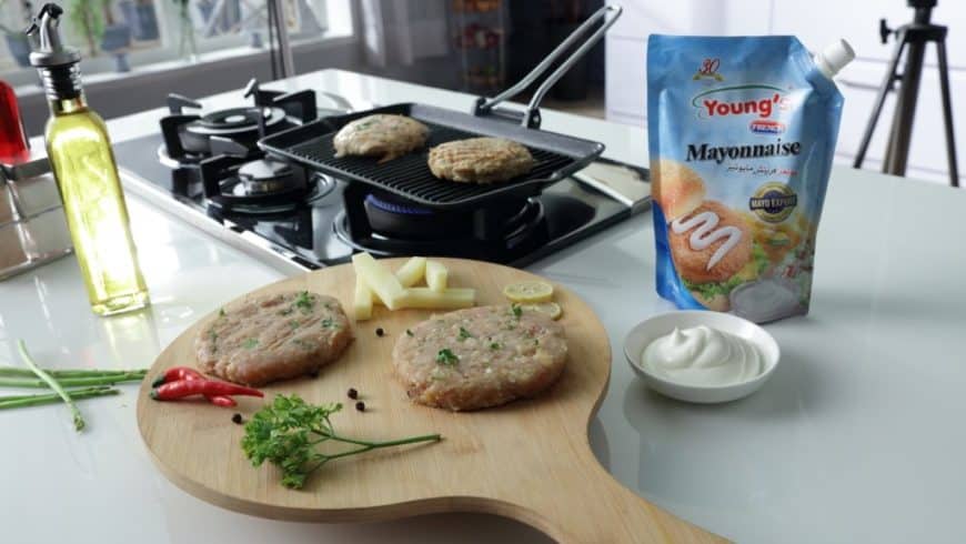
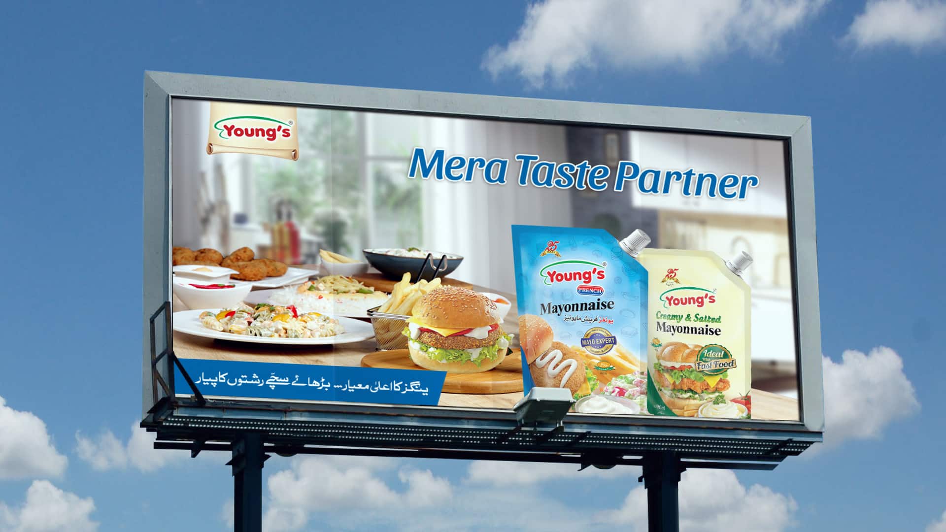
Young’s Foods decided to launch it’s first ever ATL communications for their brand Young’s Mayonnaise of brand, where the brand aims to create their inspiring imagery at par with the international food brand and depict their leadership positioning being the No.1 Selling Multi-Billion Value Winning Brand.

Young’s Foods embarked on its first-ever ATL campaign for Young’s Mayonnaise, aiming to position it alongside international food brands and reinforce its status as Pakistan’s No.1 mayonnaise. The creative challenge was significant: crafting emotionally resonant storytelling without featuring human models, music, or jingles, in adherence to Shariah-compliant advertising guidelines.

Deliverables:

Brand Strategy

Brand Positioning Statement

Communication Strategy

Creative

Creative Platform

Ideation & Storytelling

TV Concept & Storyboard

Copy & Content Writing

Key Visuals

Production Management

Tabletop Film Production

On-Boarding Filmmaking Teams

Director Board & Treatment Note

Production Design & Plan

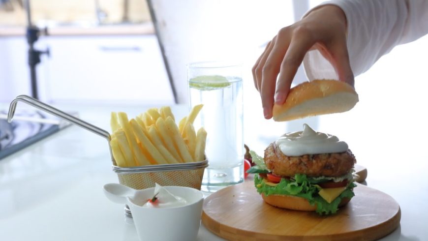
Food Styling Direction
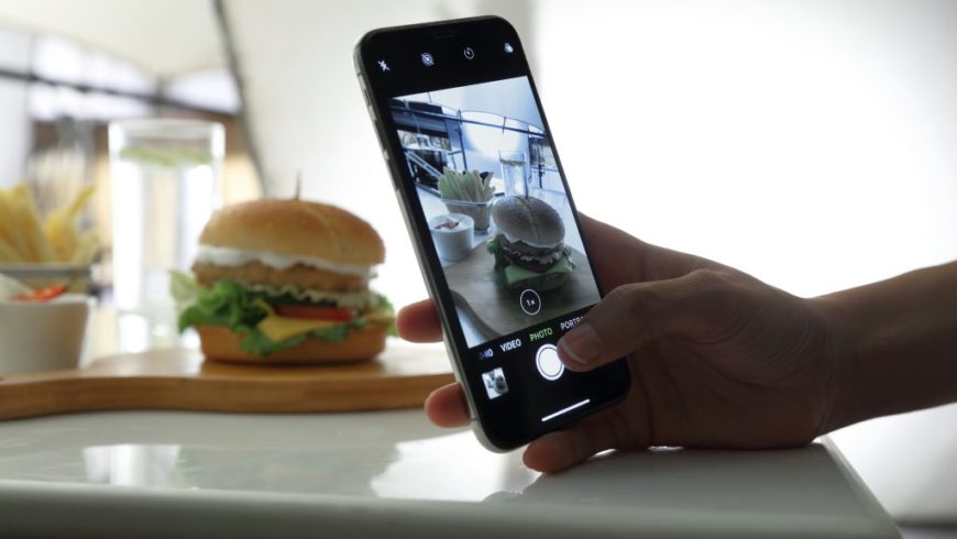
Still Photography

Shoot & Post Production

Insight

Celebrating the Mother-Daughter Bond

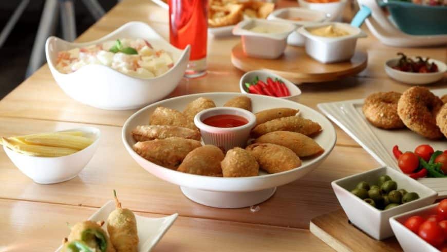
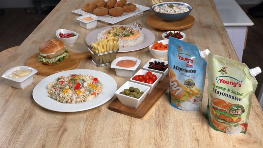
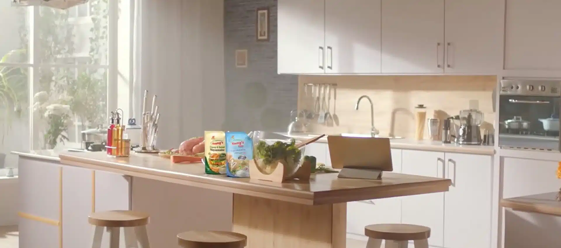
In Pakistani households, the kitchen is more than a place for cooking; it’s a space where relationships are nurtured. The evolving dynamic between mothers and daughters—where traditional culinary wisdom meets modern experimentation—provided a rich narrative ground. This intersection of experience and innovation became the cornerstone of our campaign.

Brand Purpose & Cultural Strategy

Enhancing the Taste of Love

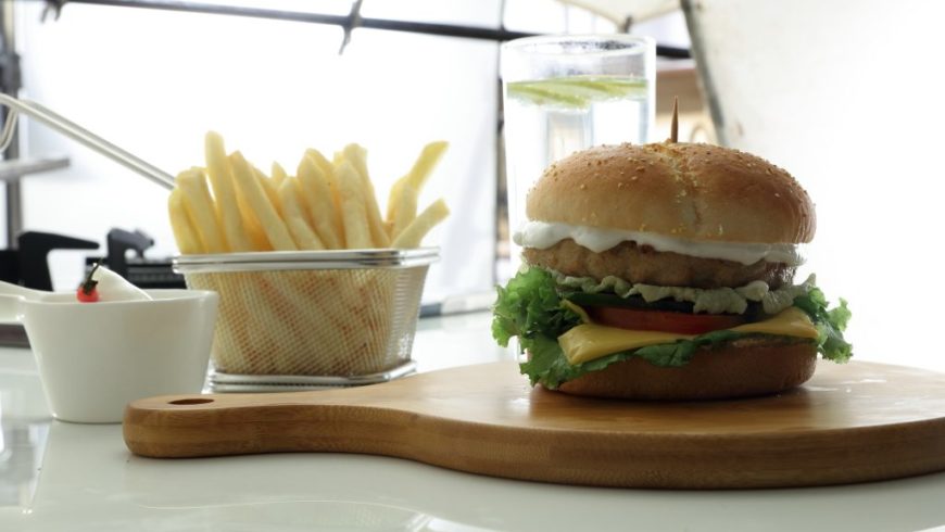
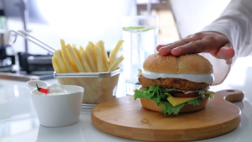
We articulated Young’s Mayonnaise’s brand purpose as “Enhancing the Taste of Love,” building a cultural narrative around the “Culture of Nurturing Relationships.” The campaign highlighted the collaborative spirit of mothers and daughters in the kitchen, showcasing how their joint efforts, complemented by Young’s Mayonnaise, create meals filled with love and flavor.

Brand Voice

Warm, Relatable and Heartfelt

The brand adopted a tone that was both warm and relatable, focusing on the emotional aspects of cooking and familial bonds. By emphasizing shared experiences and the joy of creating meals together, Young’s Mayonnaise positioned itself as more than just an ingredient—it became a symbol of love and togetherness.

Storytelling & Ideation

Crafting Emotional Narratives

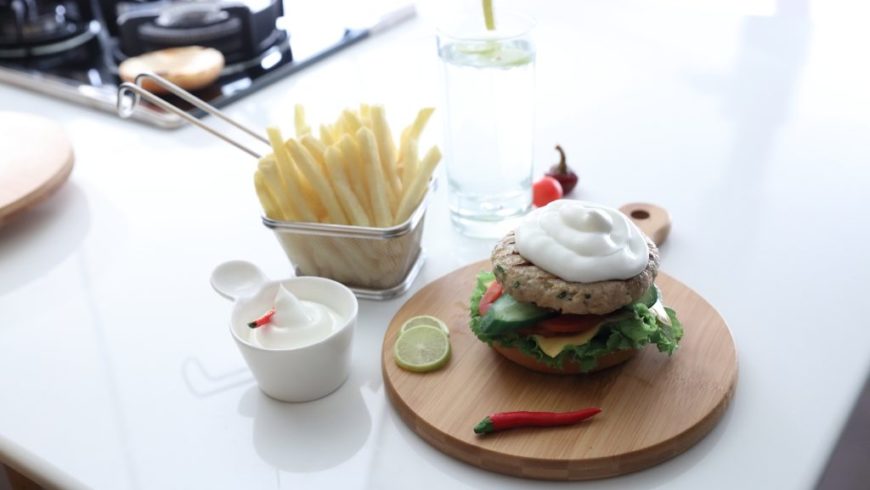
Given the constraints of Shariah-compliant advertising, the campaign relied on evocative imagery and storytelling to convey its message. Scenes depicted the hands of a mother and daughter preparing meals together, the textures of the ingredients and the final dishes enhanced by Young’s Mayonnaise. This approach allowed viewers to connect emotionally without the need for human models or music.

Signature Visual Identity

The Open Kitchen Door

In the TVC, the recurring motif of the open kitchen door serves as a powerful metaphor. It represents:

  • Transparency and Trust: Inviting viewers into the heart of the home, showcasing the authenticity of relationships nurtured within.
  • Inclusivity and Togetherness: Highlighting the collaborative spirit between mothers and daughters as they create meals together.
  • Culinary Creativity: Emphasizing the kitchen as a space where love and taste are blended, with Young’s Mayonnaise enhancing every dish.

Results

Strengthening Brand Leadership and Emotional Connection

Emotional Resonance: Post-campaign research indicated a significant increase in emotional connection with the brand, particularly among women.
Market Leadership: The campaign reinforced Young’s Mayonnaise’s position as the market leader, with a reported 2X growth compared to industry averages.
Brand Recall: The unique storytelling approach led to high brand recall and appreciation for the brand’s values and messaging.

Conclusion

From Product to Cultural Symbol

The Young’s Mayonnaise campaign successfully transcended traditional advertising methods, turning product promotion into a celebration of familial bonds. By focusing on the universal theme of love and togetherness in the kitchen, the brand not only adhered to cultural and religious guidelines but also deepened its connection with consumers, solidifying its place in the hearts and homes of Pakistani families.

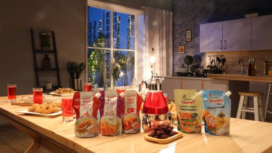
Young’S Dip Sauce Launch Campaign

Young's Chicken Spread Kids Influencer Tvc

BTS

Nestle Nido Bunyad


ACTIVATIONS & EVENTS

Interactive Consumer Shows

400 Households

450 Consumer Shows

Activating Foundation Of Success

NIDO BUNYAD INTERACTIVE CONSUMER SHOWS

Background

Nido Bunyad powder milk was launched as an affordable solution with iron fortification, which would help give a strong foundation for success.

The Challenge

Our challenge was penetrating the sec C & D income segments to open up the bottom of the pyramid to Nido.

Activation Objective

To create awareness of NIDO Bunyad as an affordable solution with iron fortification, which will empower mothers to change the fate of the next generation.

Ideation: Activating Foundation Of Success

Launch of Nido Bunyad Consumer Shows by reaching out to households belonging to SEC C & D through DDS (Door to Door Sachet Sampling – Sale of 1 + 1 sachet linked with the lucky draw on BMX Cycle beside surprise gift for mothers too.

Educate the mothers through Nido Bunyad Consumer Shows by creating awareness that:– Every third child in Pakistan is Iron Deficient.

NIDO Bunyad is an ideal affordable (more economical than loose milk) with better nutritional value than pasteurized milk. It reinforces the Iron Fortified positioning that gives a solid foundation to their growing kid.

Hence make Nido Bunyad the perfect partner (Kamyabi Ki Bunyad) for mothers to help them create a better future for their kids, thus enabling them to achieve their dreams and lead success.

We successfully managed the activation by reaching out to 400,000 households in the south region, starting from Karachi, using various contact points.

By going door-to-door (DDS) doing free sampling, product briefing and inviting mothers and kids to a total of 450 informative and interactive consumer shows in a total of 276 in Karachi city and South outstation cities like Hyderabad, Nawabshah, Mirpurkhas, Khairpur, Larkana and Sukkur.

Overall activity achievement level: 121%

DELIVERABLES:

Strategy & Ideation

Activation Strategy

Activation Platform

Activation Ideation

On-Ground Activation

Planning & Execution

Supervision & Reporting

Door-Door Sales

Consumer Briefing & Engagement

Show Invitation & Badging

Towns & Venue Permissions

Town & Shop Merchandising

Venue & Vehicles Branding

Transportation & Food

Creative & Design

Activation Theme

3D Stage & Venue Creation

Stall & Van Branding

Copy & Content

POS & Merchandising

Collateral Material

Sales Team Kit

Interactive Consumer Shows

Show Content & Segments

Show Team Management

Show Host & Celebrity Management

Audience & Participants Management

Stage & Stall Management

Venue Branding Management

Briefing & Training

Brand Ambassadors

Host & Nutritionists

Activation & Show Teams

Logistic Management

Stage & Stall Fabrication

Branding Placements & Installation

Sound & Lights

Seating & Decoration

Installation

Team Boarding & Lodging

Giveaways & Gifts Management

Product Storage & Sampling

Transportation & Generator

Refreshment & Lunch

Security & Protocol

NIDO GEHMA GEHMI

100,000 Households

350 Interactive Shows in Apartments

100 Float Shows in Residential Neighbourhoods

10 Signs Of Nutrition

CONSUMER SHOWS


The activation objective was to convince the mothers that NIDO is nutritionally the most superior milk for their growing-up children.

The activity involved:

  • Reaching out to 100,000 households through door-to-door sachet sampling.
  • Distributing Nido benefit folders.
  • Merchandising the apartments and complexes.

350 apartments successfully hosted interactive Nido shows and float activations blanketed 100 residential neighborhoods.

Oceana Greens

Marketing Campaign

New Product Launch

Oceana Greens

Oceana Greens: Where Luxury Meets Nature

Nestled along the captivating coastline of Costa Brava, Spain, Oceana Greens is a harmonious blend of luxury and nature. This residential haven offers a tranquil sanctuary where modern architectural elegance meets the serene embrace of nature, providing residents with unparalleled views of majestic mountains and verdant valleys.

Project Scope

Brand Purpose
Brand Strategy & Positioning
Brand Portfolio & Architecture
Brand Identity & Imagery
Brand Style Guidelines
Logo Creation
Packaging & Label
Messaging & Tone-of-Voice
Brand Concepts & Communications
Brand Tagline
Experiential Designs
Website & E-commerce
Retail Branding & Merchandise
OOH – Signage & Billboard
Marketing Collateral

LOGO / STATIONARY

Brand Philosophy

Oceana Greens believes in harmonious living, where the tranquility of nature and the luxury of modern design coexist. Every aspect of the community is designed to foster a deep connection between residents and their surroundings, promoting a lifestyle that’s both sustainable and luxurious.

Inspiration

We crafted a brand fusion of modern design and nature-inspired aesthetics. The design subtly intertwines the serenity of natural landscapes with the sophistication of modern architecture, preserving the integrity of Oceana Greens. Our digital marketing strategy was seamlessly integrated with an immersive customer experience journey and an interactive event for potential homeowners.

Harmony Circle and Cohesive Identity

Our branding narrative incorporated the ‘Harmony Circle’—a symbolic representation of Oceana Greens’ integration of sustainable living, genuine amenities and vibrant wellness. This cohesive identity was also reflected in the project’s floor plan, presented as a thoughtful curation to enhance the living experience.

Brand Naming

“Oceana Greens” was chosen to encapsulate the essence of the project. “Oceana” signifies its close proximity to the ocean, while “Greens” emphasizes the lush, verdant surroundings and the project’s commitment to sustainability.

Brand Identity Development

Drawing inspiration from the coastal beauty of Costa Brava, the brand identity seamlessly blends modern design with nature-inspired aesthetics. Earth tones are predominant, fostering a deep connection between residents and nature.

Logo Concept

The logo for Oceana Greens is a gold double outline circle, intricately designed with patterns of leaves and waves, symbolizing the harmonious blend of nature and luxury. This ‘Harmony Circle’ is a testament to Oceana Greens’ commitment to integrating sustainable living, genuine amenities and vibrant wellness.

Brand Usage Guide

A comprehensive guide detailing Oceana Greens’ visual and verbal guidelines ensures a cohesive brand presentation across all touchpoints, from brochures to digital platforms, maintaining consistency with the brand’s core philosophy.

Brand Tagline

“Harmonious Living, Naturally.”

Brand Essence

Harmonious Living.

Brand Imagery

Distinctive brand imagery depicts the luxurious, serene and eco-conscious spirit of Oceana Greens. This imagery, consistently carried through various branding materials, creates a cohesive and engaging brand narrative.

Web Design & E-commerce

Oceana Greens’ online presence is a testament to its commitment to harmonious living. The website offers potential residents a comprehensive view of the project, emphasizing its natural surroundings, architectural brilliance and commitment to sustainability

Brand Communications:

Through strategic branding initiatives, Oceana Greens’ narrative emphasizes the art of harmonious living, sustainability and luxury. The branding materials, including the website, brochures and promotional content, effectively communicate the essence of Oceana Greens, making it a sought-after residential destination in Costa Brava.

Brand Culture

Oceana Greens fosters a culture of sustainability, luxury and community. Residents are encouraged to immerse themselves in nature, engage in community events and live a lifestyle that’s both eco-conscious and luxurious.
Read More

KEY VISUALS

OUTDOOR

WEBSITE

Bella Gold

Marketing Campaign

New Product Launch

Bella Gold

Elevating Beauty to Timeless Elegance

At Owl Branding Studio, we were presented with the opportunity to craft a special edition range for Bella Greek, a brand synonymous with beauty and Grecian elegance. Recognizing the timeless allure of gold and its significance in beauty, we conceptualized and brought to life “Bella Gold.” This range is not just a testament to the timeless beauty of gold but also a reflection of the modern woman’s desire for skincare that’s as radiant and enduring as gold itself. Through Bella Gold, we aimed to merge the enchanting allure of gold with contemporary skincare innovations, creating a line that celebrates beauty as timeless as gold.

Project Scope

Brand Purpose
Brand Strategy & Positioning
Brand Portfolio & Architecture
Brand Identity & Imagery
Brand Style Guidelines
Logo Creation
Packaging & Label
Messaging & Tone-of-Voice
Brand Concepts & Communications
Brand Tagline
Experiential Designs
Website & E-commerce
Retail Branding & Merchandise
OOH – Signage & Billboard
Marketing Collateral

Brand Philosophy

At Bella Gold, we believe that beauty, much like gold, is enduring, radiant and worthy of celebration. Our products are crafted to amplify your natural beauty, imparting a golden glow that’s as timeless as it is radiant. Every product in this range is a reflection of our commitment to celebrating beauty that’s as timeless as gold.

Brand Name & Identity Development

“Bella Gold” – A name that encapsulates the allure and timeless beauty of gold. This special edition range from Bella Greek is designed to empower and celebrate the golden beauty in every individual.

Brand Logo

The Bella Gold logo, an emblem of elegance, symbolizes the timeless charm and allure of gold. It’s a reflection of our commitment to celebrating beauty that’s as enduring and radiant as gold itself.

Packaging Concept

Bella Gold’s packaging is a blend of elegance and sophistication. The design, predominantly in golden hues, is accentuated with subtle accents that reflect the brand’s commitment to luxury and timeless beauty. Each product not only offers a skincare solution but also feels like a piece of art, echoing the brand’s ethos.

Brand Imagery

Bella Gold’s imagery is a blend of the timeless charm of gold and the modern elegance of today’s woman. Every image tells a story of elegance, luxury and the timeless beauty that gold represents.

Brand Tagline

“Beauty as Timeless as Gold”

Website Design & E-commerce

Bella Gold’s online realm is a reflection of its commitment to timeless beauty and luxury. Every visitor is not only introduced to Bella Gold’s offerings but also feels the brand’s dedication to celebrating the golden beauty within every individual.

Brand Usage Guide

A comprehensive guide detailing the correct usage of the brand logo, colors, typography and other visual elements to ensure consistency across all platforms. The branding extends across various touchpoints, ensuring a consistent brand experience wherever customers interact with Bella Gold.

Brand Communications

Bella Gold’s communication strategy is a blend of product storytelling and celebrating the allure of gold. Through captivating narratives, we evoke a sense of empowerment, elegance and unmatched beauty, all tied to the timeless charm of gold.
Read More

PACKAGING

KEY VISUALS

OUTDOOR

WEBSITE

Luko Hvar Island

Marketing Campaign

New Product Launch

Luko Hvar Island

Weaving a Denim Narrative for a New Age Brand

Luko Hvar Island is a private luxury resort tucked away in the captivating landscape of Hvar, Croatia. This exclusive destination is set to redefine luxury and offer an unparalleled holiday experience. Collaborating with our network branding agency, Owl and MI Worldwide, we embarked on a mission to showcase this epitome of modern business lifestyle digitally.

Project Scope

Brand Purpose
Brand Strategy & Positioning
Brand Portfolio & Architecture
Brand Identity & Imagery
Brand Style Guidelines
Logo Creation
Packaging & Label
Messaging & Tone-of-Voice
Brand Concepts & Communications
Brand Tagline
Experiential Designs
Website & E-commerce
Retail Branding & Merchandise
OOH – Signage & Billboard
Marketing Collateral

LOGO / STATIONARY

Brand Philosophy

The fusion of ‘bespoke art’, ‘luxury’ and ‘personalisation’ led to the brand conceptualisation of ‘barefoot luxury’, which further led to the positioning of ‘Luxurious Escape to Nature’. We created and integrated the brand pillars of ‘Intuitive’, ‘Imaginative’, ‘Individuality and ‘Indulgent’ that fortified the brand essence.

Brand Naming

Drawing inspiration from the word ‘Luka’, meaning ‘harbour’ in Croatian, we named the resort ‘Luko Hvar Island’, signifying its serene location by the sea.

Brand Identity Concept

Our brand identity is a creative expression drawn from the tranquil azure waters and lush, verdant landscapes of Hvar. The serene sea that surrounds the island is symbolized through wave patterns, emphasizing our harmonious relationship with the waterfront. Leaf patterns reflect the verdant landscapes, reinforcing our deep connection to nature. These elements inspired the crafting of our logo and fonts, using a color palette derived from shades of azure and verdant. Together, these artistic elements visually embody Luko Hvar Island’s identity as a “Luxurious Escape to Nature”.

Brand Usage Guide

The collaterals were developed using a watercolor concept and the new visual identity was executed efficiently throughout the multichannel work. We designed the signage and wayfinding system using functional handmade icons to escape the geometric classic ones. We developed an interactive sales center that provided an immersive experience for the visitors. We tailored the brand architecture using an individual product brand architectural strategy where every F&B brand was given its own identity.

Brand Essence

Luko Hvar Island embodies the essence of ‘barefoot luxury’, offering guests a ‘Luxurious Escape to Nature’. The resort is a harmonious blend of modern comfort and natural beauty, providing a tranquil retreat in the heart of Hvar.

Brand Imagery

We carried out a lifestyle to portray great experiences that reflected “barefoot luxury”, “memorable moments” and “Luxurious Escape to Nature”. The images revealed people enjoying the moment and avoiding clichés of obvious and literal facets of life.

Brand Communications

Luko Hvar Island’s brand narrative is a symphony of luxury intertwined with nature’s serenity. In collaboration with the Brand Culture Network, we meticulously crafted Luko Hvar Island’s brand communications, ensuring they resonate with the resort’s ethos of a “Luxurious Escape to Nature.” This collaboration has enriched the brand’s narrative, deepening its connection with its audience and solidifying its reputation as a premier holiday destination. Our communication strategy encapsulates the essence of the island’s beauty and the experiences it offers. Through evocative campaigns like “Stroll into Serenity,” capturing the tranquil beauty of the island, “Cherished Moments in Paradise,” emphasizing family memories and “Sunset Serenades in Seaside Splendor,” portraying romantic sunsets, we’ve painted a vivid picture of the experiences awaiting at Luko Hvar Island. Each campaign is a testament to the resort’s commitment to offering moments of luxury, tranquility and unforgettable memories.

Brand Tagline

“Luxurious Escape to Nature”

Website & Web Portal

Owl Studio meticulously crafted Luko Hvar Island’s website, capturing the essence of the resort’s tranquil landscapes and luxurious amenities. Through scenic imagery and intuitive design, the website serves as a digital gateway to Hvar, Croatia, inviting visitors to immerse themselves in this luxurious nature-centric escape. The website’s watercolor concept and brand patterns enhance its functionality and user interface, offering a seamless digital journey. From the azure sea’s allure to the lush greenery’s embrace, every page and element is designed to resonate with the resort’s ethos of luxury, nature and sustainability.
Read More

KEY VISUALS

OUTDOOR

INTERIOR

INDOOR

ACCESSORIES

BROCHURE

FLYERS

WEBSITE

Jashanmal


Branding & Architectural

An Exquisite Perfume Haus

HOME OF SCENT WITHIN JASHANMAL, DUBAI

An exquisite perfume haus was created for distributer: extravaganza fragrances, France.

In dubai in a series of sites, accumulating to roughly 12 total sites spread throughout the UAE, with some active on-going constructions as of January 2023.

Architectural drafting, from a 2D plan to hyperrealistic visualisations were created following a thorough protocol of consultation checks by Ar. Purnia Farrukh to allow for clear and quick detailed execution by a chain of contractors.

DELIVERABLES:

Drafting, architectural design, detail drawings, 3Ds, execution, construction consultation

Bella Greek

Marketing Campaign

New Product Launch

Bella Greek

Nurturing Beautiful Womanhood Naturally

Bella Greek embodies the spirit of nurturing beautiful womanhood naturally, blending the mystical charm of Greece with modern skincare, haircare and body care innovations. Our brand celebrates the essence of womanhood, drawing on the power of nature and the rich Grecian heritage. Bella Greek is not just about beauty products; it’s a tribute to the natural grace of women, offering handcrafted experiences that capture the soul of Greece.

Project Scope

Brand Purpose
Brand Strategy & Positioning
Brand Portfolio & Architecture
Brand Identity & Imagery
Brand Style Guidelines
Logo Creation
Packaging & Label
Messaging & Tone-of-Voice
Brand Concepts & Communications
Brand Tagline
Experiential Designs
Website & E-commerce
Retail Branding & Merchandise
OOH – Signage & Billboard
Marketing Collateral

LOGO / STATIONARY

Brand Philosophy

At Bella Greek, our approach to skincare and beauty is a harmonious blend of nature, tradition and innovation. We are deeply inspired by the beauty of Greece, its rich culture and vibrant mythology. Central to our ethos is the “Women of Inspiration” initiative, through which we champion the stories of womanhood, their journeys, transformative power and their inspirations, making it an integral part of our brand’s communication.

Brand Name & Identity Development

Bella Greek” – A name that encapsulates beauty inspired by Grecian traditions, natural ingredients and the indomitable spirit of women.

Brand Logo

The Bella Greek logo, featuring the resilient dandelion, symbolizes growth, transformation and the essence of our holistic approach to beauty. which is a testament to the brand’s ethos. This emblematic symbol, combined with the brand’s chosen color palette, adds a touch of refinement, ensuring that every product feels like a piece of luxury in the hands of its beholder.

Packaging Concept

Bella Greek’s packaging design is a testament to minimalist elegance. With a predominantly white background, the packaging is accentuated with earthy green fonts and occasional light pastel backgrounds. This design approach ensures that the brand’s commitment to natural, organic ingredients and its Grecian heritage shines through, making each product not just a skincare item but a piece of art. At the heart of our packaging is the Bella Greek logo, prominently displayed, ensuring brand recognition. This is accompanied by the product name, presented in a clear and legible font, making it easy for consumers to identify and select their desired product. This minimalist approach not only enhances the visual appeal but also emphasizes the brand’s commitment to transparency and authenticity, reflecting Bella Greek’s ethos of pure, genuine and timeless beauty inspired by the heart of Greece.

Brand Tagline

“Harmony Nurtured, Naturally – Bella Greek”

Brand Communications

Bella Greek’s communication strategy is a blend of product storytelling, Grecian beauty traditions and celebrating the narratives of women who inspire, evoking a sense of empowerment, elegance and unmatched beauty.

Brand Imagery

Bella Greek’s imagery is a blend of Greece’s natural beauty and the modern woman’s elegance. From the pristine white villages of the Cyclades to the mesmerizing blue of the Aegean Sea, every image tells a story of nature’s elegance, unveiled.

Brand Usage Guide

A comprehensive guide detailing the correct usage of the brand logo, colors, typography and other visual elements to ensure consistency across all platforms. The overall branding extended across a variety of touchpoints, including packaging, outdoor advertising, signage and marketing collateral.

Website Design & E-commerce

Bella Greek’s online presence mirrors its commitment to natural beauty and empowerment. The design ensures that every visitor not only learns about Bella Greek’s offerings but feels the brand’s dedication to nurturing the natural beauty within every woman.
Read More

PRODUCTS

KEY VISUALS

OUTDOOR

ACCESSORIES

WEBSITE

Khopra Candy


CREATIVE

Perception Reshaping & Imagery
winning-brands

The Sweet Bondings

Celebrating Sweet Moments

Working on our strategic tool, we unearthed a cultural insight whereby Hilal Khopra Candy used to celebrate the most cherished moments within communities.

Taking a cue, we positioned Khopra candy as a Celebration of the ‘Sweet Moments’ instead of humor as previously – we communicated the sweet bondings of various relationships such as between two sisters, brother & sister and even friends – celebrating sweet moments.

Our communication showed the Hilal Khopra Candy as a means of celebrating and enjoying those sweet moments.

For the first time, the core USP of Khopra Candy, it’s a special formulation of a unique blend shown in the product story through high-speed shots of a visual feast of Sweet Bondings of milk, creamy caramel and coconut.

Deliverables:

Brand Strategy

Brand Positioning Statement

Brand ID & Seed

Communication Strategy

Creative

Creative Transformation

Perception Reshaping

Creative Platform

Ideation & Storytelling

TV Concept & Storyboard

Copy & Content Writing

Key Visuals

Print Ads & OOH

Production Management

International Film Production

On-Boarding Filmmaking Teams

Production Design & Plan

Talent Management

Singer & Music

Still Photography

Shoot & Post Production

Ideation & Storytelling

Working on our strategic tool, we unearthed a cultural insight whereby Khopra was used to celebrate the most cherished moments within communities.

Taking a cue, we positioned Khopra candy as a Celebration of the ‘Sweet Moments’ instead of humor as previously – we communicated the sweet bondings of various relationships such as between two sisters, brother & sister and even friends – celebrating sweet moments.

Our communication showed the candy as a means of celebrating and enjoying those sweet moments.

For the first time, the core USP of Khopra Candy, it’s a special formulation of a unique blend shown in the product story through high-speed shots of a visual feast of milk, creamy caramel and coconut.

Result

The communication proved to be a super hit, effectively building up sales to transform into a multi-billionaire winning brand besides building Hilal’s overall master brand imagery.

BTS

TIFFANY RUSKS


Creative

Integrated Marketing Campaign

Your Delicious Breakfast Call

No More Breakfast Calls

Tiffany, the flagship brand of IFFCO, was entering the first time in the Rusk category through the launch of Tiffany Rusks and required a 360º marketing/advertising campaign.

Deliverables:

Brand Strategy

Brand Positioning Statement

Brand ID & Seed

Communication Strategy

Creative

Creative Transformation

Creative Platform

Ideation & Storytelling

TV Concept & Storyboard

Copy & Content Writing

Key Visuals

Digital & Social

Print Ads & OOH

Production Management

Ad Film Production

On-Boarding Filmmaking Teams

Production Design & Plan

Talent Management

Singer & Music

Still Photography

Shoot & Post Production

Ideation & Storytelling

Through insights, it unearthed that housewives and mothers face a ‘time crunch’ of getting everybody ready for schools and offices

The brand’s purpose was thus established and presented rusks as a solution of ‘no more breakfast calls’, We would help families start a Great Morning every day.

The communication aimed to show consumers the delicious crunch of tiffany’s rusks and make it a part of every family’s breakfast table.

To differentiate tiffany rusks from its rival rusk brands, we believed it was important that the communication highlighted the unique freshness because of the three new pack process, which translates into a better, more satisfying ‘crunch’ sound rather than the usual attributes of Rusk -common selling points in the industry.

Taking the ownership of “crunch,” which is one of the key attributes of rusks, we strongly communicated the natural ingredients by showing high-speed beauty shots, i.e., milk, wheat, flour, butter and cardamom.

In the communication from the perspective of a mother/housewife making breakfast for her family, the emphasized the ideology that Rusk promises a nutritionally rich & tasty morning breakfast that helps people start a wonderful day, a promise we communicated by showing that the rusks were so delicious that they called everyone to the table immediately.

The communication consistently underscored that tiffany rusks were the perfect way for families to have breakfast together.

Result

The communication was a super hit, boosting the brand’s Top of Mind recall and increasing sales.

In a short period and became the largest selling brand in UAE and emerged as the leading brand among the top three players in the GCC region.

Social Post

BTS

GTR 2025

Marketing Campaign

New Product Launch

A Digital Odyssey That Moves Generations

A New Era for a Legendary Brand

After over six decades of driving Pakistan forward, GTR—Pakistan’s most trusted tyre manufacturer—embarked on a bold transformation to redefine what a tyre brand could feel like in the digital age. More than just a website revamp, this was a mission to craft an experiential digital journey that reflects GTR’s heritage, innovation and category leadership across generations.

Project Scope

Brand Purpose
Brand Strategy & Positioning
Brand Portfolio & Architecture
Brand Identity & Imagery
Brand Style Guidelines
Logo Creation
Packaging & Label
Messaging & Tone-of-Voice
Brand Concepts & Communications
Brand Tagline
Experiential Designs
Website & E-commerce
Retail Branding & Merchandise
OOH – Signage & Billboard
Marketing Collateral

The Mission

To create a youth-centric, emotionally resonant and AI-inspired digital platform that connects GTR’s product excellence with a powerful brand experience—one that speaks to Gen X, Millennials and Gen Z alike.

Working in close collaboration with our network partners at Brand Culture Network, Media Idee led the digital transformation, blending strategy, technology and creativity to turn GTR’s website into a storytelling medium built for discovery.

AI-Driven Design Meets Human-Centered Storytelling

We didn’t start with wireframes.
We began with a feeling.

From the very first scroll, users step into a cinematic brand universe—with AI-generated imagery echoing speed, trust and emotion. Car journeys morph into interactive UI elements. Roads become metaphors. Tyres become symbols of safety and pride.

Each visual is orchestrated to ignite imagination, blending motion graphics, product interaction and website mockups into a unified visual language powered by AI artistry.

Key Features That Drive Engagement

Vehicle-Based Product Discovery
Search by car brand, model and category (Passenger, SUV, Bike, Tractor, LCV) with intuitive filtering and comparison tools.

Immersive Brand Storytelling
Brand manifesto layers highlight GTR’s international technology, testing across Japan and Europe and unmatched safety & performance.

Dealer/Distributor Locator
Geo-based navigation connects users to authorized partners across Pakistan—bridging online and offline presence.

Mobile-First, Emotion-Led UI/UX
Designed for seamless experiences across devices, the site invites users to explore—not just scroll.

SEO-Optimized CMS Architecture
Ensures discoverability while allowing for real-time content and campaign integration.

GTR’s Digital Experience: Built for Loyalty, Designed for Leadership

With new players entering the Pakistani tyre market, GTR remains the only domestic brand producing passenger and SUV tyres at scale. This platform doesn’t just reflect product superiority—it fortifies GTR’s leadership among OEMs, dealers, distributors and consumers, particularly in the competitive replacement tyre market.

Conclusion

This wasn’t a website.
It was a digital odyssey.

A project where form met emotion, where product met storytelling and where a tyre brand stepped into a new era of digital leadership.

Outcome

A Digital Experience That Moves

Stronger brand recall through AI-powered storytelling

Deeper engagement with intelligent navigation

Increased dealer interaction via location-based search

Boosted organic reach with search-first site architecture

More informed product discovery through application-based personalization

Built by

Media Idee | Owl Studio

The Collective Powerhouses of Brand Culture Network

Read More

WEBSITE | AI-DRIVEN EXPERIENTIAL IMAGERY

Bold, high-impact AI visuals merge realism with futuristic artistry, reflecting the energy and style of GTR’s new experiential website. This unified design language extends seamlessly across digital and print touchpoints.

By fusing tyre technology with digital artistry, we position GTR not just as a tyre manufacturer but as a trendsetter in mobility, speaking directly to a new generation of drivers who demand both performance and style.