Marketing Campaign
New Product Launch
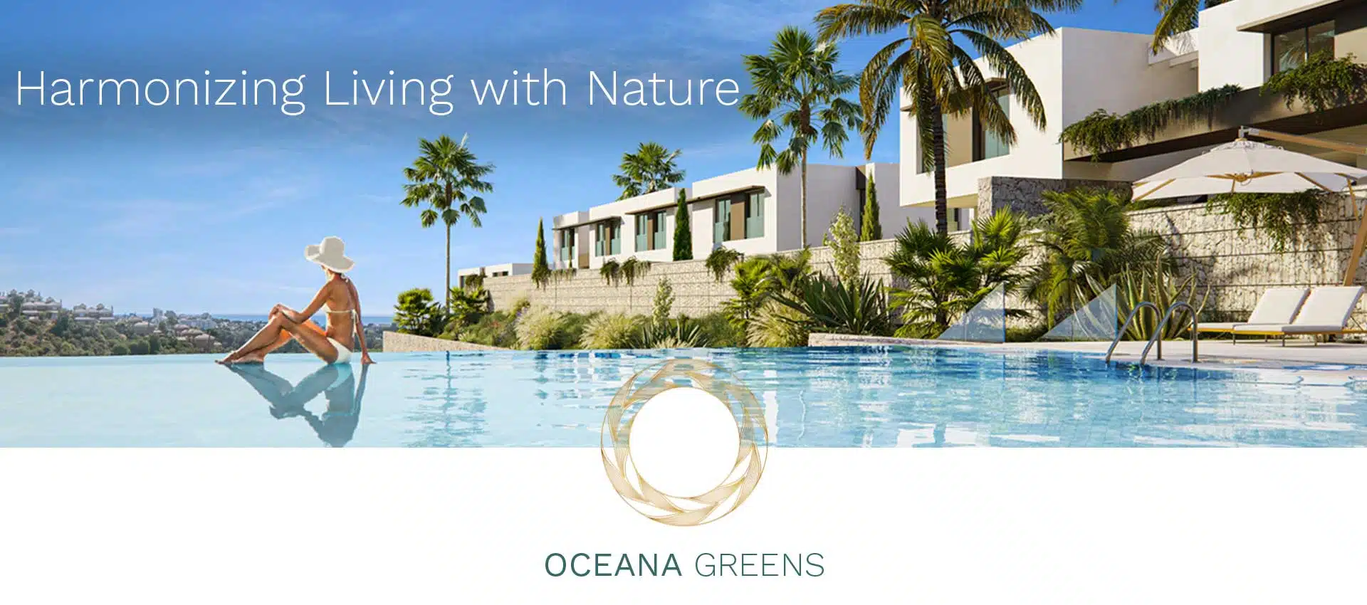
Oceana Greens
Oceana Greens: Where Luxury Meets Nature
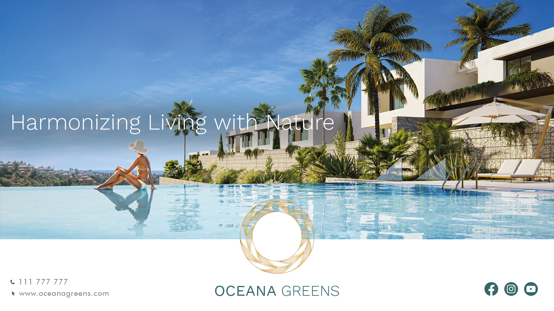
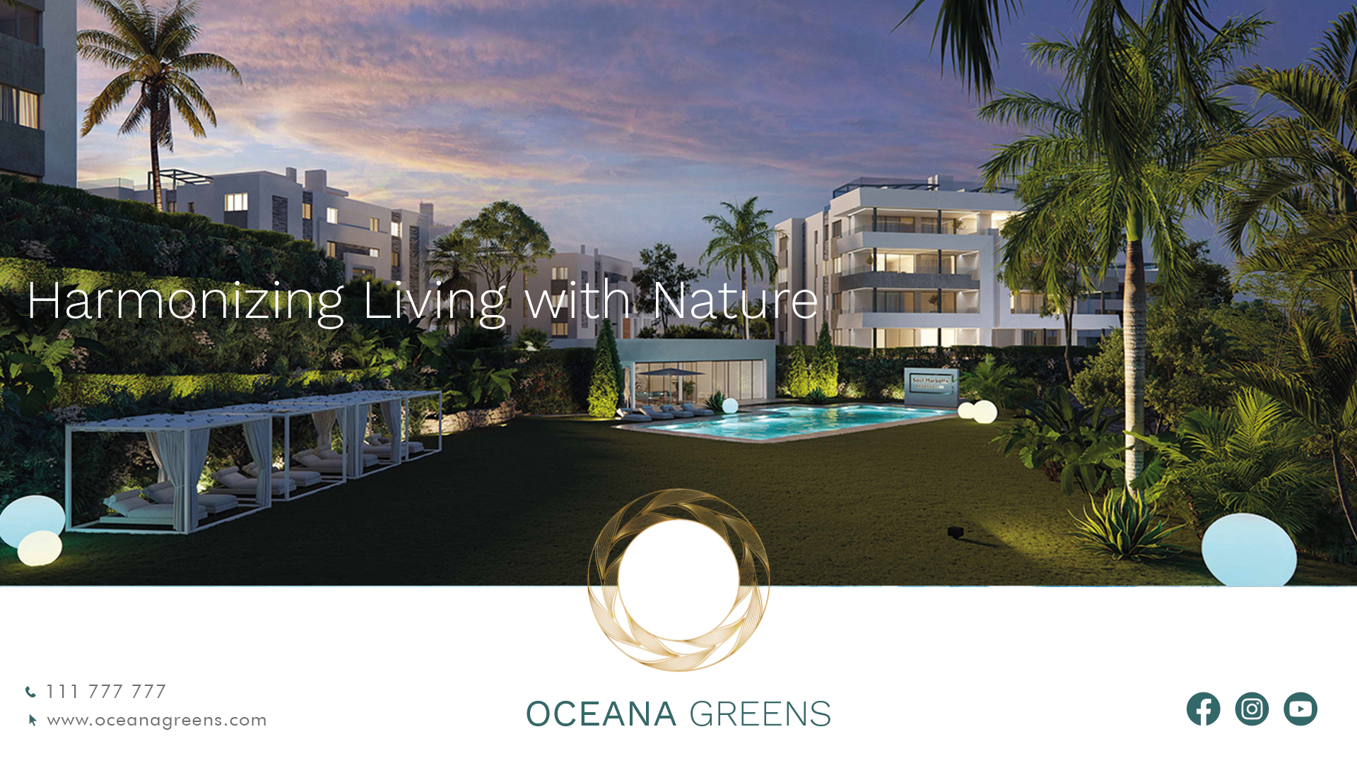
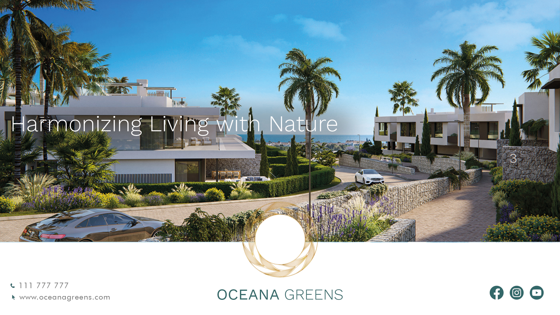
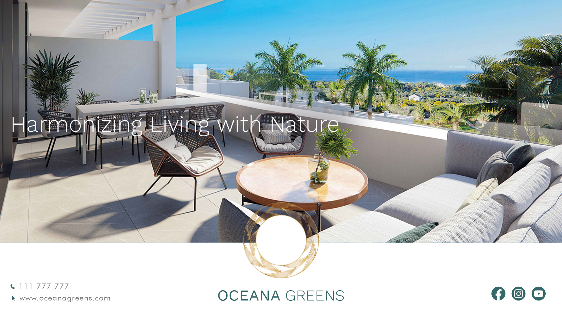
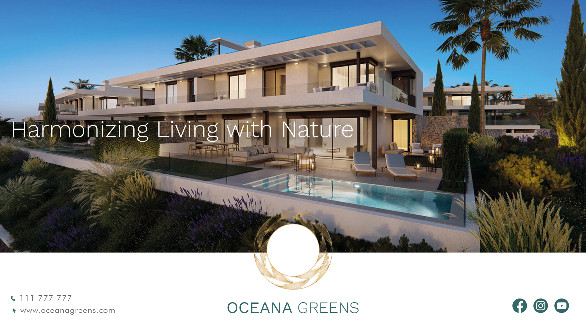
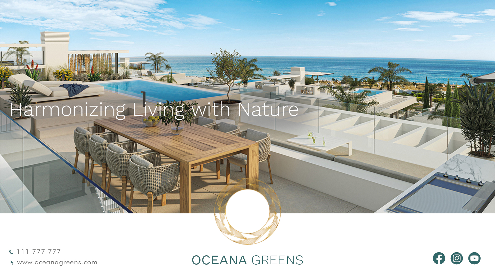
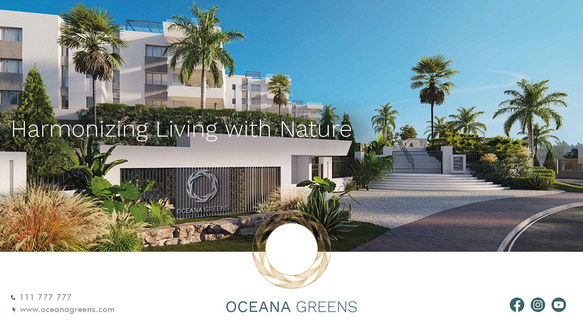
Nestled along the captivating coastline of Costa Brava, Spain, Oceana Greens is a harmonious blend of luxury and nature. This residential haven offers a tranquil sanctuary where modern architectural elegance meets the serene embrace of nature, providing residents with unparalleled views of majestic mountains and verdant valleys.
Project Scope
Brand Purpose
Brand Strategy & Positioning
Brand Portfolio & Architecture
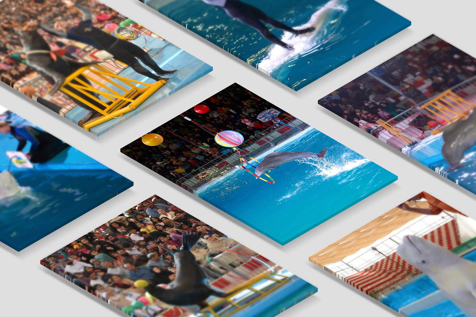
Brand Identity & Imagery
Brand Style Guidelines
Brand Strategy & Positioning
Brand Portfolio & Architecture
Brand Identity & Imagery
Brand Style Guidelines
Logo Creation
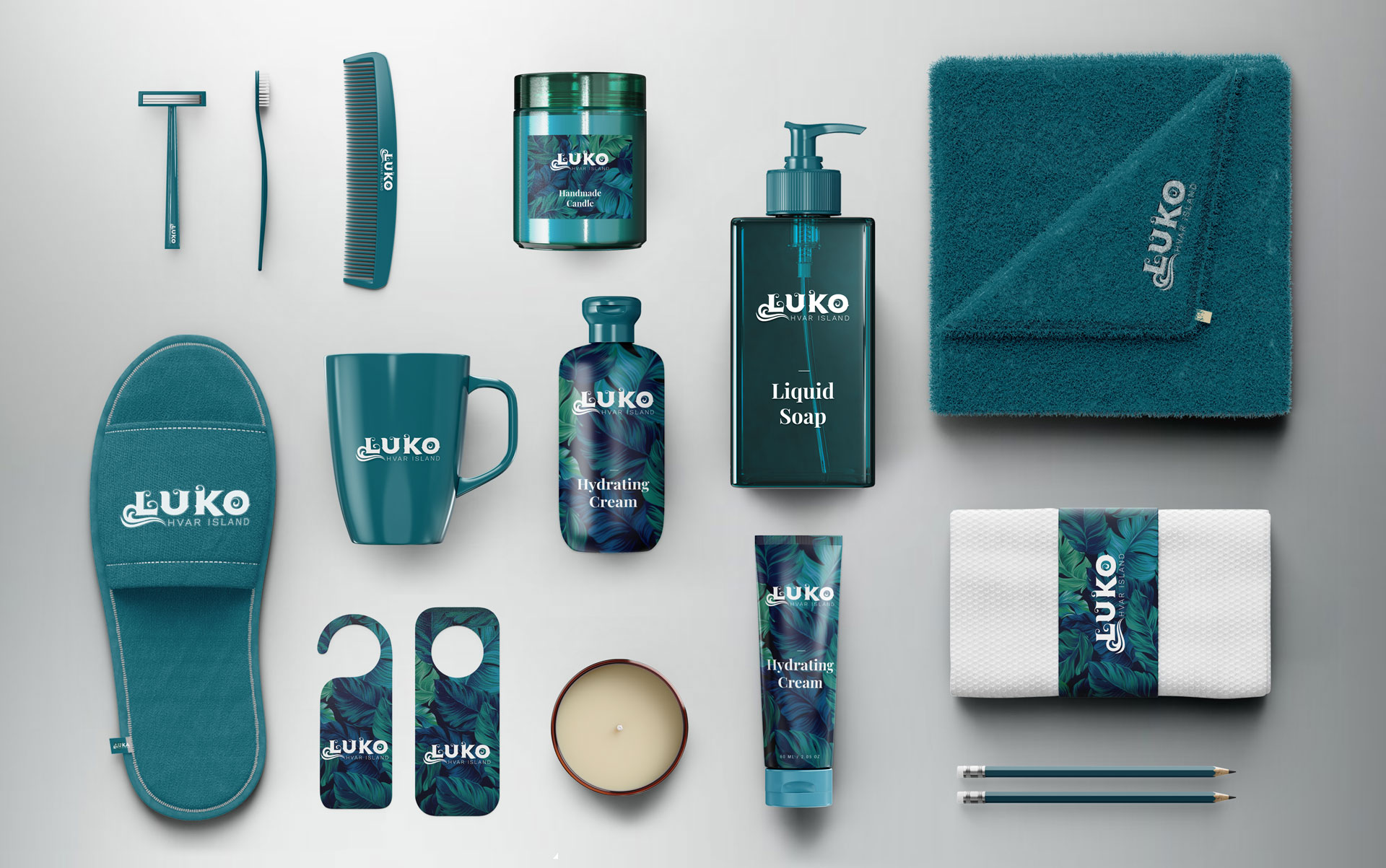
Packaging & Label
Messaging & Tone-of-Voice
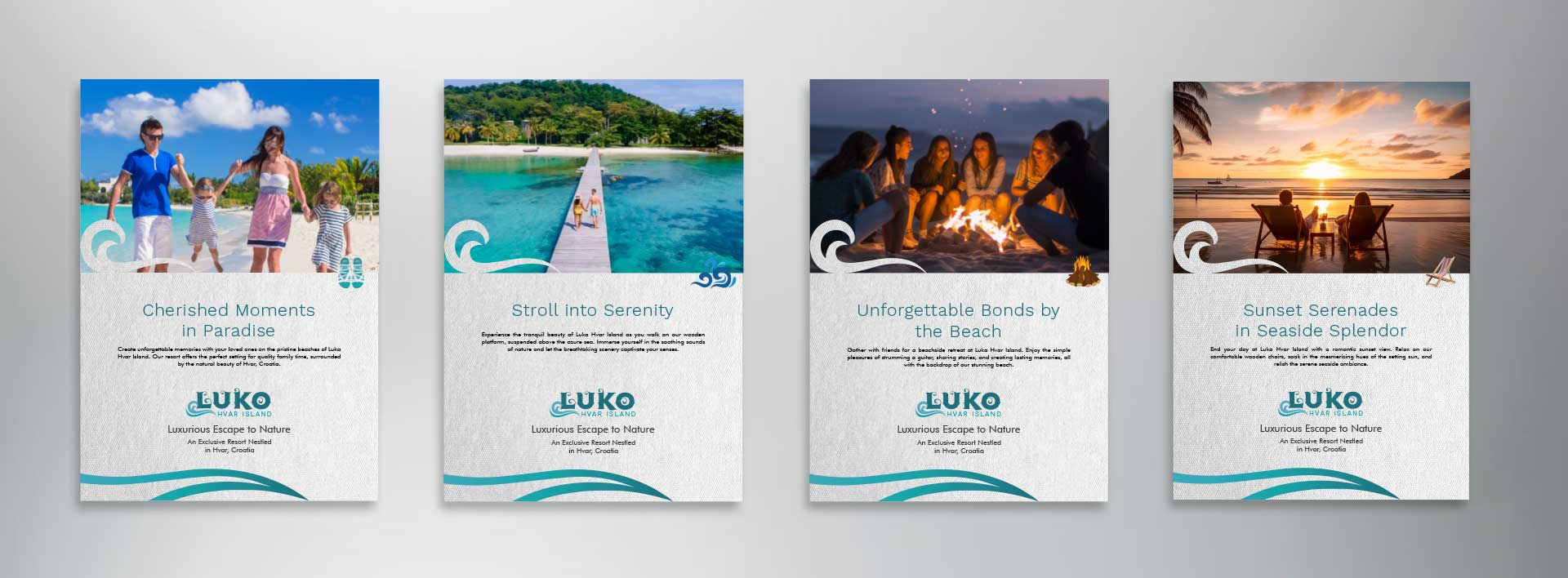
Brand Concepts & Communications
Brand Tagline
Packaging & Label
Messaging & Tone-of-Voice
Brand Concepts & Communications
Brand Tagline
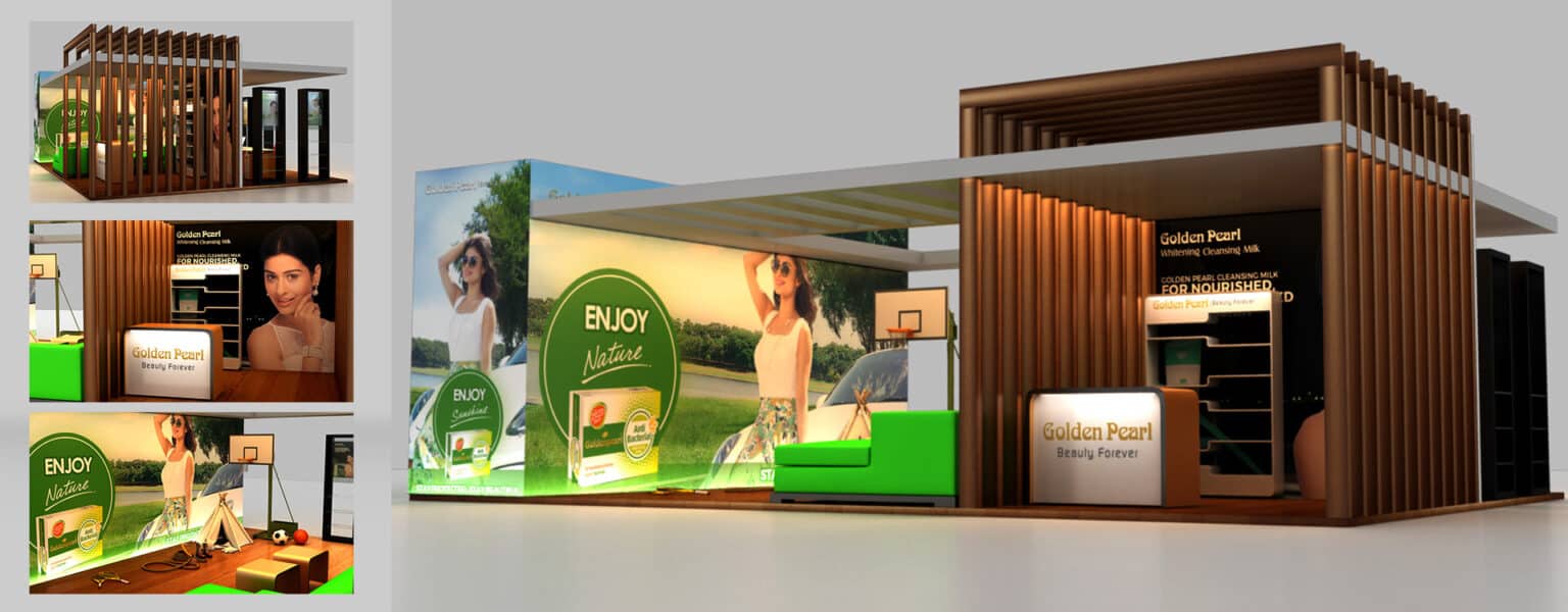
Experiential Designs
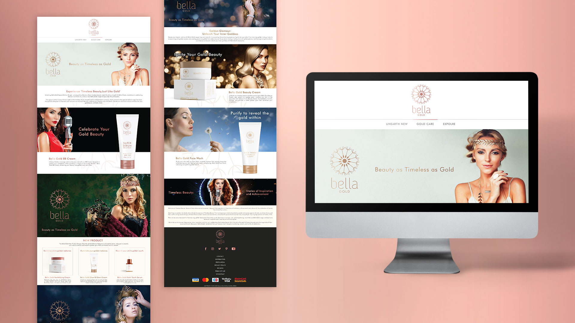
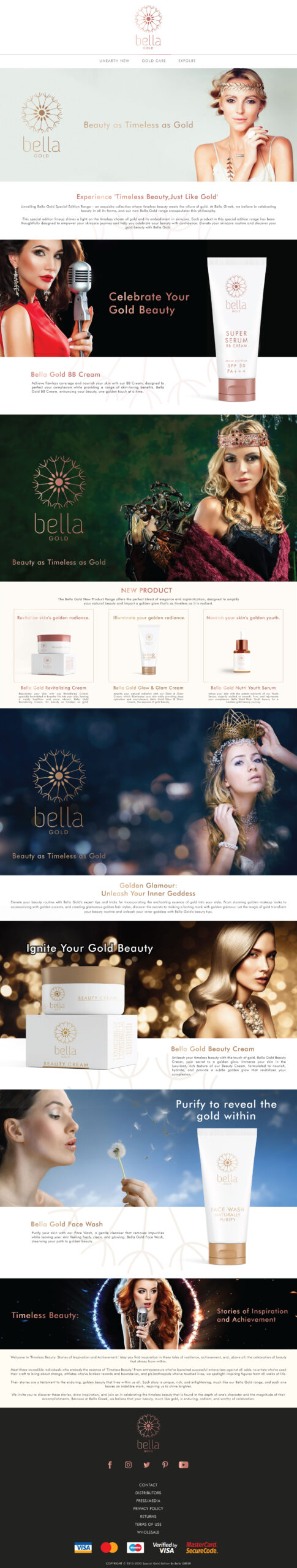
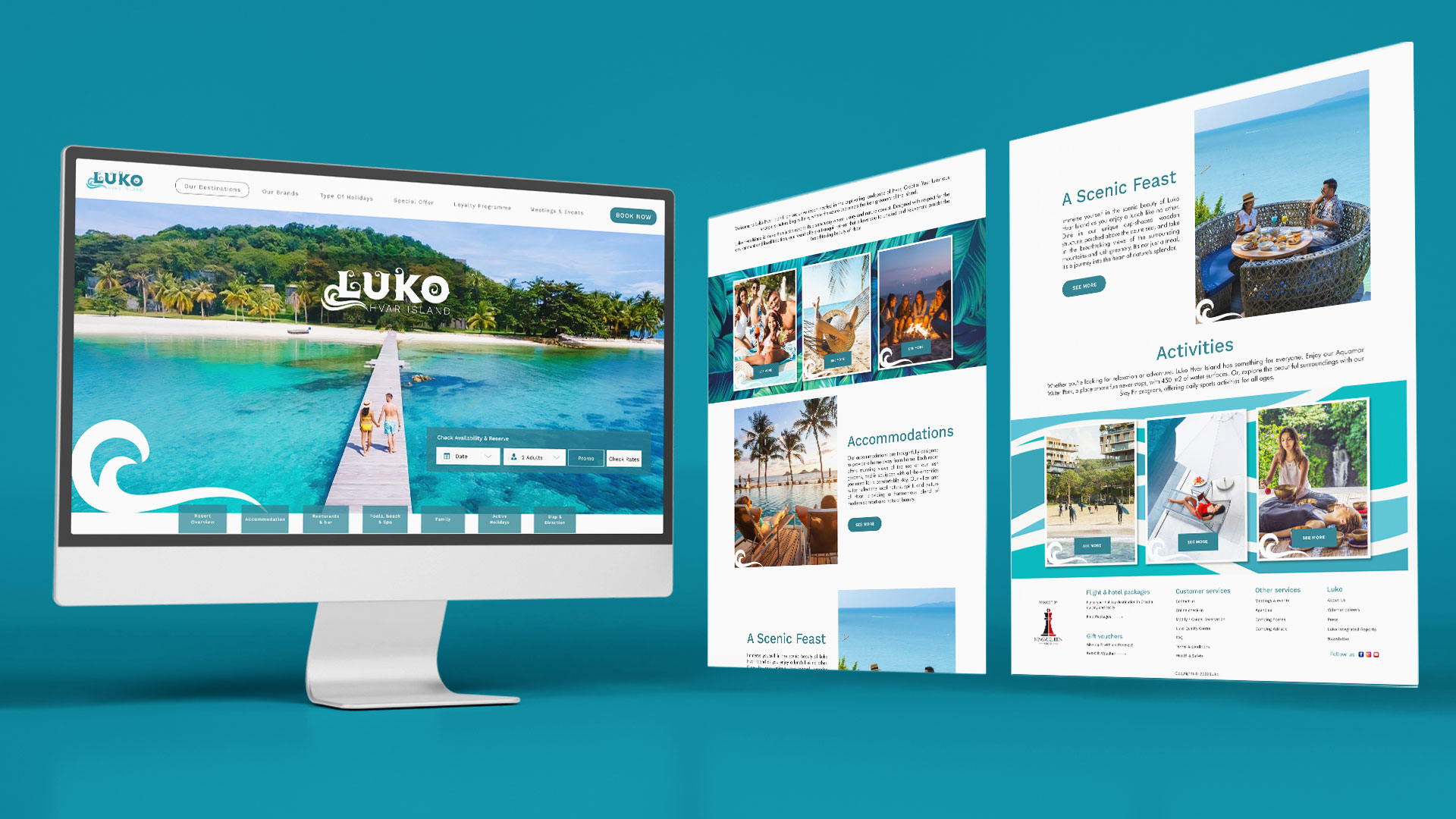
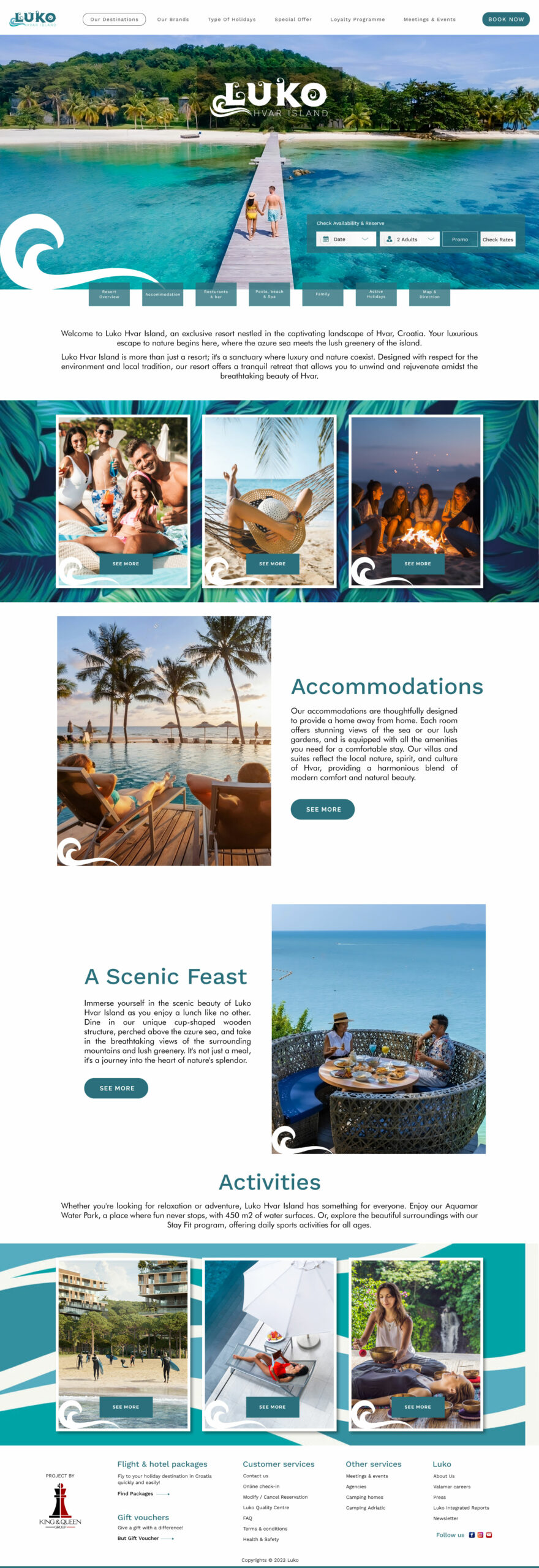
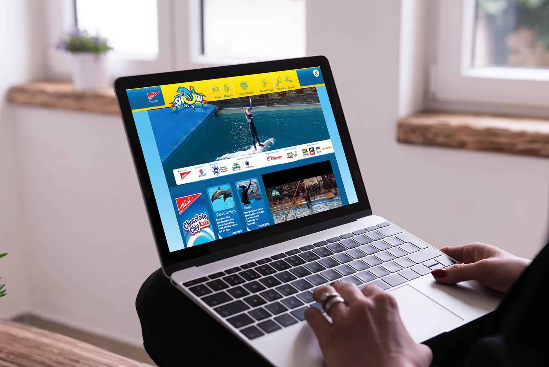
Website & E-commerce
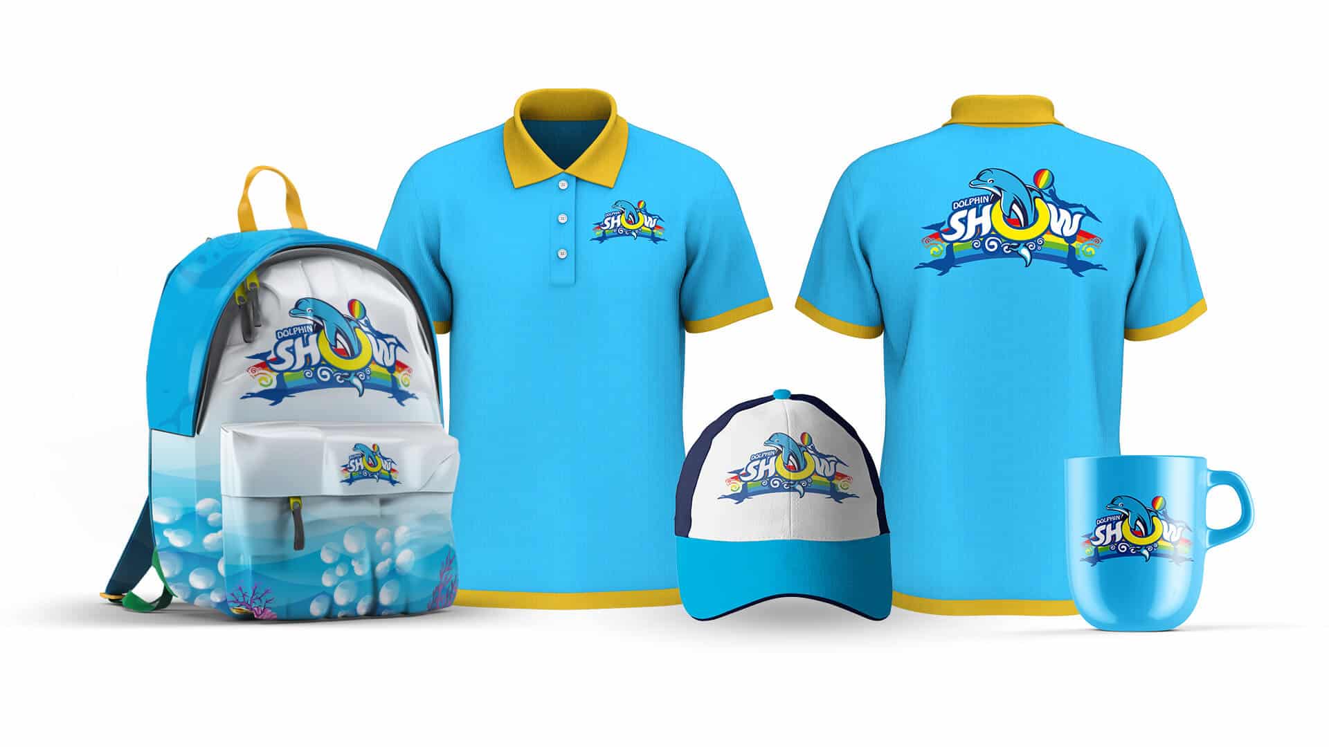
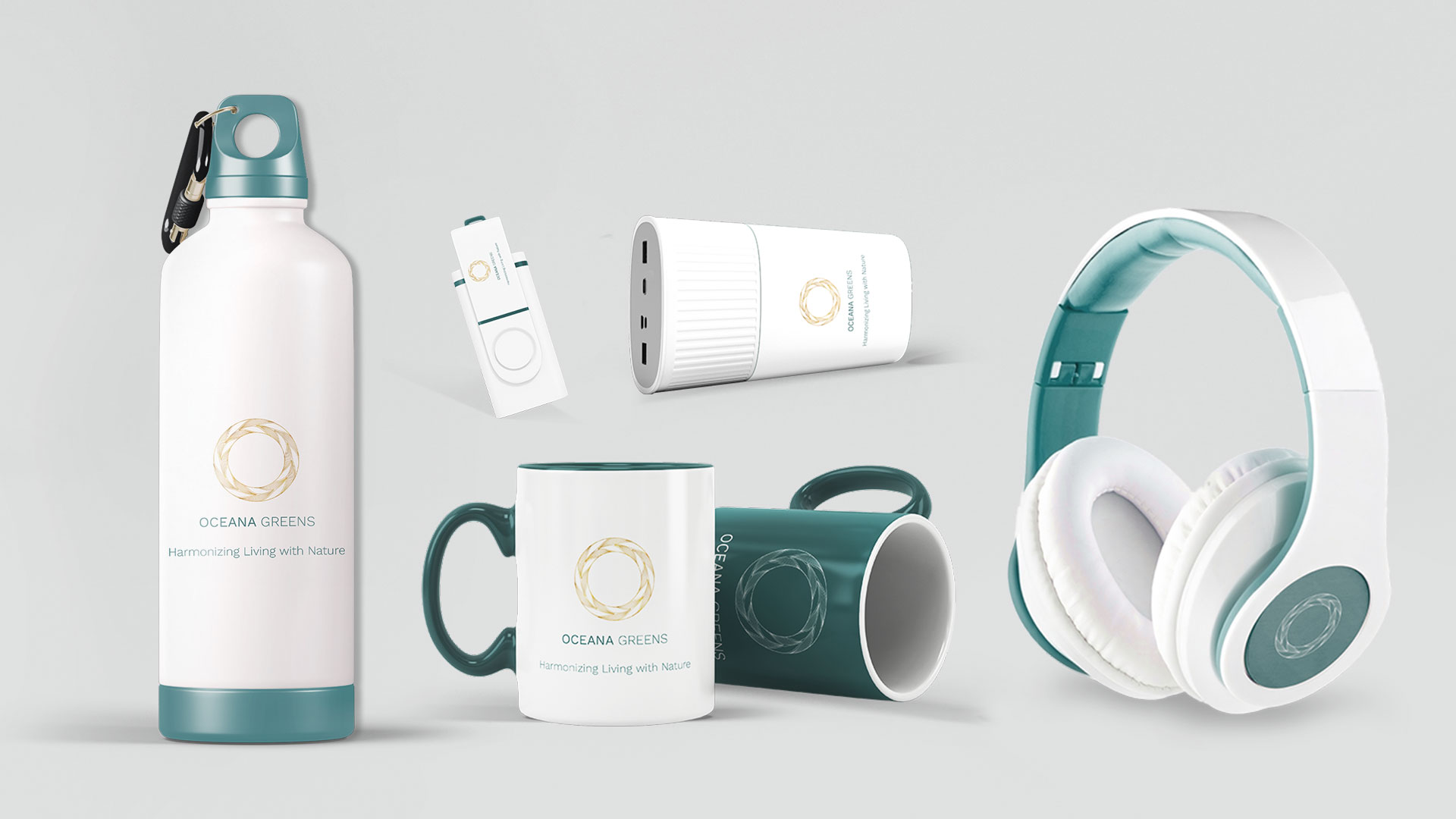
Retail Branding & Merchandise
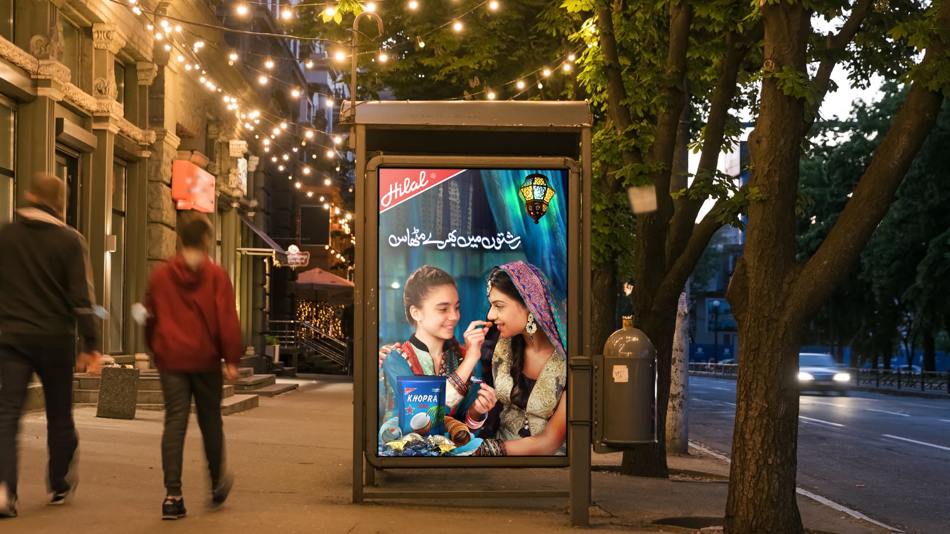
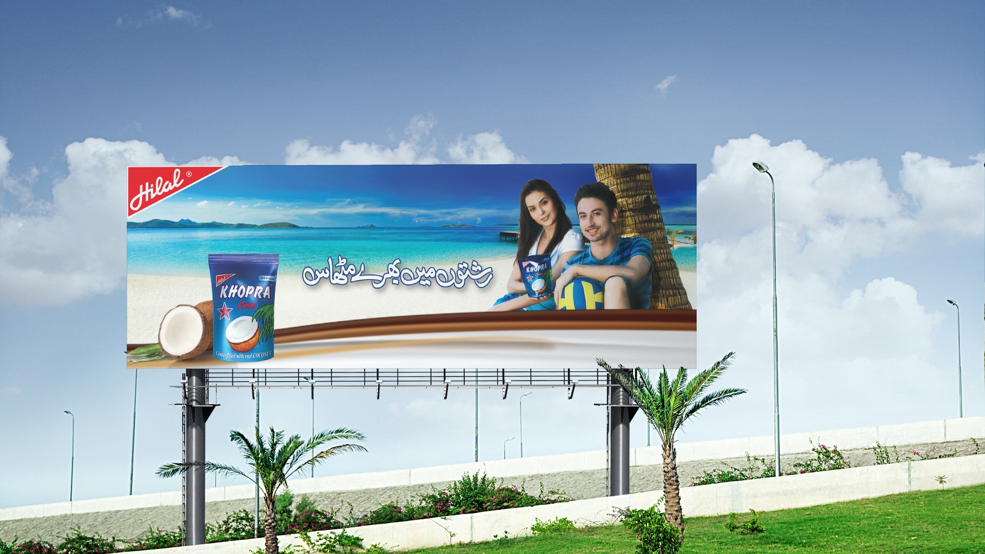
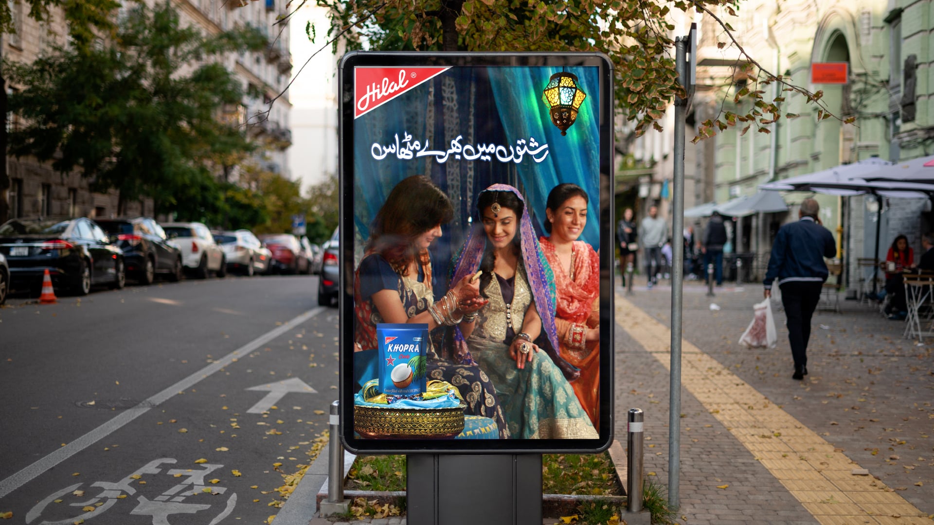
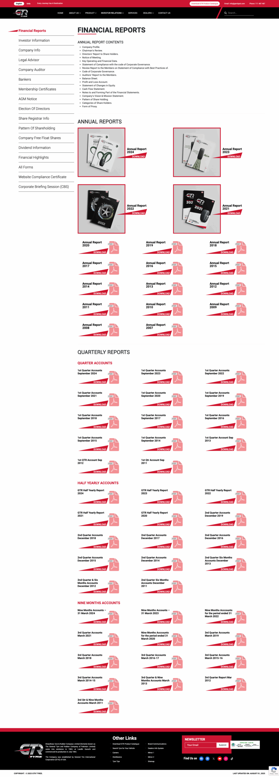
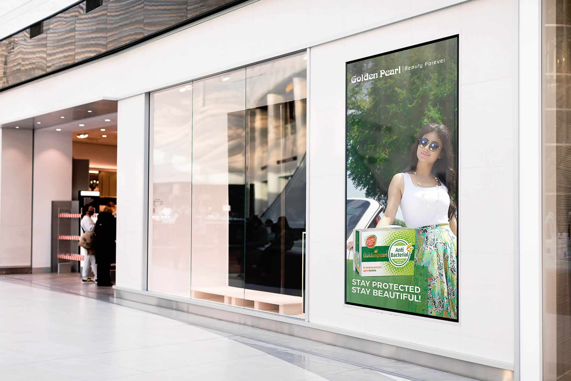
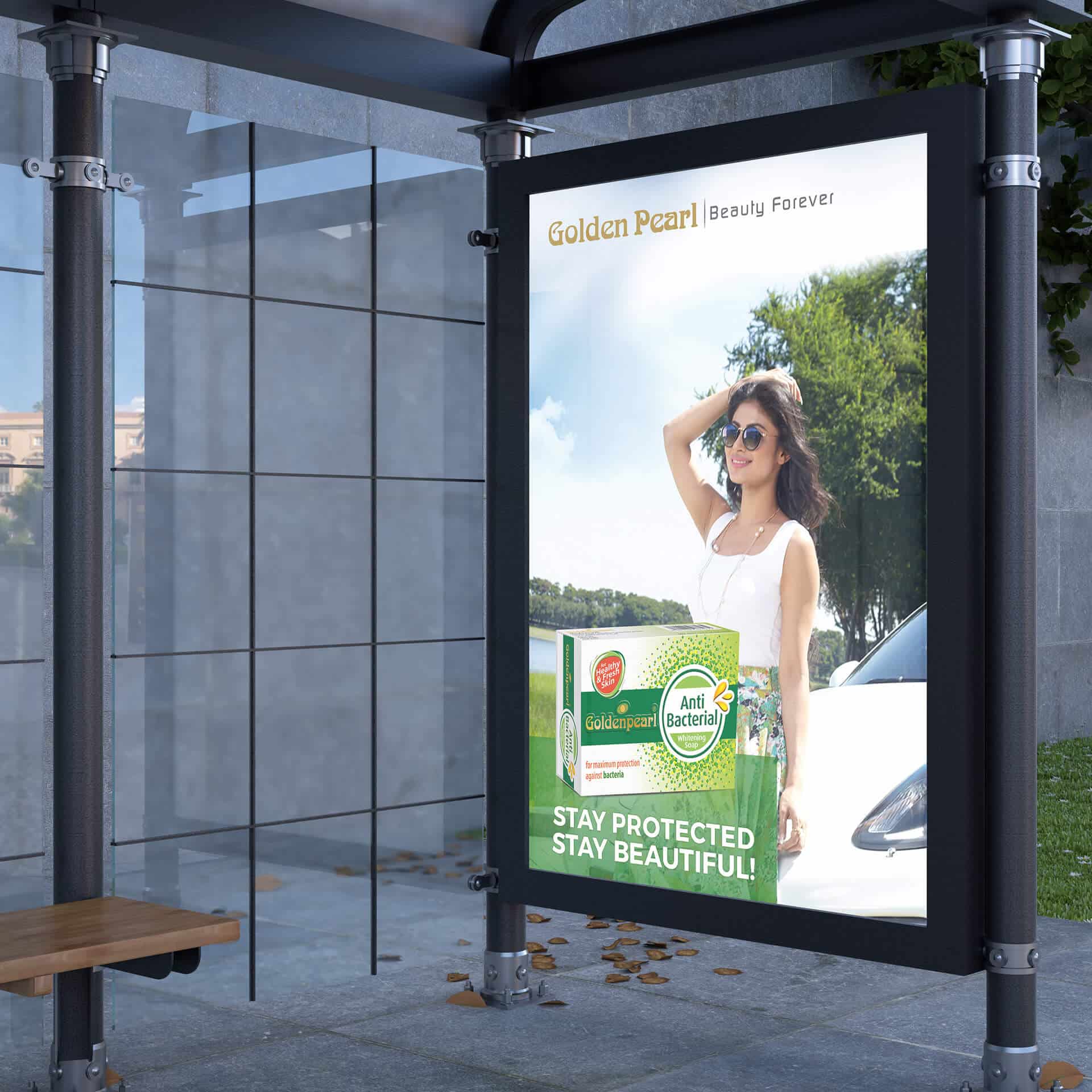
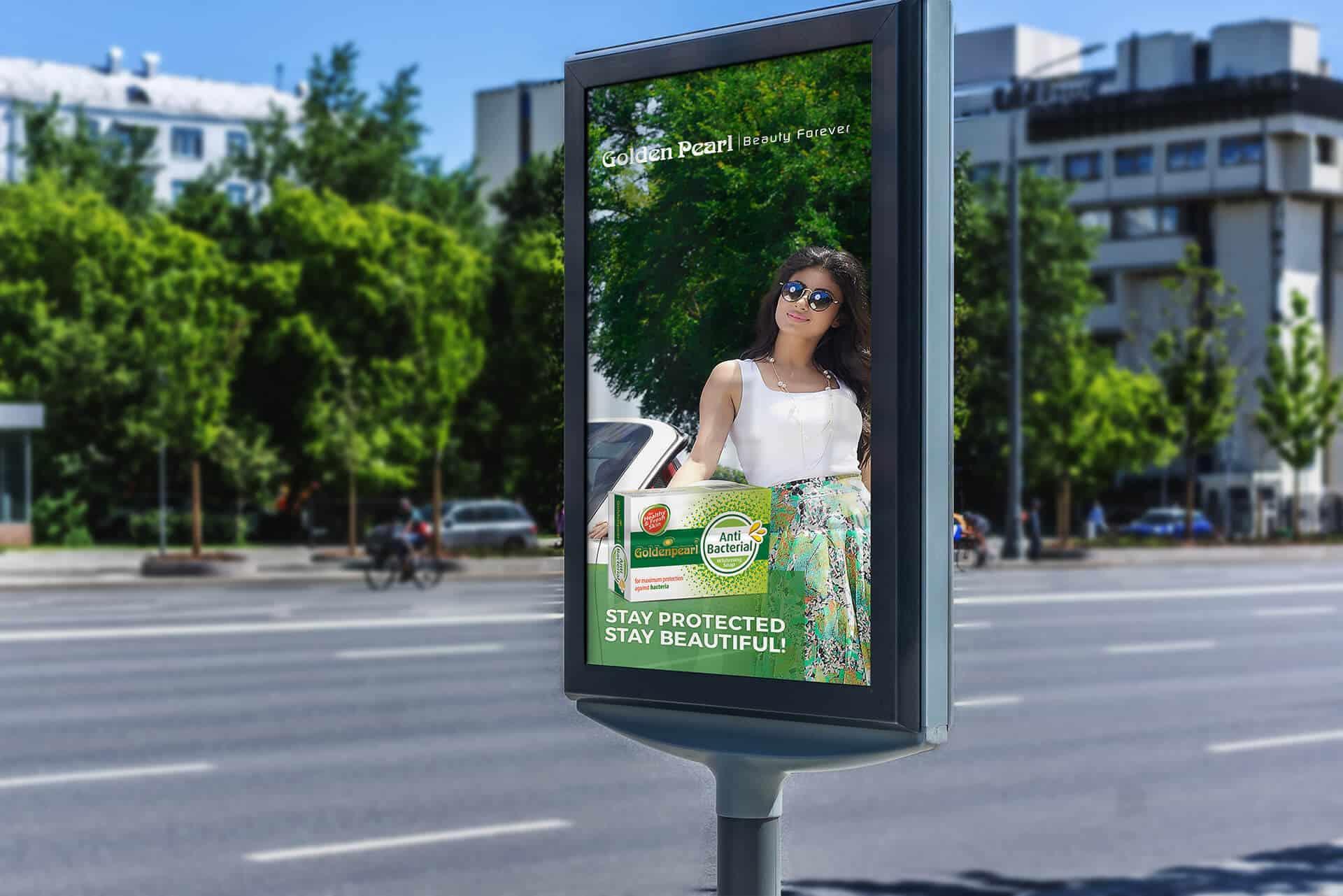
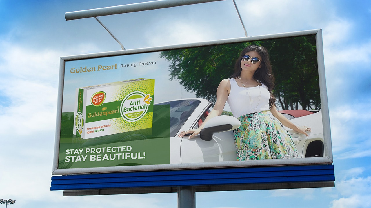
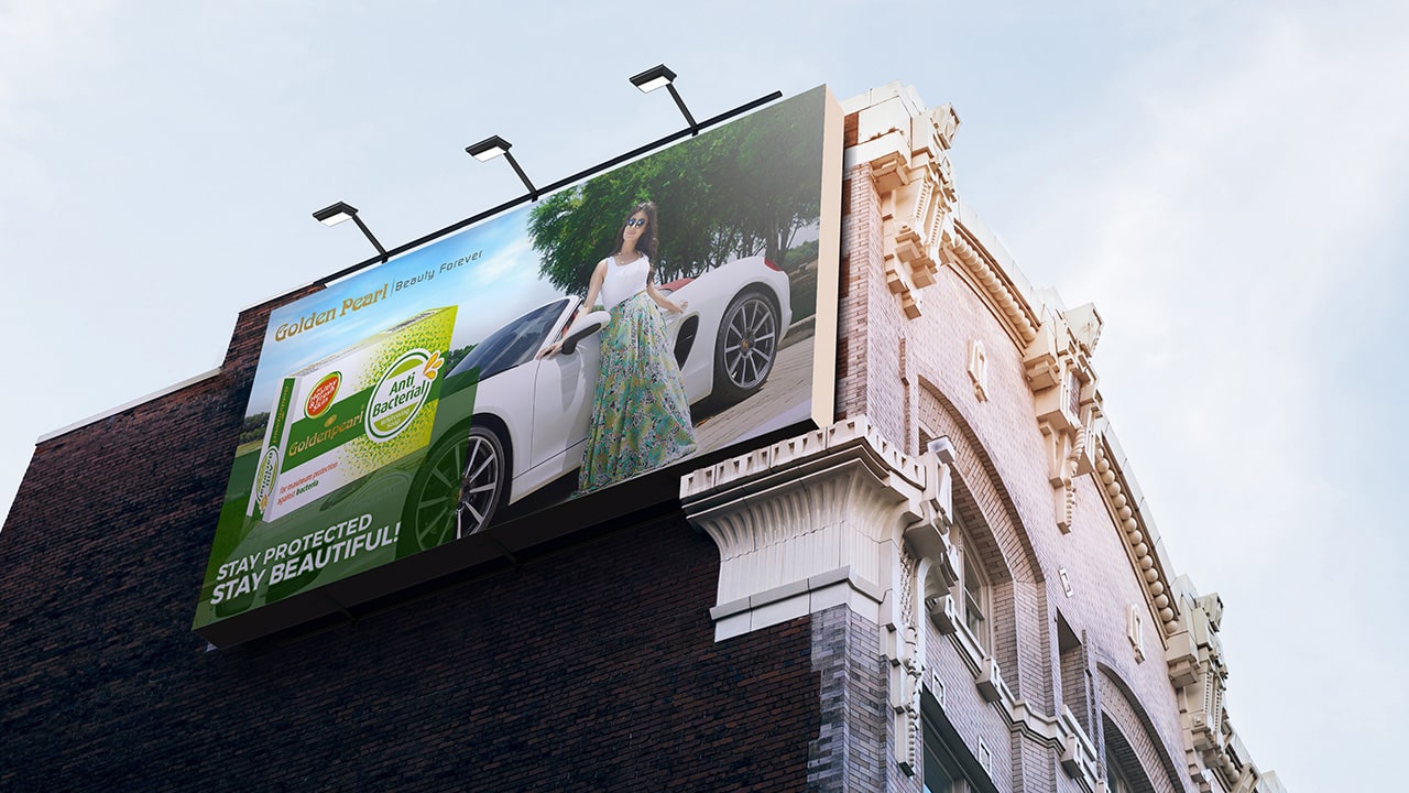
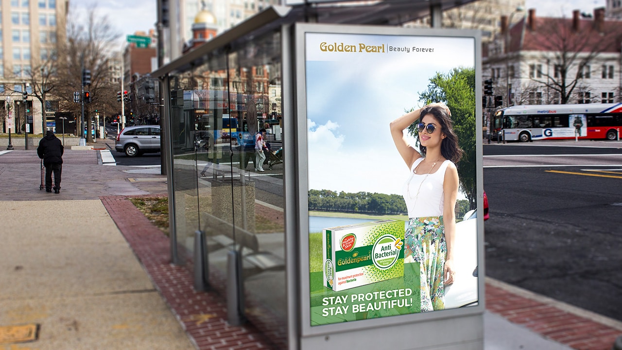
OOH – Signage & Billboard
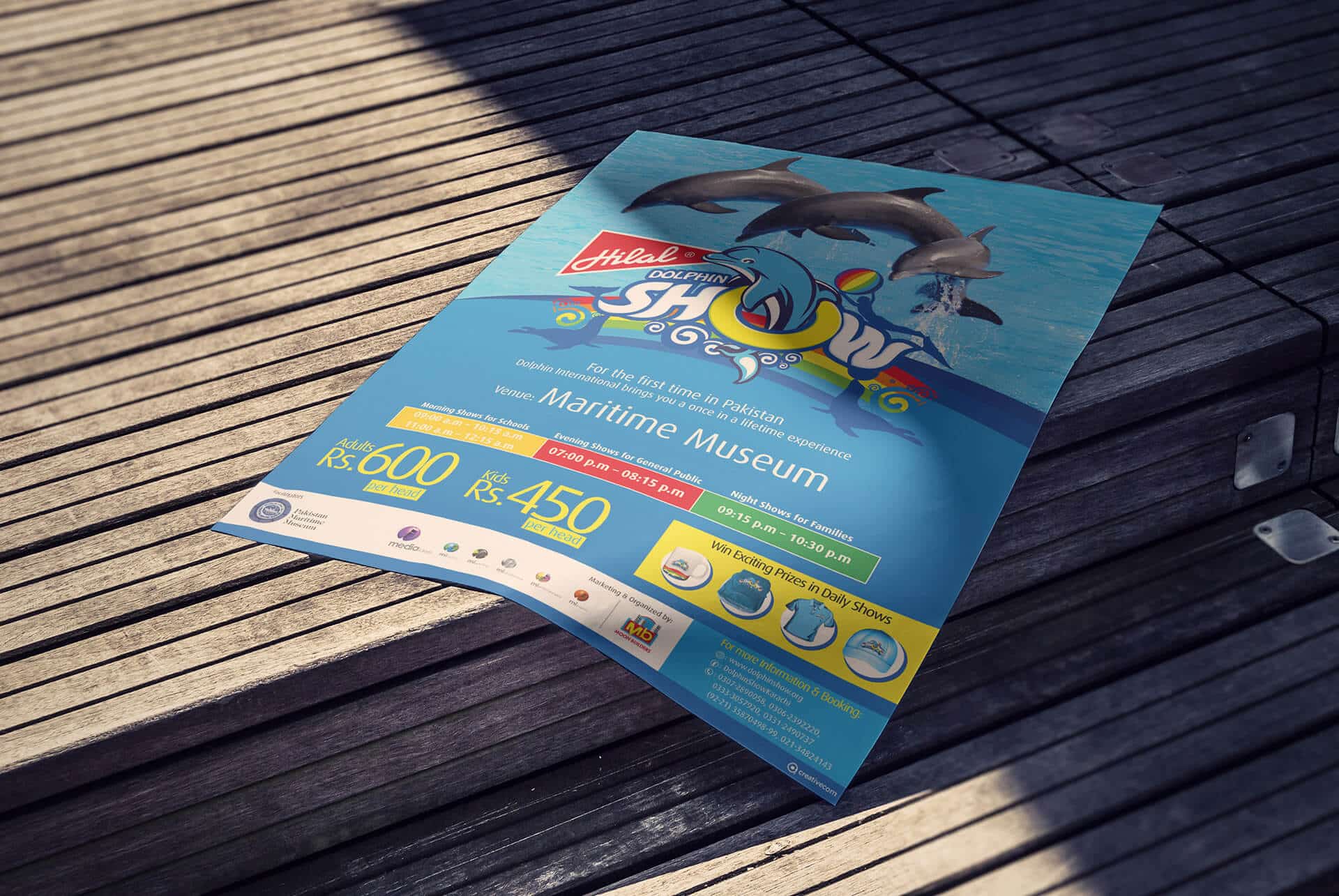
Marketing Collateral
Website & E-commerce
Retail Branding & Merchandise
OOH – Signage & Billboard
Marketing Collateral


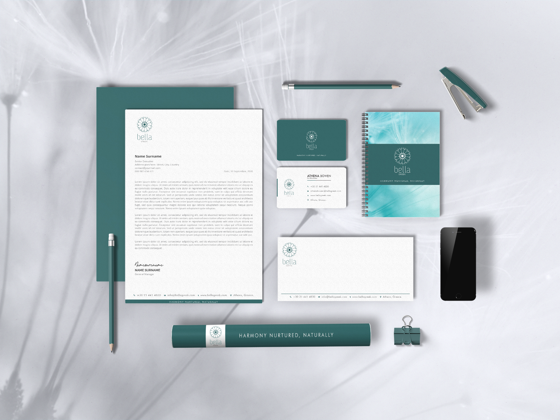
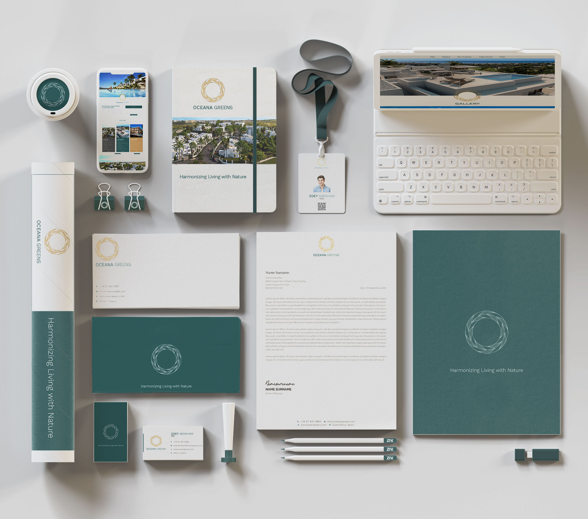
LOGO / STATIONARY
Brand Philosophy
Oceana Greens believes in harmonious living, where the tranquility of nature and the luxury of modern design coexist. Every aspect of the community is designed to foster a deep connection between residents and their surroundings, promoting a lifestyle that’s both sustainable and luxurious.
Inspiration
We crafted a brand fusion of modern design and nature-inspired aesthetics. The design subtly intertwines the serenity of natural landscapes with the sophistication of modern architecture, preserving the integrity of Oceana Greens. Our digital marketing strategy was seamlessly integrated with an immersive customer experience journey and an interactive event for potential homeowners.
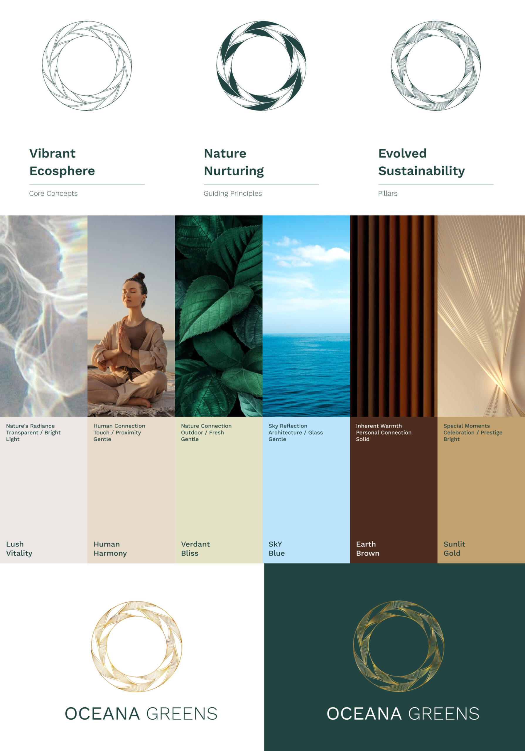
Harmony Circle and Cohesive Identity
Our branding narrative incorporated the ‘Harmony Circle’—a symbolic representation of Oceana Greens’ integration of sustainable living, genuine amenities, and vibrant wellness. This cohesive identity was also reflected in the project’s floor plan, presented as a thoughtful curation to enhance the living experience.
Brand Naming
“Oceana Greens” was chosen to encapsulate the essence of the project. “Oceana” signifies its close proximity to the ocean, while “Greens” emphasizes the lush, verdant surroundings and the project’s commitment to sustainability.
Brand Identity Development
Drawing inspiration from the coastal beauty of Costa Brava, the brand identity seamlessly blends modern design with nature-inspired aesthetics. Earth tones are predominant, fostering a deep connection between residents and nature.
Logo Concept
The logo for Oceana Greens is a gold double outline circle, intricately designed with patterns of leaves and waves, symbolizing the harmonious blend of nature and luxury. This ‘Harmony Circle’ is a testament to Oceana Greens’ commitment to integrating sustainable living, genuine amenities, and vibrant wellness.
Brand Usage Guide
A comprehensive guide detailing Oceana Greens’ visual and verbal guidelines ensures a cohesive brand presentation across all touchpoints, from brochures to digital platforms, maintaining consistency with the brand’s core philosophy.
Brand Tagline
“Harmonious Living, Naturally.”
Brand Essence
Harmonious Living.
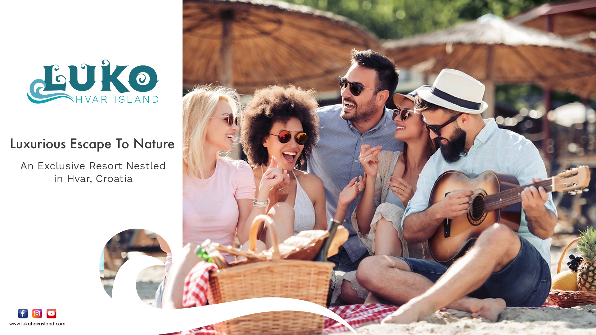
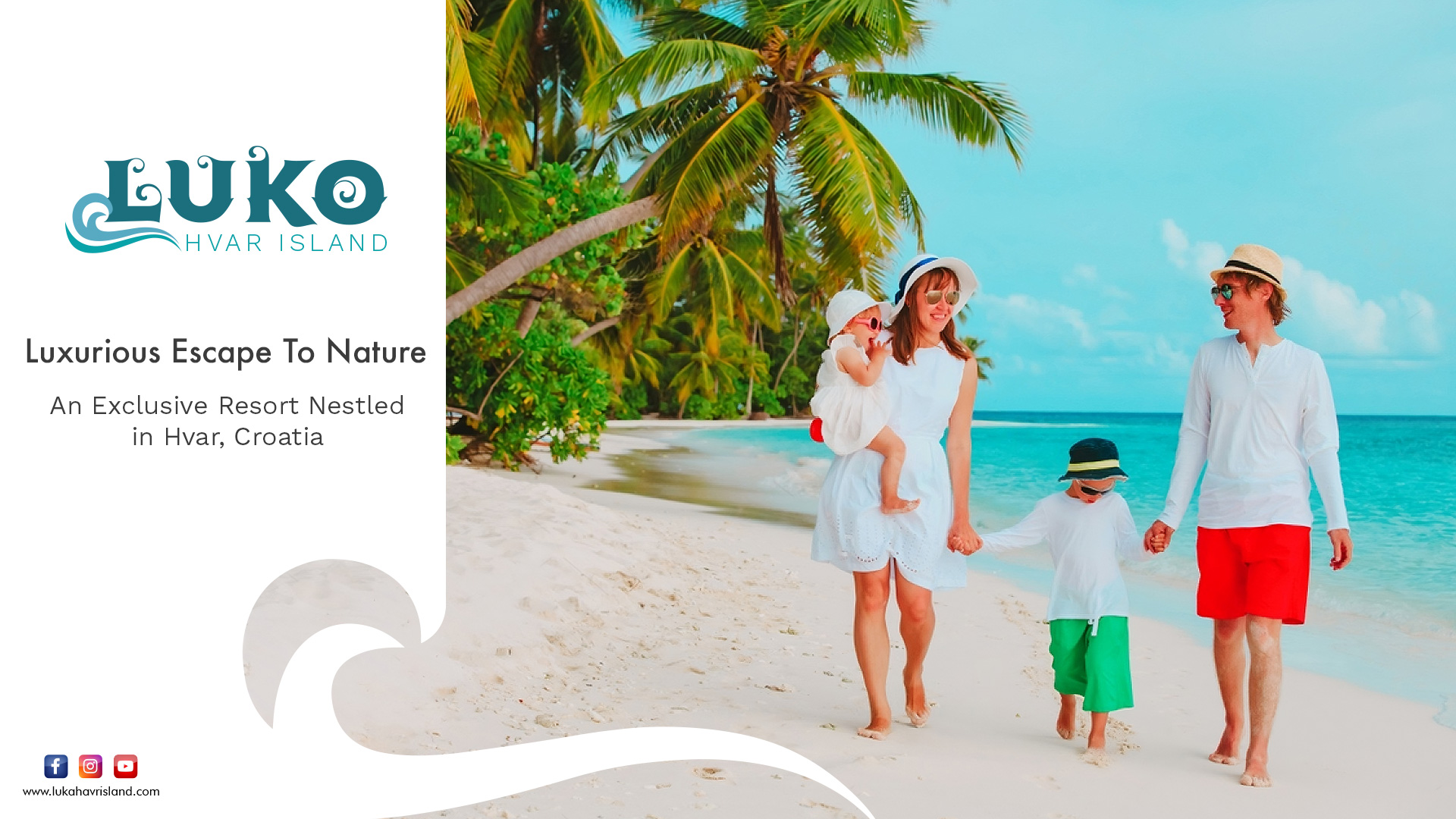
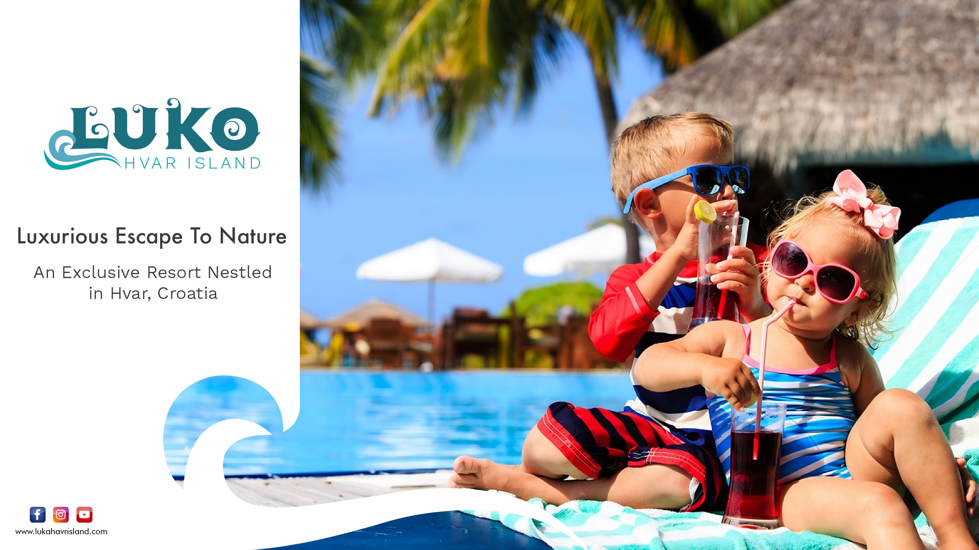
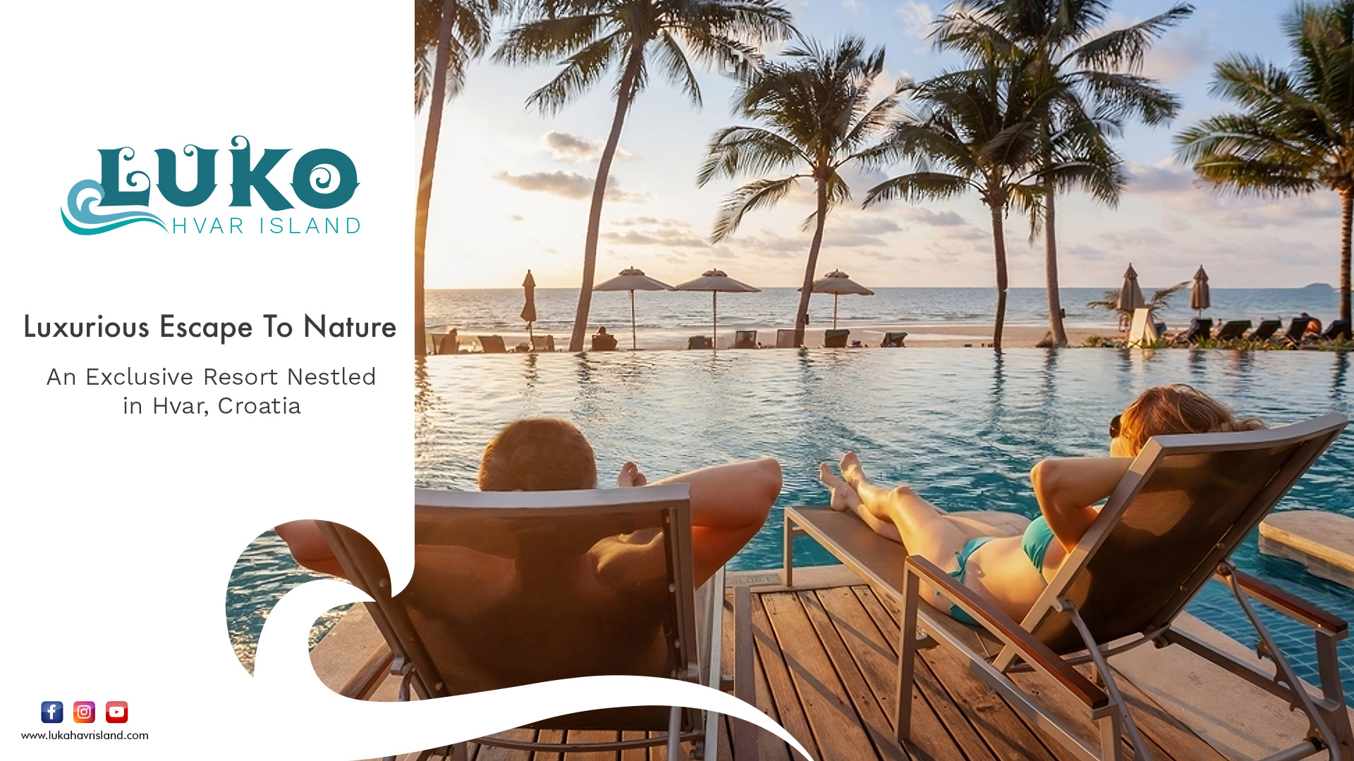
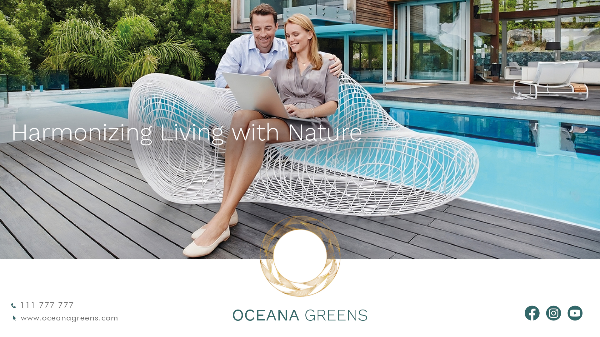
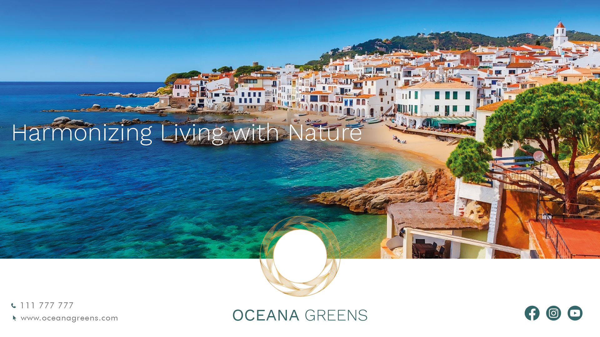
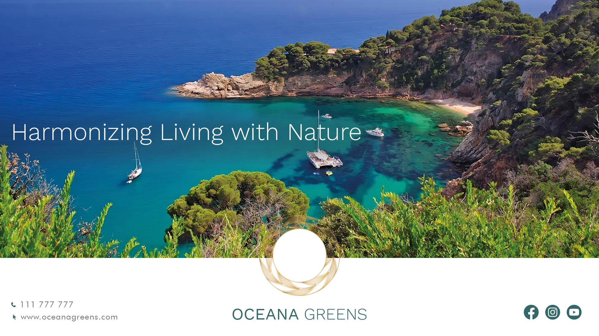
Brand Imagery
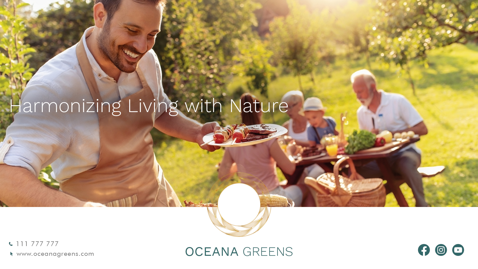
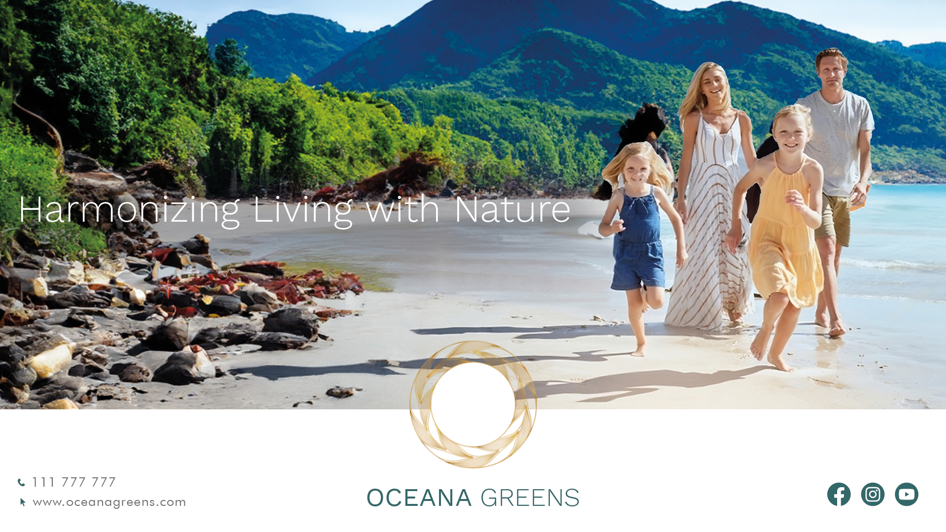
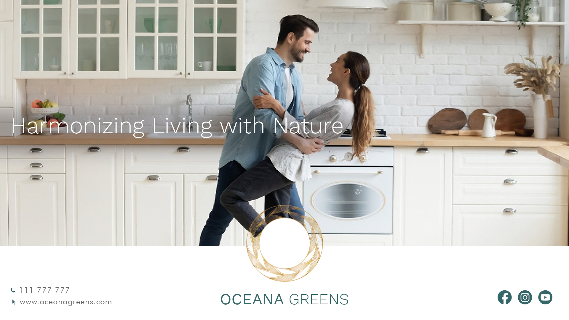
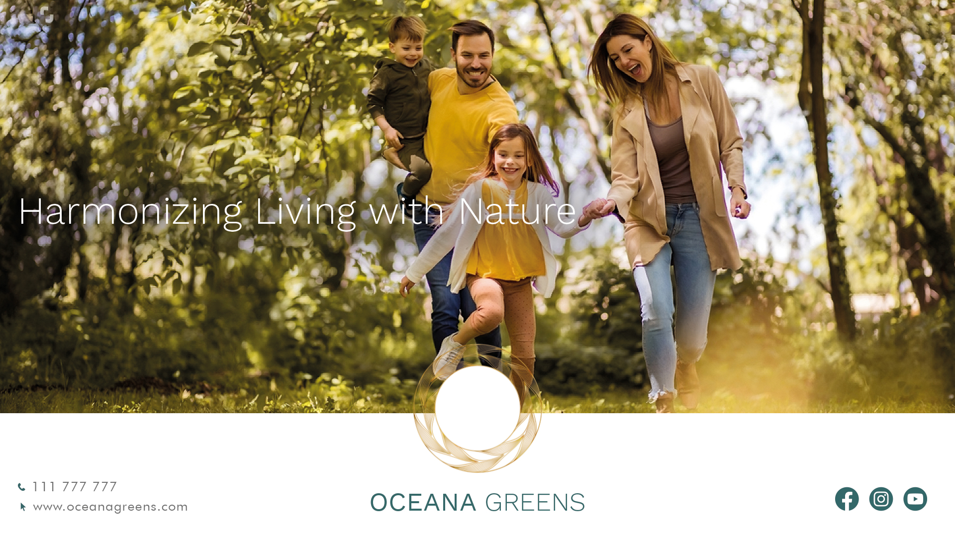
Distinctive brand imagery depicts the luxurious, serene, and eco-conscious spirit of Oceana Greens. This imagery, consistently carried through various branding materials, creates a cohesive and engaging brand narrative.
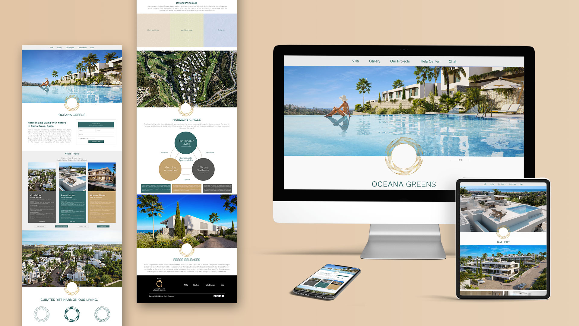
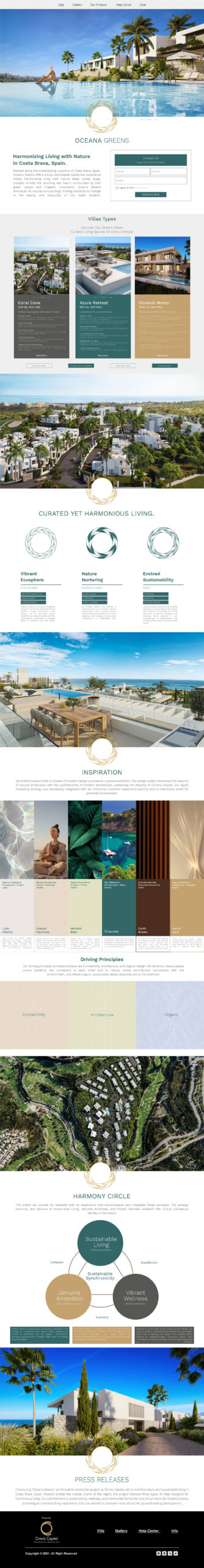
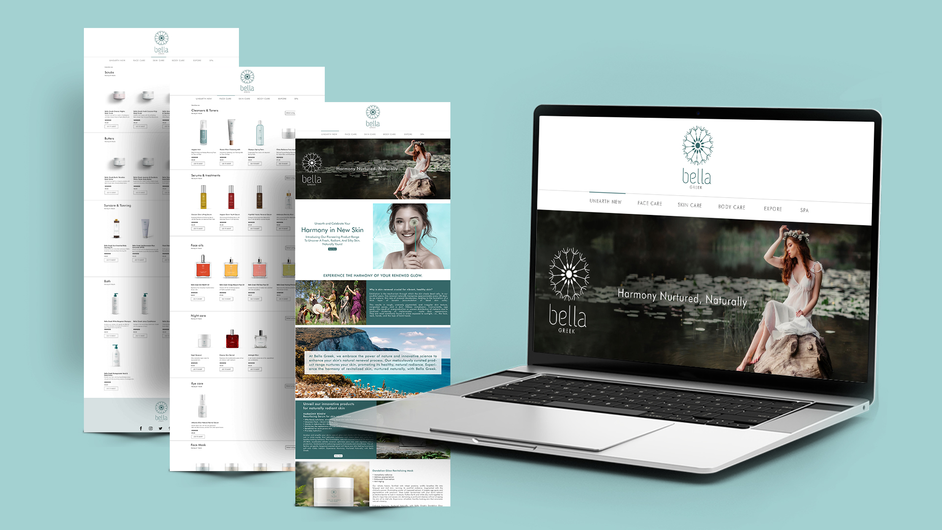
Web Design & E-commerce
Oceana Greens’ online presence is a testament to its commitment to harmonious living. The website offers potential residents a comprehensive view of the project, emphasizing its natural surroundings, architectural brilliance, and commitment to sustainability
Brand Communications:
Through strategic branding initiatives, Oceana Greens’ narrative emphasizes the art of harmonious living, sustainability, and luxury. The branding materials, including the website, brochures, and promotional content, effectively communicate the essence of Oceana Greens, making it a sought-after residential destination in Costa Brava.
Brand Culture
Oceana Greens fosters a culture of sustainability, luxury, and community. Residents are encouraged to immerse themselves in nature, engage in community events, and live a lifestyle that’s both eco-conscious and luxurious.
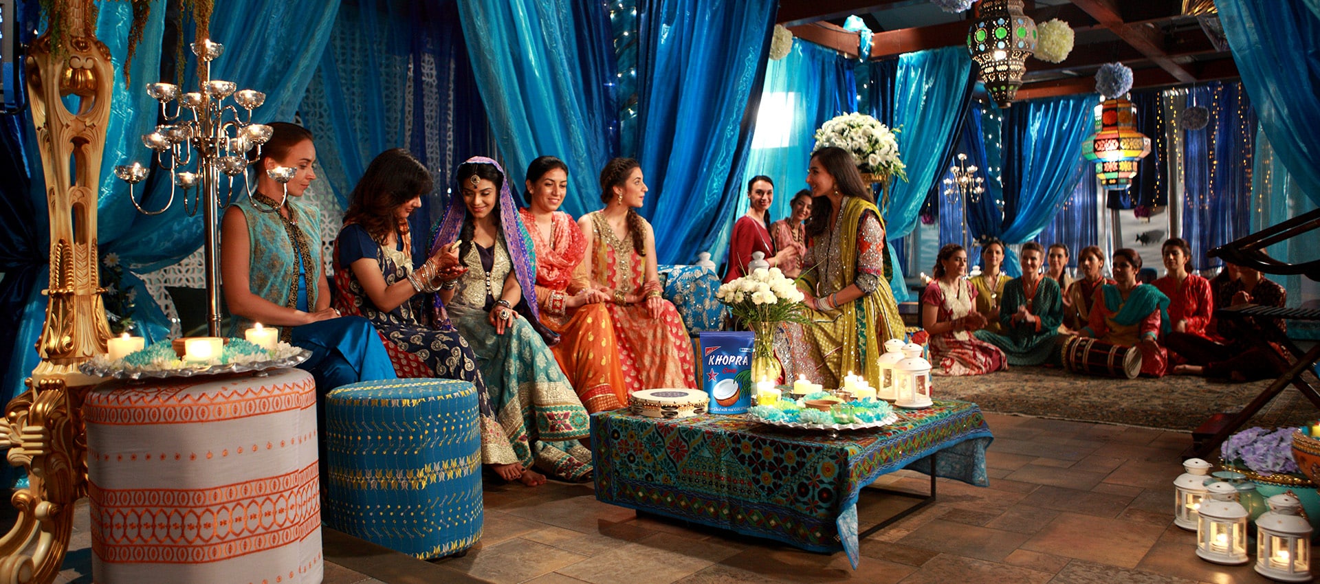
KEY VISUALS
OUTDOOR
WEBSITE