CREATIVE

Reimagining Premium Paint as a Cultural Statement
Though ICI Dulux Pentalite Classic had strong global equity and a quality product, its presence in Pakistan’s premium paint category struggled to inspire brand love. The higher price point, combined with a lack of emotional storytelling, limited resonance with affluent Pakistani consumers.
It was positioned as premium — but didn’t yet feel personal.
The brand needed to be humanized — not just seen as a paint, but as a creative medium through which people express identity, taste, and aspiration. It needed to inspire action by making luxury living emotionally meaningful and culturally relevant.
Brand Purpose & Cultural Strategy
Using our proprietary Brand Culture Hive™ Toolkit, we unearthed a key insight: for Pakistan’s style-conscious upper class, a home is more than a shelter — it’s a canvas of taste, legacy, and self-expression.
This led us to define a new brand purpose: To transform living spaces into timeless masterpieces that reflect the soul of their residents.
Elevating Everyday Spaces into Personal Masterpieces
Our cultural strategy, “My Home Is a Classic,” recast paint not as decoration, but as personal expression — positioning ICI Dulux as a lifestyle enabler for those who see their home as an extension of their identity.
Through this, we humanized the brand — allowing it to emotionally connect with homeowners, inspiring them to turn walls into expressions of elegance, culture, and creativity.
Brand Voice
We crafted a brand voice rich in inspiration — poised, elegant, and expressive — reflecting the refined taste of our target audience.
It spoke not in product specs, but in visual poetry — creating a narrative where ICI Dulux wasn’t selling paint, but empowering people to paint their lives with purpose.
Deliverables:
Brand Strategy
Brand ID & Seed
Communication Strategy
Creative
Creative Platform
Ideation & Storytelling
TV Concept & Storyboard
Copy & Content Writing
Key Visuals
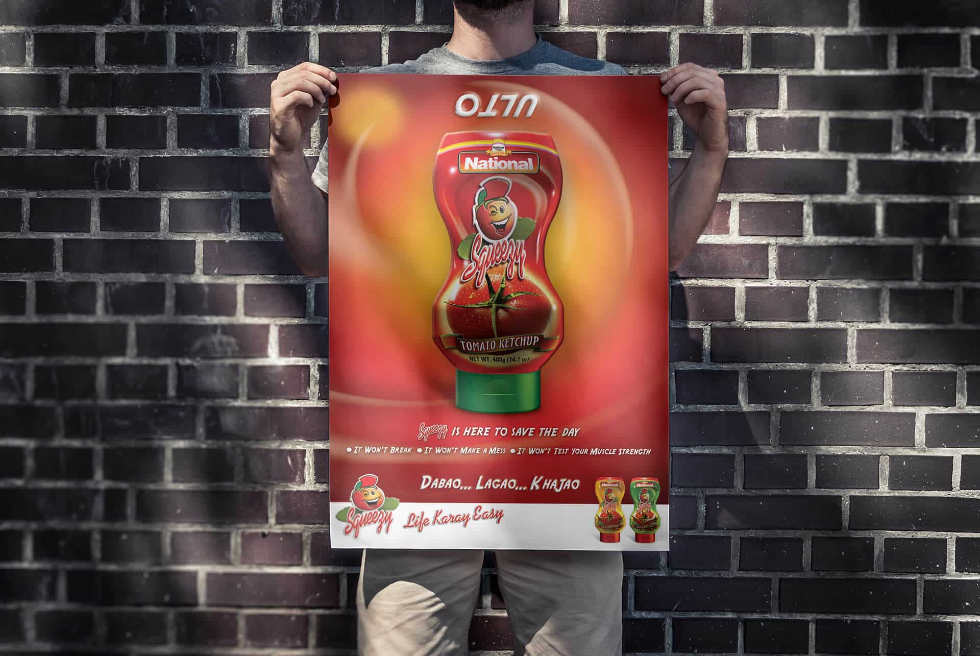
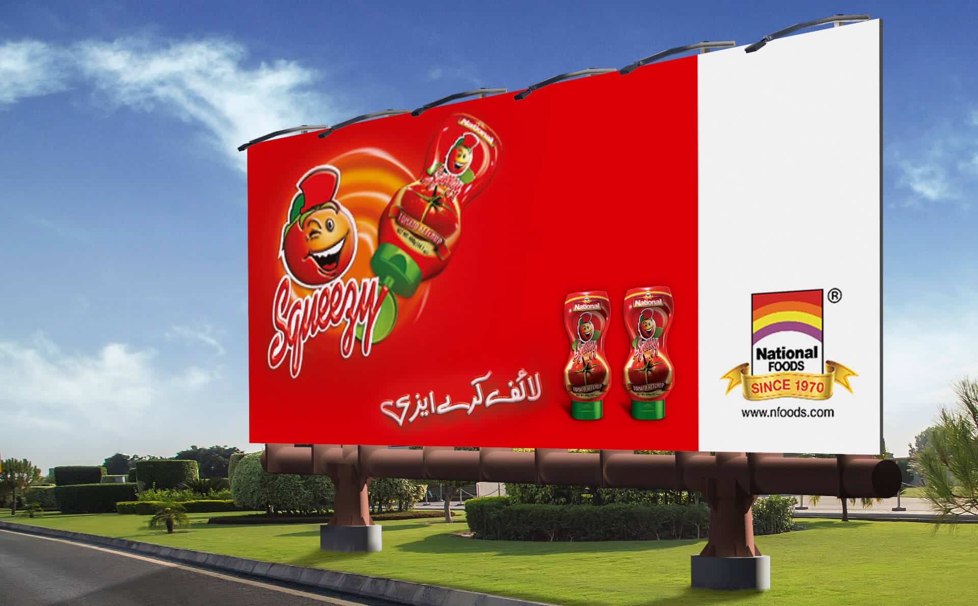
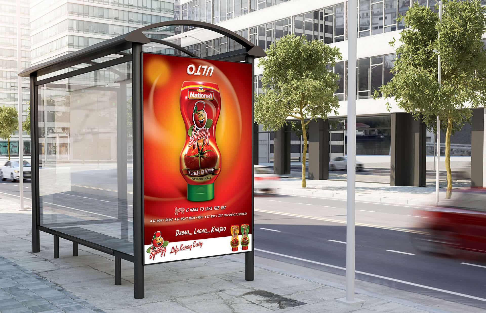
Print Ads & OOH
Production Management
Celebrity Management
Still Photography
Storytelling & Ideation
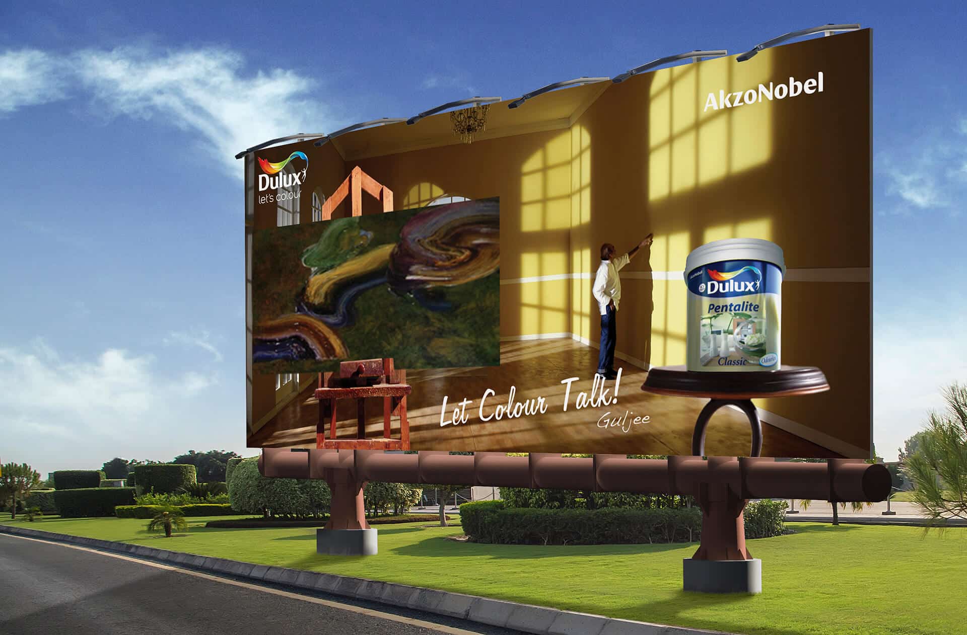
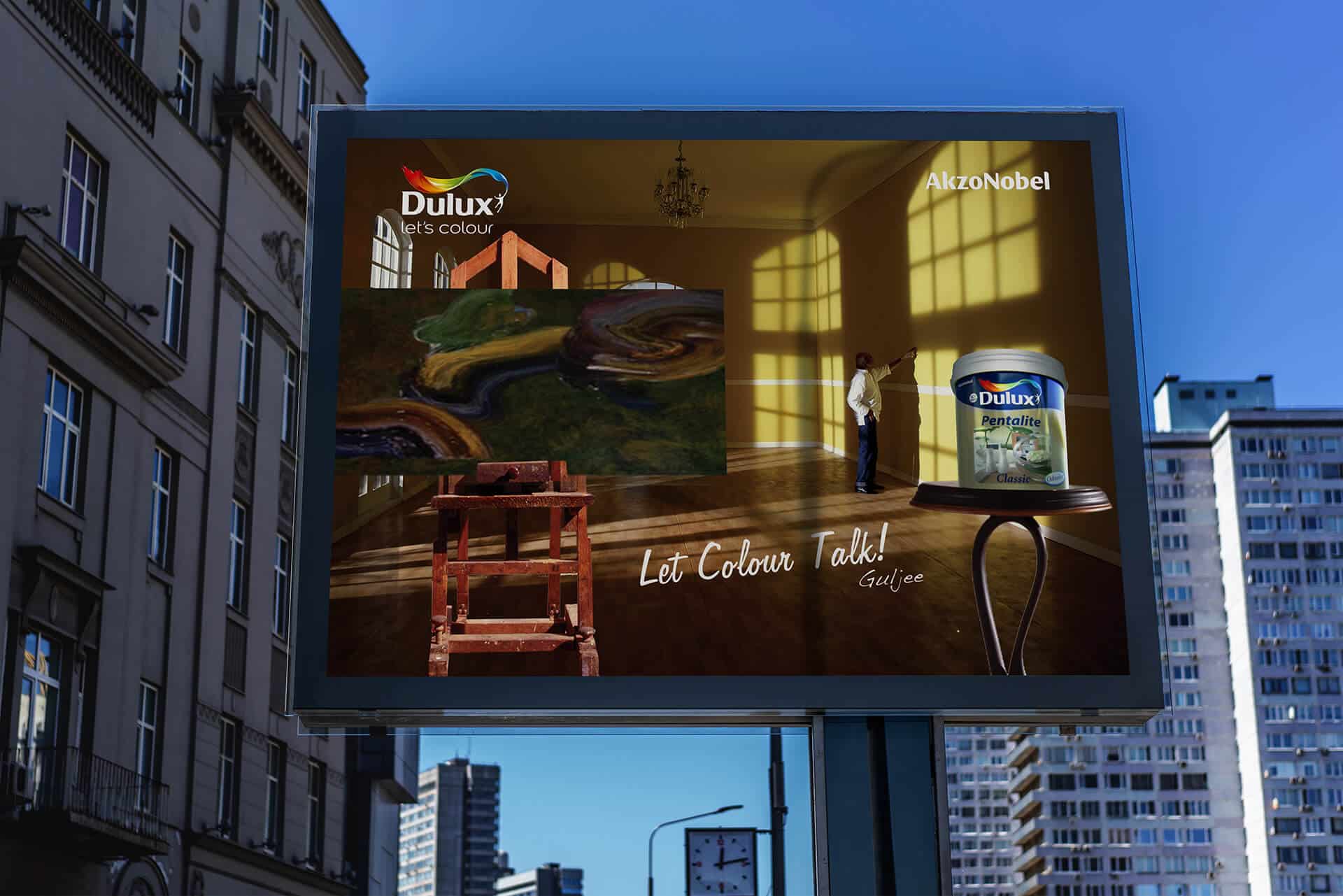
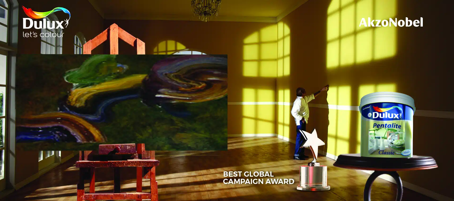
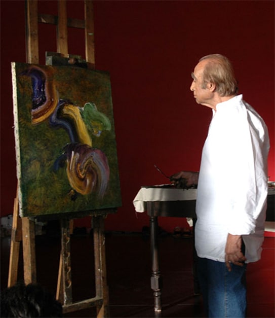
To bring the strategy to life, we partnered with Pakistan’s iconic artist Gulgee as the symbol of this transformation. His legacy of abstract art served as the perfect metaphor: like art, a home should reflect the inner life of those who live in it.
The campaign transformed interiors into living galleries — visual spaces filled not just with color, but character.
Through stylized storytelling, we showed that choosing Dulux was not about covering walls — it was about uncovering personality. Each home was reimagined as a soulful space, reflecting its owner’s classic taste.
From mood boards to final visuals, everything celebrated art, emotion, and timeless sophistication.
Won The Best Global Campaign Award
Results & Recognition
Significant Market Share Growth in Premium Segment
Named “Best Campaign of the Year” in ICI’s Global Portfolio
Conclusion
The ICI Dulux transformation was not a product repositioning — it was a redefinition of lifestyle through the emotional power of color.
By embedding cultural insight and human-centered storytelling into the brand, we inspired people to act — not just to decorate their homes, but to express themselves through them.
This is how a premium paint brand became a canvas for life — a reflection of elegance, pride, and personal meaning.
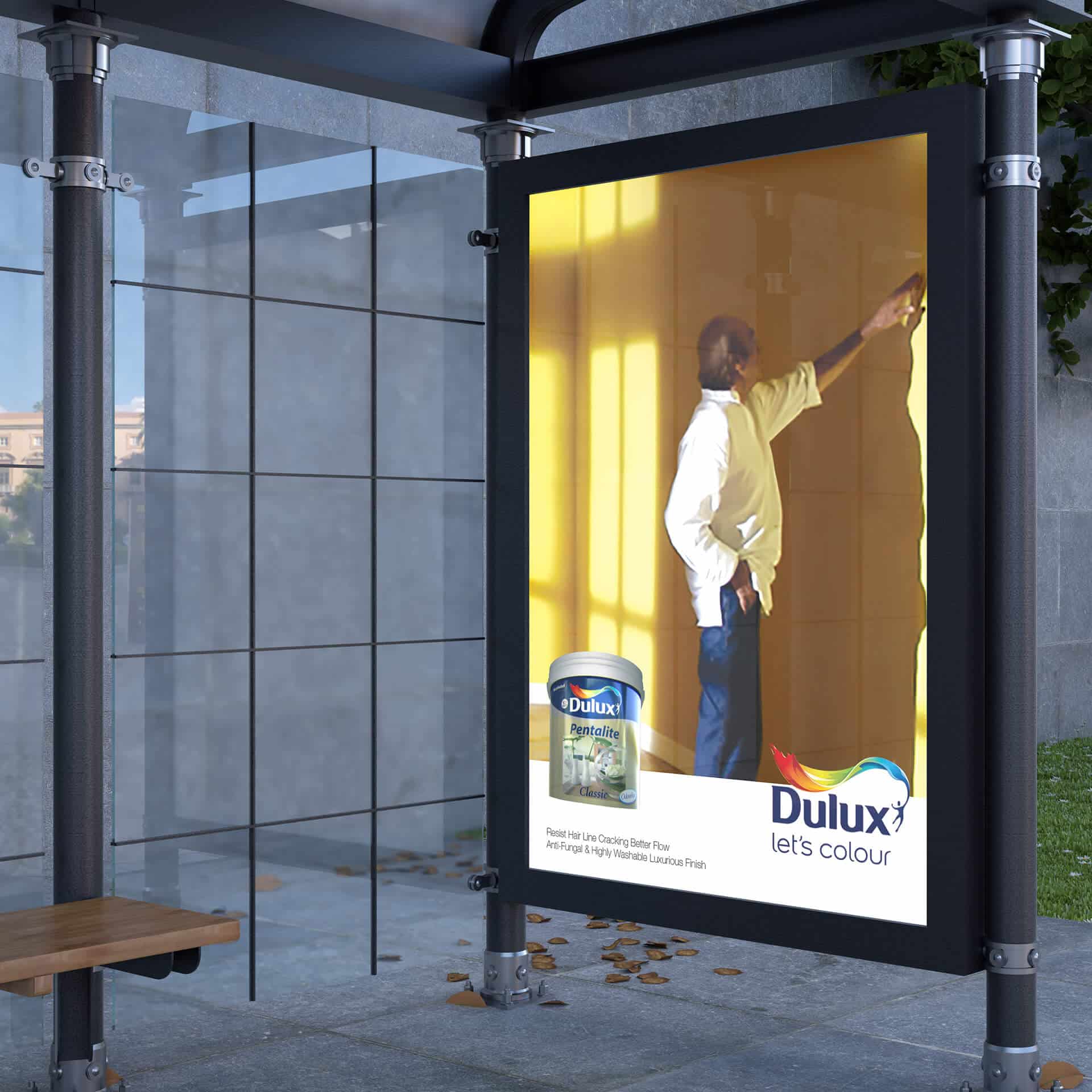
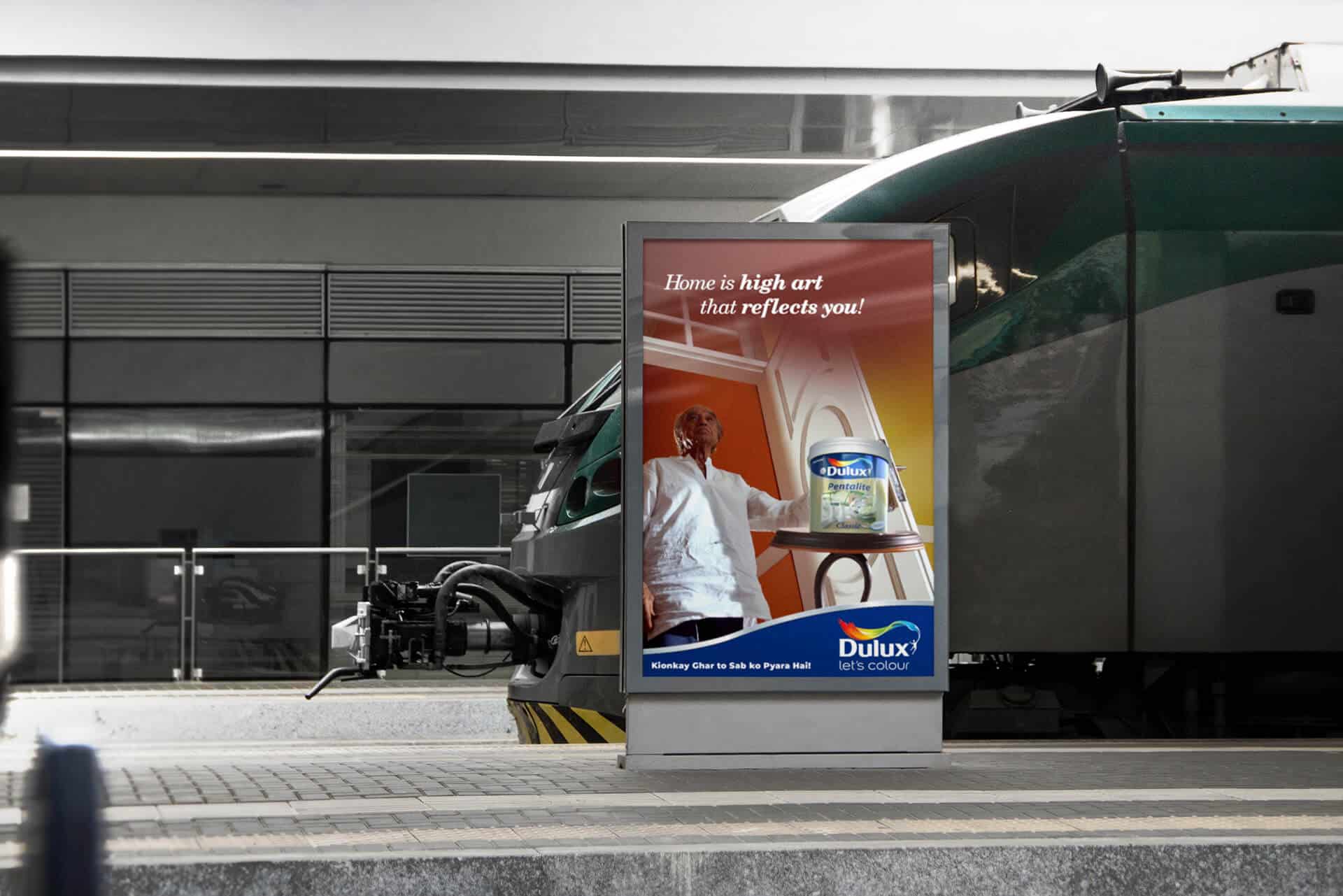
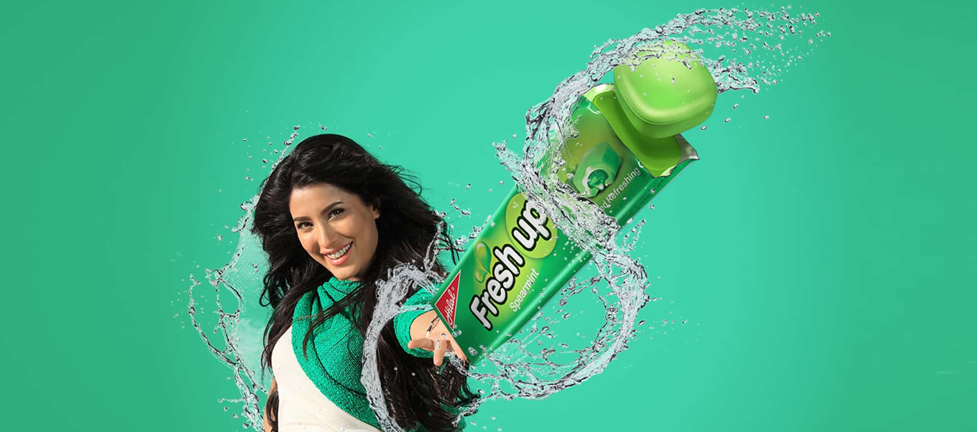
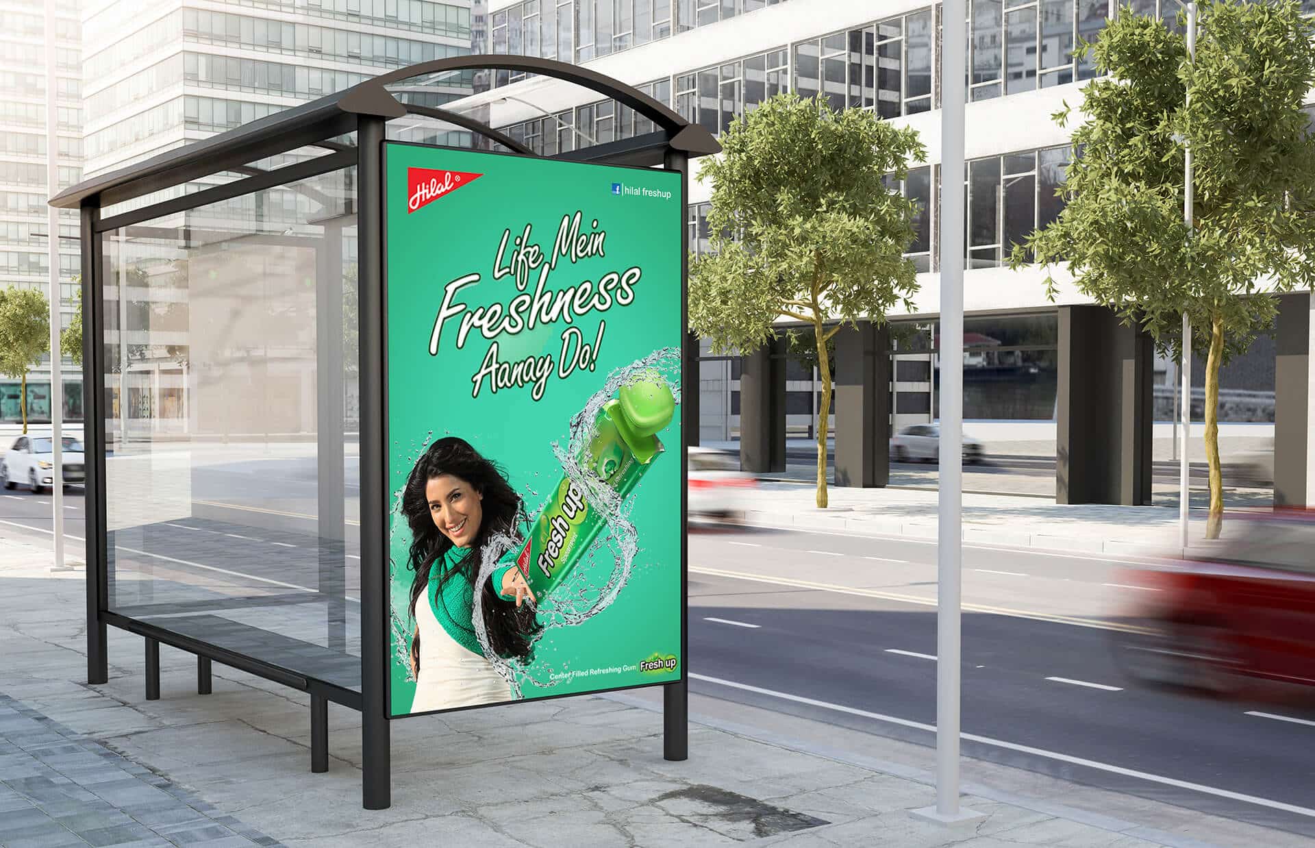
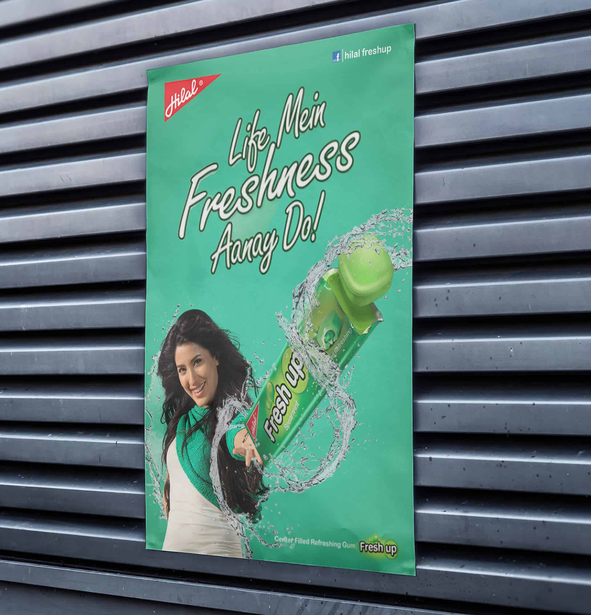
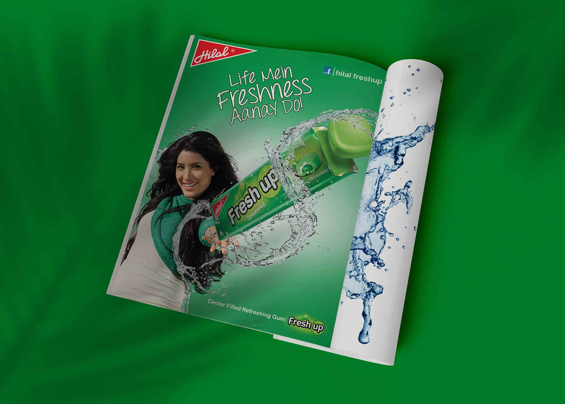
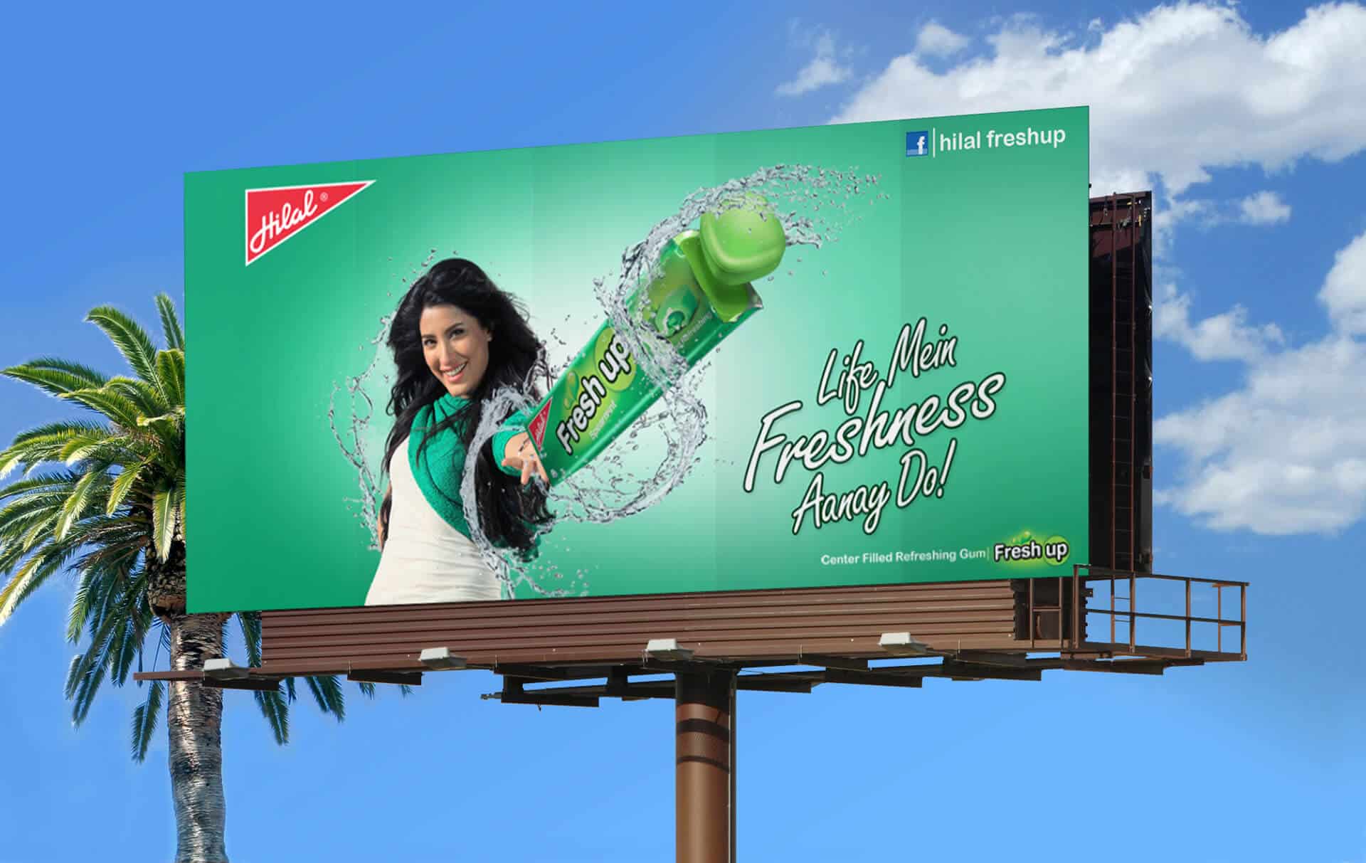
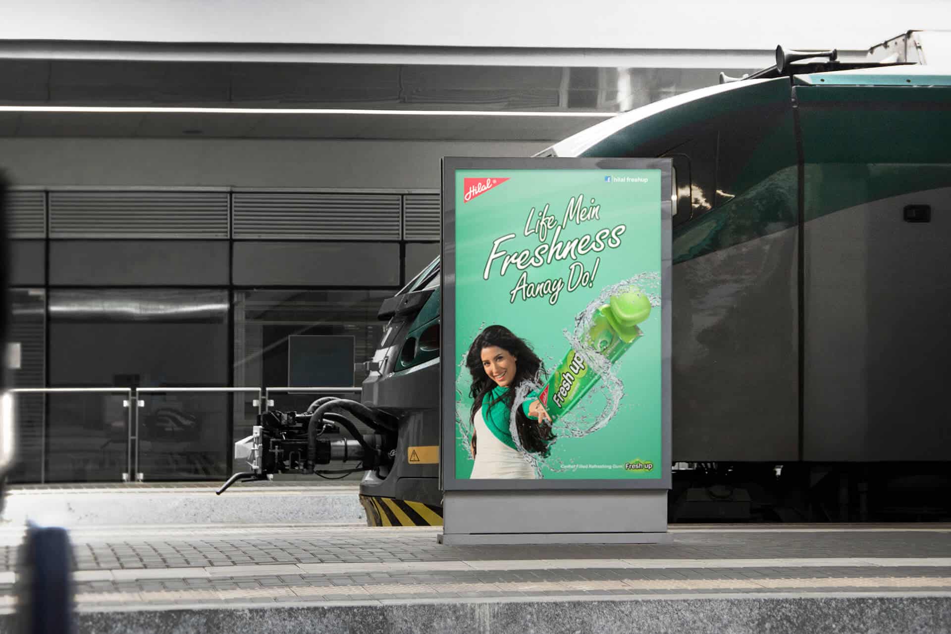
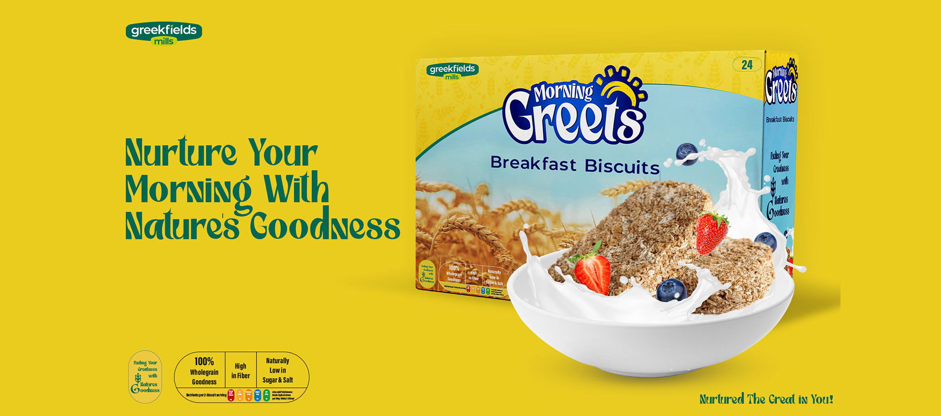
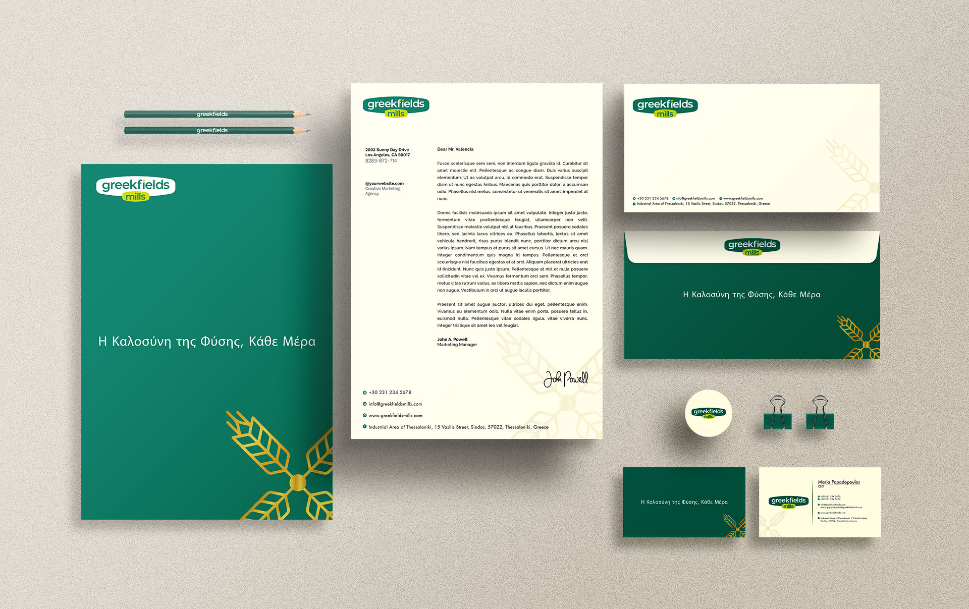
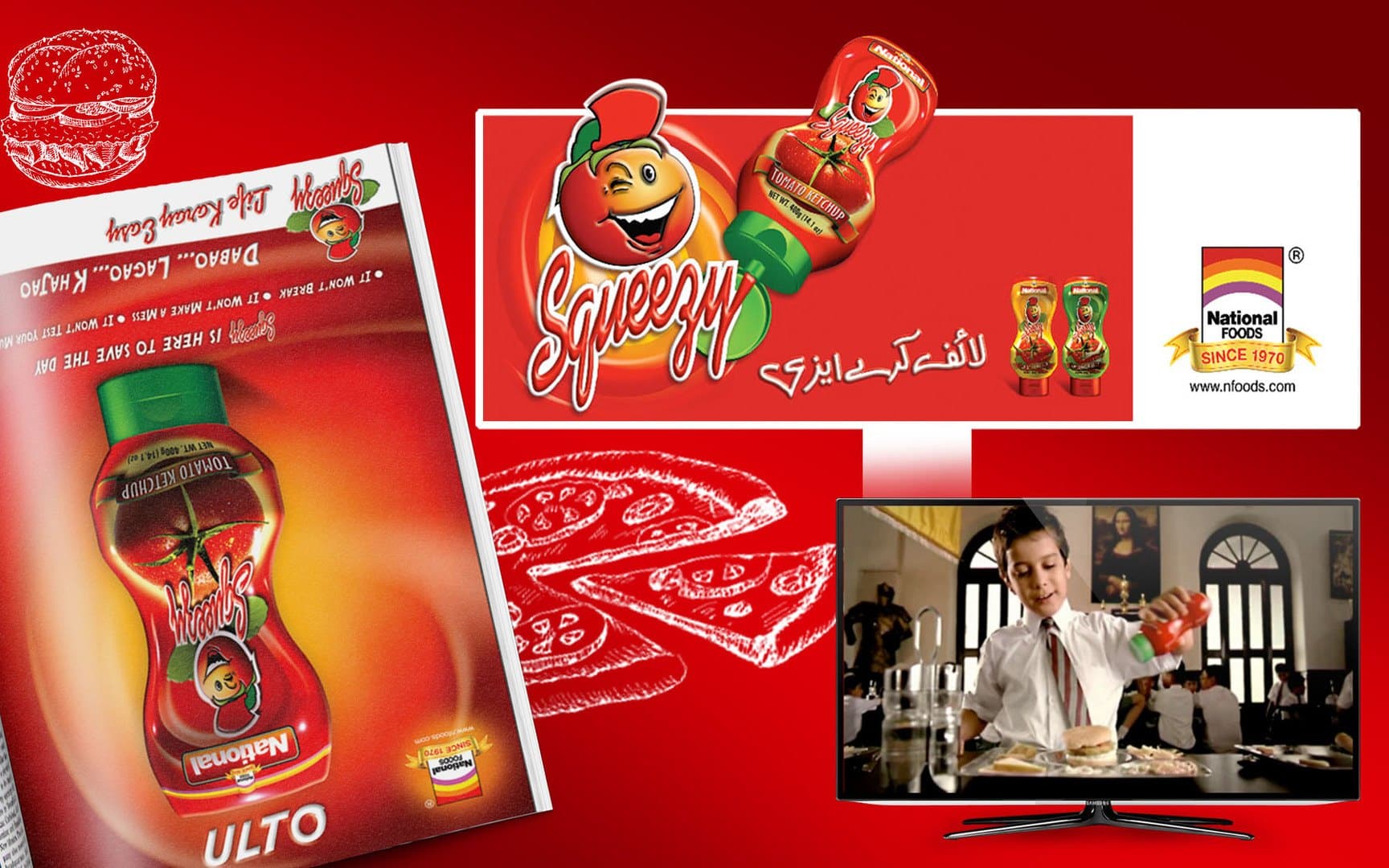
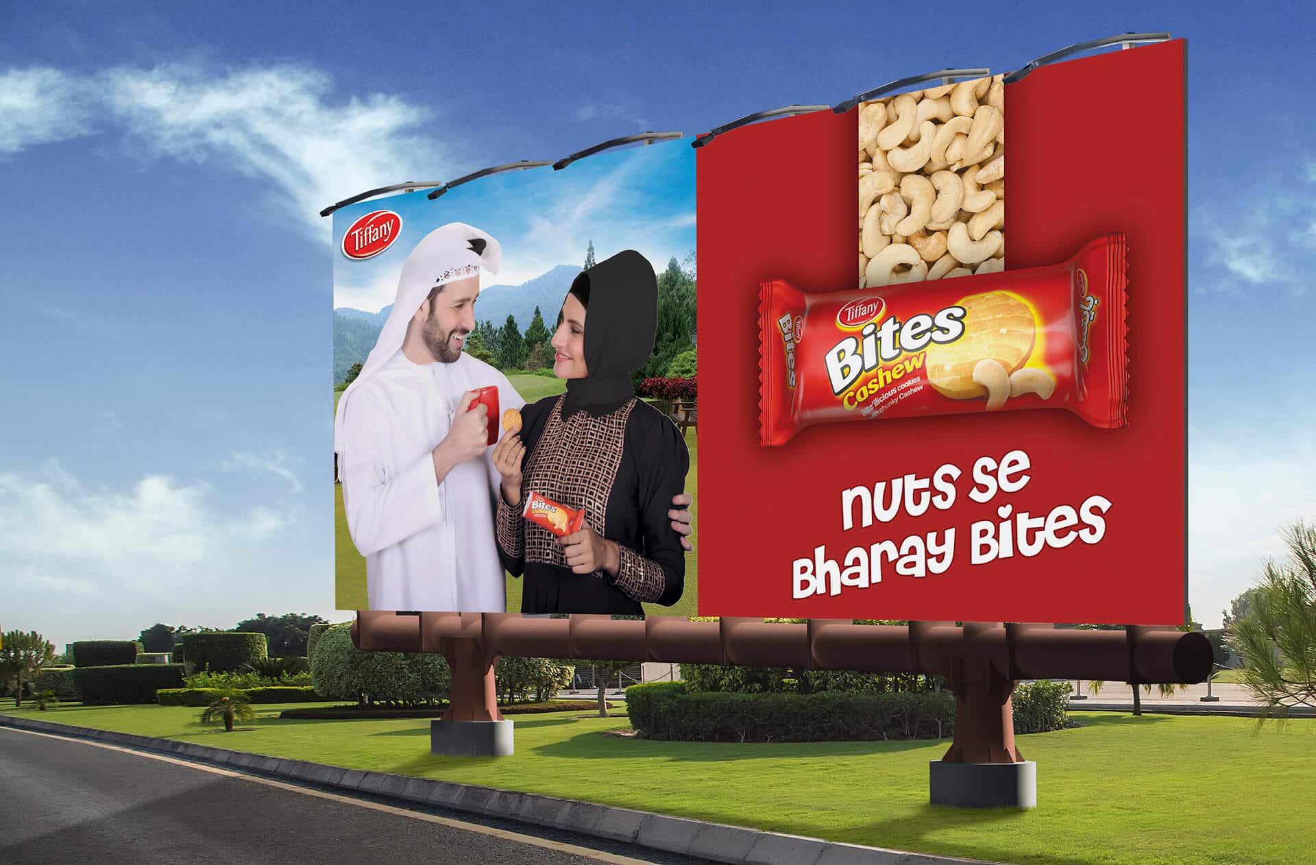
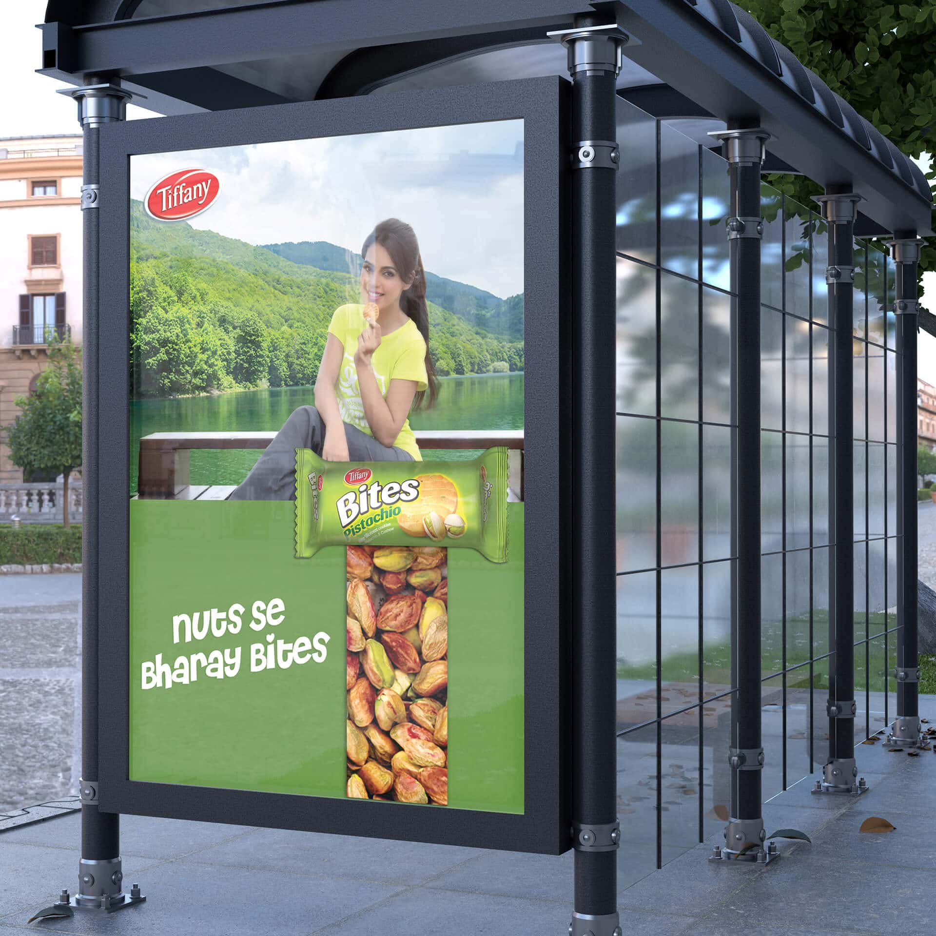
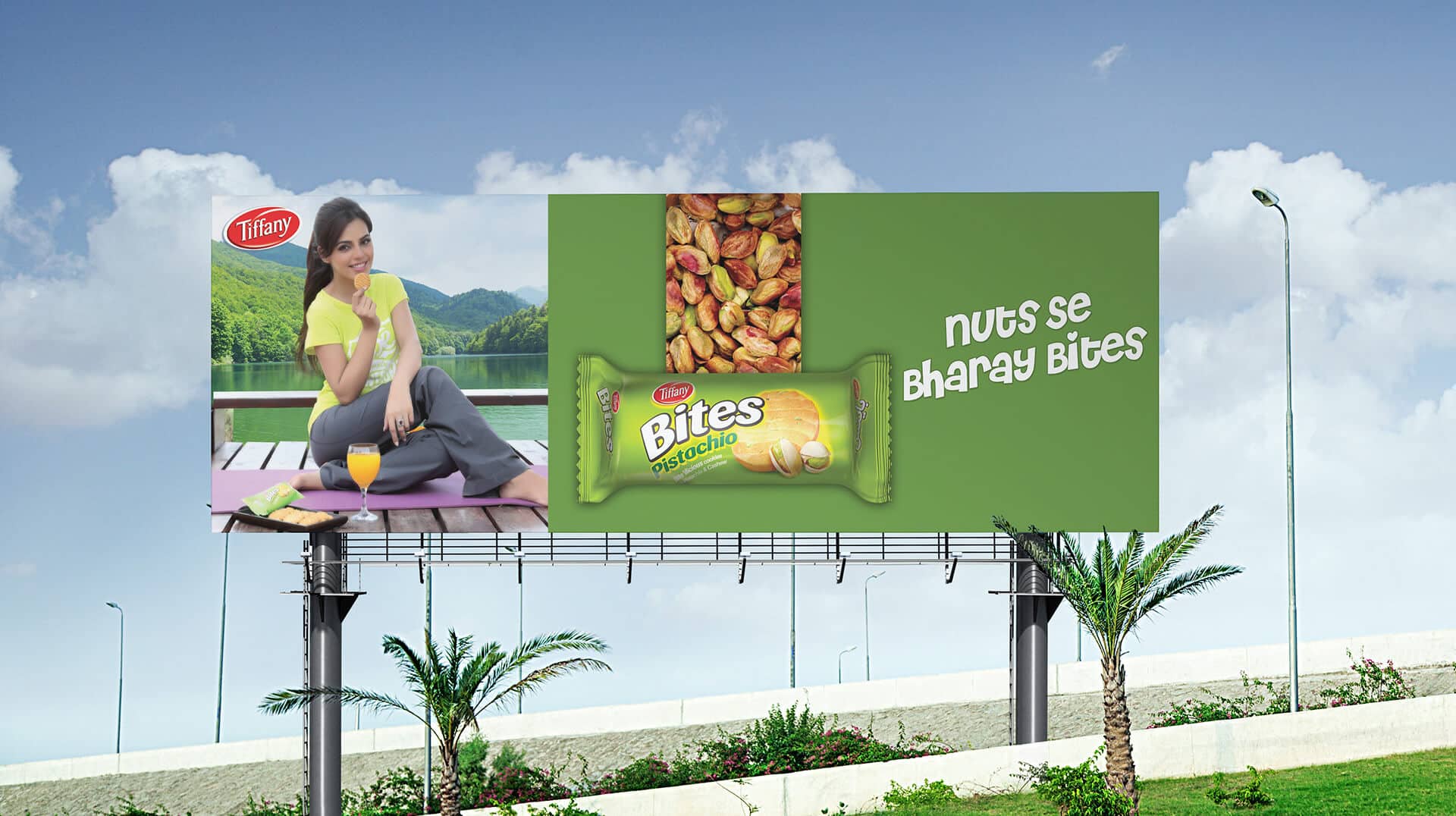
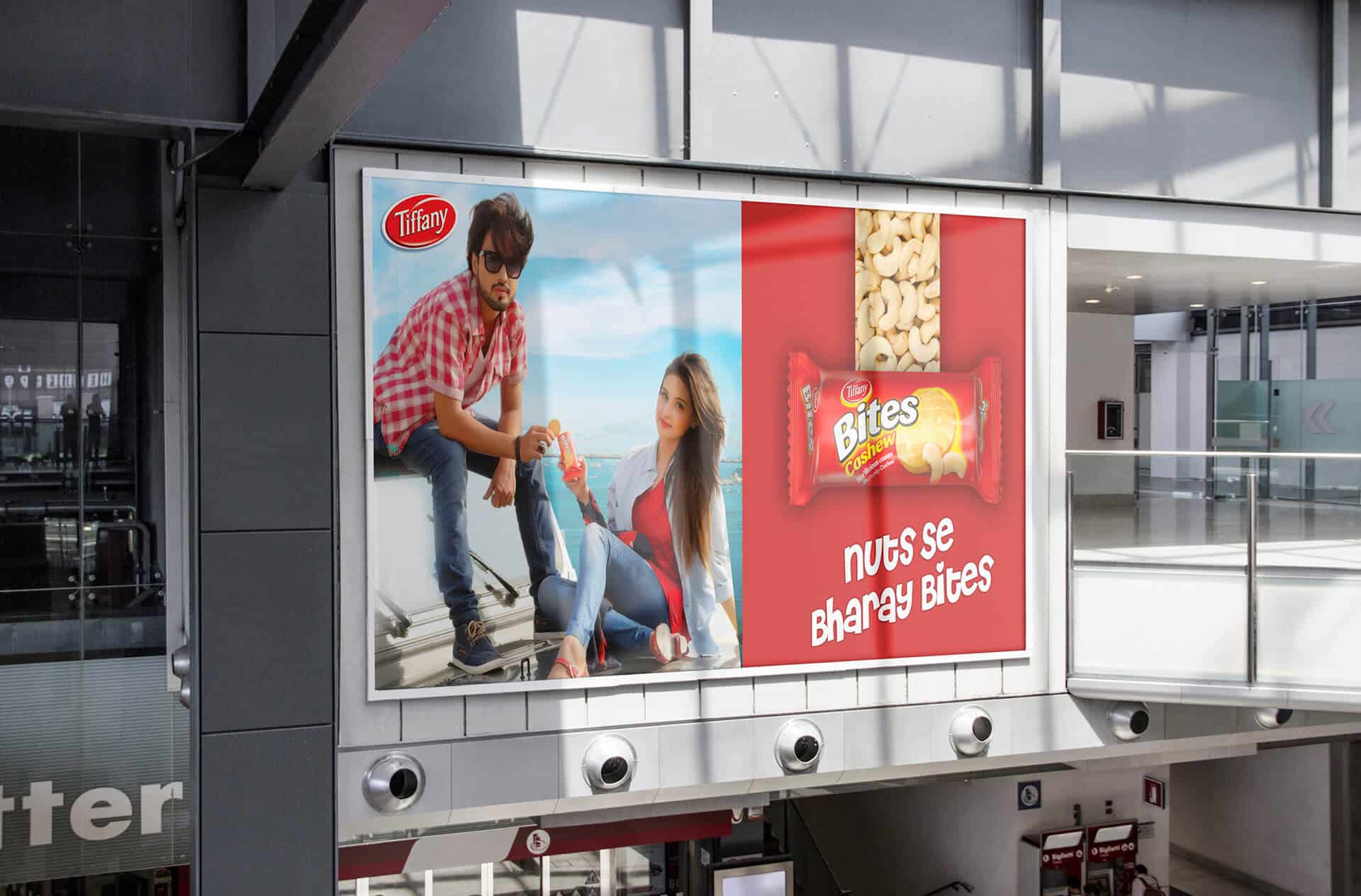
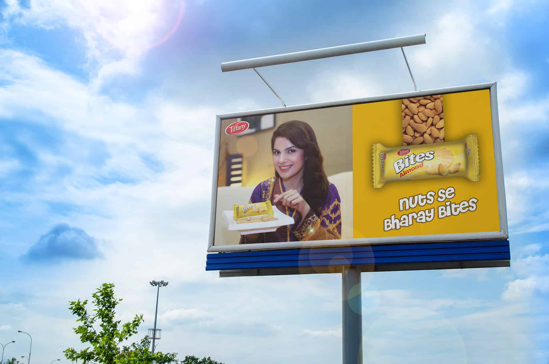
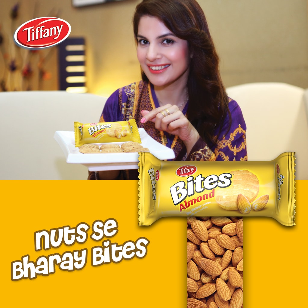
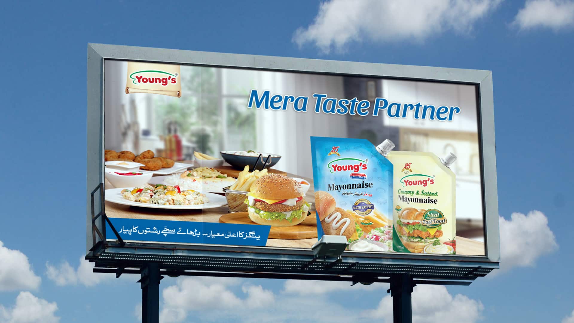
Key Visuals: Print, OOH & Branding