Digital
Digital Experiential Journey
Omnis Capital
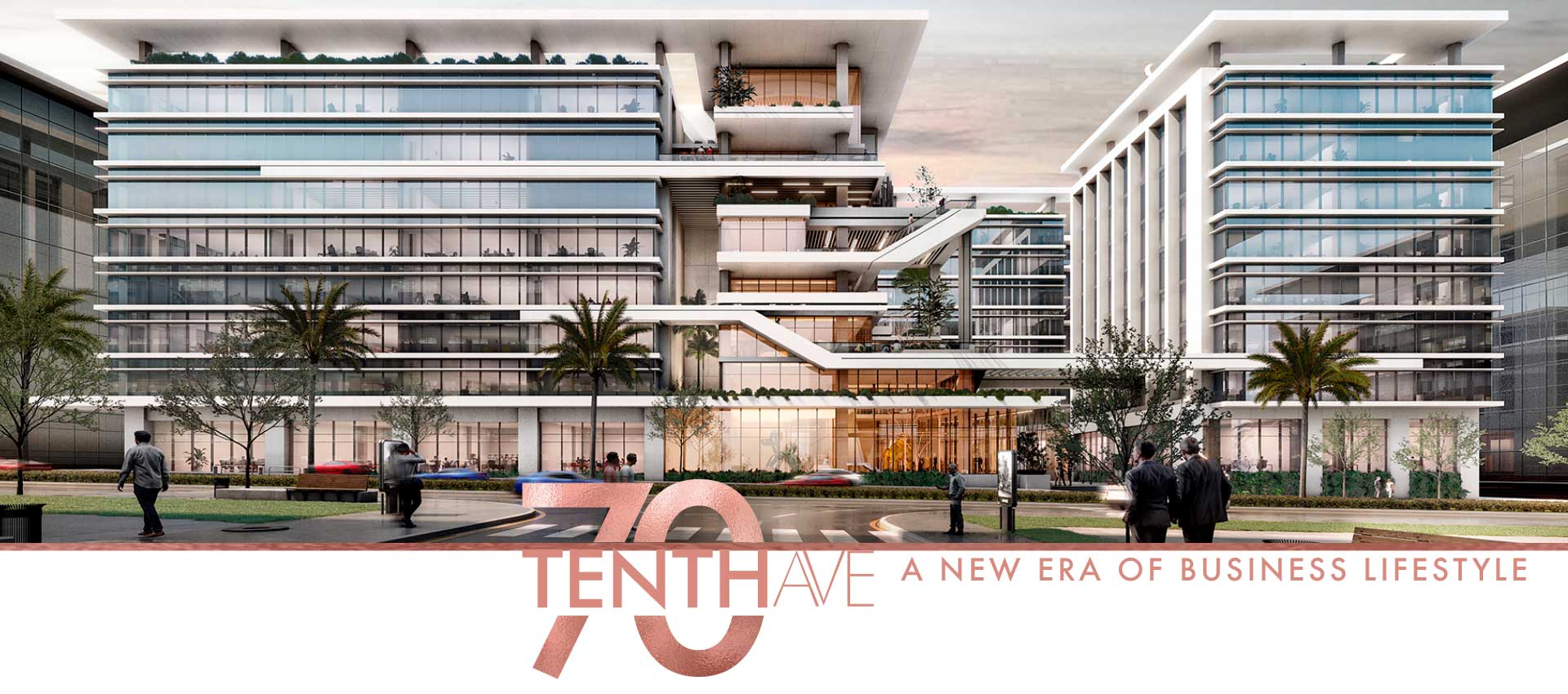
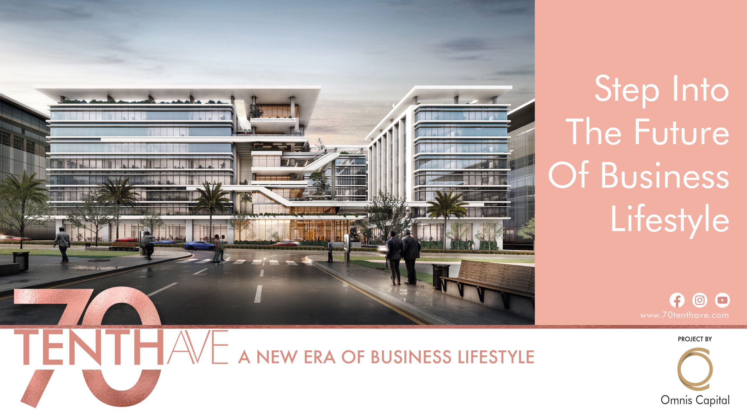
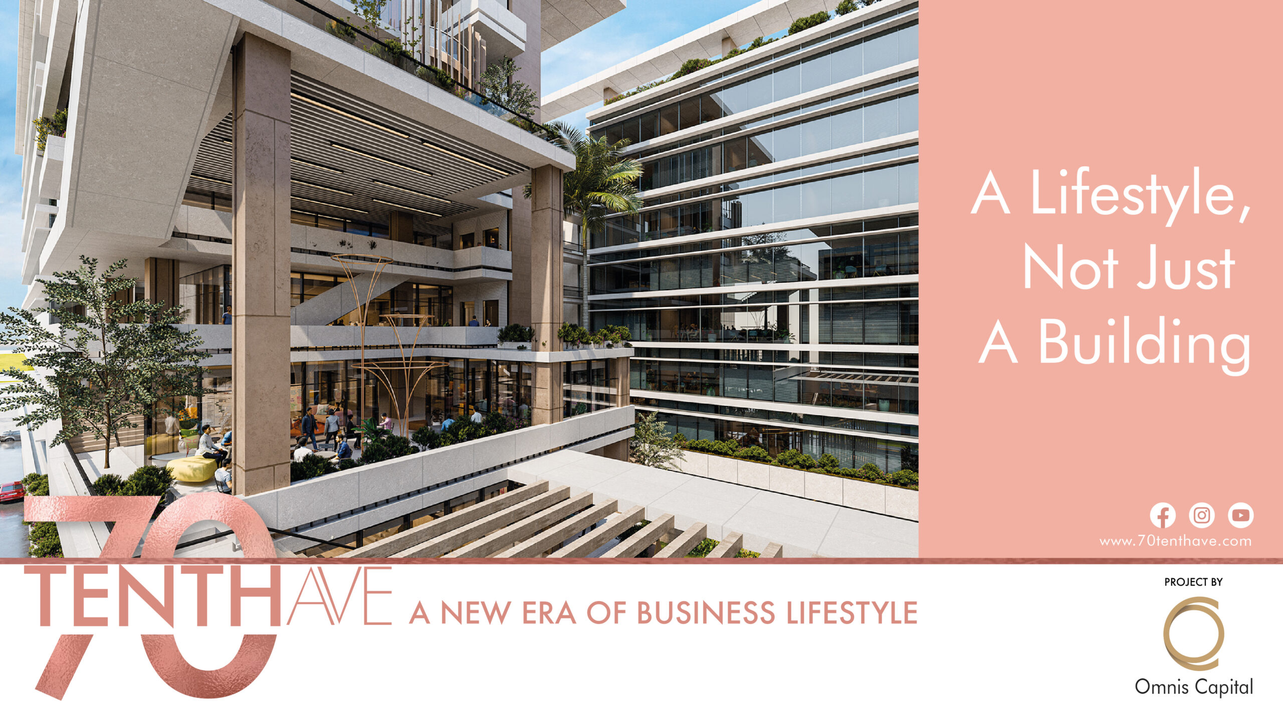
A Fusion of Minimalism and Futurism
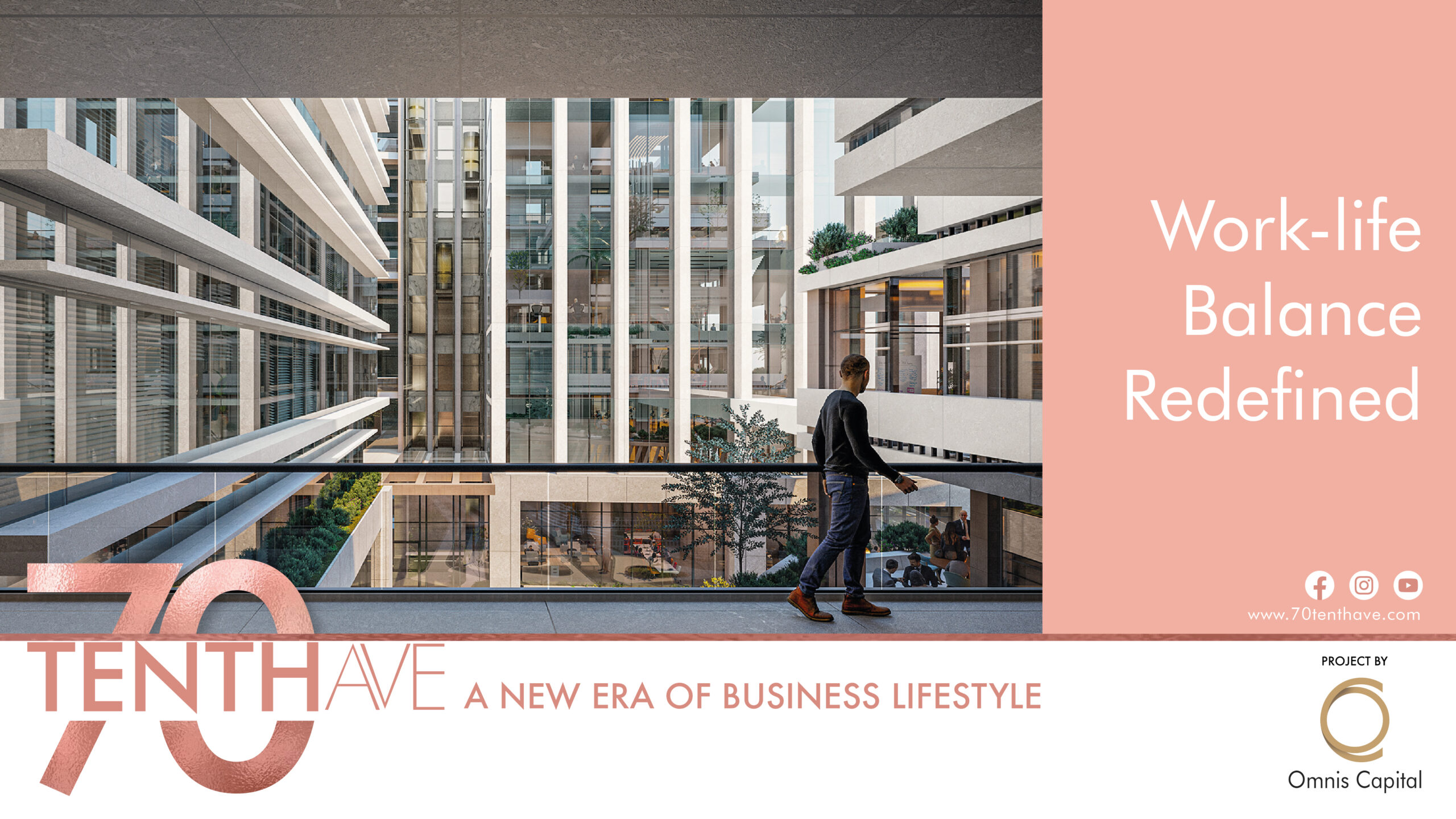
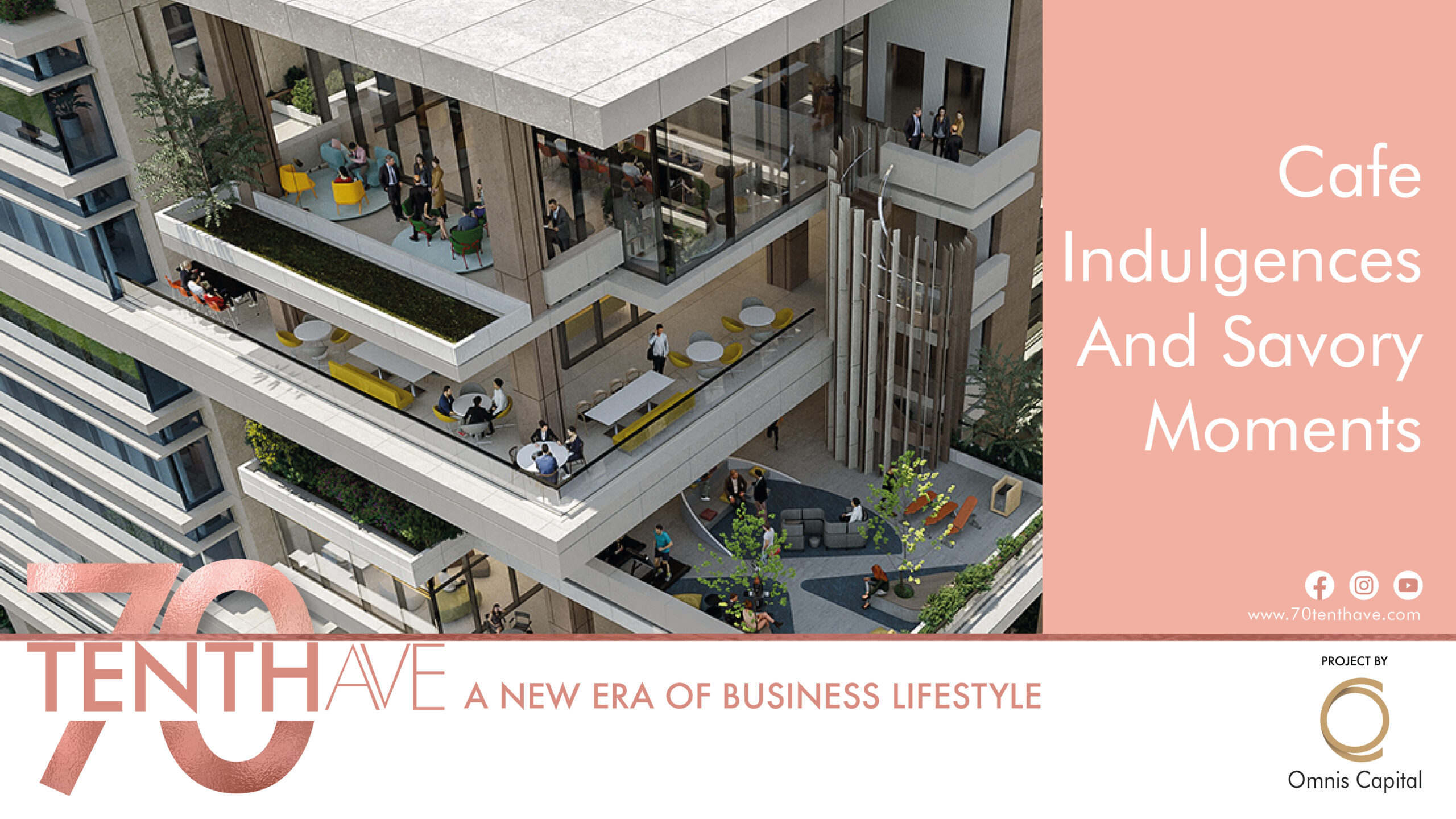
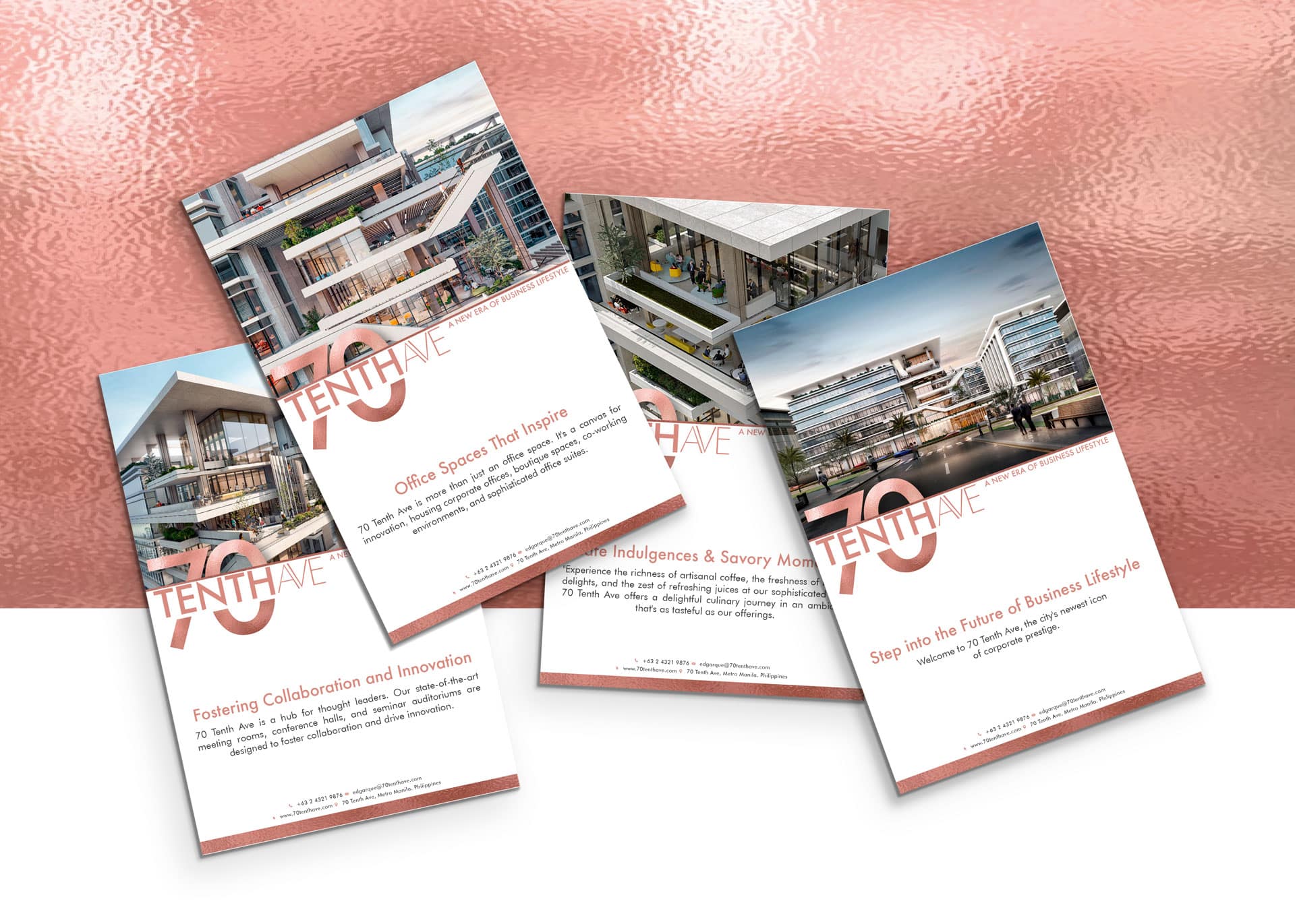
Omnis Capital, a renowned real estate firm, approached Owl Branding Studio with a vision to rejuvenate its corporate identity. They aspired to encapsulate their architectural prowess, seamlessly blending simplicity with a futuristic touch into their branding. The challenge was to craft a brand identity that resonated with their core values and stood as a testament to their commitment to pioneering future-forward living spaces.
Project Scope
Brand Purpose
Brand Strategy & Positioning
Brand Portfolio & Architecture
Brand Identity & Imagery
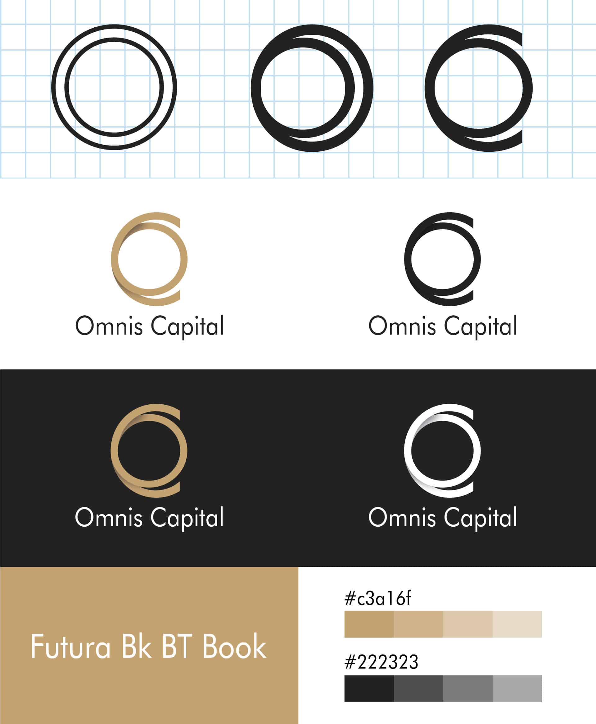
Brand Style Guidelines
Brand Strategy & Positioning
Brand Portfolio & Architecture
Brand Identity & Imagery
Brand Style Guidelines
Logo Creation
Packaging & Label
Messaging & Tone-of-Voice
Brand Concepts & Communications
Brand Tagline
Packaging & Label
Messaging & Tone-of-Voice
Brand Concepts & Communications
Brand Tagline
Experiential Designs
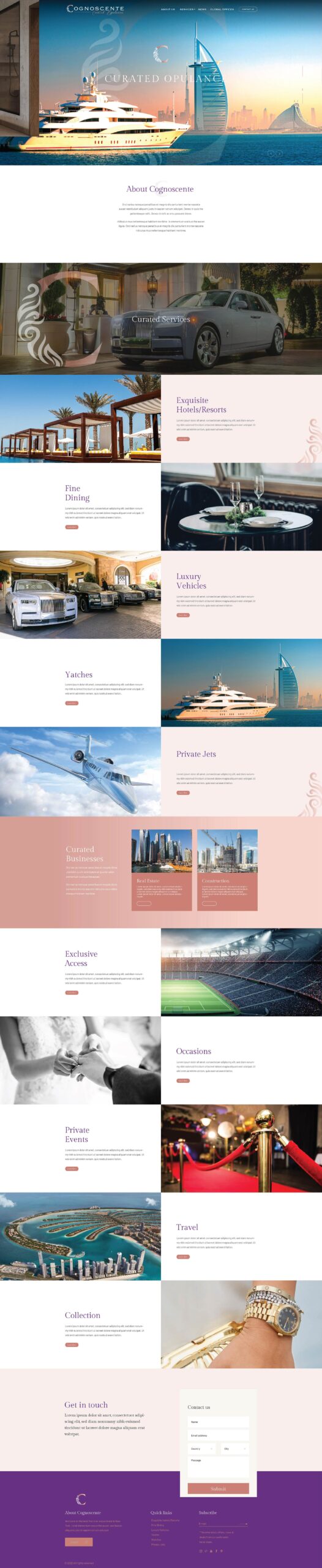
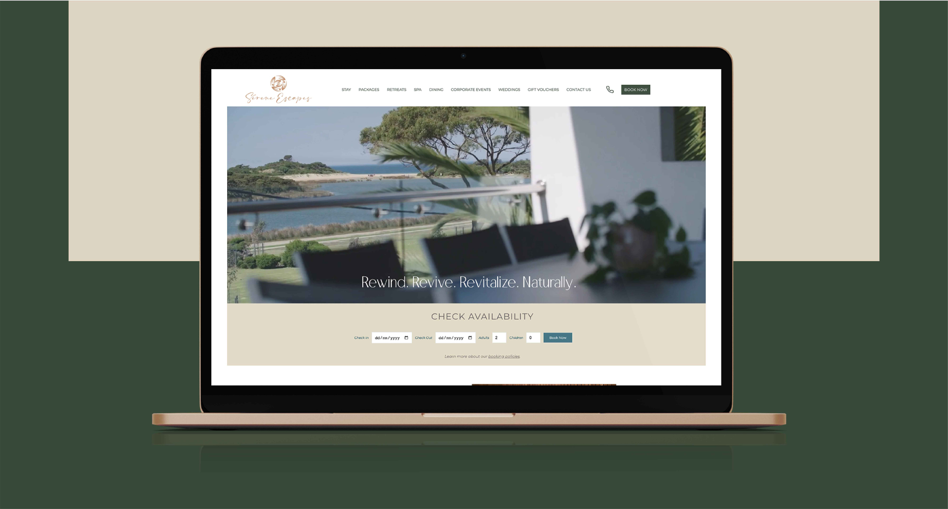
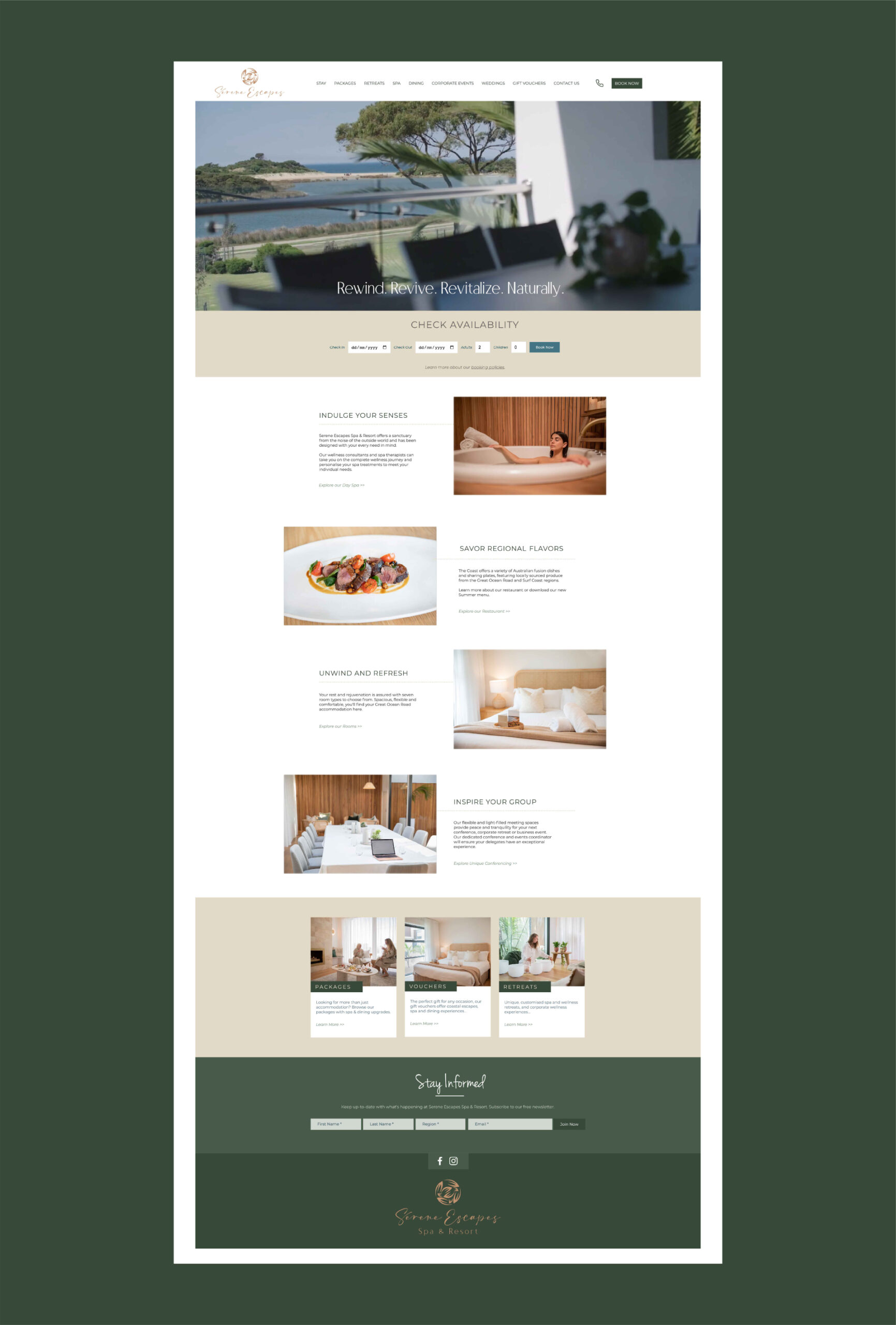
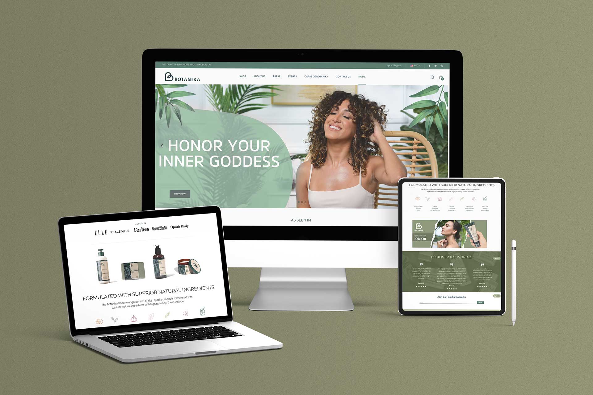
Website & E-commerce
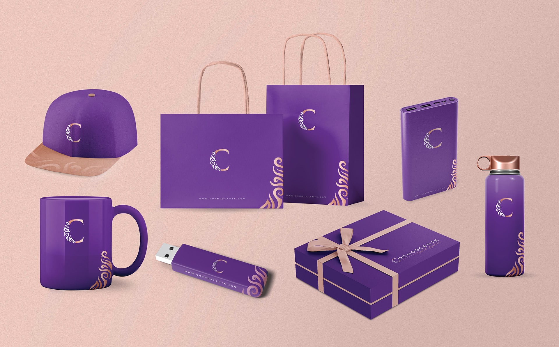
Retail Branding & Merchandise
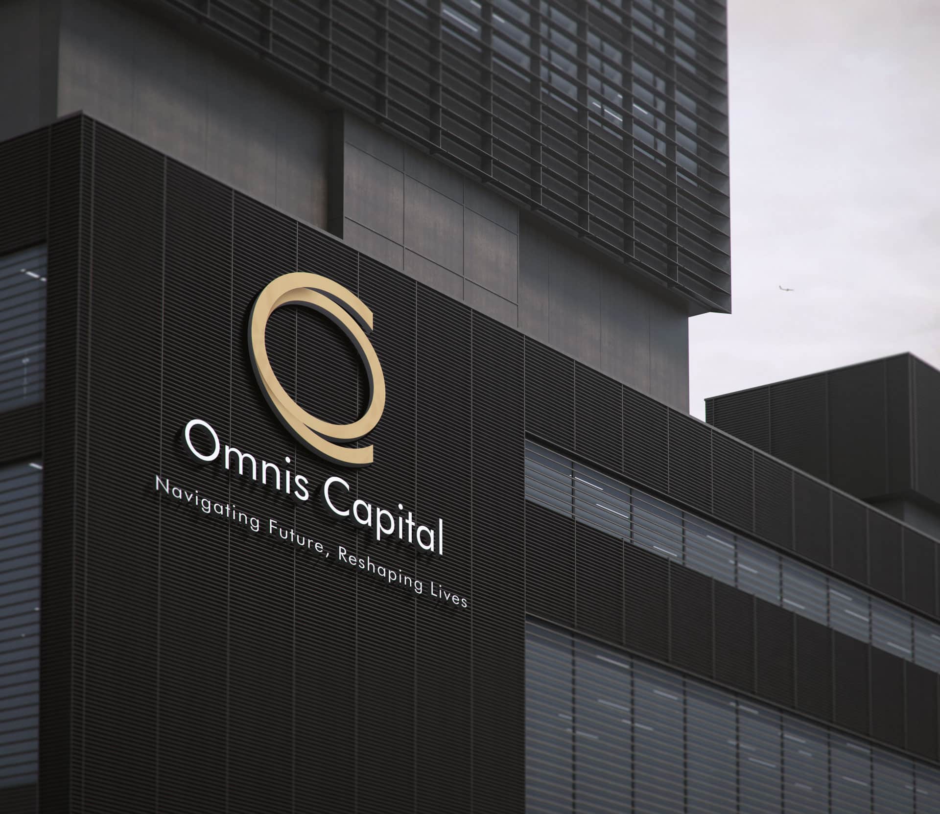
OOH – Signage & Billboard
Marketing Collateral
Website & E-commerce
Retail Branding & Merchandise
OOH – Signage & Billboard
Marketing Collateral

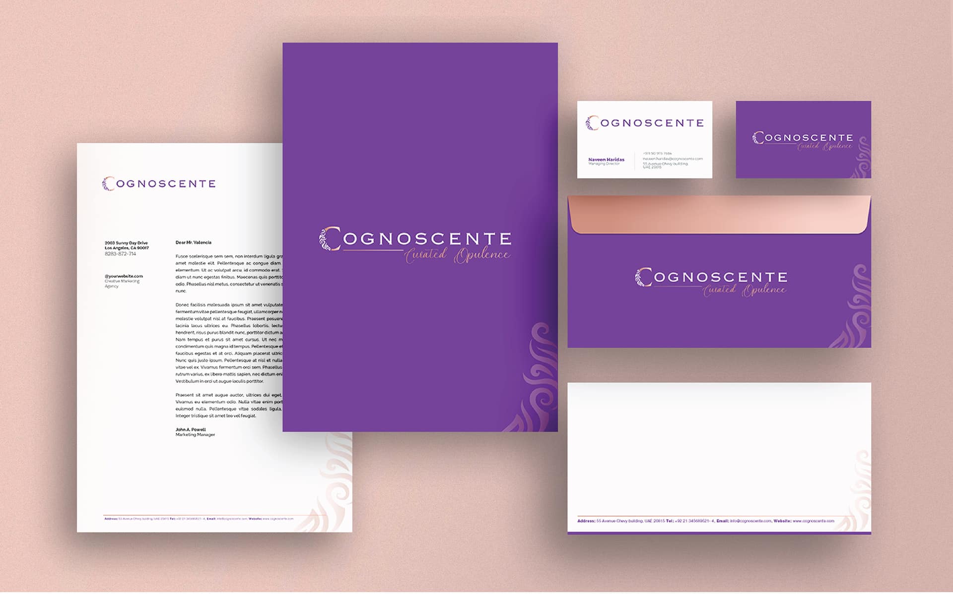
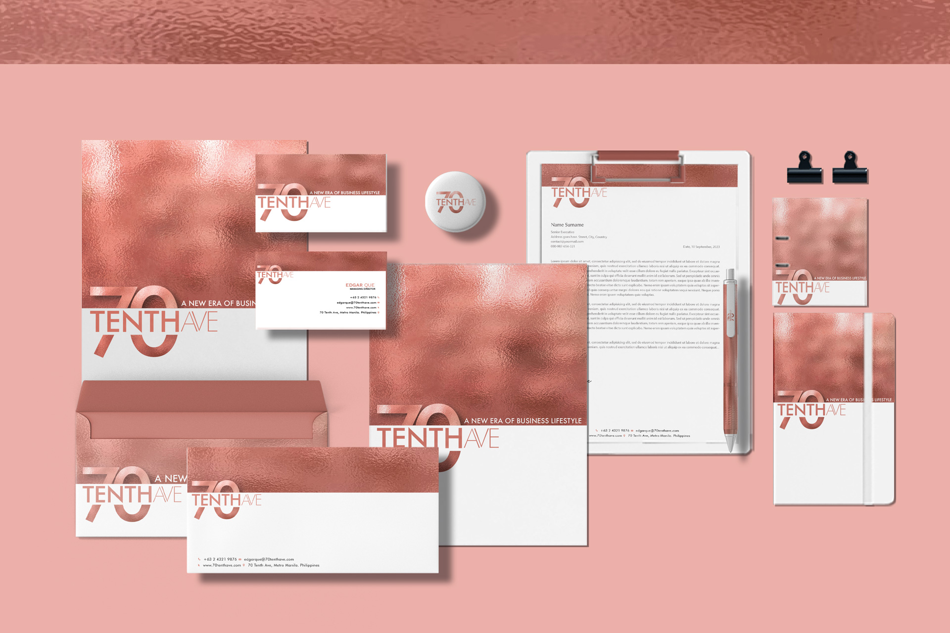
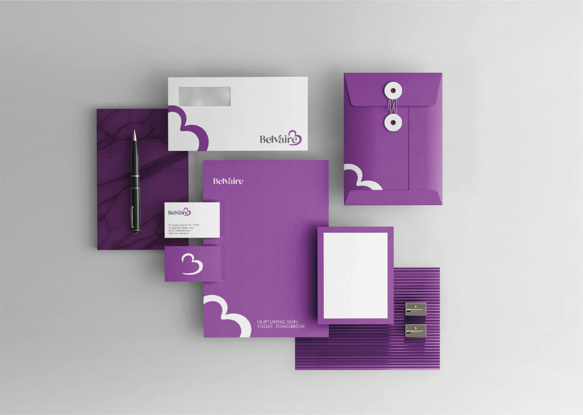
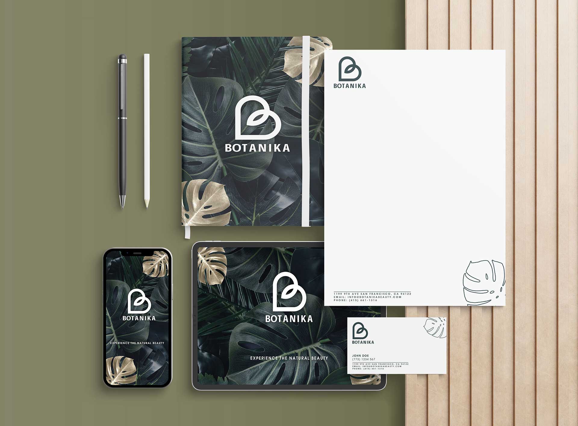
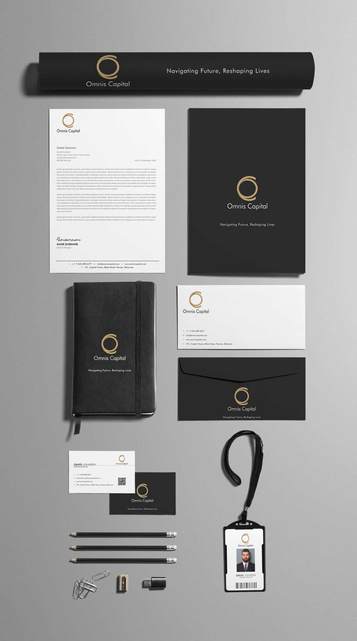
LOGO / STATIONARY
Brand Philosophy
Omnis Capital believes in the power of architecture to shape the future. Their projects are characterized by a unique blend of simplicity and innovation, ensuring that every structure is a building and a statement of future-forward living. Their commitment lies in creating aesthetically pleasing spaces that are functional, sustainable, and in tune with the evolving needs of the modern world.
Brand Identity Development
The brand’s identity was envisioned to be minimalist yet impactful, reflecting Omnis Capital’s ethos of simplicity combined with futuristic design.
Logo Concept
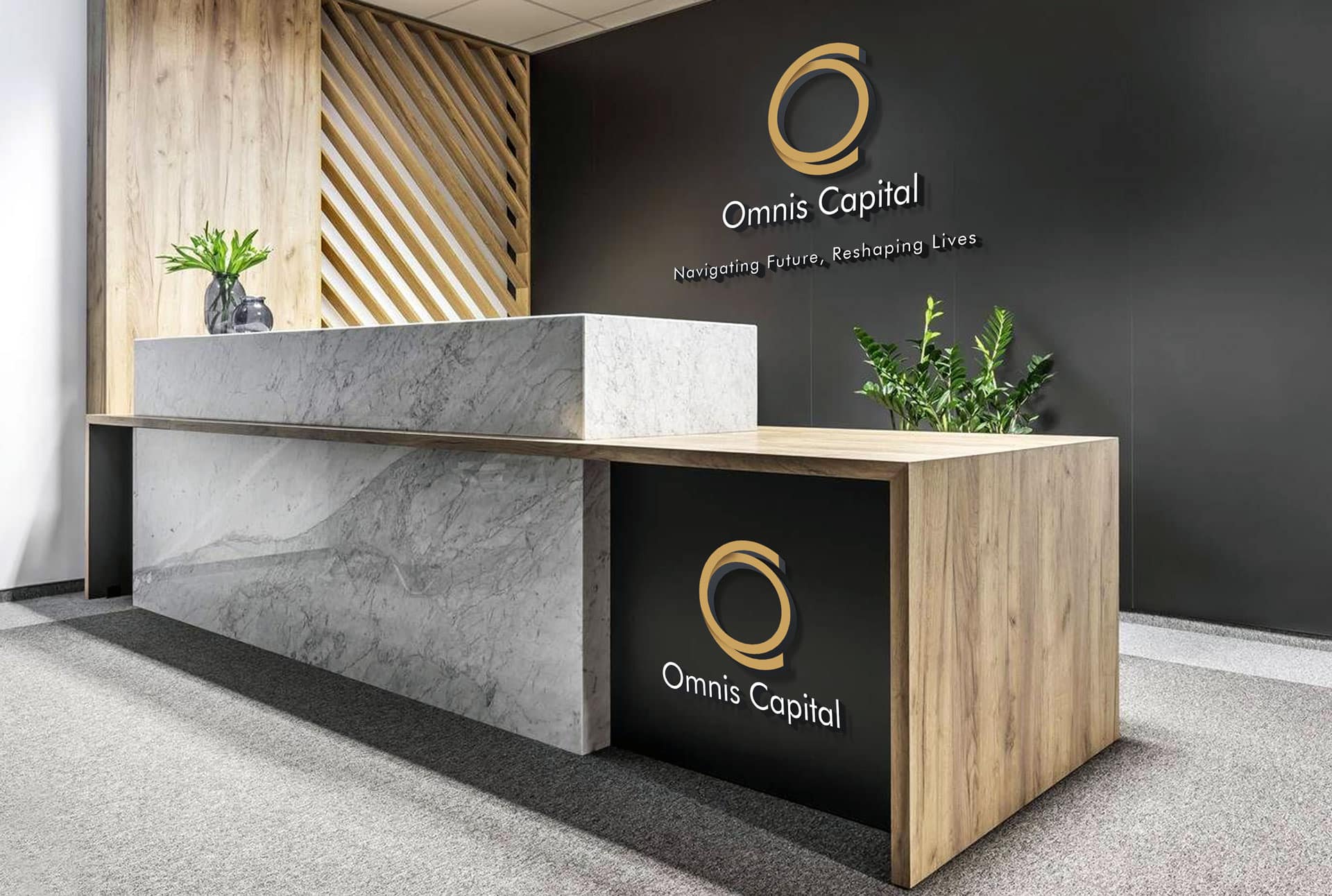
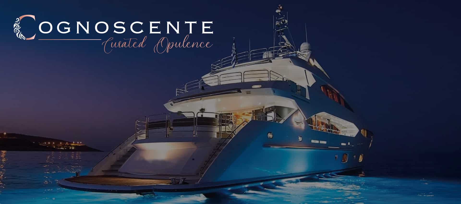
Drawing inspiration from the company’s name and vision, the logo was crafted using two overlapping circles, representing the initials of “Omnis Capital.” This design choice, where the circles blend into each other, symbolizes unity, completeness, and the infinite possibilities the future holds. Set against a charcoal background, the logo, rendered in matte gold, exudes sophistication and elegance. The company’s name is presented in reverse white lettering, ensuring clarity and enhancing its visual appeal.
Corporate Line
“Omnis Capital: Navigating Future, Reshaping Lives.” This corporate line encapsulates the brand’s mission and vision succinctly. “Navigating Future” signifies Omnis Capital’s forward-thinking approach and commitment to staying ahead of the curve. “Reshaping Lives” emphasizes their dedication to creating spaces that have a transformative impact on the lives of their inhabitants.
Owl Branding Studio’s collaboration with Omnis Capital resulted in a brand identity that is visually striking and deeply resonant with the company’s values and aspirations. The revamped identity is a testament to Omnis Capital’s commitment to excellence, innovation, and shaping the future of real estate.
OFFICE